Navigation

    UBports Robot Logo

    UBports Forum

    • Register
    • Login
    • Search
    • Categories
    • Recent
    • Tags
    • Popular
    • Users
    • Groups
    • Search

    Send Some: Content Hub Love (week 2)

    Design
    5
    17
    1137
    Loading More Posts
    • Oldest to Newest
    • Newest to Oldest
    • Most Votes
    Reply
    • Reply as topic
    Log in to reply
    This topic has been deleted. Only users with topic management privileges can see it.
    • undefined
      last edited by

      This is my thoughts from the screenshot0_1541644491204_Screenshot_2018-11-08-10-31-51.jpg

      mymike CiberSheep 2 Replies Last reply Reply Quote 0
      • mymike
        mymike @Guest last edited by

        @louies it'd be an icon grid like now with the transition to go right/left?

        1 Reply Last reply Reply Quote 0
        • ?
          A Former User @CiberSheep last edited by

          Personally, I don't see much wrong here...

          I don't particularly like the "sunken" effect around the icons, but it doesn't bother me that much.

          CiberSheep 1 Reply Last reply Reply Quote 1
          • CiberSheep
            CiberSheep @Guest last edited by

            @louies Thank you for the screenshot.

            1 Reply Last reply Reply Quote 0
            • CiberSheep
              CiberSheep @mymike last edited by

              @mymike Mmmmm...

              1 Reply Last reply Reply Quote 0
              • CiberSheep
                CiberSheep @Guest last edited by

                @3arn0wl You want it a difficult challenge, right 🙂

                ? 1 Reply Last reply Reply Quote 0
                • ?
                  A Former User @CiberSheep last edited by A Former User

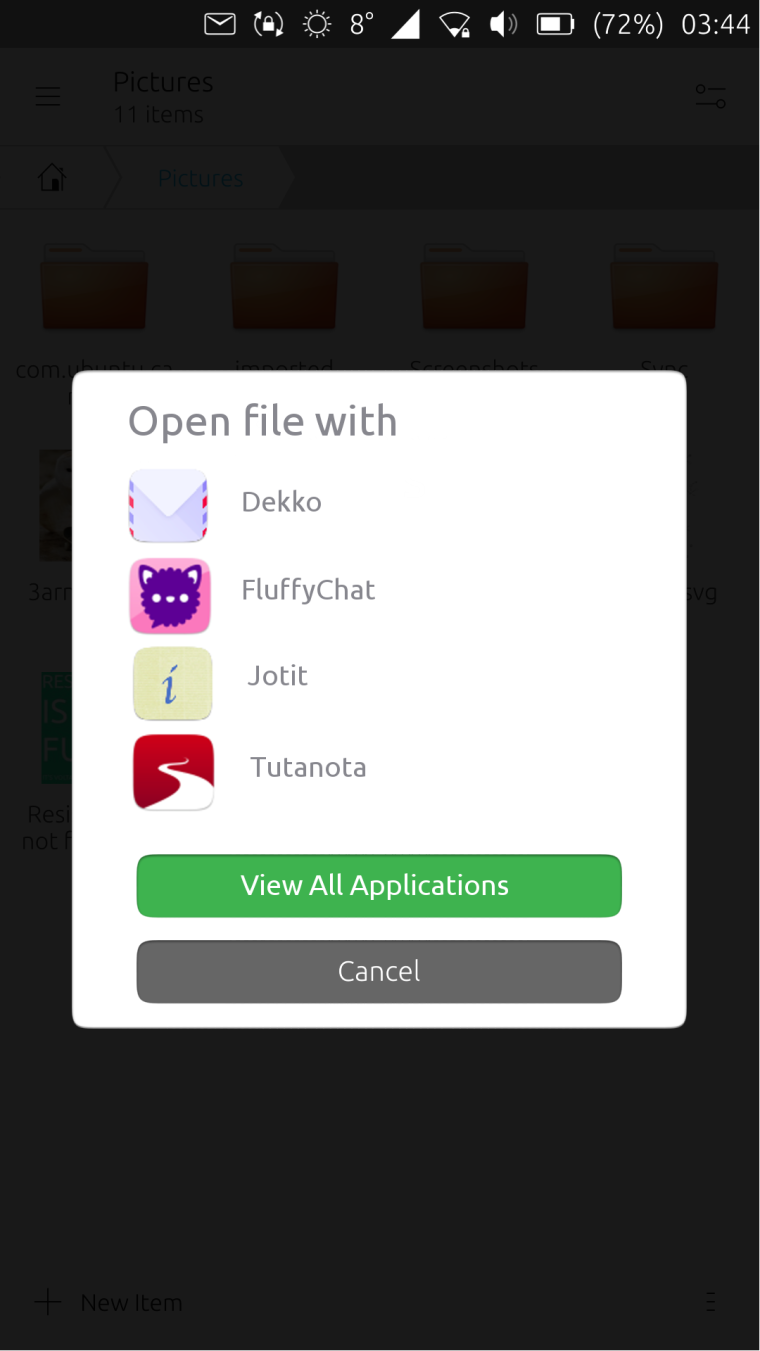
                  I was thinking @CiberSheep that, since inevitably it will only display a subset of the entire app group, perhaps it only needs to be a partial screen? If we take the cue from Unity7, it has a list of apps: the icon on the left, and the app name on the right. And the "View All Applications" option there too.

                  0_1542119472400_picker.png

                  ADDENDUM!

                  As you've probably realized, I took my inspiration from the screen which precedes the one we're working on:

                  0_1542117008700_Previous.png

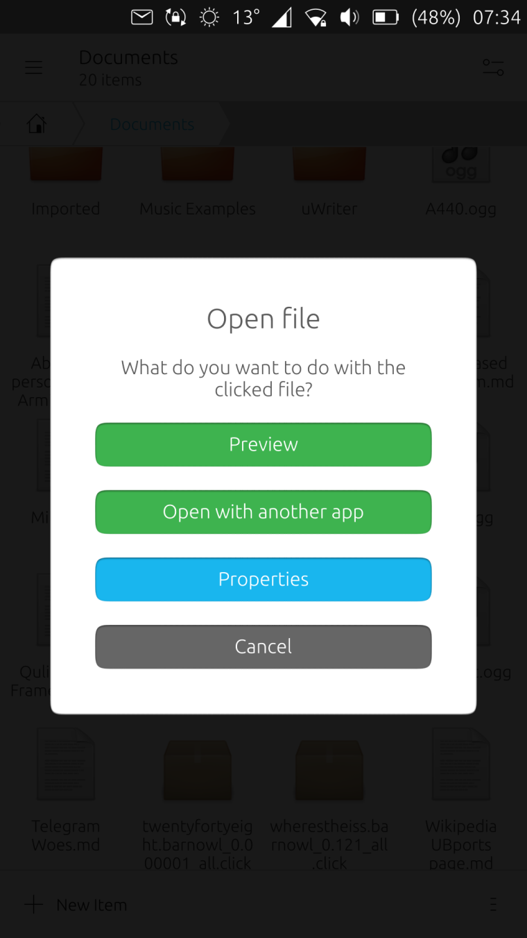
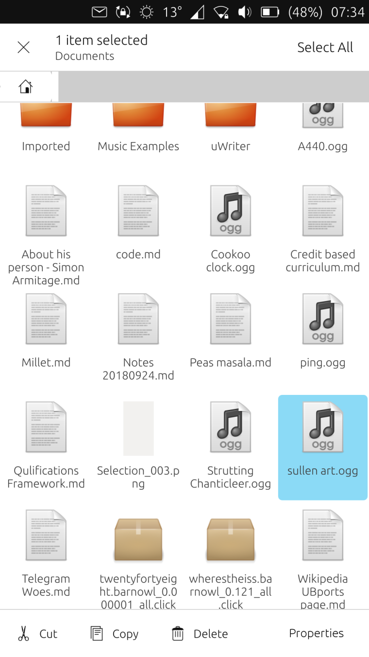
                  Subsequently, I had the idea to conflate the two screens, but it's a tad heretical! I think the "Properties" button ought to go on the screen that appears when you tap and hold:
                  0_1542117113500_screenshot20181113_073409014.png

                  The controversial idea would be to lose the "Preview" function altogether: since the OS comes with fully fledged music and photo apps, I think "Preview" is redundant. 😮

                  dobey CiberSheep 2 Replies Last reply Reply Quote 4
                  • dobey
                    dobey @Guest last edited by

                    @3arn0wl I actually kind of like this, not that I think we should directly emulate what Nautilus does, but I think this is a good starting point, and we could tidy it up a bit for sure.

                    ? 1 Reply Last reply Reply Quote 1
                    • ?
                      A Former User @dobey last edited by

                      Cor! Thanks @dobey 😃

                      1 Reply Last reply Reply Quote 0
                      • CiberSheep
                        CiberSheep @Guest last edited by

                        @3arn0wl I see you work well under pressure 😃
                        I like this idea very much.
                        Let's see what the rest of the week offers 🙂

                        ? 1 Reply Last reply Reply Quote 0
                        • ?
                          A Former User @CiberSheep last edited by

                          Just calibrating, @cibersheep! 😉

                          1 Reply Last reply Reply Quote 1
                          • mymike
                            mymike last edited by

                            0_1542025539832_ContentHub.png
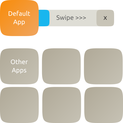
                            I don't know how Content Hub works so maybe this idea couldn't be done atm.
                            there is a default app to open what we are trying to open. the blue progress bar last something like 5-10 seconds and after that, that default app is opened, otherwise the user can swipe to open it immediately or press the "X" to stop the progress bar. or maybe something like to answer the phone, swipe right to open, left to stop the progress bar0_1542026028997_ContentHub2.png
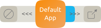
                            tapping on another app listed below opens that app and dragging that app over the default app makes the app dragged the new default one
                            this is way more complex than now and maybe not too intuitive but @CiberSheep told to go bananas and that's the result lol

                            CiberSheep 1 Reply Last reply Reply Quote 3
                            • CiberSheep
                              CiberSheep @mymike last edited by

                              @mymike I like that you surprised me... and with a sketch... and on time 😃
                              I don't know what to say. Good work.

                              mymike 1 Reply Last reply Reply Quote 1
                              • mymike
                                mymike @CiberSheep last edited by

                                Thank you @CiberSheep ! 😃

                                1 Reply Last reply Reply Quote 0
                                • CiberSheep
                                  CiberSheep last edited by

                                  So. Time is app (ho ho ho ho)...this week you took the best out of you and you should be really proud.

                                  @3arn0wl I just saw the addendum to your post now, sorry. The file manager need some love into the menus. But let's do that properly soon.
                                  I liked the simplification still in Suru and in system look you did. A very possible approach and improvement. Well done.

                                  @mymike You have impressed me getting out of the box. Well done. I don't know if that is possible to do but I'll make sure to add it to the possible things we should try to get in.

                                  @Louies thank you for the screenshots but we might need more info next time. You can hand draw if that is better with you, or explain what your idea is as your message is not landing. Sorry.

                                  1 Reply Last reply Reply Quote 0
                                  • First post
                                    Last post