Notification indicators
-

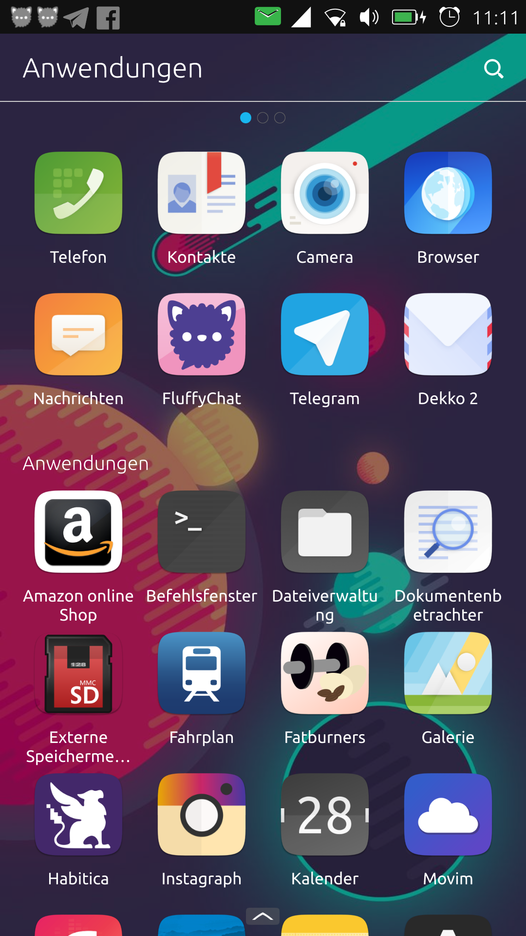
Hi, I have a design proposal. The top-left corner of the system is unused in phone mode so we could use this to display the icons of the apps of the persistent notifications.
The new notification indicator seems to be always the first left indicator, so the relationship would be clear for the user.
In tablet mode, at this position is the title name of the focused app. Then the icons should be on the right side, left from the notification indicator.
What do you think?

-
 As I've said elsewhere, I'd certainly like to see deeper integration with Matrix (and other messaging services like XMPP) on the device: being able to respond to messages actually within the Notifications Bar, as you can with text messages. It would also be nice to see our Matrix usage reflected in the Welcome Circle, as Telegram is.
 -
@3arn0wl this is really possible already, but in the hands of the App developers. So you might want to file a suggestion in the App´s tracker for that. Lock screen has an API to reflect stats. Reply function in the dropdown indicator has an API as well.
-
 Thanks for that, @flohack. I'm discussing it with Krille at the moment.
Hello! It looks like you're interested in this conversation, but you don't have an account yet.
Getting fed up of having to scroll through the same posts each visit? When you register for an account, you'll always come back to exactly where you were before, and choose to be notified of new replies (either via email, or push notification). You'll also be able to save bookmarks and upvote posts to show your appreciation to other community members.
With your input, this post could be even better 💗
Register Login