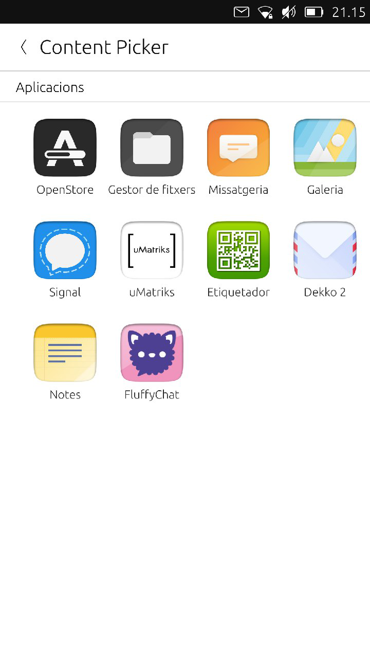
Send Some: Content Hub Love (week 2)
-
@mymike Mmmmm...
-
@3arn0wl You want it a difficult challenge, right

-
I was thinking @CiberSheep that, since inevitably it will only display a subset of the entire app group, perhaps it only needs to be a partial screen? If we take the cue from Unity7, it has a list of apps: the icon on the left, and the app name on the right. And the "View All Applications" option there too.
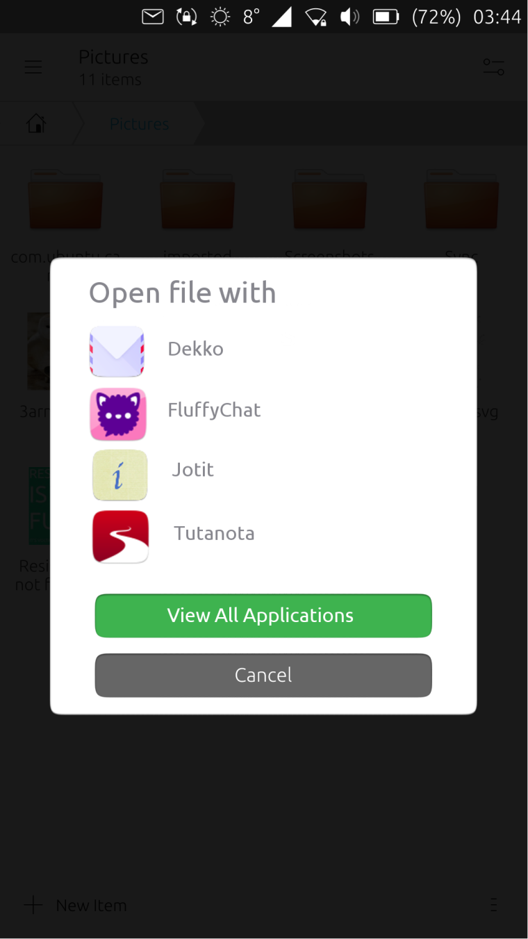
ADDENDUM!
As you've probably realized, I took my inspiration from the screen which precedes the one we're working on:
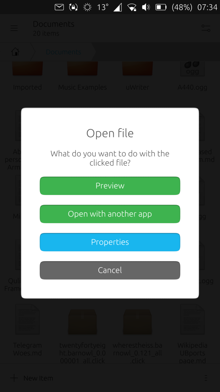
Subsequently, I had the idea to conflate the two screens, but it's a tad heretical! I think the "Properties" button ought to go on the screen that appears when you tap and hold:
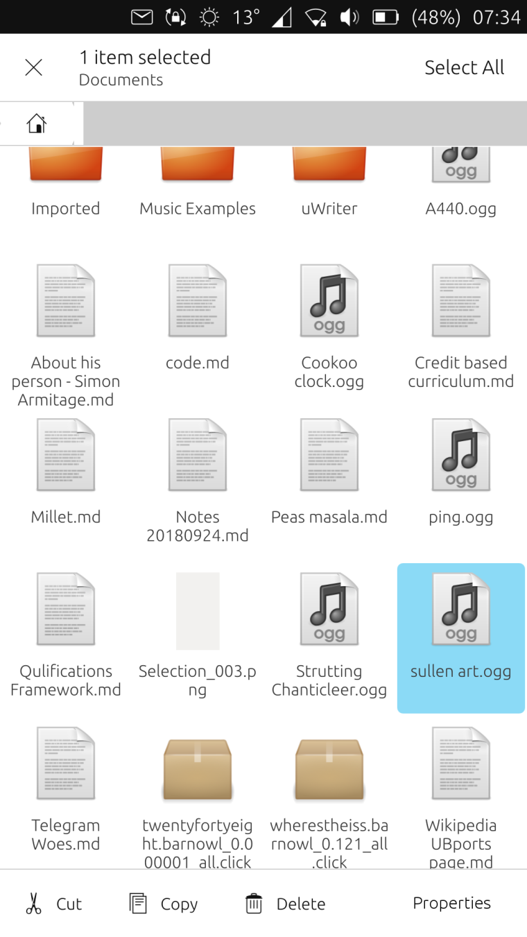
The controversial idea would be to lose the "Preview" function altogether: since the OS comes with fully fledged music and photo apps, I think "Preview" is redundant.

-
@3arn0wl I actually kind of like this, not that I think we should directly emulate what Nautilus does, but I think this is a good starting point, and we could tidy it up a bit for sure.
-
Cor! Thanks @dobey

-
@3arn0wl I see you work well under pressure

I like this idea very much.
Let's see what the rest of the week offers
-
Just calibrating, @cibersheep!

-
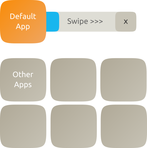
I don't know how Content Hub works so maybe this idea couldn't be done atm.
there is a default app to open what we are trying to open. the blue progress bar last something like 5-10 seconds and after that, that default app is opened, otherwise the user can swipe to open it immediately or press the "X" to stop the progress bar. or maybe something like to answer the phone, swipe right to open, left to stop the progress bar
tapping on another app listed below opens that app and dragging that app over the default app makes the app dragged the new default one
this is way more complex than now and maybe not too intuitive but @CiberSheep told to go bananas and that's the result lol -
@mymike I like that you surprised me... and with a sketch... and on time

I don't know what to say. Good work. -
Thank you @CiberSheep ! =D
-
So. Time is app (ho ho ho ho)...this week you took the best out of you and you should be really proud.
@3arn0wl I just saw the addendum to your post now, sorry. The file manager need some love into the menus. But let's do that properly soon.
I liked the simplification still in Suru and in system look you did. A very possible approach and improvement. Well done.@mymike You have impressed me getting out of the box. Well done. I don't know if that is possible to do but I'll make sure to add it to the possible things we should try to get in.
@Louies thank you for the screenshots but we might need more info next time. You can hand draw if that is better with you, or explain what your idea is as your message is not landing. Sorry.
Hello! It looks like you're interested in this conversation, but you don't have an account yet.
Getting fed up of having to scroll through the same posts each visit? When you register for an account, you'll always come back to exactly where you were before, and choose to be notified of new replies (either via email, or push notification). You'll also be able to save bookmarks and upvote posts to show your appreciation to other community members.
With your input, this post could be even better 💗
Register Login