Since it seems to be Open Season on the Dash...
-
This is what I'd do.
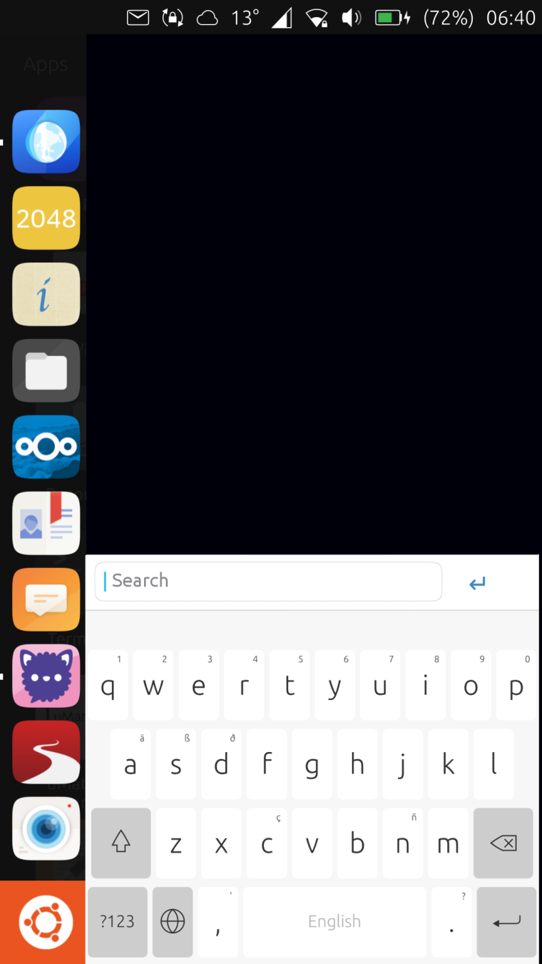
On clicking the Dash button you'd get a search function:

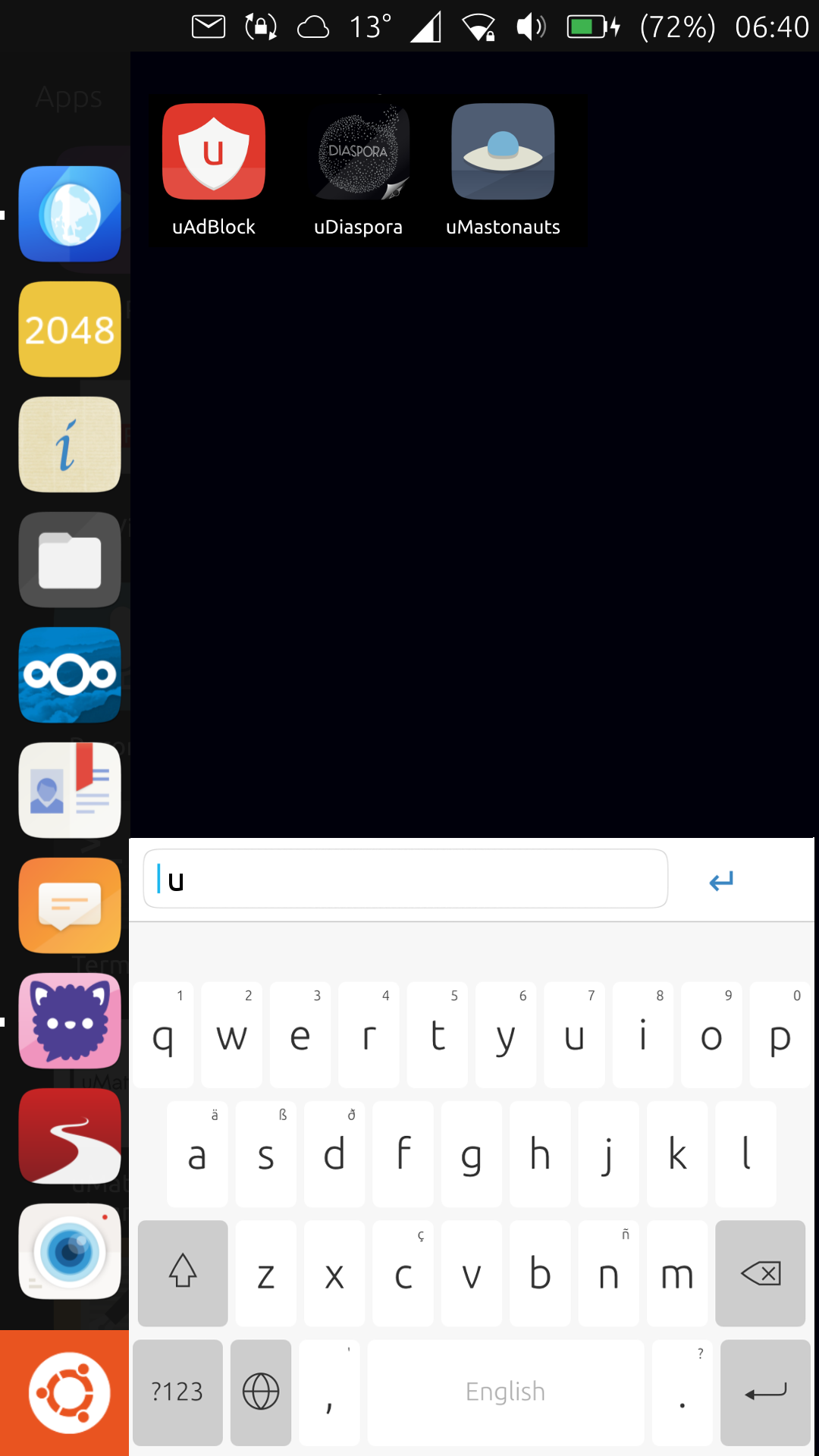
As soon as you start typing, you get suggestions:

I think it's a more Ubuntu approach.
-
I don't think that's very convenient on a mobile.. The aim of a good homescreen/app drawer should be to get your informations and/or needed apps fast and without many swipes or clicks or typing... I've been totally satisfied by the scopes approach but it seems I'm part of a minority

-
Remember that the most common apps you use are on the app launcher - you'd only use this occasionally anyway.
-
I like the idea in theory. Not sure if I would like it in practise though.
Having to type on the device to get at an app might be an unpleasant experience, especially on a tablet. -
@3arn0wl said in Since it seems to be Open Season on the Dash...:
Remember that the most common apps you use are on the app launcher - you'd only use this occasionally anyway.
Yes but as there are more "most common apps" I need I'm already using tweek tool to get them on top of the current app drawer
 - I also never used that search tool for the menus on any desktop OS - they all have it from Apple to XFCE and I never got used to that approach - searching documents, yes but apps should be just a click away or the GUI doesn't make sense at all - I already can start programs on the shell, no gui for the os needed if I want to do it like this - if I want to use a DE I want it user friendly ...
  - but different habits need different solutions .. that's why I like linux
-
@3arn0wl That's a poor assumption to make. It may be how you are using your device, but it is not how everyone uses the device.
Also, the new app drawer has search already. I think it's even focused by default, but not 100% sure on that. There are definitely focus issues with the new app drawer when using unity8 on a PC, though.
-
Well at least we agree about something, @dobey - people use their devices in different ways.
-
As an experiment, on my Android phone (must use it for now), I have decided to remove all the icons from the "home" screen(s). I now have only phone and camera on the bottom bar, along with the "all apps" button.
So far, I am liking this. No icons/widgets blocking the wallpaper view, and forces me to be more mindful about use of the device.
-
 I like the idea of an uncluttered screen.
 -
@dobey on Android you may try Smart Launcher (if still exists) is the last thing I had installed when I used Android
Hello! It looks like you're interested in this conversation, but you don't have an account yet.
Getting fed up of having to scroll through the same posts each visit? When you register for an account, you'll always come back to exactly where you were before, and choose to be notified of new replies (either via email, or push notification). You'll also be able to save bookmarks and upvote posts to show your appreciation to other community members.
With your input, this post could be even better 💗
Register Login
