-
I think yall have made a nice mobile OS with compatibility for a wide range of devices, but I'd like to express some UX things I think could be improved, at least for consistency. These are listed in no particular order, and obviously, are my opinion, and I realize some of these changes I'm listing would take limited dev time to implement.
-
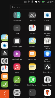
Long-Pressing applications in "Pinned Applications" & "The Drawer" menus should do the same things: Open a context menu, or enable dragging

Right now, long-pressing applications in the pinned applications sidebar on the left, will bring up a context menu of additional actions you can do with it, including unpinning. It also allows you to rearrange the order of the icons by dragging.
However doing the same in the Drawer menu on the larger right side, will only attempt to open the app in OpenStore - often failing if the app was not installed from OpenStore. As far as I can tell, there's no way to pin an application from here? (It's likely I just have not figured out how to do it.) Most OS's give multiple routes of doing the same thing. As an end user, I would expect no different from the UX of Ubuntu Touch.
Even if you do not plan to actually allow users to rearrange their icons in the Drawer menu, enabling the ability to visually drag the icons, then snap back to original position when released, can give useful usage-context clues to the user. For example, I did not realize the icons on the left side could be reordered at all, until I read on this forum it could be done. (Because I first had tried with the Drawer menu, and it didn't work)
Doubling back to application-specific context menus, I think these kinds of menus are quite useful for fast shortcuts to frequent tasks (Uninstalling, viewing info, app-settings, app-administration, etc), and expandable from a programming perspective. Google phones/APIs went further with this idea and let apps add their own context menu entries, which may be a bit too much overhead work for this project, at this point. Just thought I'd mention - context menus are versatile from both sides. -
The top "Notification Menu" ...at first I did not understand the nature of its gesture, but after a few hours I got the hang of it, with its single swipe down, then left or right. It's something I could get very used to, but honestly I'd really appreciate the ability to customize the sub-menus that are shown when you swipe down, in the system settings or something. I'm never going to use that "Keyboard" sub-menu on my device; it just takes longer to scroll past it. Likewise, I feel many sub-menus on my phone are just very blank; the "Files" sub-menu is literally blank for me. Does "Rotation Lock" toggle need its own entire sub-menu to scroll past?
Coming from vanilla Google Pixel 3a (Android 12) I feel they made a good balance of making everything you could need accessible and visible, in a short amount of time. If it couldn't be shown there, it was a single tap to take you to a different page to configure it (eg, wifi settings).
Things like enabling flashlight (sometimes useful in dark emergencies!) were right there. Now its hidden under... "Battery"?
I think you are on to something new and innovative with your current Notfication menu, but at the same time you might consider reorganizing some things, such that you borrow what's good from competitors' UX in this area. A hybrid, if you will. Especially, I think your actual notifications need to be on display in this menu, not hidden off to the far side in a sub-menu.
Maybe make it so if you do a partial swipe-down+left/right, it will show you something closer to what you have implemented currently, vs if you do a full swipe-down and release, it would show you an overview of everything, with frequently-used shortcut buttons, like flashlight.
I do like the current menu, how it does not take up the entire screen when the device is in landscape rotation, which segways to my next topic... -
Screen Rotation Logic... I don't know what's up with it, but I find my screen will rotate when I do not want it to do so, like at slight diagonals. Maybe it needs the gyro thresholds adjusted, or add a delay before it applies the rotation?
Something fancier like "floating gyro thresholds", so the more noise in gyro values, the more the system will be likely to try and rotate the screen from where it currently is? No idea if that math would even work in practice tbh.
Additionally, I can't get the screen to rotate to reverse-portrait. Oversight in the code maybe? It hasn't been a big deal, just something I noticed. It might be a bigger deal for someone else. All other screen orientations are working for me.
Honestly, the rest of my feedback is down to specific apps, battery usage on an already well-worn battery, or has already been expressed by myself or others elsewhere.
-
-
 K Keneda moved this topic from Design on
-
@bamboy360 thanks for the feedback.
1- This is how Unity works. There is a difference from the Launcher that from the App drawer.
2- It has been some discussion on how to simplify all the indicators...
3- Inverted portrait should work as default but some porters blocked that feature.
Hello! It looks like you're interested in this conversation, but you don't have an account yet.
Getting fed up of having to scroll through the same posts each visit? When you register for an account, you'll always come back to exactly where you were before, and choose to be notified of new replies (either via email, or push notification). You'll also be able to save bookmarks and upvote posts to show your appreciation to other community members.
With your input, this post could be even better 💗
Register Login