UI / UX discussion
-
I think it's not that easy to measure or calculate the improvements in snappiness and ease of use, compared to a practical test.
So here it is:
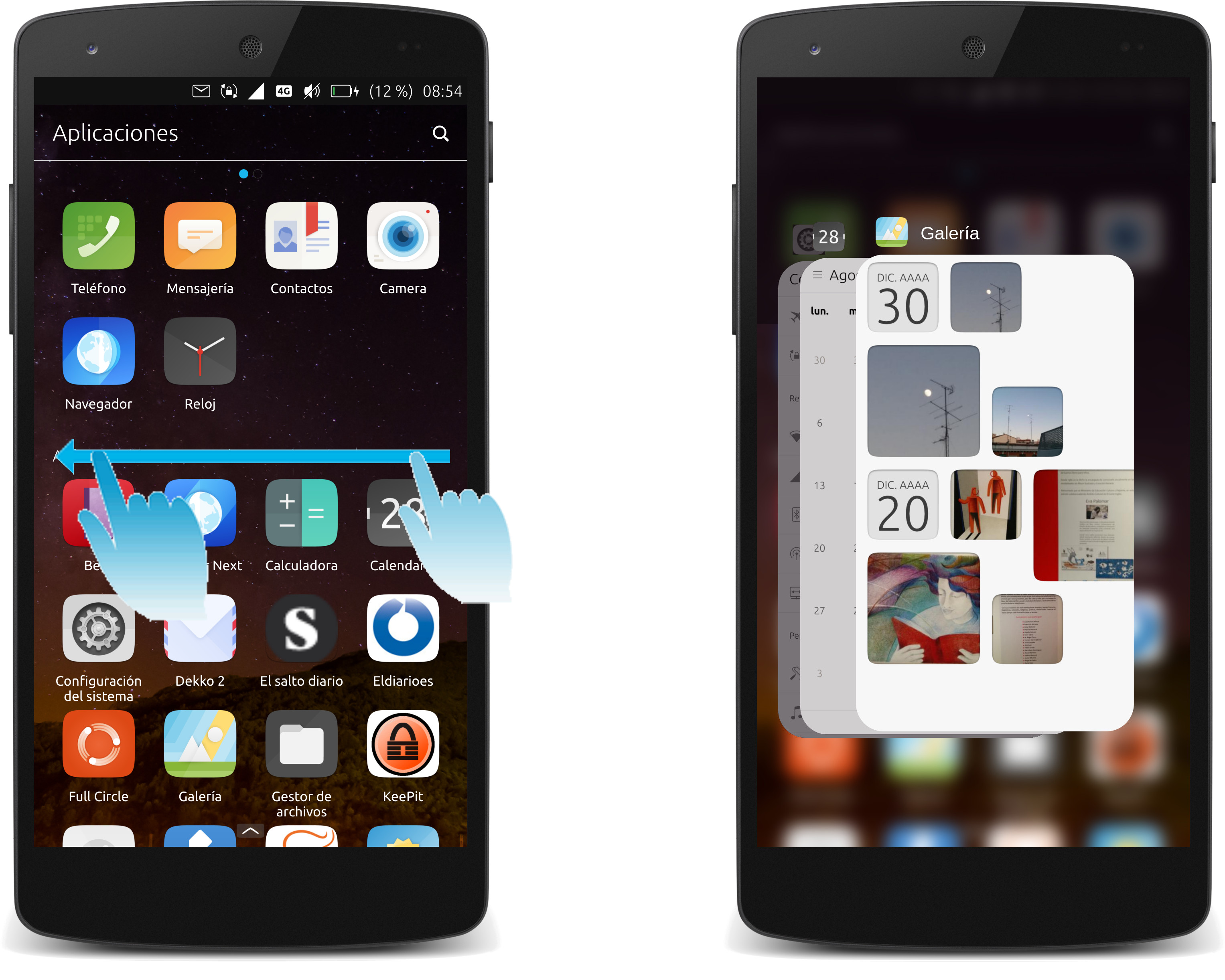
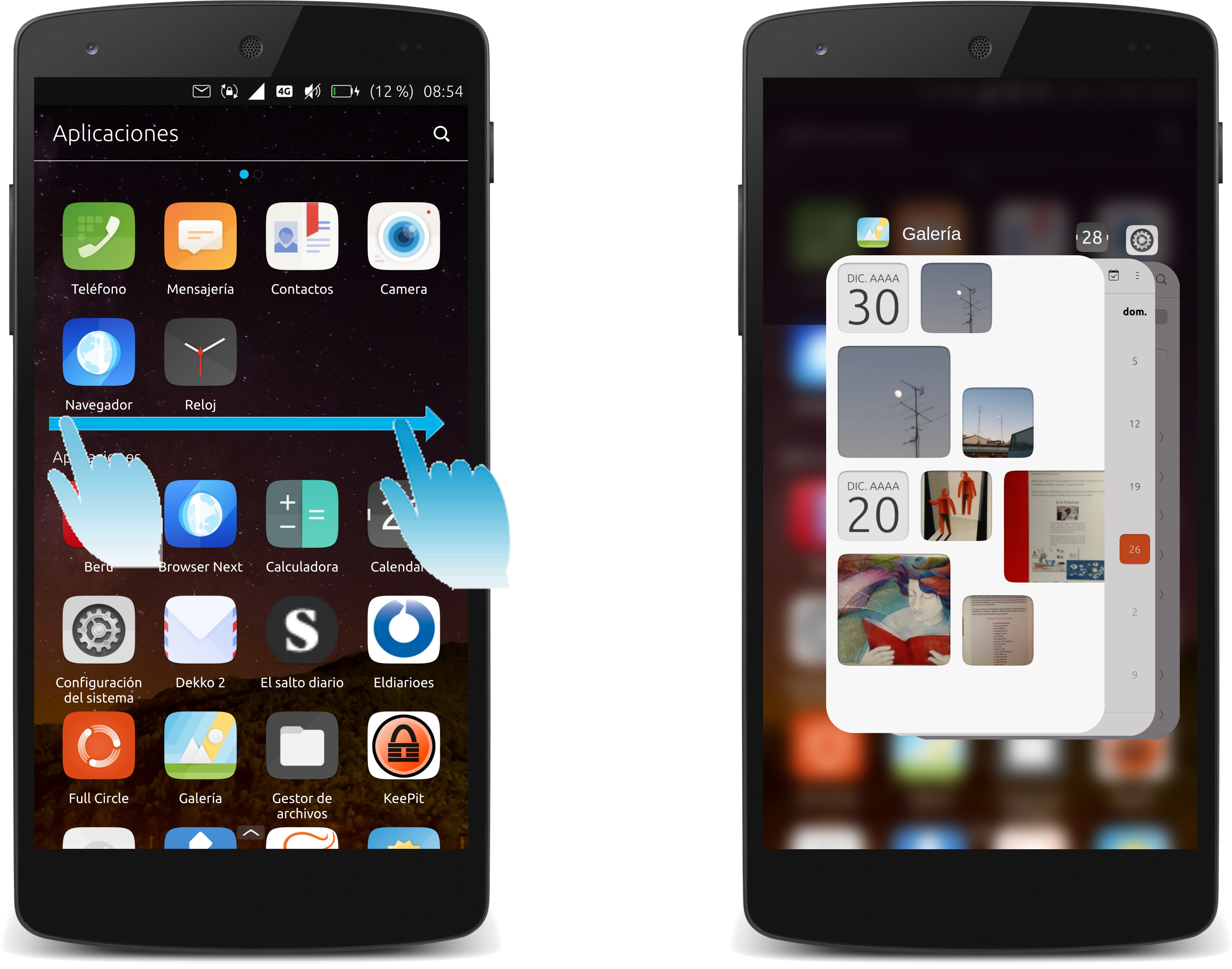
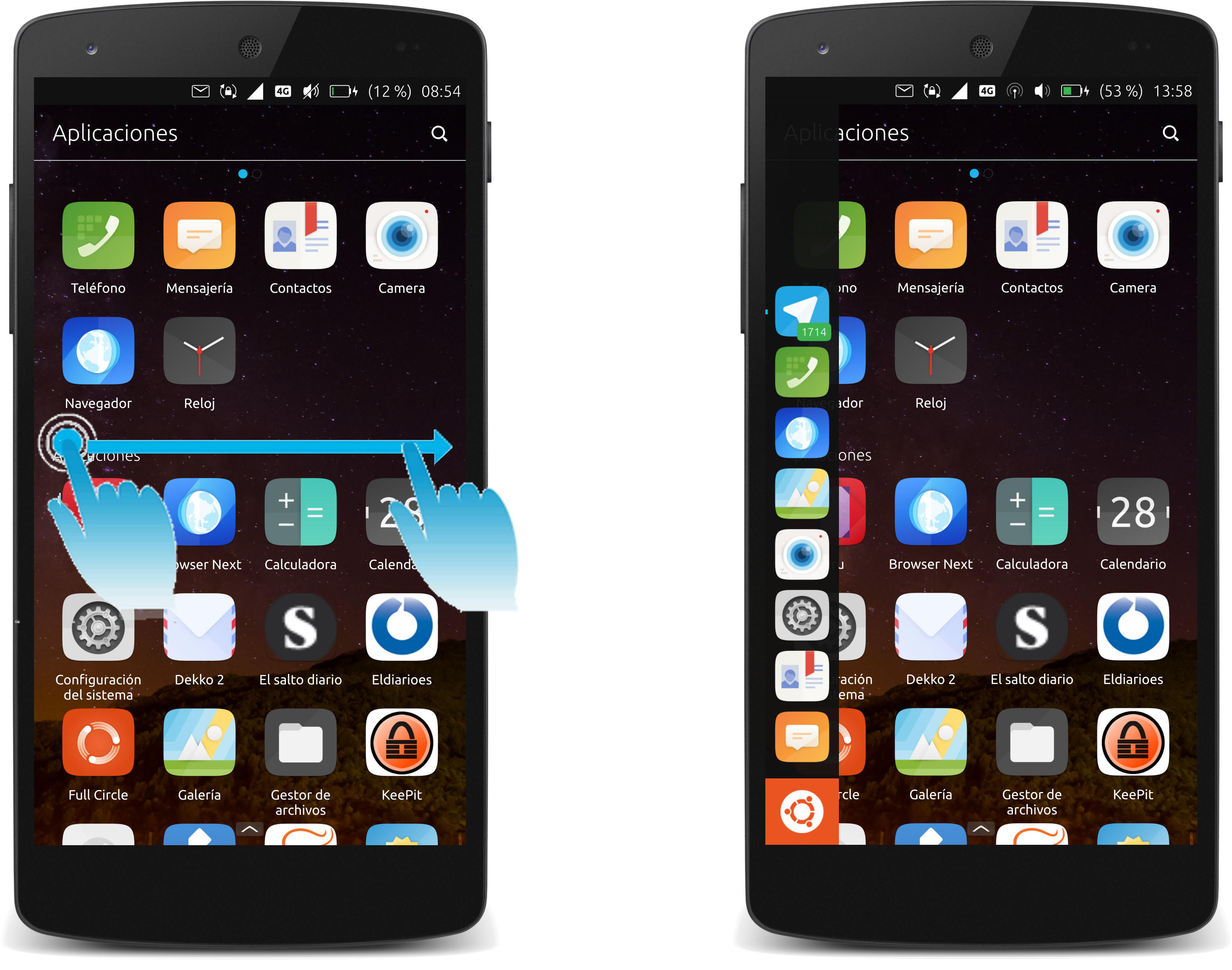
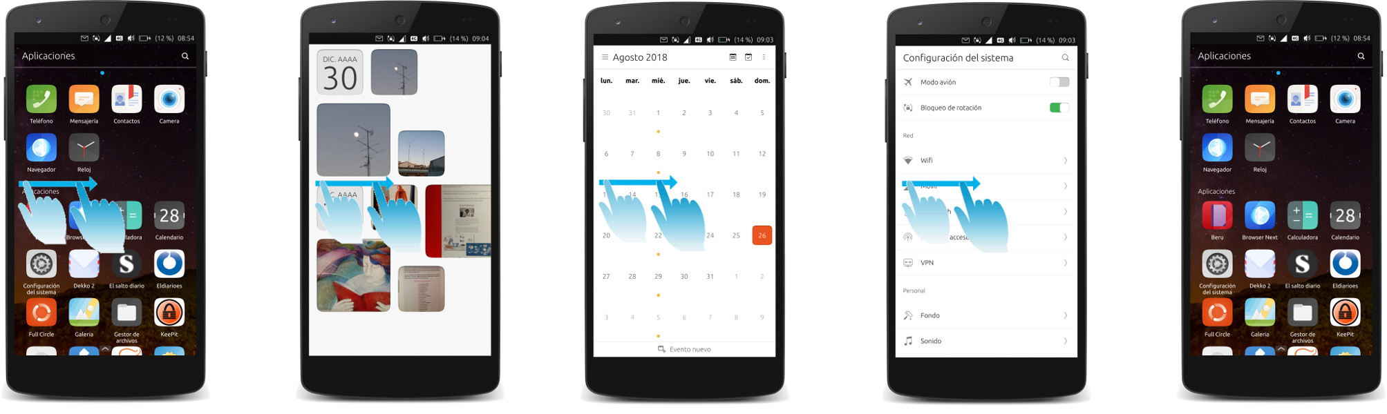
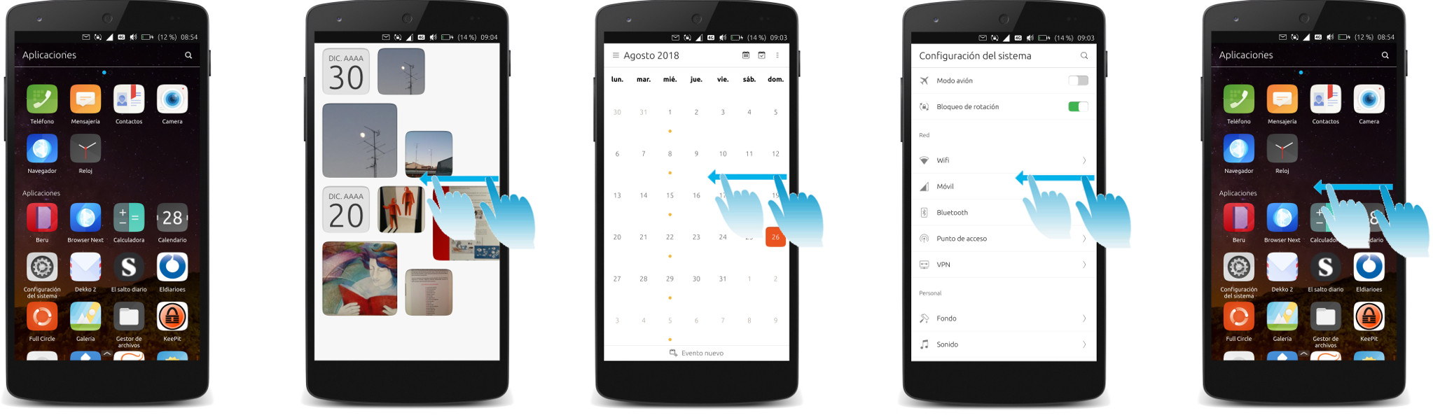
The only comparable action at the moment is the right edge "flip-to-latest-app". One could try out this flipping for a while, and then imagine you could flip apps left and right, and flip "home" in and out from the upper edge, with exactly the same speed!
-
Just 2 cents, I think that making the corners of any window that much rounded reminds me of Apple design. The proportion of the circled making up the rounded corner should be more like on the Suru icons. Its somewhat inconsistent right now with the rest of the UT design.
-
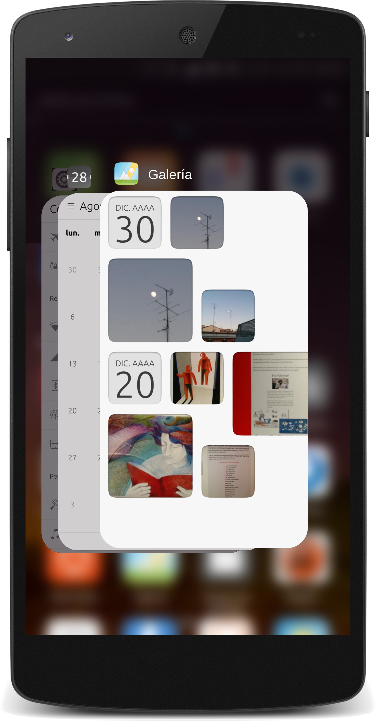
@flohack I'd say there's no good reason to make the screenshots have curved corners, as that's not how the windows are actually presented when in use. It is best to keep those two things consistent.
-
@dobey I mean the corners of the new App switcher window inside the screenshot. Not the screenshots...
-
@flohack Yes I know. Those are "screenshots" of the apps I think.
-
I'd also say the current design of the app switcher, showing slightly angled screenshots of the apps, makes it easier to distinguish the apps.
-
Still pretty messy. I'd like to see only 4 gestures:
pull right = in app: application menu (replaces hamburger).
push left = in app: back (replaces back arrow).
push up = notifications. Opposite to everyone else, but its easier to access with thumb.
pull down = multitasking (grid - BB10/N9 style), then do left/right cycle between multitasking, apps & feed (N9 style).With notifications you could have a BB10 style mini notification (icons + numbers) when partly transitioned. With this you can quickly 'peek' to see what kind of notification you have.
The main thing is to replace the hamburger and back-arrow as they are often too small and/or in a thumb-inaccessible corner of the screen - immensely frustrating when trying to use the device with one hand while carrying the shopping, or holding a rail on the train.
-
@cpb I don't think that is feasible. The edge gestures are system gestures. In-app gestures are something the app can do if they want (but it can't be from the left/top/right edges, only the bottom.
Changing to what you suggest would be untenable, requiring every app developer to change their apps, and a massive overhaul of the whole system.
-
This post is deleted! -
This post is deleted!