UBports Robot Logo UBports Forum
    • Categories
    • Recent
    • Tags
    • Popular
    • Users
    • Groups
    • Search
    • Register
    • Login

    Send Some: File Manager Icon Set Love

    Scheduled Pinned Locked Moved Design
    mockupsfilemanagerdesign
    34 Posts 7 Posters 8.0k Views 1 Watching
    Loading More Posts
    • Oldest to Newest
    • Newest to Oldest
    • Most Votes
      Reply
      • Reply as topic
      Log in to reply
      This topic has been deleted. Only users with topic management privileges can see it.
      • CiberSheepC Offline
        CiberSheep @Guest
        last edited by

        @louies Thanks.

        Another planet, another time, another universe!

        1 Reply Last reply Reply Quote 0
        • ? Offline
          A Former User @CiberSheep
          last edited by

          @cibersheep Just zoom in!

          1 Reply Last reply Reply Quote 0
          • E Offline
            elastic @Guest
            last edited by

            @3arn0wl for me sunburst diagrams are nice to look at for the first days ... after that the become somehow annoying as it always takes to much time to get where you want. DaisyDisk for mac works in this way and by being a brilliant app from the esthetic graphical side its definitely not the fastest way of getting things done in a file manager 😉 - but still nice looking though ...

            1 Reply Last reply Reply Quote 0
            • CiberSheepC Offline
              CiberSheep
              last edited by CiberSheep

              @3arn0wl I have more «problems» for you to solve 🙂

              • If you need to search for file «build . sh» how do you propose it would be done?
              • Saving (exporting) a file from an app to the file manager, how it would be handled?

              @Louies for you too 😄

              • That icon set which license is published under?
              • How colors and shape would fit in Suru style?

              Thank you both

              Another planet, another time, another universe!

              ? 1 Reply Last reply Reply Quote 0
              • ? Offline
                A Former User @CiberSheep
                last edited by

                @elastic - so far as I know, this is just an exercise in lateral thinking... so I'm just offering an alternative solution. I hadn't particularly considered its merits...

                @cibersheep -
                0) I guess there would need to be a search box at the top...

                1. Holding down a blob (file) would offer the options to move/copy/delete etc (as with the right-click options of Ubuntu desktop)
                1 Reply Last reply Reply Quote 0
                • mateo_saltaM Offline
                  mateo_salta
                  last edited by

                  I rather like the filemanager, but would like to see it move away from the old humanity icon set, and even the orange folder theme. I like the more modern style that sam hewitt https://snwh.org/suru has made, although for the purposes of ubuntu touch we could modify the color away from orange. 0_1541369845862_Screenshot_2018-11-04_16-13-51.png

                  0_1541370202996_Screenshot_2018-11-04_16-23-03.png

                  ? C 2 Replies Last reply Reply Quote 3
                  • ? Offline
                    A Former User @mateo_salta
                    last edited by

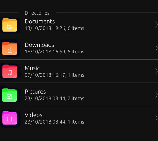
                    @mateo_salta the photo file & app file icon Because the color is too light or too bright, will not see the folder icon

                    1 Reply Last reply Reply Quote 0
                    • mateo_saltaM Offline
                      mateo_salta
                      last edited by

                      0_1541385467506_Screenshot_2018-11-04_20-37-09.png Cool, I played with the intensity so it didn't wash out the icon

                      ? CiberSheepC 2 Replies Last reply Reply Quote 3
                      • ? Offline
                        A Former User @mateo_salta
                        last edited by

                        @mateo_salta Yes like this( '今'd

                        1 Reply Last reply Reply Quote 0
                        • C Offline
                          chdslv @mateo_salta
                          last edited by

                          @mateo_salta Lovely!!!

                          1 Reply Last reply Reply Quote 0
                          • CiberSheepC Offline
                            CiberSheep @mateo_salta
                            last edited by

                            @mateo_salta The new light colours are better 🙂

                            Another planet, another time, another universe!

                            1 Reply Last reply Reply Quote 0
                            • CiberSheepC Offline
                              CiberSheep
                              last edited by

                              Aaaand the time is up.
                              Thank you all indeed for joining this first experiment.

                              @3arn0wl I see your proposal as interesting but maybe in the information side. Maybe System-Settings > About > Storage
                              i could work there.

                              @mateo_salta I think the way to go with the icon set is feeding from upstream Suru project. You gave here a little twist with the colors. Conservative but effective 🙂

                              Follow up next: The Content Hub

                              Another planet, another time, another universe!

                              mymikeM 1 Reply Last reply Reply Quote 0
                              • mymikeM Offline
                                mymike @CiberSheep
                                last edited by

                                @cibersheep sorry I'm late :*(, I'll upload my work this afternoon but it's quite similar to @mateo_salta 's one

                                1 Reply Last reply Reply Quote 1
                                • mymikeM Offline
                                  mymike
                                  last edited by

                                  0_1541631451060_33e8b9bf-9509-4d17-a2e7-04607f26194f-immagine.png
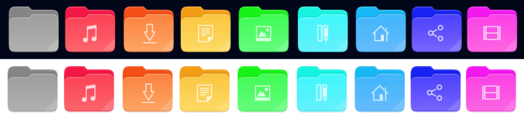
                                  here is it! I took quite everything from suru-icon-theme. the video image could be not visible with SuruDark, but this was the color from video mimetype. in the music and models/templates I experimented a bit more with gradients making the back part of the folder more different from the near front part, a bit of contrast in addition...

                                  mymikeM CiberSheepC 2 Replies Last reply Reply Quote 4
                                  • mymikeM Offline
                                    mymike @mymike
                                    last edited by

                                    @mymike also I'm not very sure about the right and bottom folds, not originally present in the folder icon, but took from mimrtypes

                                    1 Reply Last reply Reply Quote 0
                                    • CiberSheepC Offline
                                      CiberSheep @mymike
                                      last edited by

                                      @mymike Very nice (you're late) I like the colors but not the folds. Good job (even you're late 😄 😄 :D)

                                      Another planet, another time, another universe!

                                      ? 1 Reply Last reply Reply Quote 1
                                      • ? Offline
                                        A Former User @CiberSheep
                                        last edited by A Former User

                                        @cibersheep
                                        This is even later - well! you can't expect creatives to keep to deadlines! 😛

                                        A couple of ideas for a new desktop icon based on Suru:

                                        0_1544090029800_files.png

                                        0_1544090043300_files 2.png

                                        And the suggestion that the app just be called "Files", rather than the more cumbersome "File Manager".

                                        Also, I was wondering where the images came from on the documents themselves? And whether there were alternatives? The videos one is very orange...

                                        CiberSheepC 1 Reply Last reply Reply Quote 1
                                        • CiberSheepC Offline
                                          CiberSheep @Guest
                                          last edited by

                                          @3arn0wl Ha ha ha... nicely played with deadelines 🙂
                                          I like that icon.
                                          About the name, actually in the desktop is called Files.

                                          Another planet, another time, another universe!

                                          ? 1 Reply Last reply Reply Quote 0
                                          • ? Offline
                                            A Former User @CiberSheep
                                            last edited by A Former User

                                            @cibersheep
                                            Hmmm - I took the File shape from the Suru link that @mateo_salta gave, but I've noticed subsequently that it's different to the one in his images. 😕 I wonder where he got them from?

                                            0_1544129365300_Files x1.png

                                            Also, I quite like the idea that Files itself is "coloured" white - white being the combination of the whole spectrum - but it's a difficult hue to work with! Maybe it could have a folded background with a spectrum of colours? But then again, that might be too much... A monochrome Icon seems the other extreme though - just dull. 😕

                                            0_1544134420100_Files x2b.png

                                            (Apologies for my artwork not being up to snuff - I'm just trying to give an idea)

                                            CiberSheepC 1 Reply Last reply Reply Quote 0
                                            • CiberSheepC Offline
                                              CiberSheep @Guest
                                              last edited by

                                              @3arn0wl There's a pattern and it's to use whitish icon on greyish background for core system app:

                                              • System Settings (nearly)
                                              • File Manager
                                              • Ciborium
                                              • Terminal
                                              • Clock
                                              • Calendar
                                              • OpenStore

                                              and I kinda like it

                                              Another planet, another time, another universe!

                                              ? 1 Reply Last reply Reply Quote 0
                                              • First post
                                                Last post