• Categories
  • Recent
  • Tags
  • Popular
  • Users
  • Groups
  • Search
  • Register
  • Login
UBports Robot Logo UBports Forum
  • Categories
  • Recent
  • Tags
  • Popular
  • Users
  • Groups
  • Search
  • Register
  • Login

Send Some: Indicators Love (week 3)

Scheduled Pinned Locked Moved Design
60 Posts 9 Posters 16.9k Views 3 Watching
Loading More Posts
  • Oldest to Newest
  • Newest to Oldest
  • Most Votes
    Reply
    • Reply as topic
    Log in to reply
    This topic has been deleted. Only users with topic management privileges can see it.
    • D Offline
      dR0W
      last edited by dR0W 14 Nov 2018, 11:47

      And what do you think about putting another slide button for enable/disable device visibility in the Bluetooth section when the Bluetooth is enabled?

      1 Reply Last reply Reply Quote 0
      • ? Offline
        A Former User @CiberSheep
        last edited by 14 Nov 2018, 13:22

        @cibersheep

        Some people have seen this idea before: a Comms Indicator.

        0_1542201655900_Communications.png

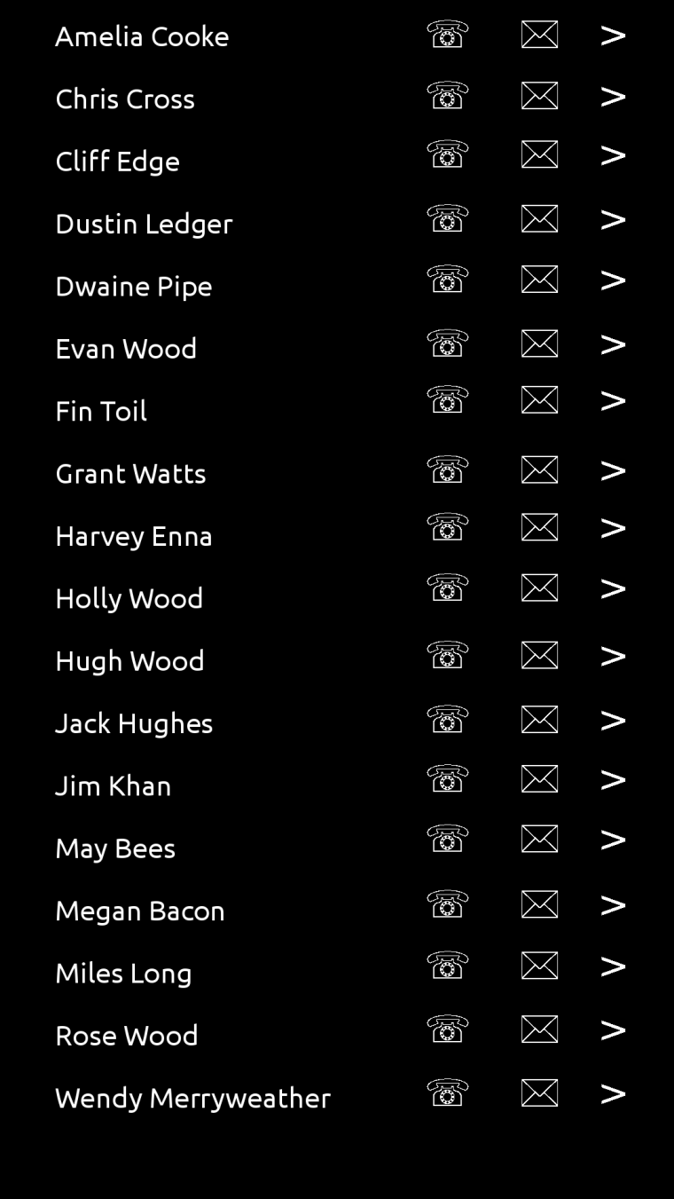
        Pull down gives you your contacts, and you can choose to call them, text them or go to their entry in the contacts app. There would need to be an intermediary dialogue to enquire about the app to be used: SMS / Telegram / Matrix / Signal, for example.

        C 1 Reply Last reply 14 Nov 2018, 22:29 Reply Quote 1
        • C Offline
          CiberSheep @dobey
          last edited by 14 Nov 2018, 22:25

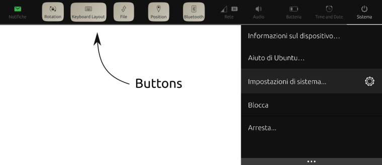
          @dobey I actually love how the indicators works now. It's very easy to find things. For example: changing the brightness of the screen is very quick to access. And that is something I do not want to lose.

          I don't see how that would work with one panel.

          Another planet, another time, another universe!

          D 1 Reply Last reply 15 Nov 2018, 01:34 Reply Quote 0
          • C Offline
            CiberSheep @Guest
            last edited by 14 Nov 2018, 22:27

            @3arn0wl Mmmmm...

            Another planet, another time, another universe!

            1 Reply Last reply Reply Quote 0
            • C Offline
              CiberSheep @dR0W
              last edited by 14 Nov 2018, 22:28

              @dr0w I don't know if disabling the SIM is possible... or do you mean the data connection per SIM?

              Another planet, another time, another universe!

              1 Reply Last reply Reply Quote 0
              • C Offline
                CiberSheep @Guest
                last edited by 14 Nov 2018, 22:29

                @3arn0wl I don't think this is a good idea. Think of having 300 contacts, listed in the indicator... and you have the Contacts app 🙂

                Another planet, another time, another universe!

                ? 1 Reply Last reply 14 Nov 2018, 22:35 Reply Quote 0
                • ? Offline
                  A Former User @CiberSheep
                  last edited by A Former User 14 Nov 2018, 22:35

                  @cibersheep
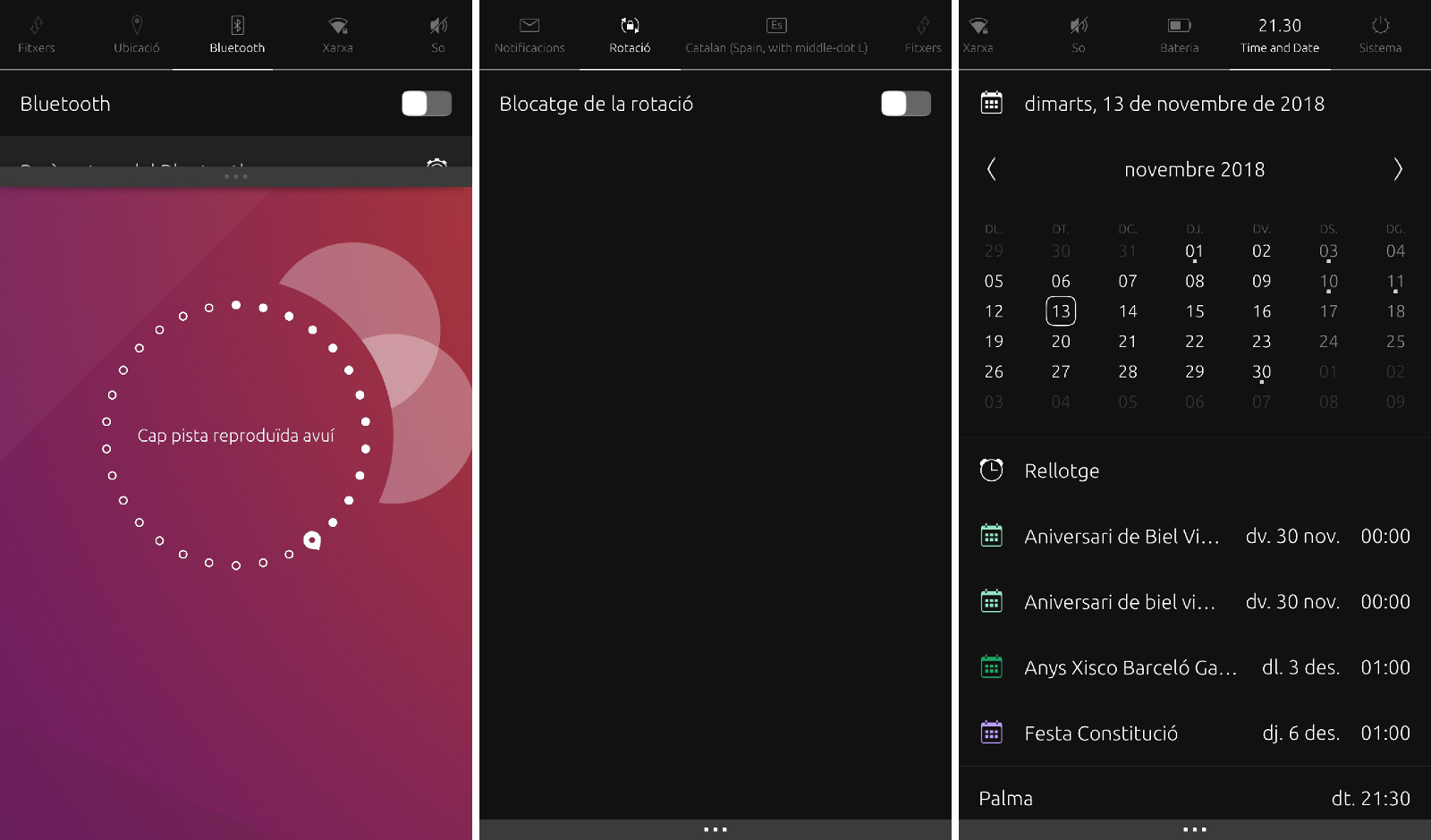
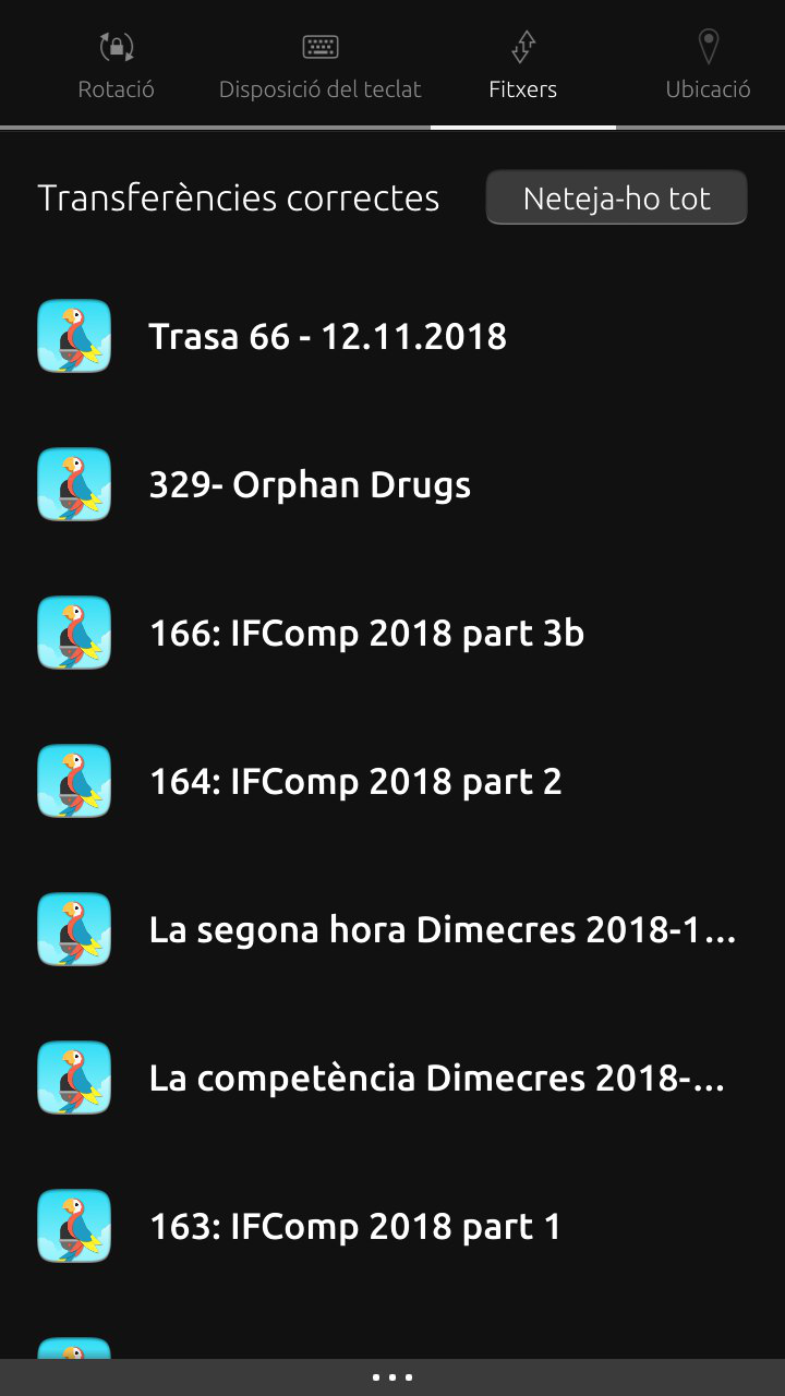
                  I've come to the conclusion that Indicators ought to be a way of getting to do the common, important things, like calling/texting, listening to music and scheduling quickly and easily. And I think a comms indicator would do just that.

                  The Files Indicator by contrast doesn't seem to have any functionality to it at all... I think in that case, going through the app icon process is better. So perhaps the Files Indicator could be removed...

                  C 1 Reply Last reply 14 Nov 2018, 22:42 Reply Quote 0
                  • C Offline
                    CiberSheep @Guest
                    last edited by 14 Nov 2018, 22:42

                    @3arn0wl Files, lists the download files (as podcasts from Podbird, or pdf from the browser 🙂

                    0_1542235356681_47346a9d-ba65-4ded-b0e1-f9eb40dee0cf-imatge.png

                    Another planet, another time, another universe!

                    ? 2 Replies Last reply 14 Nov 2018, 22:57 Reply Quote 0
                    • ? Offline
                      A Former User @CiberSheep
                      last edited by 14 Nov 2018, 22:57

                      Fair enough, @cibersheep - mine's completely empty. 😕

                      1 Reply Last reply Reply Quote 0
                      • D Offline
                        dobey @CiberSheep
                        last edited by 15 Nov 2018, 01:34

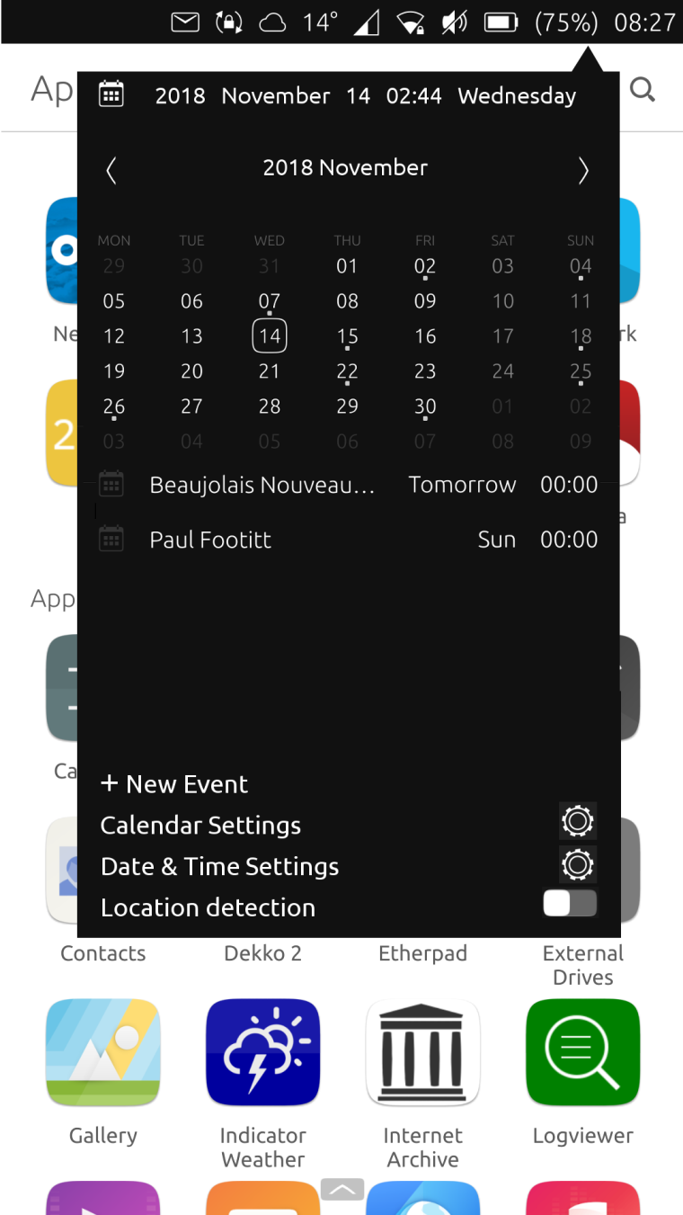
                        @cibersheep Try GNOME. It's something like this:

                        GNOME system menu

                        ? C 3 Replies Last reply 15 Nov 2018, 09:53 Reply Quote 0
                        • D Offline
                          dR0W
                          last edited by dR0W 15 Nov 2018, 05:31

                          @cibersheep SIM disabling is possible with this script command that another user said me (in other thread):
                          /usr/share/ofono/scripts/offline-modem/ril_0 for SIM1 or using ril_1 for SIM2
                          and using online-modem command you can enable it again

                          C 1 Reply Last reply 15 Nov 2018, 15:50 Reply Quote 0
                          • ? Offline
                            A Former User @dobey
                            last edited by A Former User 15 Nov 2018, 09:53

                            @dobey @CiberSheep

                            Is the pop-up design language of GNOME, with a flattened palette, preferable to a pull down screen?

                            0_1542293703100_Calendar 3.png

                            M 1 Reply Last reply 15 Nov 2018, 16:56 Reply Quote -1
                            • C Offline
                              CiberSheep @dobey
                              last edited by 15 Nov 2018, 15:49

                              @dobey I'll do that when staying at my mum's (she has 18.04 with GNOME)

                              Another planet, another time, another universe!

                              1 Reply Last reply Reply Quote 0
                              • C Offline
                                CiberSheep @dR0W
                                last edited by 15 Nov 2018, 15:50

                                @dr0w I didn't know that. Thanks

                                Another planet, another time, another universe!

                                1 Reply Last reply Reply Quote 0
                                • M Offline
                                  mymike @Guest
                                  last edited by 15 Nov 2018, 16:56

                                  @3arn0wl nope, it's how thing are put inside it. different things (connectivity, bluetooth, position, battery, volume ecc...) inside one single panel...

                                  1 Reply Last reply Reply Quote 0
                                  • M Offline
                                    mymike @dobey
                                    last edited by 15 Nov 2018, 16:58

                                    @dobey I don't understand exactly what you mean: a single panel but with more things/options that on android or a few panels but that groups things together?

                                    D 1 Reply Last reply 15 Nov 2018, 18:53 Reply Quote 0
                                    • M Offline
                                      mymike
                                      last edited by 15 Nov 2018, 17:19

                                      imho there are too much indicators and scrolling through them sometimes is a bit long.
                                      So my idea is to hide/disable empty indicator (or the ones not visible when indicators are closed except the system one: so rotation, keyboard, files, position and bluetooth) and show only the icon (which becomes a button) at the top when indicators are opened (swiping left from the network indicator would go directly to notifications)
                                      If I want to use bluetooth I have to pull down an indicator and tap on the bluetooth button: this switches on bluetooth, enable it's indicator (e.g. to see other devices and other features will land in the indicator) and hides the button
                                      to switch it off just use the switch inside the indicator.
                                      same for others. ok it doesn't make sense for the files indicator: forgot the button, just disable the indicator if there's no content inside it

                                      idk if I'm enough clear, it's quite simple but complex to describe :*( ...
                                      0_1542301149185_main.png

                                      C ? 2 Replies Last reply 15 Nov 2018, 22:45 Reply Quote 0
                                      • D Offline
                                        dobey @mymike
                                        last edited by 15 Nov 2018, 18:53

                                        @mymike A single panel which has a few items, and notifications perhaps. A panel that is more convergence friendly. Anything that requires swipes only to work, is not a good solution.

                                        M 1 Reply Last reply 15 Nov 2018, 22:26 Reply Quote 0
                                        • M Offline
                                          mymike @dobey
                                          last edited by 15 Nov 2018, 22:26

                                          @dobey Well, it should require swipes only on phones. idk how is the UX with a mouse but definitely it should not require swipes/drags , at least scrolling. if with the mouse you have to swipe then it's a bug and needs to be fixed...

                                          1 Reply Last reply Reply Quote 0
                                          • C Offline
                                            CiberSheep @dobey
                                            last edited by 15 Nov 2018, 22:43

                                            @dobey I'm comming back from my mum's.
                                            I have used the indicators from GNOME now. Calendar is as busy as our calendar indicator though.

                                            The thing I don't like and it's similar to Android is you need to tap on several areas to expand the menu. And the GNOME indicator shows a lot fewer options that in UT. And this is what UT is much better at, accessing to several indicator in a very simple and direct way.

                                            Another planet, another time, another universe!

                                            D 1 Reply Last reply 15 Nov 2018, 23:13 Reply Quote 0
                                            24 out of 60
                                            • First post
                                              24/60
                                              Last post