Privileged ICE contacts and medical information available on lockscreen [WORK IN PROGRESS]
-
Personally I think your beginning to drift from your first ideas a bit. If it's simple easy to understand at a quick glance wherever in the world you are or use it all the better. That should also help with where it ends up on the device as well, but as I said just my personal thoughts.
-
@Rondarius
Hoping it will help you for your next GIF ^^ -
@Keneda Yes I think I get the point, I will try it out later, thanks again.
-
@Lakotaubp I don't know what is wrong or what is right in this topic, I just wanted to give another point of view when it comes to making the icon more noticable. If this is the wrong way to go then it's fine by me:thumbs_up:
I just feel that using the Star of Life as the image for the app would be wrong. The Star of Life itself has nothing with medical infomation about the owner, associated with it.
The image I used and tweeked was the official image from the person who came up with ICE from the beginning(lack of insperation:smiling_face:).
And yes we got a little of topic here at the end, almost a how to in making gifs:smiling_face:
-
@Rondarius That's why I said "personally"
 it's not up to me what you end up with. It's a good idea I think a lot of people want to see completed.
 -
@Lakotaubp yes, I know, I wasn't offended in any way. We are all here to give our own points of views and ideas :smiling_face:
-
@Lakotaubp said in Privileged ICE contacts and medical information available on lockscreen [WORK IN PROGRESS]:
It's a good idea I think a lot of people want to see completed.
Do you mean the .gif or the ICE app as a whole people want to see completed?
I believe the people on this thread would like to see the feature be integrated in UT, not just the app. Although I'm grateful to @syper for creating the 'proof of concept', the importance of an ICE feature in my opinion should justify the necessity to have it implemented as a worthy and full supported feature in Lomiri lockscreen. It has the potential to safe lives, what more important feature could there be to any mobile device?
"A lot of people want to see it completed" should indicate that developers and designers would take interest in this thread and take on the challenge, right?
From where I stand, currently the people who really want to see it completed are trying hard, neither of them being able/having the skills to really push it forward. We are simply waiting for
a. @syper to take the app to the next level or
b. UBports committing to have the feature be integrated in Lomiri.Meanwhile we are merely playing around with .gif's and exchanging thoughts knowing we can't push this project on our own.
We can only wait for some real expertise and hands on mentality to be brought in to have the ICE feature become a reality (as it was intended to be -> see OP). There are a lot of opportunities here and we all know the devs have a lot on their plate. Nevertheless I sincerely wish UBports would have it on their priority list.
Edit: as a positive addition, @C0n57an71n generously offered his help
-
@Rondarius said in Privileged ICE contacts and medical information available on lockscreen [WORK IN PROGRESS]:
I just feel that using the Star of Life as the image for the app would be wrong. The Star of Life itself has nothing with medical infomation about the owner, associated with it.
Then we disagree (which is normal and fine). I feel that the Star of Life is suitable because it has such strong associations with
- medical stuff
- emergencies
And also because medical personnel or volunteers with First Aid training will be so familiar with the symbol that it will attract their attention.
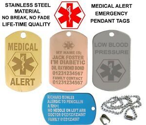
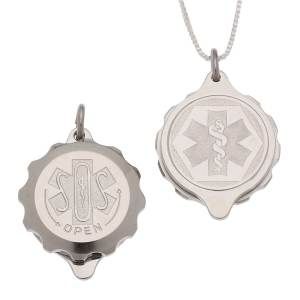
There's a reason why similar symbols are often used on medical alert pendants like these:

-
This may or may not help or be of use, but android has the ability for a simple message to be displayed on the lock screen at all time and also in the About phone section in system settings there is an Emergency section. Don't know what info you can store etc .
Might be worth a look or may not, might give ideas to use or ignore. -
@Moem
If we were to use the Star of Life or a derative thereof we would need to get authorization since it's copyright protected. I agree it would be best to include it for the reason you mentioned. -
@3T_Ed said in Privileged ICE contacts and medical information available on lockscreen [WORK IN PROGRESS]:
If we were to use the Star of Life or a derative thereof we would need to get authorization since it's copyright protected.
Good point. I've read the document about the Start of Life as found on https://www.ems.gov/staroflife.html and apparently it's only copyrighted in the blue version they use there. That makes me think it would be legal to use it if it weren't blue, and also not a copy of the official version.
Which brings me back to the version from the Noun Project that I posted here. Maybe in red? They're often red on those medical alert pendants. And it also looks a bit like a Red Cross which is a good association. -
If a specific design with a Star of Life would be the final result, made by someone from this community and being in line with UT design, I would be all in favor to use that over a generic one and just ask for the permission if time permits.
Before submitting the final design, I assume a lot of thought has gone into the design and at that point I don't think we should hesitate to make that UT version official. I can't imagine the request to be rejected, probably even encouraged if it could spread the word of I.C.E. even further and making it easier for the emergency services when many users (potential persons in need for immediate help)on another platform would use an ICE feature in lockscreen, be helped in time or even life saving.
-
@Moem HAHAHA, who is assumiing to much, great call. HAHAHA
-
Thanks to @Moem I got a new idea, I know the text under the star of life is too small.

-
@Rondarius I like that! It just needs a more UT-like styling.
-
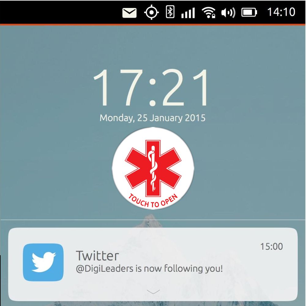
What about a layout like the Twitter notification with a different background? Logo on the left, text on the right of it. If that ICE could be pinned to the top it may be more acceptable to many as it 'blends in' in the overall look of the lock screen.
Edit 1:
Rectangular ICE notification should be on top, replacing the Twitter notificationText could be like
ICE - In Case of Emergency
Tap hereOr any preferred text by the user/language assuming this pinned notification will be a customizable one.
Edit 2: If this ICE notification would indeed be customizable, meaning enabling the user to upload a logo, then there will be no need to design a logo at all! You'll be free to upload any logo you think is best recognized by your national emergency services. Right?
-
@3T_Ed I was thinking of that too, but it needs to stand out from the rest of the feeds so it wont be mistaken. Maybe a fixed background colour, to start with?
-
@Rondarius
If that's the way we can have the ICE feature adopted in Lomiri lockscreen then we have a winner on our hands.Reference the Calender request thread, the original Canonical layout of the lockscreen being in line with current OS's on the market, I think the route we're taking now is getting valid to have the ICE feature implemented.
-
@Moem thanks, but I'm not sofisticated enough to do something that could be used as something official. I make mockups and hopefully someone with the required talent could do something with it.
@3T_Ed Its a great idea to have your own logo. But we still needs a default one. Most of the regular users doesn't have the interest or the skill to make/add their own logo.
-
@Rondarius said in Privileged ICE contacts and medical information available on lockscreen [WORK IN PROGRESS]:
I make mockups and hopefully someone with the required talent could do something with it.
Exactly.
 I was not saying 'you, Rondarius, should now personally make this in UT style'. I was pointing out that I like the direction you're going, I believe we're on the right track, and someone with design skills could build on what has been done so far. It's a group project after all!
Hello! It looks like you're interested in this conversation, but you don't have an account yet.
Getting fed up of having to scroll through the same posts each visit? When you register for an account, you'll always come back to exactly where you were before, and choose to be notified of new replies (either via email, or push notification). You'll also be able to save bookmarks and upvote posts to show your appreciation to other community members.
With your input, this post could be even better 💗
Register Login