Privileged ICE contacts and medical information available on lockscreen [WORK IN PROGRESS]
-
Information:
Here will be shortcut of our best ideas discussed below and information about available projects.
There are two points of view, how this functionality should looks. That's why there are described both.
The priority is the basic form.When somebody want me to add something in 1st post you call me up using "@"

However I'll try to mark helpful information here in spare time.Started & Connected Projects:
ICE - Personal Safety App - by @syper

OpenStore - https://open-store.io/app/indicator-ice.ubuntouchfr
Source - https://framagit.org/syper/ice-personal-safety-app
Support - https://framagit.org/syper/ice-personal-safety-app/-/issuesThis Project adds ICE Information on status bar but for now there is no possibility to call contact form owners phone or to access this screen using button - you have to swipe down from statusbar
Big thanks for @syper

Basic form:
(simplicity and other popular mobile OS are the key)
Overview: The idea is to create SOS, ICE, EMERGENCY screen available without permission on UT lock screen.
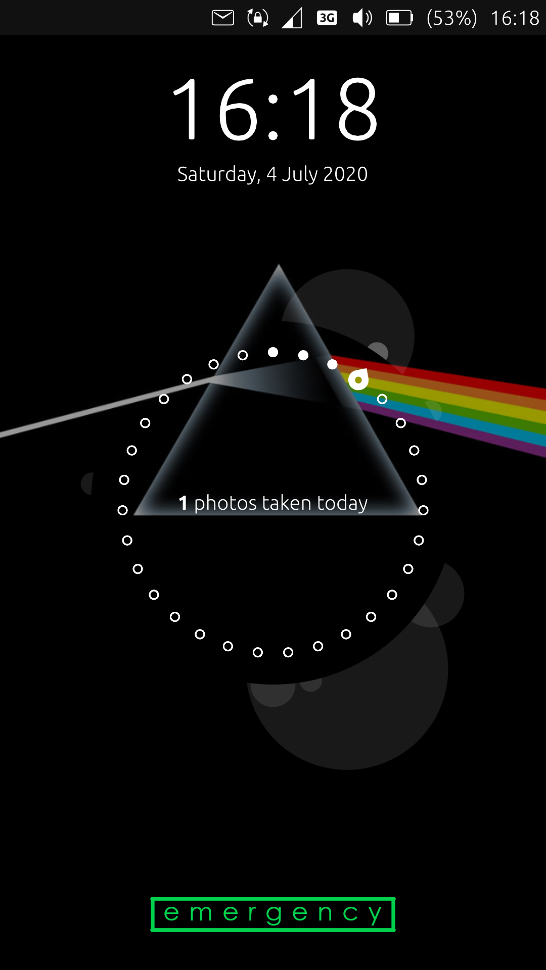
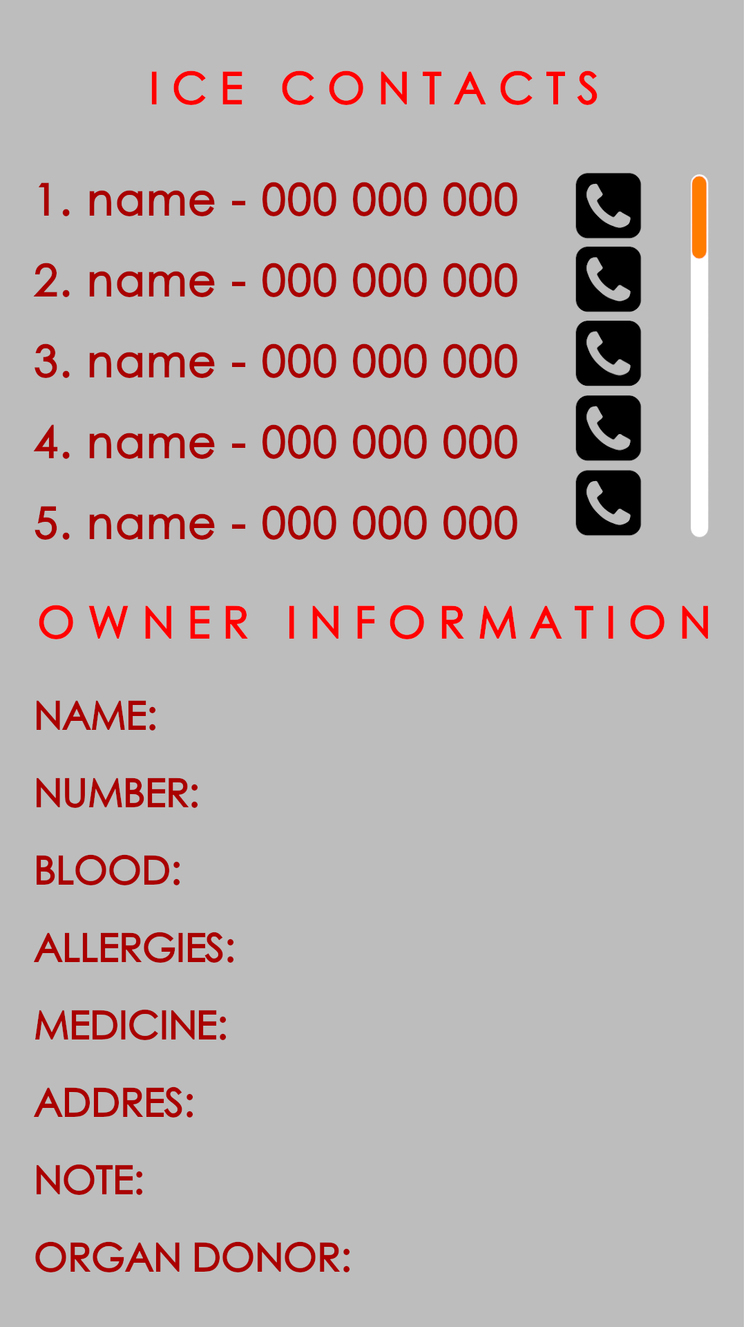
Layout: Simple access to that screen after double tap ICE/EMERGENCY button available on lock screen. Button may be at the bottom of the screen. It shouldn't be aggressive looking. It can be transparent. However writings border looks good and may be a good choice. Button redirect to screen where place is separated in two parts: ICE Contacts and Owner InformationICE Contacts includes:
- Priority Number on list
- Name
- Phone number
- Call button - in stress this way may better than gestures
Owner information fields:
(Excluding 2, these points you can find in LineageOS 17)- Owner Name, age, gender
- Owner (this phone) number
- Blood Type
- Allergies
- Medicine
- Address
- Organ Donor
- Note - here may be everything we forgot to include
Extended form:
(proposed by @3T_Ed )
#1. parameters
- open source UT
- Armor/confined (lowering treshold for installing)
- basic feature with minimal data permissions
- extensions (opt-in) for geolocation, QR-code, etc
#2. Front-end: structure/lay-out
a. lockscreen: emergency call button + medical ID button (one tab to -> b.)
b. one click to Overview (basic/essentials), similar to this existing ICE app (last screenshot)
c. Overview:- Tab 1. overview (current: basic medical ID with optional links to geolocation, call nearest ER, etc.)
- Tab 2. owner details
- Tab 3. medical condition (optional linking to Tab 6.)
- Tab 4. medical history (opt-in extension)
- Tab 5. relationships
- Tab 6. show procedure/ (manual input or standard first aid procedure)
- Tab 7. Red Cross standard guide on common first aid procedures, preferably in your own language
- Tab 8. User log (logging access usage+detecting unauthorized usage)
After consensus on #2., #5. and #6. a visual draft can be made.
#3. back-end: structure/lay out
- to be determined
#4. Usability and possible opportunities
By allowing more permissions- direct call emergency rooms
- pinpoint the exact location for helpers to guide emergency services to that spot
- QR code/NFC for emergency services
- geolocation for sending out emergency text to ICE in case of falling (think diabetics, elderly people)
#5. Must have/Nice to have
- see #1
- see data provided by @BigB
#6. List of data fields
Tab 1: Overview- photo (identifying owner)
- name, date of birth (+age), gender
- this/owner's phone number
- ICE (most important + dropdown showing rest)
- family doctor (name, phone number)
- blood type
*height + weight
*allergies
*medication - medical condition(s) - clickable to Tab 3.
- Organ donor
Tab 2. Owner details
- full name
- call name
- address
- phone needed
- important notes (like children nearby - extra ambulance needed)
- relationships (clickable -> showing Tab 5)
optional by opt-in:
- insurance data
- car data + nearest servicepoint
- upload organ donor registration
Tab 3. medical condition(s) details
detailed description (bullet points of each separate condition + dropdown for description)
linking to Tab 7. to show procedureTab 4. Medical history (only by privacy opt-in/extended permissions!!)
- detailed history health issues
- detailed history medication + dose
- upload medical/dentist/etc. records
- upload x-rays
- upload donor registration
Tab 5. Relationships (only by privacy opt-in/extended permissions!!)
- status (married/single/divorced)
- name spouse + phone number(s)
- children (names+date of bidefault+phone numbers)
- address (same as owner by default)
- next of kin (in case of emergency if it involves family)
Tab 6. first aid procedure
- description by owner how to respond/act in case of known issue x,y,z
- show general procedure in case of medical issue according to first aid guide (direct link)
- show first aid guide Red Cross + language selection (default: country of address)
Tab 7. user log (only by privacy opt-in/extended permissions)
- registration times of use + how long
- optional by opt-in: take picture of user (getting image of helper to identify/thank him/her later or identifiable abuser
- registration for doctor to determine history
Other Ideas:
- Problem with too any information (in extended form) - group information for basic available in basic for and rest hidden under second button "more". Empty field shouldn't be displayed.
- Problem with storing this data - those are really personal information so It could be good to store it in restricted part of system.
Pros and Cons of both forms:
Basic form
Pros:- Simple and fast to use in stress
- Similar to other mobile OS. That means it wouldn't causes problems in use for paramedics
Cons:
- Sometimes it's to less information
Extended form
Pros:- Really enough information for everyone not only paramedics to help
- Good for people living alone, who doesn't have anyone to call
- Identifying person, contacts, facts is much simpler especially when someone dies...
- Medical history can help when someone is ill for not ordinary disease
Cons:
- It's easy to get lost when these information are not grouped/hidden properly
- problems for paramedics to get needed information they should fond in regular phone (they are not notified how to find it on Ubuntu Touch)
- Someone unwanted (thief, founder of lost device) could know your restricted, personal data...
Important Posts:
@Flohack about project and ideas
"some words on that from the core team:
- Adding a colored icon like this to the indicator bar will break the style that we try to keep consistent for system-realated things. So this wont be acceptable at all for taking it into the main OS
- Even if we would accept it, its much too small. Somebody who does not know ,Ubuntu Touch and that is the majority of the ppl on the planet will never ever figure out that they can find ICE contacts and infos
- Why don´t you use the free space below the circle for that:

- Yes, that change involves hacking into Lomiri quite a bit, but it is not that complicated. And then add it to the system settings for configuration.
- In this position the icon can be colorful, and big enough so ppl recognize it.
- If you want to align design ideas with the core team, please ping @CiberSheep for that, he is always a friendly sheep
 "
"
@Flohack wrote important information: "The problem is make something accessible on the lock screen. (...) That's basically that you need to design an API for that"
@Lakotaubp & @theare27 proposed temporary solution for only displaying some information in circle using app: https://open-store.io/app/circle-message.mivoligo but as @dobey said to change information in circle you have to double tap it and it ma causes problem for first aid.
@Flohack about NFC - "NFC is currently not an available option in UT, the API is not implemented down to the Android layer."
First post changelog:
- 2020.07.28 - Title changed
- 2020.07.13 - added @Flohack 's post to important posts.
- 2020.07.13 - Added Started & Connected Project Section and written about @syper project, changed header "Missing (...)" to Information, added [solutions] to title
- 2020.07.07 - Added headers, split to basic and extended form, added NFC information, added "Other Information section", added Pros and Cons of both forms, added lock screen tag (@3T_Ed I couldn't add more than 5 so I picked lock screen)
- 2020.07.06 - added draft including information what we need to design everything, quotes, temporary solution, moved my first message to bottom
First message:
Hello everyone,
It would be wonderful if on lock screen there will be available big red/green button Emergency (for now it's too small in my opinion). Under it, there is dial pad. What I miss there, is second button for medical services called ICE Contacts & Owner information. I heard that paramedics are notified how to find this in regular phones, like android or apple. According to that, in contacts/settings we should have option to mark contacts as ICE and create queue of displaying them - not automatically by alphabet, but you know, your choice of most important person. The last thing is medical information like blood type, am I an organ donor and so on. It's pretty well done in LineageOS so it may be base model, but yeah, if you could include more and more information (and mentioned special contacts queering), It would be wonderful. I write it because I use my UT device as daily driver. It may safe life one time.
Thank You
-
+1
I would very much like to second that thought, not just for UT homepage but a uniform type/template (in different languages - happy to help for my native language) that can (and should) be used as a template for customized launchers like @syper Launcher Modular as well for people who do not use standard UT homescreen. Hopefully, like with other OS's this will be picked up so that one day this feature might safe a life of someone from this community. -
@BigB
Welcome to this forum! -
@Lakotaubp
Could you please move this request to the app dev section? It might get the right attention and hopefully be picked up there. Thanks! -
@3T_Ed I have a vague recollection of this being asked before but a quick forum search didn't find it. Then again it is q&a day https://forums.ubports.com/topic/4543/ubuntu-touch-q-a-79-saturday-4th-of-july-at-19-00utc.
Or as a work around for now there is https://open-store.io/app/circle-message.mivoligo so you could try that.
As for moving here is as good as any. It's not a direct support question or about help with an app dev issue. So as it would affect all the OS here is as good as any. -
@Lakotaubp
I did recall that too, did a search to no avail. There are a lot of ICE apps on other OS that work very good. Actually it was the first app I tried to find when UT was installed on my OPO 3T. For me personally, my UT does not show the circle so the workaround will not be helpfull, using Launcher Modular for that reason, thanks for that anyway as it might trigger others to put their ICE info there. Hopefully it'll be on @syper radar as well.@BigB
Thank you for having entered this opportunity on the Q&A thread. Having an ICE app or embedded lockscreen in UT I think it can be of extreme value to the users and give potential users ease of mind it is available, showing this community really cares.In these times having the option of an ICE should be almost mandatory - even when one wishes to not being tracked by local or national - to at least provide emergency services and bystanders to retrieve life saving and therefore critical information from the phone. Same goes for a tab on first aid procedures that should be accessible on the spot, few really good examples available on other OS.
-
I don't use that kind of choice, can you show me examples on other OS?
-
@syper said in [Request] Privileged ICE contacts available on lockscreen + medical information:
I don't use that kind of choice, can you show me examples on other OS?
Thanks @syper for taking notice. For some examples please see the url's listed below. There are a lot of similar apps in each store when searching for 'ICE'
In Case of Emergency (ICE) lockscreen examples:
https://play.google.com/store/apps/details?id=com.lagache.sylvain.ice_android
https://play.google.com/store/apps/details?id=app.medicalid
https://apps.apple.com/us/app/echo112-medical-id/id1097077349
https://www.microsoft.com/en-us/p/ice-lock-screen/9nblggh0fdz7?activetab=pivot:overviewtab
Red Cross examples (could be used as an add on/tab to the ICE lockscreen for most common injuries first response)
https://apps.apple.com/us/app/first-aid-by-swiss-red-cross/id903028871
https://play.google.com/store/apps/details?id=com.cube.arc.fa
https://play.google.com/store/apps/details?id=nl.rodekruis.android
Hope these examples can give you a better insight and inspire you and others to add it to the launcher/lockscreen. In my opinion this feature does not neccessarily need additional permissions as it can all be entered by the user.
-
@3T_Ed Thank You for support, links, ideas I mean continuing thread

So I created simple layout concept. Don't look at colors, background etc. It's just first quick idea.
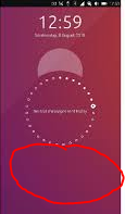
On first Image I modified my lock screen screenshot by adding button under the circle. This button should open emergency screen after double click (second attached image)

Button should be visible but not aggressive looking. Background of it may be transparent, borders may be thin and writing regular. (I left button there because It is the fastest way to get needed information and common phones can be unlocked by swipe-up not like UT devices and in stress it may cause problems)
On second image I created simple emergency screen layout

On top we have ICE contacts. On bottom more information about owner.
In my opinion, on android, there are too many steps to get needed information, so that's why I simplified it.
Please write Your ideas, I'm only a human and probably I forgot about adding something.

-
@BigB
I see you like the PF 'dark' theme Good one!
Agreed that the button does not have to be overly exposed. If the user could upload his/her own image or logo it's up to the user, however I think it should be the ICE logo by default as that's the first help services would be looking for.
Your setup would be the bare minimum I guess. Some extra data could be vital like height+weight for getting a specific dose of medicine, but I suppose we can sort the necessities out (insurance number, physician, et cetera) once a dev is willing to implement the ICE feature in the current lockscreen/launcher/app. I'm sure we should be able to have all fields compiled in categories within a few hours, especially since there are many examples of similar features on other platforms.
-
@3T_Ed That's right I like Pink Floyd
 Their music and themes are the best!
Going back to the main topic: yes, those mentioned are base information. Actually I copied these fields from LOS17 ICE screen.
I agree there should be as many fields as it's possible but of course with some priority.How about creating a list of things we want include, in first post? (that I'm able to edit)
On top there will be things most needed.If I understand correctly it might not be a problem to get this feature in close future because It's already done on other platforms.
I'm happy to hear that!
-
Everything is doable! and this function seems simple to implement, it would be necessary that I have a little time ...
In any case the idea interests me.
And with your links I understand better (I am French so English is a bit complicated especially with the word "ICE")
-
Thank you for your responsiveness and willingness to think along. It's great to hear this feature can be implemented. I'm well aware most development is voluntary and is being done in spare time, your effort to enable an ICE feature to UT is highly appreciated. If I would have any skills in this department I'd loved to develop this feature, which I think is a must for every user - be it with medical issues or not, one should have it on the phone from a responsibility point of view.
Would you be okay with us setting up a draft in this thread? It could give us a good insight of possible options and limitations for you to get an overview before implementing it
Proposed draft:
- parameters
- front-end: structure/lay out (simplicity is key)
- back-end: structure/lay out
- usability and possible opportunities of ICE
- must have/nice to have features
- list of (optional) data fields
- discussion on privacy/minimize app permissions
If there's any consensus on (any of) the points above @BigB can have that edited in his original post as an overview for anyone to see and for those who want to contribute.
PS.
no English native here either, it does not matter as long as we can all contribute to improving the UT experience -
@3T_Ed
indeed if a procedure is given, it will advance the project faster ... -
On Open Store there is an App called Circle Message - you can use that to put a ICE message with a phone number in the circle
They'd have to copy the number to their own phone I guess, but it's better them nothing
Top tip, set it early in the morning as it only seems to show up onwards from the time of day you initially set up
-
@theare27 They'd also have to know to double-tap on the infographics to switch what is displayed to get to that item. So not really a feasible solution in many emergency conditions.
-
@syper said in [Request] Privileged ICE contacts available on lockscreen + medical information:
(I am French so English is a bit complicated especially with the word "ICE")
I think we should avoid using this acronym, as in the US it is also the acronym for an arm of the DHS which is going around and collecting immigrants and detaining them, in a grave humanitarian situation.
-
@dobey messages set with that app seems to take priority and is the default one displayed
-
@theare27 said in [Request] Privileged ICE contacts available on lockscreen + medical information:
On Open Store there is an App called Circle Message - you can use that to put a ICE message with a phone number in the circle
Unfortunately that app doesn't work when using an alternative launcher (like Launcher Modular)
-
@syper Simple to implement? You probably never looked at the codebase of Lomiri/Unity8 ^^
