UBports Robot Logo UBports Forum
    • Categories
    • Recent
    • Tags
    • Popular
    • Users
    • Groups
    • Search
    • Register
    • Login

    Telegram Style Reduction?

    Scheduled Pinned Locked Moved App Development
    35 Posts 11 Posters 9.3k Views 3 Watching
    Loading More Posts
    • Oldest to Newest
    • Newest to Oldest
    • Most Votes
      Reply
      • Reply as topic
      Log in to reply
      This topic has been deleted. Only users with topic management privileges can see it.
      • flohackF Offline
        flohack
        last edited by

        Guys,

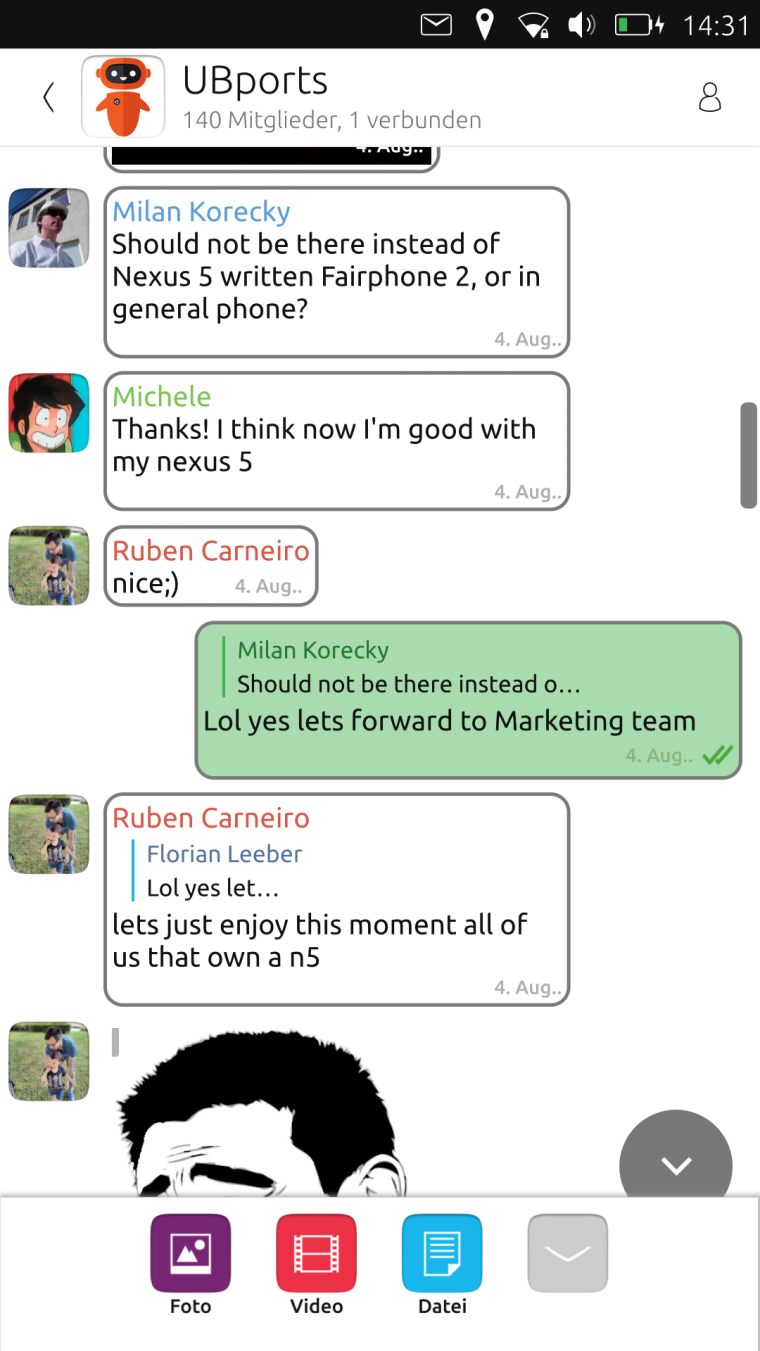
        since most of the core apps are really reduced in visual style, I was playing also with Telegram a bit like this:
        0_1502541233593_screenshot20170812_143150380.png

        Tell me what you think here...

        My languages: πŸ‡¦πŸ‡Ή πŸ‡©πŸ‡ͺ πŸ‡¬πŸ‡§ πŸ‡ΊπŸ‡Έ

        1 Reply Last reply Reply Quote 1
        • J Offline
          Jujuyeh
          last edited by

          Looks nice! But I would change a few things:

          • I would make the edge of the messages thinner
          • I would put a lighter color on the first person messages
          • I would put a little more margin in the messages
          • Messages should be centered with respect to their boxes
          1 Reply Last reply Reply Quote 0
          • N Offline
            NeoTheThird
            last edited by

            I like it! I agree with @Jujuyeh that the edge could be a little thinner, but that doesn't bug me very much. I would not increase the margin or center the text though, since that reduces readability and causes the messages to break up into too many lines.

            1 Reply Last reply Reply Quote 0
            • mymikeM Offline
              mymike
              last edited by

              What do you mean with β€œreduced in visual style”?
              Anyway I don't like the border and I liked also the background...
              But why should Telegram considered as a core app? In the canonical os it wasn't developed by the core team iirc...

              N flohackF 2 Replies Last reply Reply Quote 0
              • flohackF Offline
                flohack
                last edited by

                Yeah the edge thickness was a good guess, but too much πŸ™‚

                The background color goes now in the same style as the new marking color for secret chats - and also that Ubuntu color palette is quite heavy πŸ˜›

                BR

                My languages: πŸ‡¦πŸ‡Ή πŸ‡©πŸ‡ͺ πŸ‡¬πŸ‡§ πŸ‡ΊπŸ‡Έ

                1 Reply Last reply Reply Quote 0
                • N Offline
                  NeoTheThird @mymike
                  last edited by

                  @mymike said in Telegram Style Reduction?:

                  But why should Telegram considered as a core app? In the canonical os it wasn't developed by the core team iirc...

                  Yes, it was.

                  1 Reply Last reply Reply Quote 0
                  • flohackF Offline
                    flohack @mymike
                    last edited by

                    @mymike I found a background manager class, so we could allow custom backgrounds in the future. But honestly I want to have a different look than the official Apps, so the background, and the message bubble color tone need to change πŸ˜‰

                    If you look at the messaging app, its a similar style there, I could even imagine to copy the style mostly 1:1 to Telegram...

                    My languages: πŸ‡¦πŸ‡Ή πŸ‡©πŸ‡ͺ πŸ‡¬πŸ‡§ πŸ‡ΊπŸ‡Έ

                    1 Reply Last reply Reply Quote 0
                    • J Offline
                      Jujuyeh
                      last edited by

                      @NeoTheThird Yeah, I meant just a little bit of margin, the text is too close to the left side... πŸ™‚

                      flohackF 2 Replies Last reply Reply Quote 0
                      • flohackF Offline
                        flohack @Jujuyeh
                        last edited by

                        @Jujuyeh But this was always like that, I changed nothing πŸ˜‰

                        My languages: πŸ‡¦πŸ‡Ή πŸ‡©πŸ‡ͺ πŸ‡¬πŸ‡§ πŸ‡ΊπŸ‡Έ

                        1 Reply Last reply Reply Quote 0
                        • flohackF Offline
                          flohack @Jujuyeh
                          last edited by

                          @Jujuyeh It is actually:

                                      anchors.centerIn: parent
                                      width: Math.max(maxWidthNoMsg, message_wrapper.width)
                                      clip: true
                          

                          I could put a little margin though...

                          My languages: πŸ‡¦πŸ‡Ή πŸ‡©πŸ‡ͺ πŸ‡¬πŸ‡§ πŸ‡ΊπŸ‡Έ

                          1 Reply Last reply Reply Quote 0
                          • flohackF Offline
                            flohack
                            last edited by

                            0_1502542496404_screenshot20170812_145346737.png

                            My languages: πŸ‡¦πŸ‡Ή πŸ‡©πŸ‡ͺ πŸ‡¬πŸ‡§ πŸ‡ΊπŸ‡Έ

                            1 Reply Last reply Reply Quote 0
                            • J Offline
                              Jujuyeh
                              last edited by

                              Much better! But maybe a lighter green on the sent messages? The current green makes the date of the message a little bit unreadable

                              flohackF 1 Reply Last reply Reply Quote 0
                              • flohackF Offline
                                flohack @Jujuyeh
                                last edited by

                                @Jujuyeh Yeah the green is not perfect, maybe I try the old green. But its soo candy-green xD

                                My languages: πŸ‡¦πŸ‡Ή πŸ‡©πŸ‡ͺ πŸ‡¬πŸ‡§ πŸ‡ΊπŸ‡Έ

                                J 1 Reply Last reply Reply Quote 0
                                • J Offline
                                  Jujuyeh @flohack
                                  last edited by

                                  @Flohack Could you try with light gray? πŸ˜›

                                  flohackF 1 Reply Last reply Reply Quote 0
                                  • flohackF Offline
                                    flohack @Jujuyeh
                                    last edited by

                                    @Jujuyeh Can you pick me one in HTML notation please πŸ˜‰

                                    My languages: πŸ‡¦πŸ‡Ή πŸ‡©πŸ‡ͺ πŸ‡¬πŸ‡§ πŸ‡ΊπŸ‡Έ

                                    J 1 Reply Last reply Reply Quote 0
                                    • PhoenixLandPiratP Offline
                                      PhoenixLandPirat
                                      last edited by

                                      I prefer the old look, but perhaps if you use the same green as the current telgram this new look would look as good as the current telegram.

                                      A 1 Reply Last reply Reply Quote 0
                                      • J Offline
                                        Jujuyeh @flohack
                                        last edited by

                                        @Flohack Try with #CBCBCB or #B0B0B0 πŸ™‚

                                        flohackF 1 Reply Last reply Reply Quote 0
                                        • flohackF Offline
                                          flohack @Jujuyeh
                                          last edited by

                                          @Jujuyeh Ok will try, got to go now πŸ˜‰

                                          My languages: πŸ‡¦πŸ‡Ή πŸ‡©πŸ‡ͺ πŸ‡¬πŸ‡§ πŸ‡ΊπŸ‡Έ

                                          1 Reply Last reply Reply Quote 0
                                          • PhoenixLandPiratP Offline
                                            PhoenixLandPirat
                                            last edited by

                                            Perhaps somewhere in settings you could customise both your backgrounds, and text chat colours?

                                            So if you like candy green, use that, if you prefer the grey then have that.

                                            And you could either have a selection between 3-5 colour options, or just let people use there own #'s?

                                            flohackF 1 Reply Last reply Reply Quote 0
                                            • S Offline
                                              sverzegnassi
                                              last edited by sverzegnassi

                                              I don't like the idea of a full-white application, I'd prefer to see the current background or, at least, a different shade of white (e.g. #F8F8F8).

                                              For the message bubble, I think you could use the light shadow that was meant to be used for Suru buttons.
                                              I agree with the other guys, a bit more of padding for the text, a lighter font, and a different tint of UbuntuColors.green (#63c972 or #71ce7f) might be more appealing. πŸ™‚


                                              (with Telegram bg: http://i.imgur.com/LUbFMPd.png)

                                              The shadow is a simple Rectangle which stays below the white/green container. Something like:

                                              Rectangle {
                                                  id: container
                                              
                                                  Text { [...] }
                                              
                                                  Rectangle {
                                                      width: container.width
                                                      height: container.height
                                                      radius: container.radius
                                              
                                                      y: units.dp(1)
                                                      z: -1000
                                              
                                                      color: "#e6e6e6"    // theme.palette.normal.base (i.e. #CDCDCD) with opacity: 0.5
                                                  }
                                              }
                                              

                                              See e.g. the Button style in the Suru theme for QtQuick Controls 2
                                              https://github.com/sverzegnassi/qqc2-suru-style/blob/master/qqc2-suru/qml/Button.qml

                                              1 Reply Last reply Reply Quote 0
                                              • First post
                                                Last post