Send Some: Indicators Love (week 3)
-
@dobey I don't understand exactly what you mean: a single panel but with more things/options that on android or a few panels but that groups things together?
-
imho there are too much indicators and scrolling through them sometimes is a bit long.
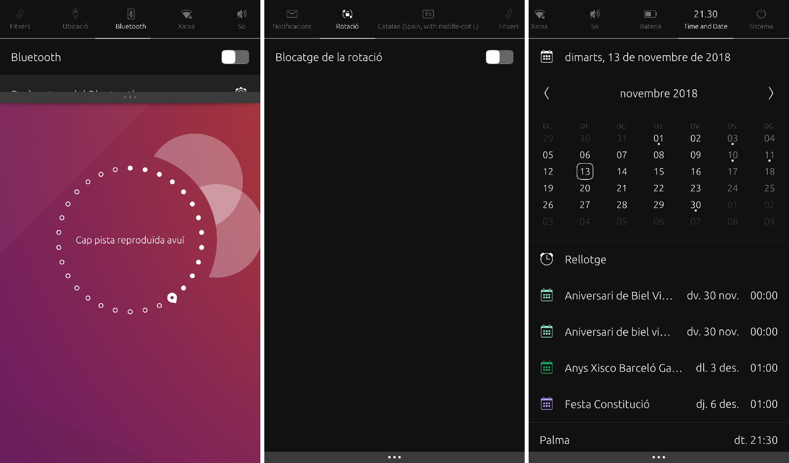
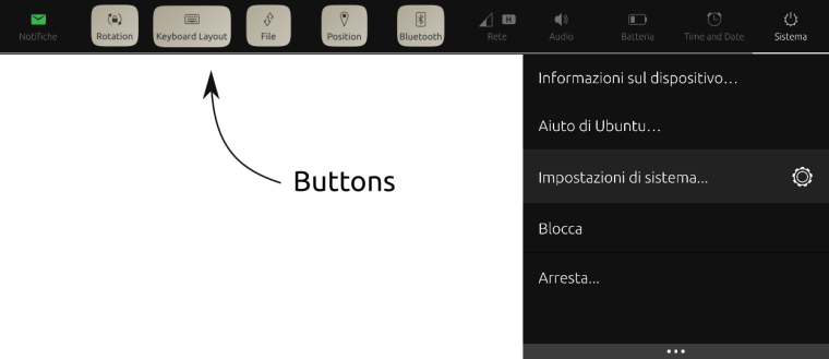
So my idea is to hide/disable empty indicator (or the ones not visible when indicators are closed except the system one: so rotation, keyboard, files, position and bluetooth) and show only the icon (which becomes a button) at the top when indicators are opened (swiping left from the network indicator would go directly to notifications)
If I want to use bluetooth I have to pull down an indicator and tap on the bluetooth button: this switches on bluetooth, enable it's indicator (e.g. to see other devices and other features will land in the indicator) and hides the button
to switch it off just use the switch inside the indicator.
same for others. ok it doesn't make sense for the files indicator: forgot the button, just disable the indicator if there's no content inside itidk if I'm enough clear, it's quite simple but complex to describe :*( ...
-
@mymike A single panel which has a few items, and notifications perhaps. A panel that is more convergence friendly. Anything that requires swipes only to work, is not a good solution.
-
@dobey Well, it should require swipes only on phones. idk how is the UX with a mouse but definitely it should not require swipes/drags , at least scrolling. if with the mouse you have to swipe then it's a bug and needs to be fixed...
-
@dobey I'm comming back from my mum's.
I have used the indicators from GNOME now. Calendar is as busy as our calendar indicator though.The thing I don't like and it's similar to Android is you need to tap on several areas to expand the menu. And the GNOME indicator shows a lot fewer options that in UT. And this is what UT is much better at, accessing to several indicator in a very simple and direct way.
Another planet, another time, another universe!
-
@mymike You know you don't' need to swap from one to another, if you swipe down on the indicator you want, it expands with that indicator. So the way is no so long
")
Another planet, another time, another universe!
-
@cibersheep Yes, I am not suggesting we do an exact clone of GNOME or Android. There are things I don't like about both as well. But really, there's only so much you can fit on a screen, and having too much settings/information in indicators, is just as bad as having too little, if not worse.
-
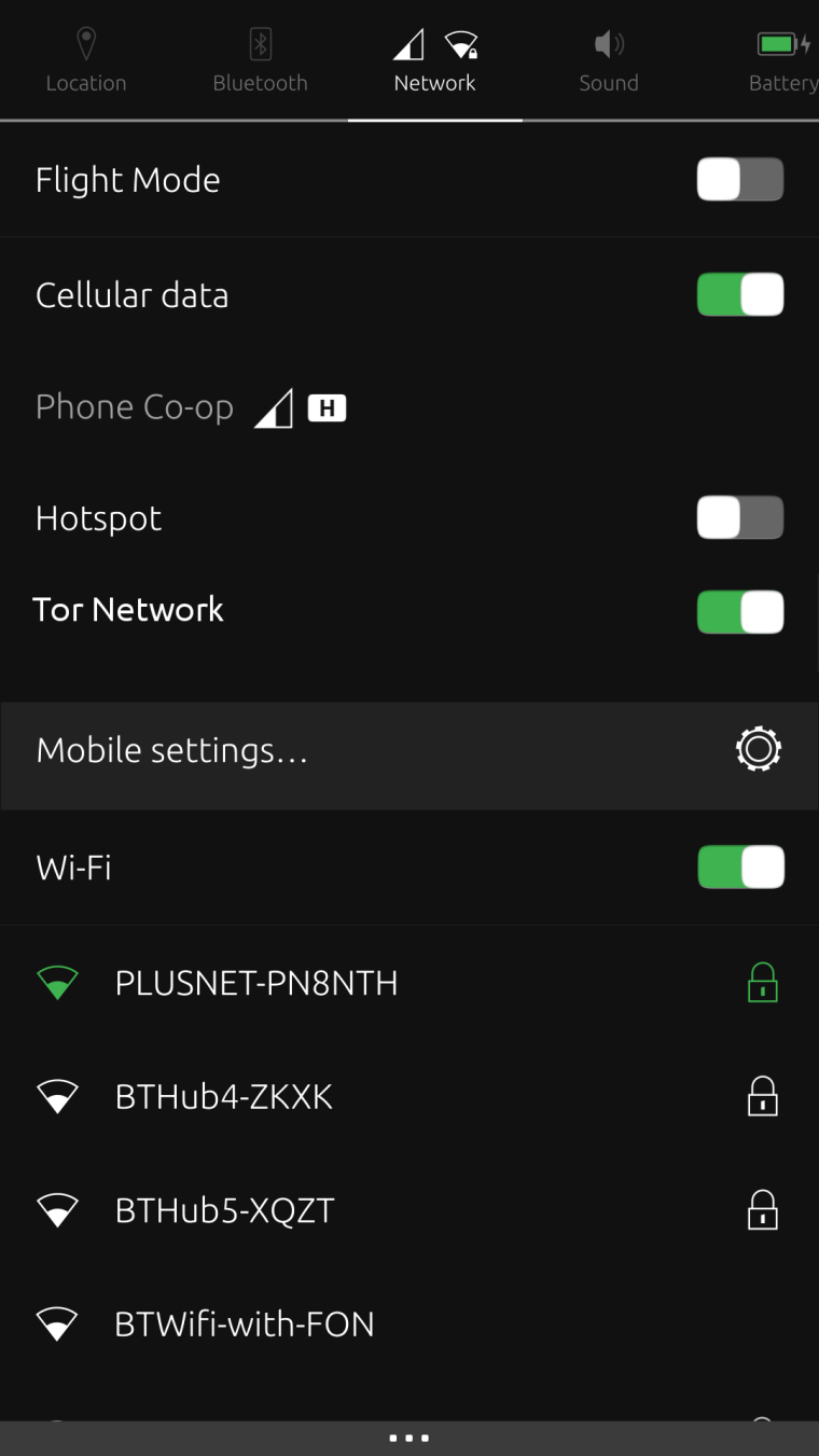
@cibersheep well if you need location you need to pull down on network and swipe left as location icon is not shown as it is not enabled yet.
and if I'm in the network to switch wifi on and then I want to go to notifications I can: scroll the top bar and tap notifications (but it's difficult to reach with one hand) or I can navigate by press and drag the bottom bar (easier with one hand) but I have to pass through all the indicators. hiding/disabling unused would improve the UX lot IMO -
@mymike I agree that there are some indicators that I use far more than others, and some I use not at all, so I wonder if it is possible / desirable to be able to customize the top bar? But at the same time be able to reach other settings easily, when necessary. (Actually, it's not that hard to reach any settings really, is it!?)
-
@3arn0wl
(Actually, it's not that hard to reach any settings really, is it!?)
no it's not. but my proposal would speed up it that means a better UX
-
@3arn0wl said in Send Some: Indicators Love (week 3):
(Actually, it's not that hard to reach any settings really, is it!?)
Try navigating the indicators using only mouse/keyboard sometime. Remember, we are building a converged platform, and not simply a phone/tablet system.
-
@dobey Ah! Fair point. (I don't have a keyboard yet, sadly)
Edit: The top panel in Unity7 was easy enough to use with a keyboard...?
-
@3arn0wl if you get a male microUSB to Female USB adapter, then any USB keyboard can be used with your UTouch device. (do double check if you need USB 2 or USB 3 on the micro side though)
-
Thanks @arubislander . I know the one I'd like, but I haven't found it in a shop yet.

-
Time is up for this week.
Thank you all for you input and idea. It's clear that is not clear where want to arrive. So, let's come back to the subject in the near future.As a resume, I would say we agreed on:
- we kind of like the notification
- we want them changed
- We like them like they are
- but different
Again: thank you all
-
Following on from something that was suggested in the Q&A yesterday - a Tor Network button:
If only it were that easy to write and implement the code.
-
@3arn0wl True!
-
Hm... What about just change the background from black to transparent with blur effect?
-
@cibersheep
Gah! I'm so slow!
I've got lots of files on my phone - .md .png etc. - so why don't they show up in the Files Indicator?The distinction between app and indicator, and scope for that matter, seems to be quite blurred.
Wouldn't it be cool to be able to have our most-used apps transform into indicators, so that they're there to just pull down.
-
@3arn0wl Hehehe... the files indicator is for download (any app that uses the Download Manager to download a file will show in the file indicator, for example, Podbird or the Browser?).
About to make an most used app indicator... I don't think is a good idea, it's not the place for it. You can favorite apps on top of the app scope, or in the Dash
Don't worry about scopes, they are going away (1 minute of silence) between apps and indicators, I would say if you print a document, you have an app that prints and an indicator that tells you that a document is being printed. On other cases the lines goes a bit away.
Another planet, another time, another universe!
Hello! It looks like you're interested in this conversation, but you don't have an account yet.
Getting fed up of having to scroll through the same posts each visit? When you register for an account, you'll always come back to exactly where you were before, and choose to be notified of new replies (either via email, or push notification). You'll also be able to save bookmarks and upvote posts to show your appreciation to other community members.
With your input, this post could be even better 💗
Register Login