Send Some: Indicators Love (week 3)
-
@cibersheep
Gah! I'm so slow!
I've got lots of files on my phone - .md .png etc. - so why don't they show up in the Files Indicator?The distinction between app and indicator, and scope for that matter, seems to be quite blurred.
Wouldn't it be cool to be able to have our most-used apps transform into indicators, so that they're there to just pull down.
-
@3arn0wl Hehehe... the files indicator is for download (any app that uses the Download Manager to download a file will show in the file indicator, for example, Podbird or the Browser?).
About to make an most used app indicator... I don't think is a good idea, it's not the place for it. You can favorite apps on top of the app scope, or in the Dash

Don't worry about scopes, they are going away (1 minute of silence) between apps and indicators, I would say if you print a document, you have an app that prints and an indicator that tells you that a document is being printed. On other cases the lines goes a bit away.
-
@3arn0wl said in Send Some: Indicators Love (week 3):
Wouldn't it be cool to be able to have our most-used apps transform into indicators, so that they're there to just pull down.
Please no. We already had this problem of lines being blurred between apps and scopes. We definitely don't need apps sticking around in the top panel and pretending to be indicators either.
-
@cibersheep said in Send Some: Indicators Love (week 3):
, I would say if you print a document, you have an app that prints and an indicator that tells you that a document is being printed.
Nope. There is no indicator for printing under unity8. There are only notifications for ink/toner low and such. The old print indicator was basically useless in success cases, so we did not implement it under unity8, but instead only have a daemon which notifies for error conditions.
-
I guess I just don't want this beautiful thing to degenerate into a poor version of what's available already, just for the sake of expediency or lack of resources.
-
@3arn0wl Sure. But "less is more" is also true. We don't need to stuff it with every possible thing for indicators to be better. You've got to cut all the fatty tissue out of a steak to get the best parts. No different with software.

-
@dobey
I know that things change, and we shouldn't cling on to things that people don't want, but we also need to be careful of the direction of change. I'm seeing something that looks like iOS 1.0 this morning. Not where we should be heading, IMO. -
@3arn0wl That's a very odd comparison to make. Personally, I don't know what iOS 1.0 was like, or why you think you're seeing it here. That just sounds like a denigrating comment for the sake of it, instead of discussing any actual problems or concerns. Let's not let fear of change dictate what we do with the system we've been given the opportunity to care for.
If we want to make things better, we need to discuss the real issues, and concerns, not just be afraid of losing some unnamed "thing" with the software. But this thread wasn't really about addressing specific concerns either. These week long threads are more about drive-by design sessions of one aspect of the UT experience. It seems people were pretty confused by what indicators even are, in this one. Which actually points to more issues with them.
But I think we shouldn't have a lengthy discussion about those issues, in this thread. Maybe a new thread, or in issues on github/gitlab, would be a better place to organize that.
-
@dobey
it was meant as artistic criticism, but not to be denigrating: I'm sorry if it came over as being rude. -
It's very clarifying some aspects that are confusing and one of the things in my list is to try to do a little post / guide about it.
Also seems inevitable to all threads to go its way out of topic
 so, feel free to link any other place you want to follow the conversation.
In short, about the look and feel of UT, I think it feels like a better version of AndriOS

-
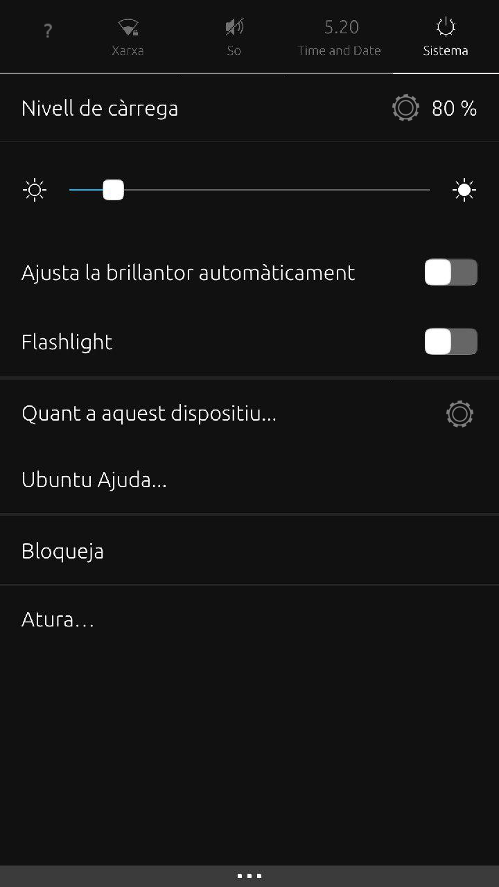
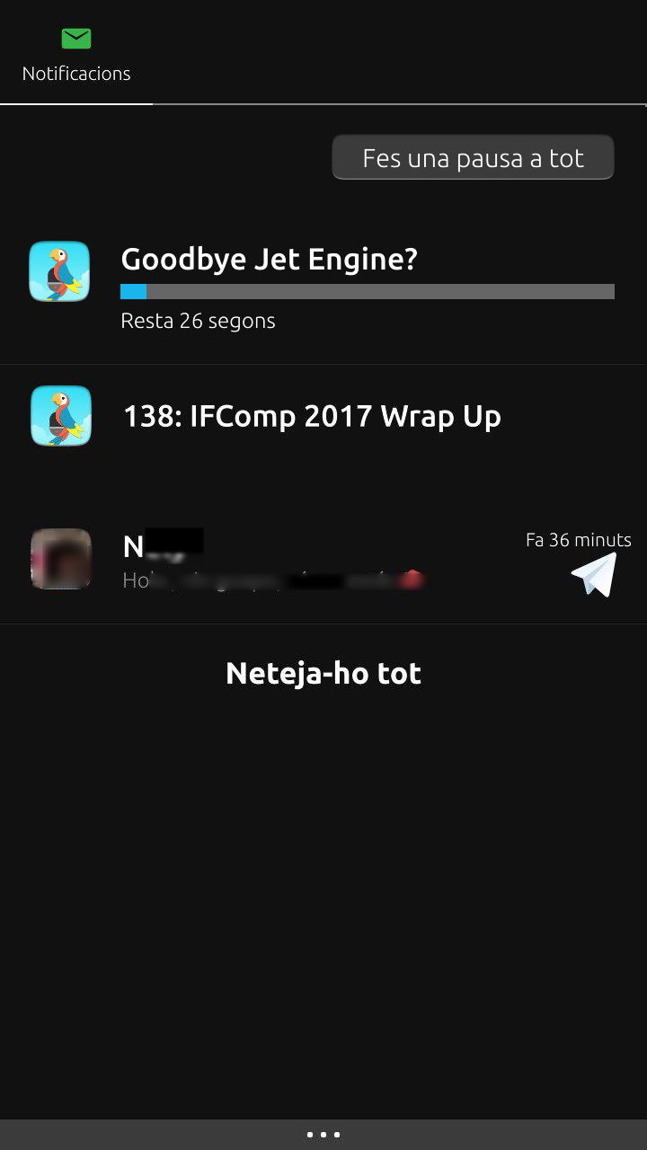
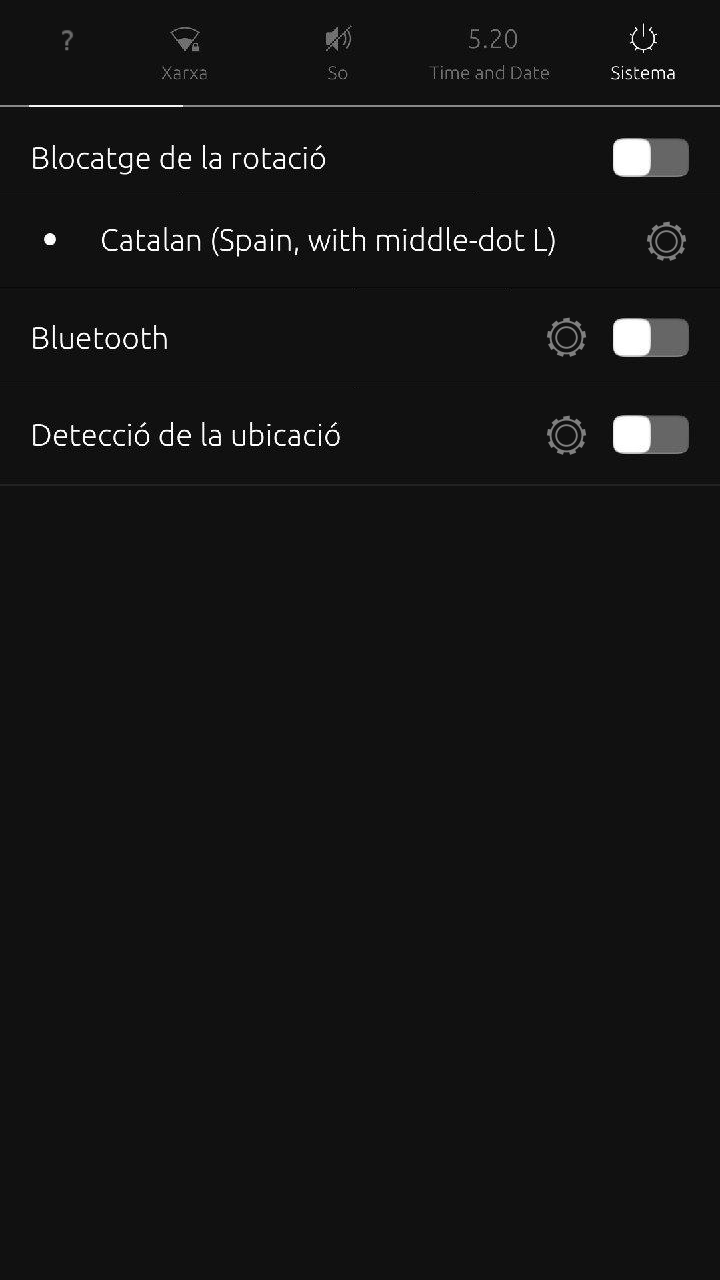
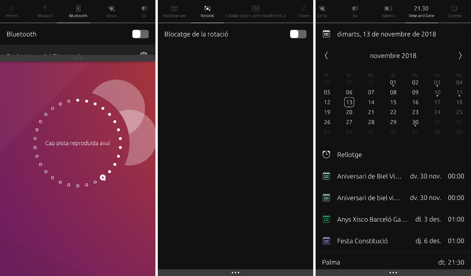
As a resume of all ideas, this could be a first step towards a more compact indicators:
- Connections, Audio and Date nearly untouch.
- Energy and power

- Notifications and downloads:

- Bluetooth, rotation, keyboard, GPS

-
What is the decision process around these things?
Who's deciding what needs attention?
And who's deciding what, if any of the solutions are going to be implemented? -
@3arn0wl
Well, it's not decision, is a recapitulation of the ideas we have been putting here but:- we decide how we want it to work
- we are tied to «what is possible» to implement
- all in the case that we start implementing it
-
 C CiberSheep referenced this topic on
Hello! It looks like you're interested in this conversation, but you don't have an account yet.
Getting fed up of having to scroll through the same posts each visit? When you register for an account, you'll always come back to exactly where you were before, and choose to be notified of new replies (either via email, or push notification). You'll also be able to save bookmarks and upvote posts to show your appreciation to other community members.
With your input, this post could be even better 💗
Register Login