An idea for a different approach than the classic grid home.
-
Hi everyone.
I recently tried the Brian Sprint App.
This App allows you to customize the home of the device, even if its design makes Ubuntu Touch more similar to the home of Android, iOS, etc.
Personally, I appreciate Brian's work and abilities, but I think the original idea of Ubuntu Touch and then Ubports is to have an innovative OS.
Android, iOS, Plasma and other systems, revolve around more or less the same scheme: a grid of applications.
Ubports has the sidebar that contains the "favorite" applications, so an alternative solution could be tested.
I was thinking of proposing an idea that is based on entities called "universe" that are customizable in the home.
Each "universe" is an icon (or logo) that can be pressed in two ways: quick click or long click.
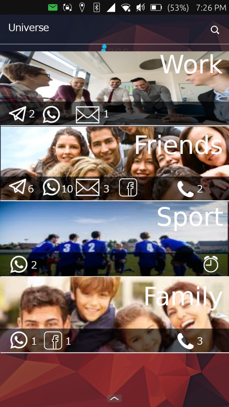
I can have, for example, a "universe" WORK and a "universe" FRIENDS. By clicking on the "universe" WORK, I will expand the links to the applications I choose to make belong to this universe (eg Dekko2, Contacts, Camera, Message).
But this is not the "containers" of the apps in Android.
Clicking on the Universe will expand the links to the applications contained around the logo.
The links contained in the "universe" will pre-set the opening of the applications, based on specific parameters.
For example, if you open Dekko from the "WORK" Universe, the app will show the work account, the address book will show the work contacts, Telegram will open on a specific group, etc.
The same application (uniquely installed) can belong to several Universes.
Around the Logo will be placed the simplified icons of the applications that notify, with the number corresponding to the notifications received.
A long press on the Logo of the Universe will cause the drop-down to show the notifications referring to the specific Universe (the work email, a call from a work contact, etc.).
Of course, it's just about presets: if I enter the contacts of the Universe FRIENDS, I can still manually select the display of the other contacts.
It is not about using the multi-user typical of Linux systems. This, in fact, is designed to make use of the same device by multiple users. I think, instead, of a system that optimizes the device for the same person but for different uses.Clearly the "grid" intended as the overall collection of Apps will have to remain. It could be placed in a second scrolling screen (like the current Scopes)
I hope I've been sufficiently clear.
Gabriele -
Hi.
")
his sounds very interesting but is a little bit hard to imagine. Maybe you can provide some sketches? -
@krille
of course. I will try to make some Mockups, maybe not very beautiful, but just to make the idea clearer -
This post is deleted! -
This post is deleted! -
a simple example (made quickly and with little precision)
-
I think I understand what you're trying to do with this idea, but I don't think it will work out well for most people. Similar things have been tried before in various systems, and they all have the same problem. Most of the people one interacts with are not finitely divisible into such categories, nor are the conversations or interactions with those people. And then there's the issue of getting apps on board. You'd need to define APIs that apps must use to be fit into such categories well, and that creates another reason for app developers to either not support the platform, or not integrate at that level, because it's not something that can be shared across other platforms.
-
@dobey
I understand your point of view. I have two clarifications to make: the first is that the categories are not "preset" but customizable (trivially, I could also have a universe only "family"). For everything else, I can always count on the shortcuts on the left bar.
The second is that Universe, as I see it, is a sort of "scope", in the sense that it is an aggregator. The "grid" of the app would still exist.
For the "technical" part I do not know if it is complicated or not to add a layer that pre-sets the opening settings. In fact, however, this would serve only for some apps (typically social, e-mail, address book and little else). But, apart from social networks, the rest is "homemade" (Telegram, Dekko2, Contacts, Camera, Gallery, etc., that can be built "sartorially" by the community) would remain outside Facebook, Whatsapp and little else that do not already develop for UT. All the rest of the apps can remain exactly the same and be inserted as simple links in one or more universe. IMHO -
@giemme
That blank section at the bottom ,could be called "RETIRED " and all it needs is a big "snooze" button -
@marathon2422 said in An idea for a different approach than the classic grid home.:
@giemme
That blank section at the bottom ,could be called "RETIRED " and all it needs is a big "snooze" buttonThe empty section at the bottom is only because I chose a "bar" theme and I added 4 bands (but in reality I could create less)
-
@giemme
sorry just my sense of humor.
would it be feasible ,to have that page, set up like a scope, in the sense that you could swipe across and use it ,or not as the user wished.
and would or could there be a way to lock/secure it , in the event of someone else was using you device. -
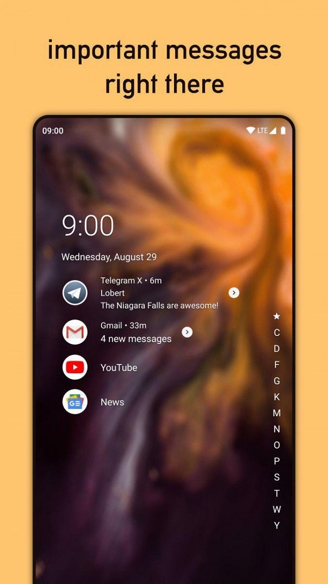
I don't think this is a crazy idea at all. Google is reimagining the UI with Fuchsia (see preview video here: https://www.youtube.com/watch?time_continue=24&v=_7rRK4S9uk0). I actually prefer something simpler. In fact, before switching to UT full time, i was using Niagara launcher which is very minimal, but also provides tons of great features right from the home screen and i love that it works so well one handed.

-
@giemme Sorry, that's not quite what I meant. It doesn't matter if you can define custom categories or if they're preset. What I mean is, relationships between humans are more organic. To use the example in your mock-up graphic to make the point: I work with friends, and sometimes do other categorical things with those same people. If one sends me a message, there is no way for the phone to know if it's work related, friend related, or sport related, or perhaps something else entirely. So trying to group notifications into such categories will fail.
So it will always feel weird to try and split relationships categorically as such, when they are so organic. It seems like you're trying to solve a very specific problem that you might be having, but I don't think it scales well to general usage.
Hello! It looks like you're interested in this conversation, but you don't have an account yet.
Getting fed up of having to scroll through the same posts each visit? When you register for an account, you'll always come back to exactly where you were before, and choose to be notified of new replies (either via email, or push notification). You'll also be able to save bookmarks and upvote posts to show your appreciation to other community members.
With your input, this post could be even better 💗
Register Login