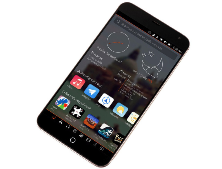
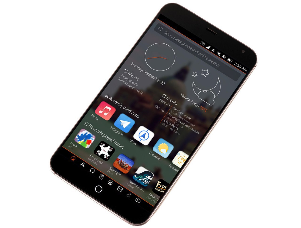
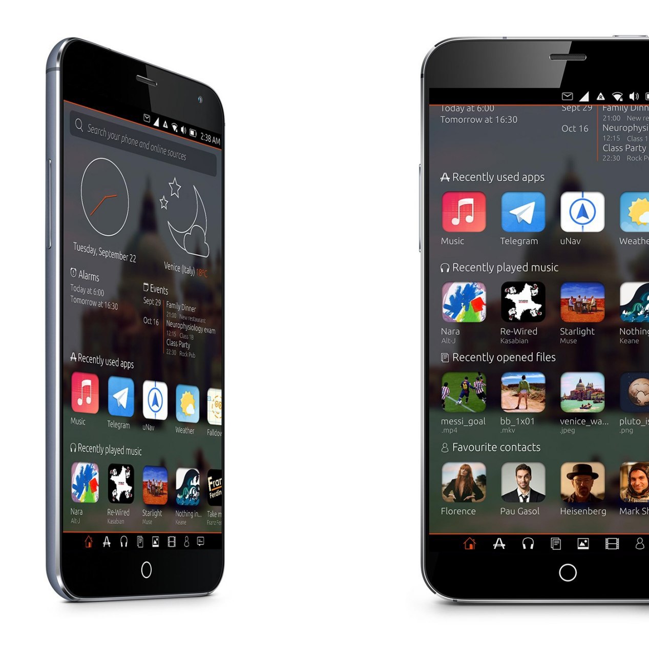
UT home concept
-
Hello everyone,
I just want to share here a nice concept which pop up in the french telegram group.
It seems that the concept exists since the start of UT under Canonical.


I like the concept too, but meanwhile, I also like to have a empty home with a nice wallpaper and the clock.
Cheers -
In my option weather icons are better in original app! But in general it looks fresh.
-
Would be exactly what I want as a home screen...
-
i'd prefer something more minimalist but it is a beautiful design.
-
This looks beautiful!
Perhaps a swipe up to show all the apps? -
@cunotj apps look like to be in the next page, see icon on the bottom : home, apps, music and so on
I like the concept too, so awesome & better than today scope
-
If every screen/page/scope...whatever it is would be customizable, then yes, it would be awesome. But since scopes are going to be obsolete, don't know if that pass Ubports design plans. Certainly looks nuch better then the old scopes, and as a concept looks better than any design proposal before.
-
Hello! It looks like you're interested in this conversation, but you don't have an account yet.
Getting fed up of having to scroll through the same posts each visit? When you register for an account, you'll always come back to exactly where you were before, and choose to be notified of new replies (either via email, or push notification). You'll also be able to save bookmarks and upvote posts to show your appreciation to other community members.
With your input, this post could be even better 💗
Register Login
