OSK Enhancements Proposals
-
but in selection mode you can move only one of the two cursor, am I right?
starting dragging the thumb from the left part of the osk could move the start-selection cursor while starting dragging in the right part could move the end one -
@jezek most likely they will work but the terminal app already has the keyboard shortcuts which are actually more and more useful there.
@mymike That would be cool but I don't now if there are keyboard shortcuts that do those. Currently, the keys/shortcuts in the OSK are just mapped to actual keyboard shortcuts.
-
Here's a better version of a demo video. This already includes all the work I've done so far. Please ignore my incorrect grammars and bad typing

-
This post is deleted! -
@marvolichko Compiling creates deb files (if no-debs parameter was not used) and you'll have to use crossbuilder deploy to copy to your device via ADB. I get an error though for the actual installation so I do them manually.
As for your concern, unfortunately you really can't pick things to install aside from the languages. Trying this out will always have the risk to break your OSK. In case of breakage, you can build the xenial branch from the original repo and install from there
-
@CiberSheep I would like to get the opinion of the design team about the OSK.
I'm exploring the possibility of keyboard themes especially the Ambiance and SuruDark themes.
I used "hacky" ways to implement it in my previous screenshots but now I want to make a proper implementation.
However, one of the blocking points are the Border Images that were used for some kind of drop shadows.
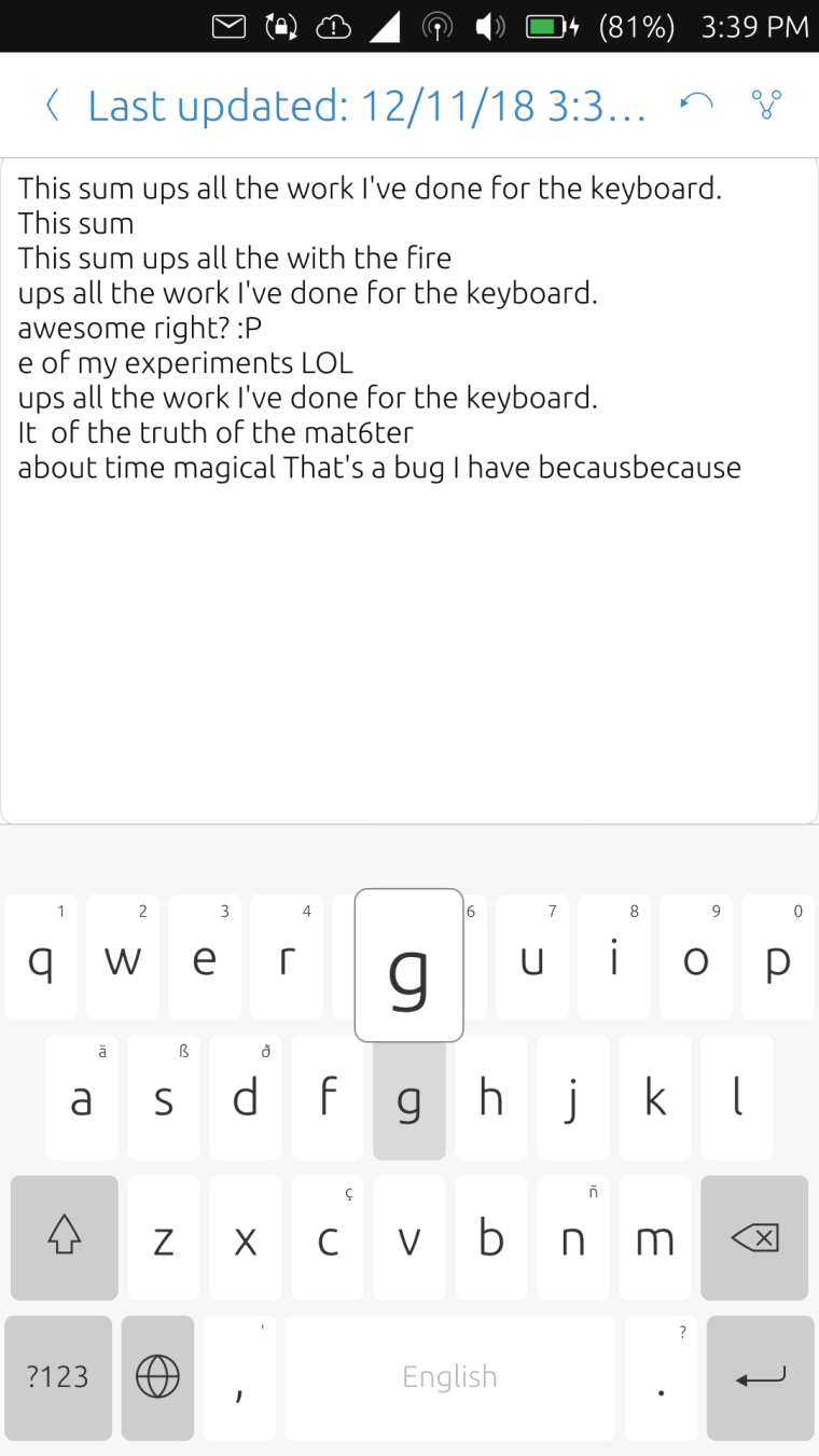
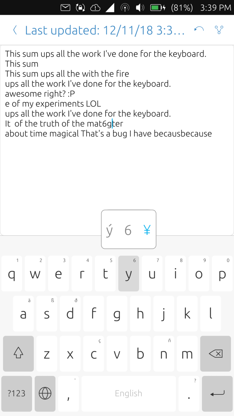
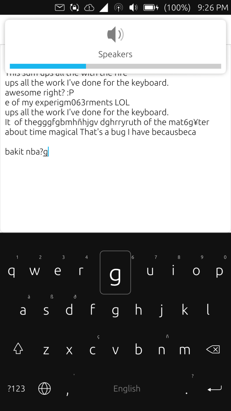
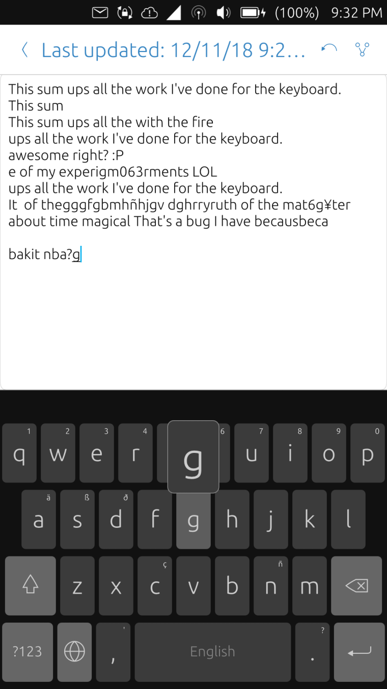
Would it be okay to replace them with just a rectangle with border instead so that theming support will be easier?Here are a few screenshots showing rectangle with border instead of drop shadows.
-
@kugiigi I would say: go ahead and forget the drop shadow

-
@cibersheep Roger that! someone has to approve my PR anyway in case I really get a proper implementation

-
Some progress for the themes support hurray!

Here are the repositories I've uploaded which so far works quite well except the settings-app which I was not able to build myself but I've only changed QML and those worked fine when I tested directly on my phone

Keyboard component
Settings appMy initial plan was just create a dark mode for the OSK but since the foundation for the colors is already there so I experimented with different themes and these are the ones I've come up.
(I don't know how to shrink the photos here :P)Ambiance (Default)
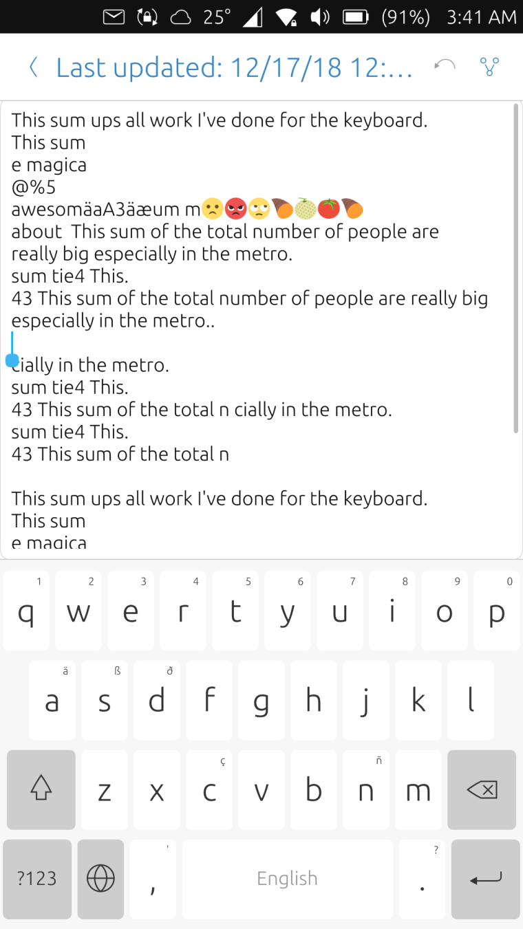
Suru Dark
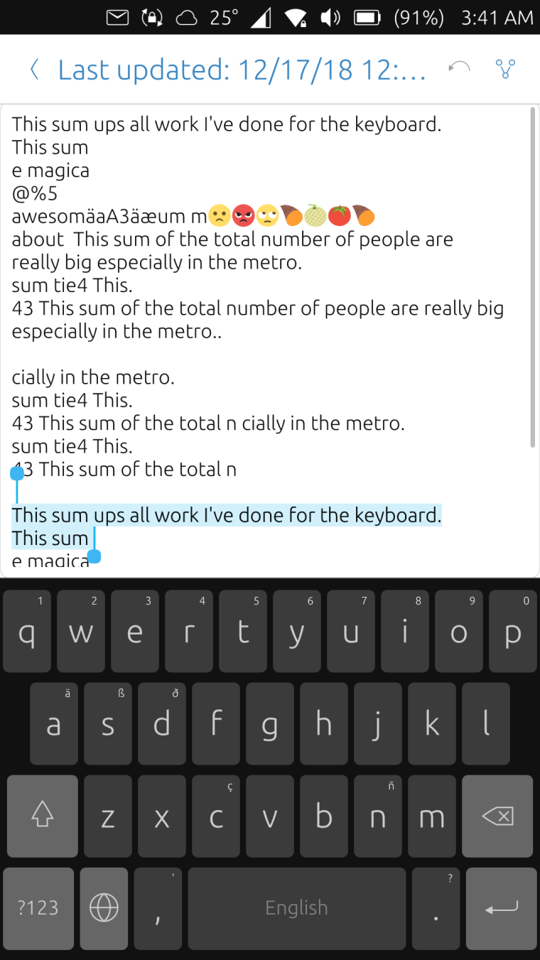
Suru Black
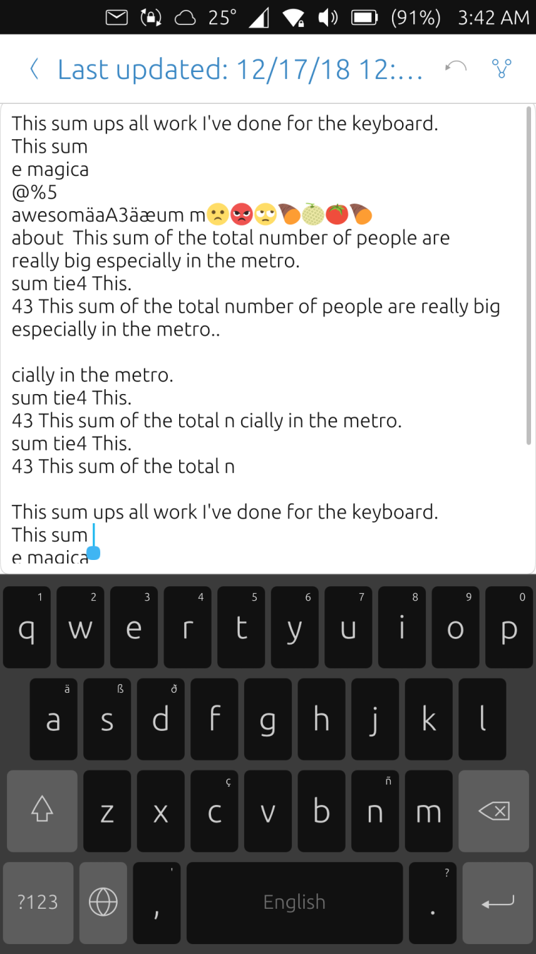
Just White
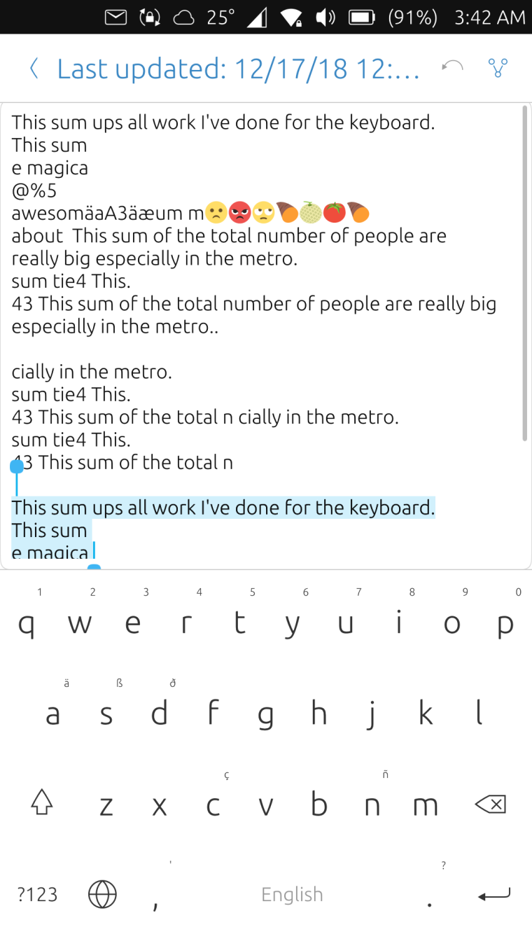
Just Black
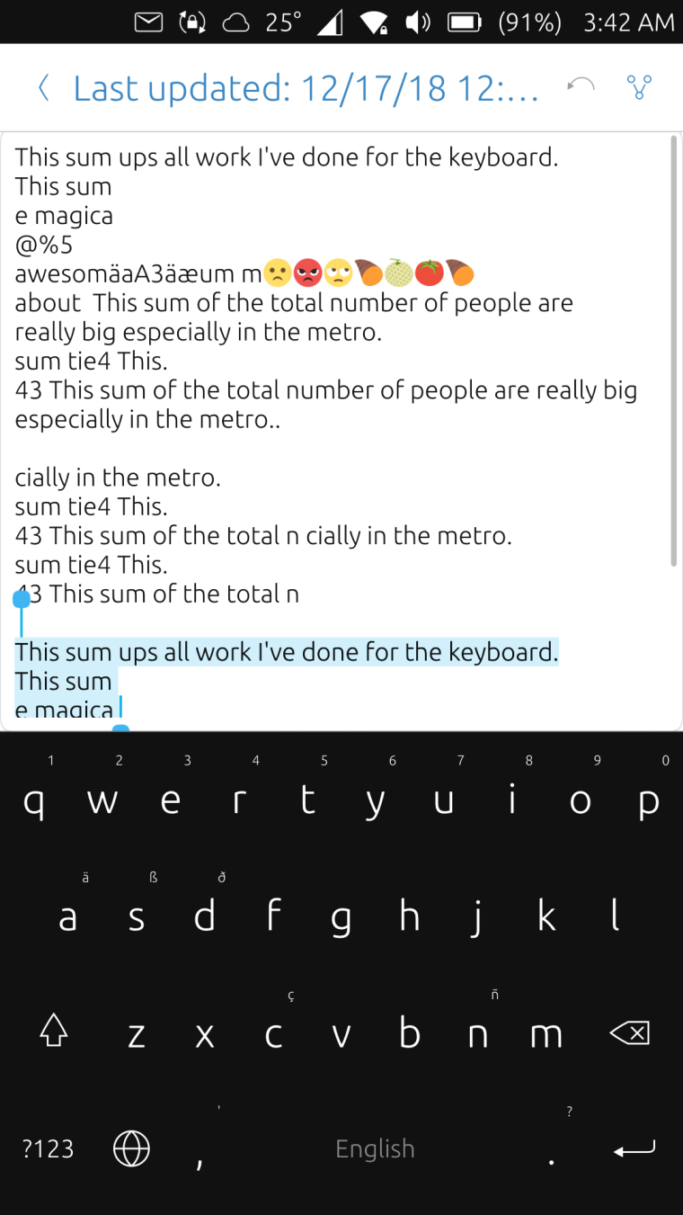
Just Grey
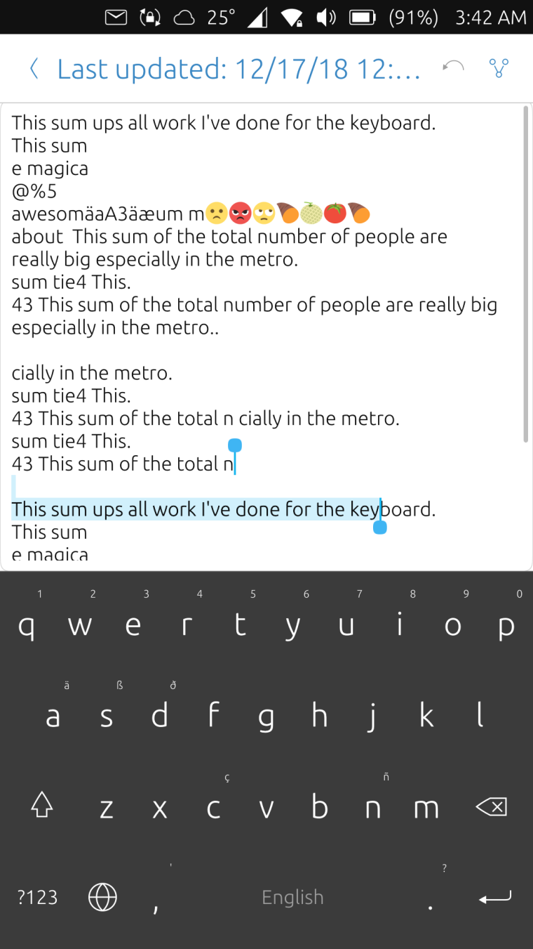
Bordered White
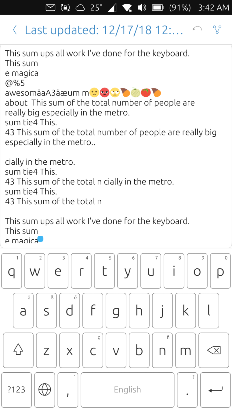
Bordered Black
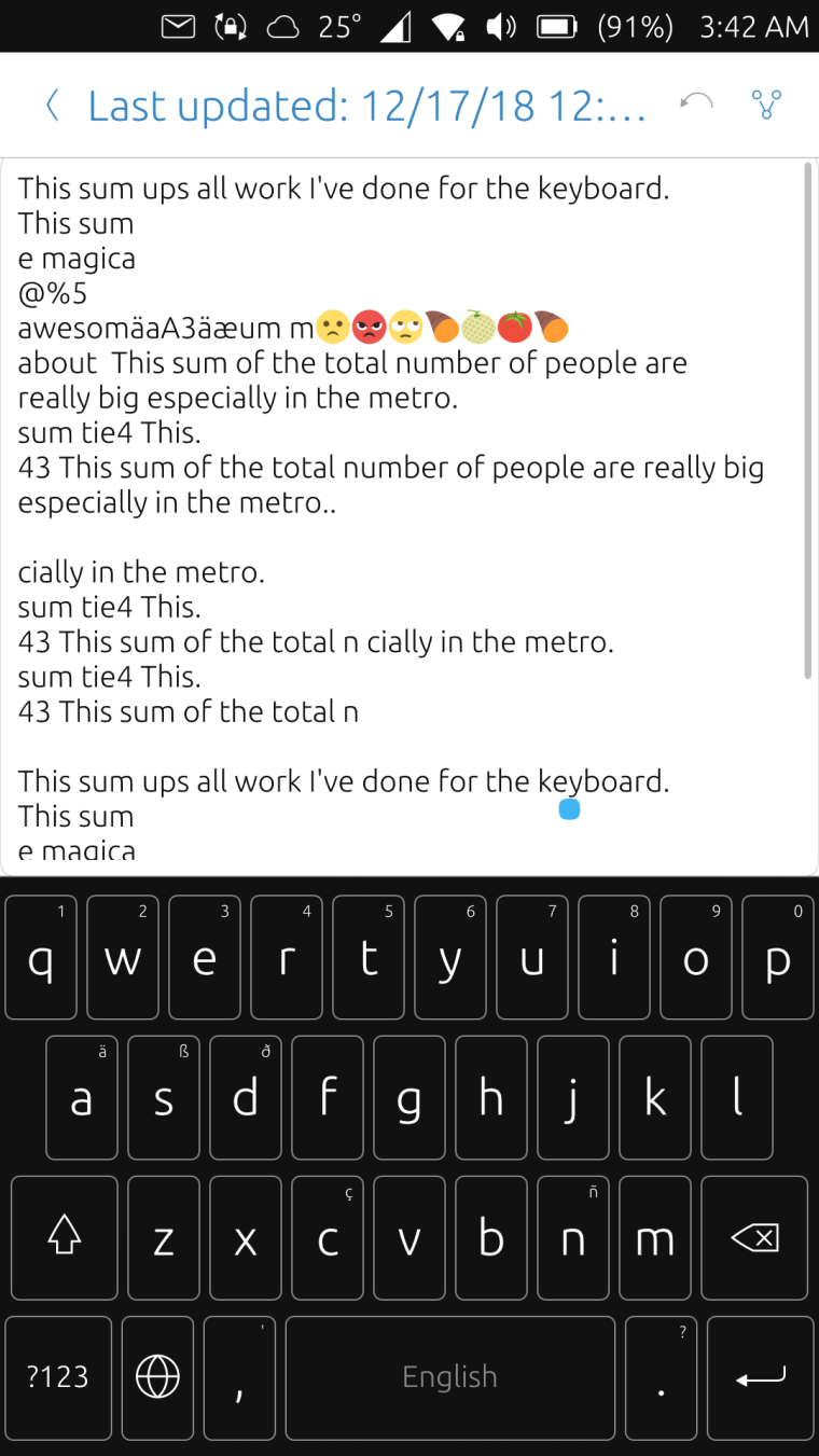
Bordered Grey
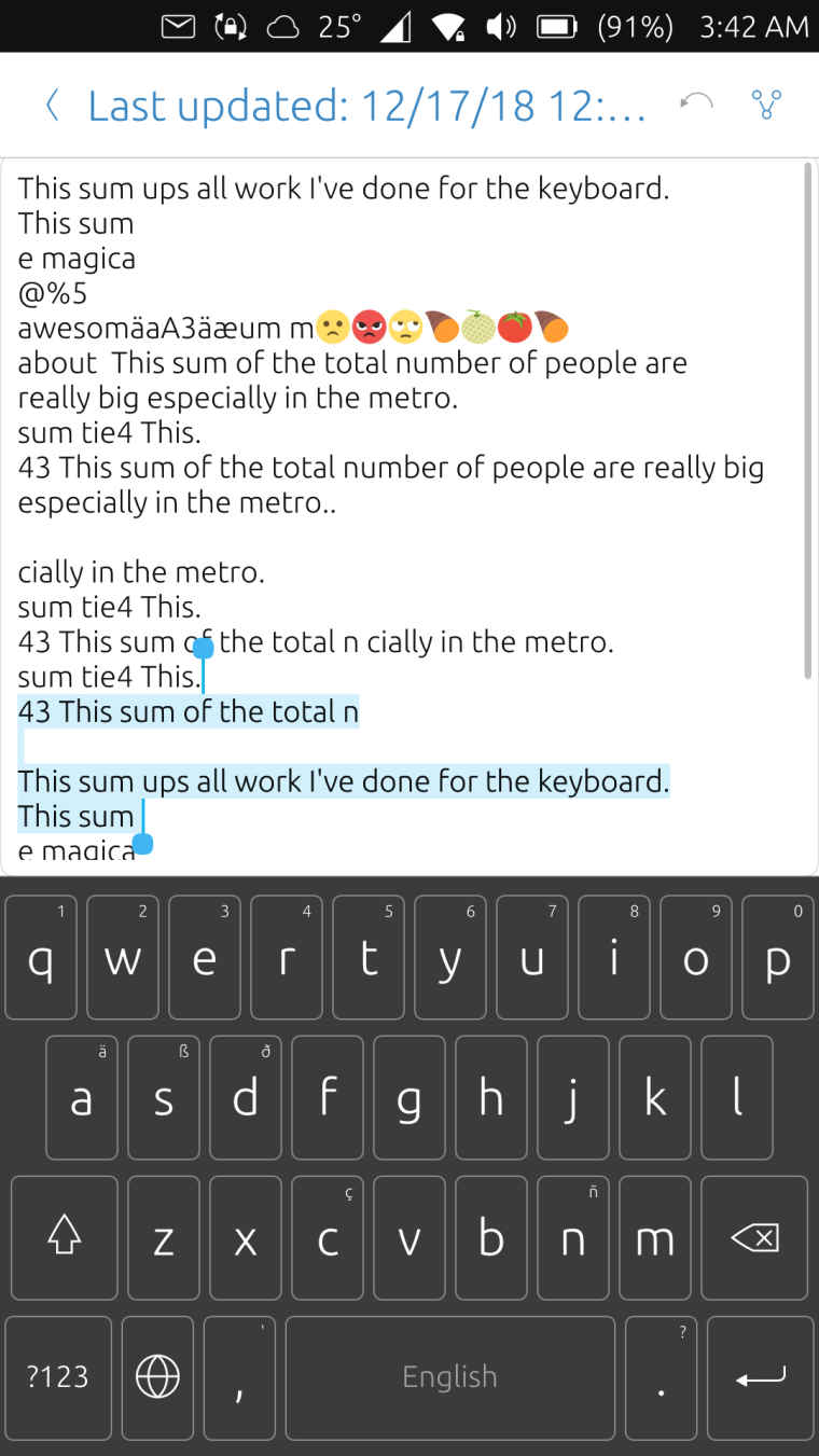
Colored ones are also possible but I did not include any in the repo but here's a sample
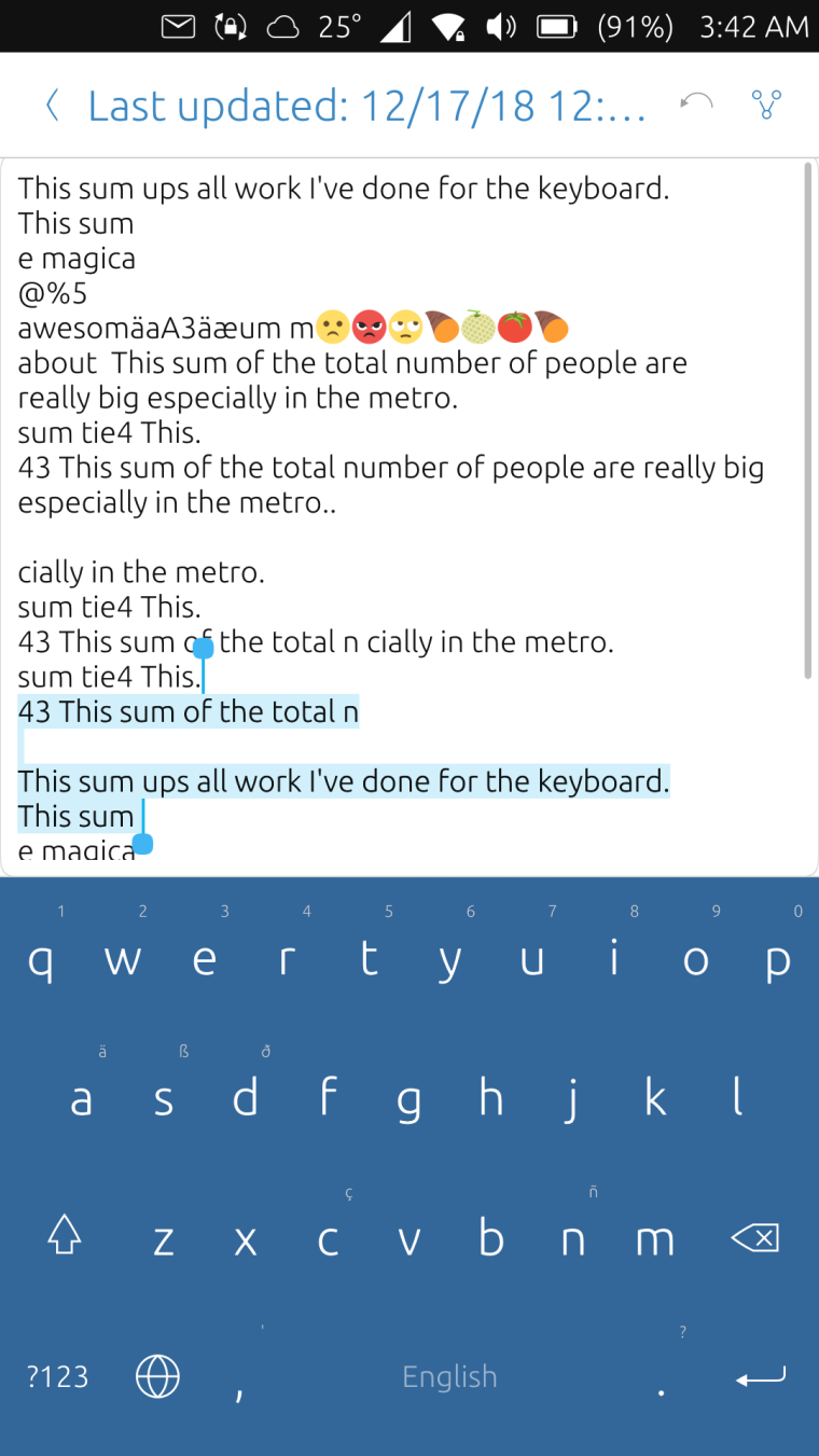
I don't know if this will be accepted but if yes, @CiberSheep I would like get the opinion of the design team and you can check the colors.
They're just in json files in the repo and can be easily modified
And BTW, this completely removed the border images and replaced with rectangles with borders
-
In two words: im pressive XD
If you want the Suru colors, are:
#DC3023
#FF8936
#FFB95A
#8DB255
#749F8D
#48929B
#A87CA0 -
@kugiigi really cool! But the ones using the same color for keys, background and borders look strange to me...

Now we have to make the keyboard respecting the (system wide) theme setting...
-
@kugiigi good job
-
@cibersheep I used the palettes from the official toolkit themes so those are already suru colors

Although I did not explore the more extensive list of suru palettes.
Do you want to check the design/palettes first or should I create a PR now and just do any changes on that based on your comments?
@hummlbach I considered doing that at first, using "theme.palette" and so but it wasn't quite simple to convert since not all the original palettes have equivalent in the toolkit. And personally, I don't think we'll have system-wide theme setting soon especially that the UITK's future is quite bad at the moment. But in any case, we can still have a workaround for maybe setting the theme to Ambiance or SuruDark

-
@kugiigi I know you used the Suru palette, sorry: I ment that if you want more colors, that list is the «official» additional colors

I think you can do a PR and we can work from there, don't you?
-
@kugiigi what about making shadows from qml with
DropShadows? honestly I don't like very much that border... -
@kugiigi here I prefer the first 2 screens and I don't like the ones with borders... how are the magnified key when pressed on the just one color keyboard?
-
@mymike I didn't try that but it might have performance impact I guess?
You mean the border in the magnifier right?I guess the preference depends on the person. I like those with border
 Although in my PR, I updated those a bit, I changed the color of the action keys similar to Ambiance,Suru Dark and Suru Black.
Magnifier for the pure colors are still bordered.
-
You mean the border in the magnifier right?
yes
@mymike I didn't try that but it might have performance impact I guess?
Idk tbh, but I saw you can cache the shadow
from DropShadows qt docs about the cache property:
This property allows the effect output pixels to be cached in order to improve the rendering performance. Every time the source or effect properties are changed, the pixels in the cache must be updated.
-
@mymike I can try out using DropShadows and see if it has adverse effect especially with the performance.
-
@CiberSheep If the design team wants to intervene with the themes support, now is the time

Pull requestI did not check/test all the palette assignments thoroughly so I'm not confident the they all look fine

Hello! It looks like you're interested in this conversation, but you don't have an account yet.
Getting fed up of having to scroll through the same posts each visit? When you register for an account, you'll always come back to exactly where you were before, and choose to be notified of new replies (either via email, or push notification). You'll also be able to save bookmarks and upvote posts to show your appreciation to other community members.
With your input, this post could be even better 💗
Register Login