New Launcher, edge channel.
-
No, I added the handle on the right. Previously you could drag from anywhere on the Drawer to get it to close, but that behavior didn't work right. Now you can only drag from the handle.
I tried to make the handle not appear on larger screens to avoid the desktop issue, but that doesn't work. Touch screens can be large enough to get it to disappear.
Of course the code is all open and Drawer.qml is pretty simple to understand. I'd appreciate your suggestions.
-
@UniSuperBox said in New Launcher, edge channel.:
I'd appreciate your suggestions.
Can't you make it magically do what every individual wants on their own devices? It's just code, right?

-
@UniSuperBox What if instead of a handle, the 'short right edge swipe' gesture closed the drawer? In other contexts, the short right swipe reveals the previous app used, so it would make sense that in the drawer context that gesture would hide the drawer and reveal the open application.
-
I don't know who desing the new launcher, but you sir are my hero. On thing that I love about UT is that android and ios feels exactly the same to me and UT with all the swipe gesture brought a new view on phone UI that I love it. And gettng ride of the 'home' screen and having a app drawer like that is the best desing I ever used.
I know some ppl don't like it but I hope if we make change it will be in the form of configuration and not removing this desing.
I switch to edge on my main device just for this feature and I dont regret it!
-
This post is deleted! -
@B2288 Not all devices have the drawer fill all the horizontal space like desktops. In fact in landscape mode, the drawer usually only take up around 3/4 of the screen.
For me, it's not a big deal because it works and serves its purpose. Perhaps a better design in the future.
-
I love the design, three dots and all. It makes sense for the conversion in desktop mode and it looks great on the phone. Besides having a search function, which comes in handy at times. Good job!
-
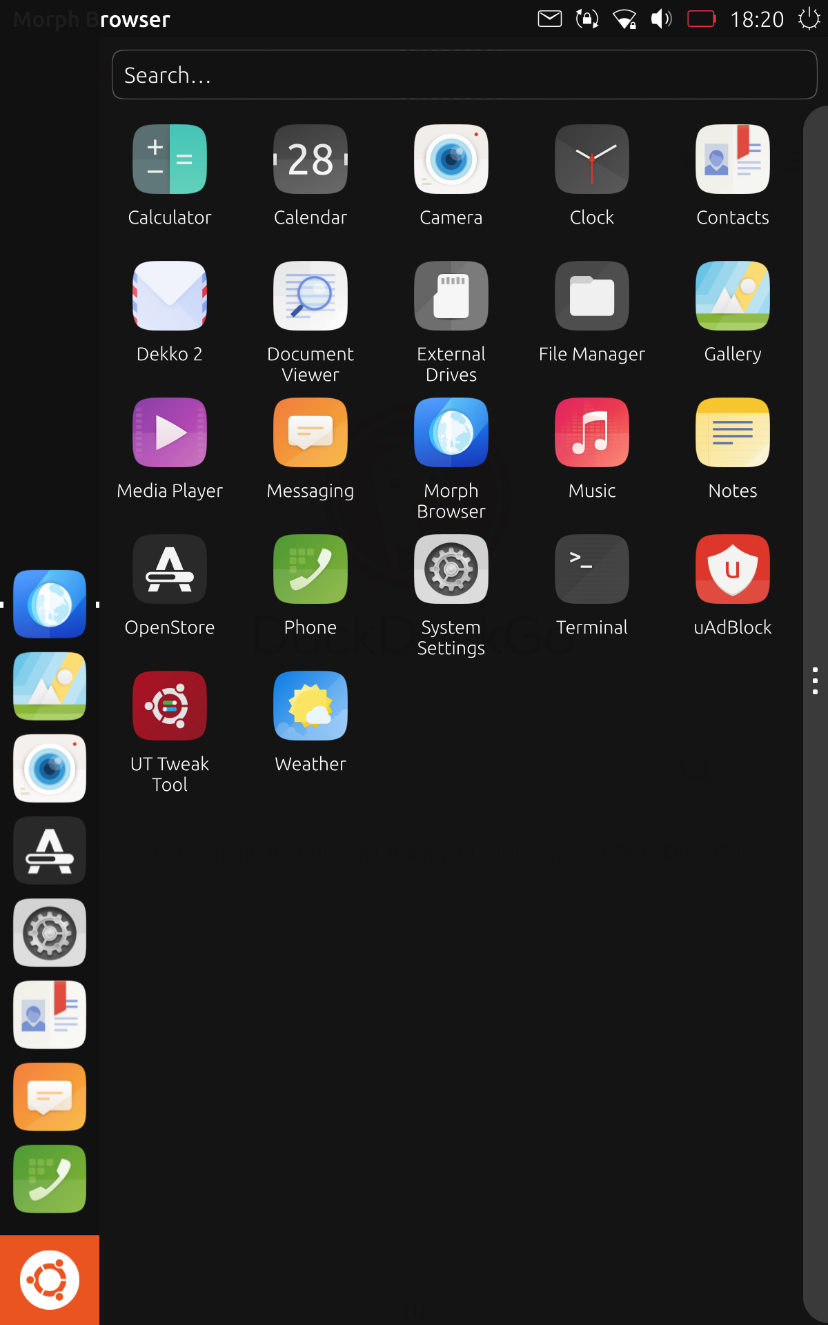
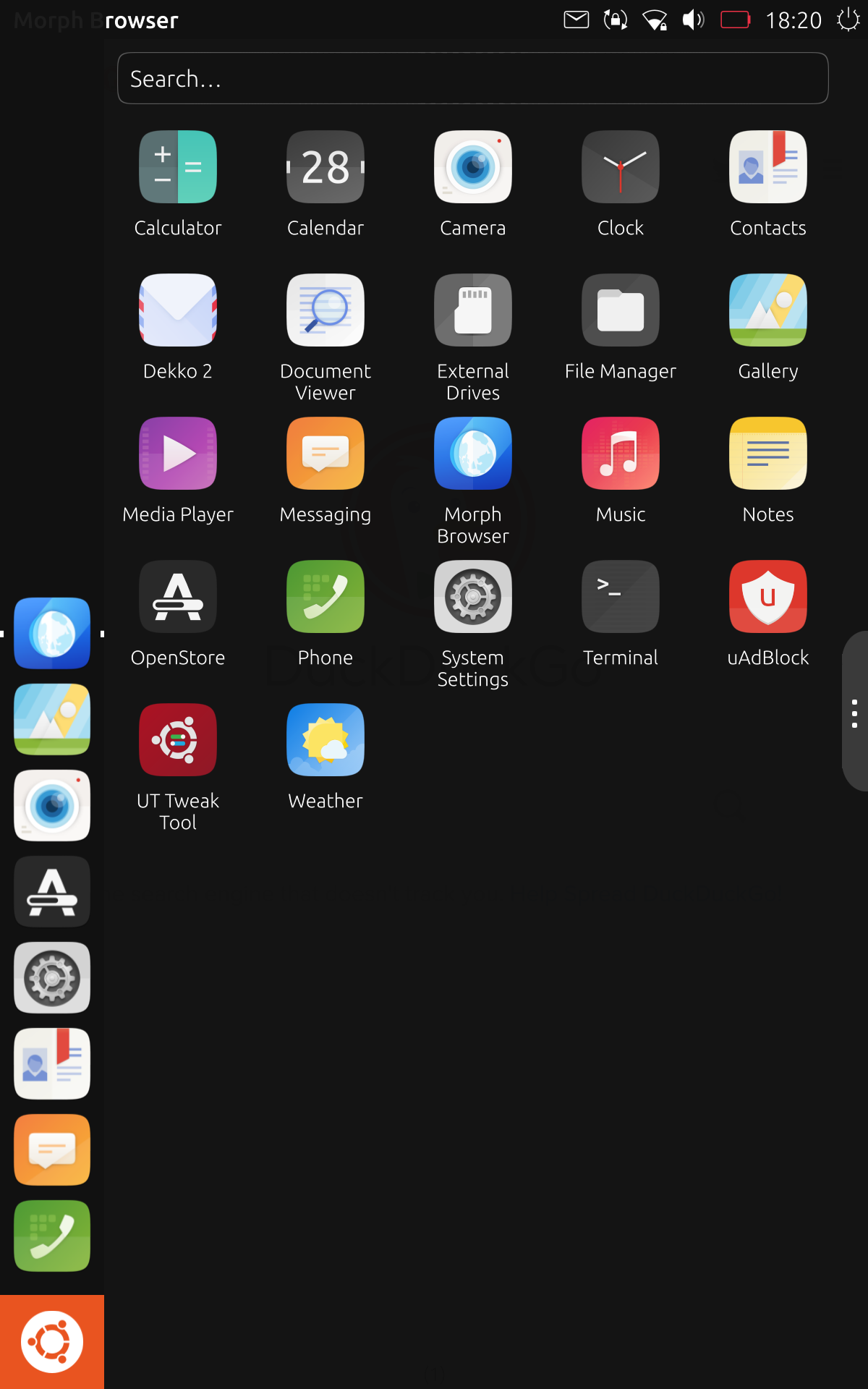
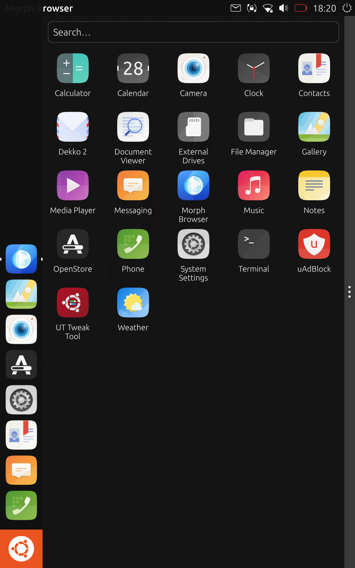
@kugiigi @UniSuperBox IMO, the specific thing that is aesthetically unpleasing is the sudden cutoff / hard edge between the drawer handle and the statusbar. Maybe some edge rounding would make it look nicer?
How do either of these look?


-
The second option is very pleasing to my eyes.
-
The second option makes it visually pleasing but far less usable for the people who actually have to work with it. Fitts's Law still applies, roughly, since a taller handle reduces the distance someone must travel to reach it. In one-handed (left hand) or tablet use, it would be very difficult to reach.
The first option seems fine from a non-functional screenshot. I'll point you to where these things are implemented so you can experiment on your own. The Drawer is the component you're working on, and specifically the Drawer's Handle. You can find it at line 202 of Drawer.qml. The Handle component is declared in Handle.qml in the Components folder. It is shared between the Drawer and the pulldowns, so be careful to make changes in a way that you only change the visual style of one.
These files can be found on-device as
/usr/share/unity8/Launcher/Drawer.qmland/usr/share/unity8/Components/Handle.qml. It's easiest to edit them via adb or ssh. You'll need to make your system image writable withsudo mount / remount,rwfirst. You can edit the files, then typerestart unity8in your terminal to load them. If Unity8 fails to load, it will flash a white screen then go to black. If you hit the power button twice, it'll show you the error it hit. Once you fix that error, asudo restart lightdmwill get you loaded again. You might have to open a new shell using your preferred method to restart it again.If anything goes completely wrong, you can run
sudo apt install --reinstall unity8orsudo system-image-cli -b 0 --progress=dotsto go back to stock. Your changes will be overwritten, so be sure to save them somewhere. -
@UniSuperBox said in New Launcher, edge channel.:
The second option makes it visually pleasing but far less usable for the people who actually have to work with it. Fitts's Law still applies, roughly, since a taller handle reduces the distance someone must travel to reach it.
Ah... I had naively assumed that the 'mouse area' of the handle would still extend the full length of the right side and that the modification would only be visual.
-
I think it's not much about the mouse area per se but the visual suggests that the drag area is only limited to the hint area so user's tendency will still be reaching to it even though dragging anywhere will work.
-
A physical drawer can also be opened from any part on its edge, not only by grabbing the handle.
-
Virtual representations of ideas are only equivalent to physical objects by name, in most cases. Just because it's called a Drawer doesn't mean you apply all of your knowledge about a drawer to it.
Anyway, we're bikeshedding now. I'd prefer something that proves that changing the drawer is better, not conjecture.
-
The comment that sparked off this discussion was more about esthetics than function. Let's wait and see if @UniSuperBox's suggestions will be taken up and we can have new suggestions that both work and are an improvement on what we have now, if possible.
-
@arubislander said in New Launcher, edge channel.:
The comment that sparked off this discussion was more about esthetics than function.
The problem with this though is that we cannot ship something which is optimally designed to a single person's preferred aesthetic. We need to design things that are usable by as many people as possible, if we want UT to gain a significant user base. That means things need to be visually obvious, accessible, etc… and we must think from the point of views of others to accomplish such a design.
-
@dobey
The three dots have been on the notifications drop down for ages... it wasn't obvious to me what they did until someone pointed it out fairly recently.
-
@3arn0wl Do you mean it wasn't obvious that it's a handle for dragging and closing the drawer?
Personally I got it right from the start, well I guess that's because I've used the drawer pre-handle so I immediately noticed the change. To me, it is perfectly usable and intuitive and definitely an improvement from the mess it was before.
I guess it's just that it doesn't look great especially on larger screens but I'd take usable than pretty any day of the week
-
@kugiigi said in New Launcher, edge channel.:
@3arn0wl Do you mean it wasn't obvious that it's a handle for dragging and closing the drawer?
For dragging it, yes. I thought you had to have your fingers over the icons at the top. Once I found out, I did suggest some tiny < > icons in stead.. but I'm not sure, on reflection.
-
@3arn0wl said in New Launcher, edge channel.:
For dragging it, yes. I thought you had to have your fingers over the icons at the top. Once I found out, I did suggest some tiny < > icons in stead.. but I'm not sure, on reflection.
The indentation dots and similar have been used for quite a long time as "grip" indicators in GUIs, for objects which may be dragged, such as toolbars and pane handles. This is because it is a bit skeuomorphic given how physical objects have such designs as a means of increasing surface area contact as your skin presses into them when squeezing (thus increasing the "grip" you have on them).
So, while I wouldn't be surprised if you consciously didn't recognize this, the visual indication of this type is used to create a subconscious realization.
Hello! It looks like you're interested in this conversation, but you don't have an account yet.
Getting fed up of having to scroll through the same posts each visit? When you register for an account, you'll always come back to exactly where you were before, and choose to be notified of new replies (either via email, or push notification). You'll also be able to save bookmarks and upvote posts to show your appreciation to other community members.
With your input, this post could be even better 💗
Register Login