Looking for a volunteer to make app icons
-
Dear lovely UBports people,
are there any graphic designers or similar enthusiasts around to help out a graphically handicapped app
developer?I'm working on a sun compass app and I'd need an icon and a compass rose to show
on the map. The sun itself could also be prettier I guess.I also have this other app libertine tweak tool which uses a really ugly copy of the
libertine logo and could also do with some graphical finesse. -
I can have a look at it. but I'm not sure when i'll have time for it.
in the meanwhile, did you have already some ideas regarding those icons? -
@mymike Thanks!
For libertine tweak tool, it would already be nice if it's not so pixelated on the start screen. In addition I think the black on white contrast is too hard, especially when using SuruDark from UT tweak tool. Maybe some shades of grey could work? But the icon should stay similar to the actual libertine icon from the system settings. Maybe with some wrench or cogwheel overlayed?! Actually, while thinking about it, also the libertine icon itself as used in the system settings looks out of place compared to the other system settings icons. It's a big black (or white) blob. So, I guess if someone would design something lighter it could be proposed to core team to give the system settings a nicer look. Maybe contour lines around the whatsitcalled brim and the band of the stovepipe hat. A bit like the battery icon.
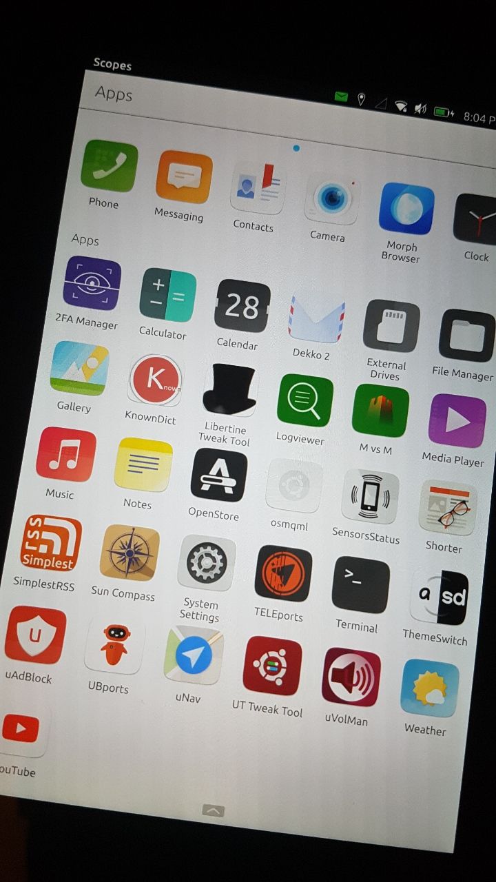
For the sun compass, the compass rose could be really simple, all it has to convey is the direction of north. The icon could be some blend of a compass rose and a peripheral, but clearly visible light source & ray (the sun) shining from some angle onto the center. Or maybe a globe, but no actually I think a compass rose would be better. That way the icon and the compass rose on the map could we equal/very similar so it gives a nice consistent look.
But for either one, I am very open to suggestions!
-
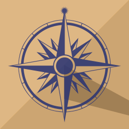
Hi, I read your post and I'm trying to improve my designing skills, so I decided to give it a try and I did a first proto for your solar compass.
If you like the design I can change the colors or upgrade the design.
I put a sun logo to indicate north on a basic rose.
Then I added a shadow to represent something like a sundial...What do you think?
I have no inspiration for libertine tweak tool, but if something came to my mind...
Cheers.
[Edit] : By the way, this is a PNG file but I made a SVG, so no size issue
")
-
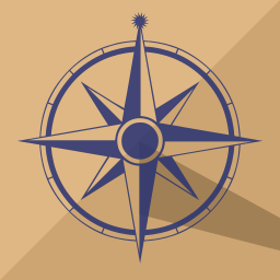
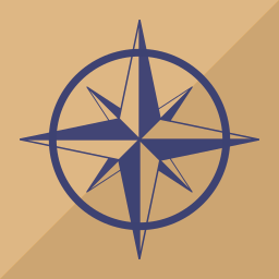
Its great, though I think the compass itself is too detailed. I would make it more iconic, and remove the smaller directions. It will be very small on a high dpi device...
-
Thanks @Flohack for the suggestion.
I removed the smaller directions and yes it's good. I didn't push it to the phone to see what it's like.
-
Awesome!
I'm not too convinced about the sundial shadow tbh. The app is not telling you the time, so I have the feeling the shadow is the wrong association. I think we could simply leave it out.
Wrt detail, it is probably indeed too much. As an image icon on the app grid on can still kinda see most of the details and it makes for an old fashioned look that suits a compass, but I'd be curious to see at least without the degrees on the circle and without the lowest level of directions like the "North North East". I like the iconic sun, but this one is way too small to be recognized. Also, on the icon, I find it not too suitable to donate North with it. While using the app, a sun will be shown, but it will normally not be in the north. Maybe we could make the sun much bigger, somewhere between the size of the dot and half the size of the degree circle? And place it somewhere, say East South East apart from the rose. and maybe with a smaller rose. Not sure whether rose pushed out of the center to make more room for the sun would make sense ...
As a compass rose overlayed on the map in the app, there is definitely way too much detail. It would be just a few millimeters wide. So needs to be reduced a lot. Also it would need a transparent background. And at such a small size, I think some other means to denote north is needed. I guess either a letter but then I would also still have to make it bigger on the map to be recognisable, or maybe make the arm pointing North bigger than the East, South and West arms.
Hang on, I'm trying to attach pictures....
... one more coming need to reduce resolution ...
-
Icon for the app, simplified design:
North indicator inside the app:
I kept the same blue, but maybe for the app, different shade of gray would be better?!
I filled the hands from the rose with light gray to make it more visible, creating contrast from the map. -
@AppLee said in Looking for a volunteer to make app icons:
Thanks!
Icon for the app, simplified design:
Mhm, sorry, I'm flip flopping
") actually now that I see the simpler icon, I kinda miss the more detailed "nostalgic look", maybe we could put the North North East arms back, but keep the circle as is. but more importantly, now it is just a nice compass. It doesn't have much "sun association". Did you think about placing the star somewhere to the side? Not sure whether it will get too crowded.
actually now that I see the simpler icon, I kinda miss the more detailed "nostalgic look", maybe we could put the North North East arms back, but keep the circle as is. but more importantly, now it is just a nice compass. It doesn't have much "sun association". Did you think about placing the star somewhere to the side? Not sure whether it will get too crowded.North indicator inside the app:
I kept the same blue, but maybe for the app, different shade of gray would be better?!
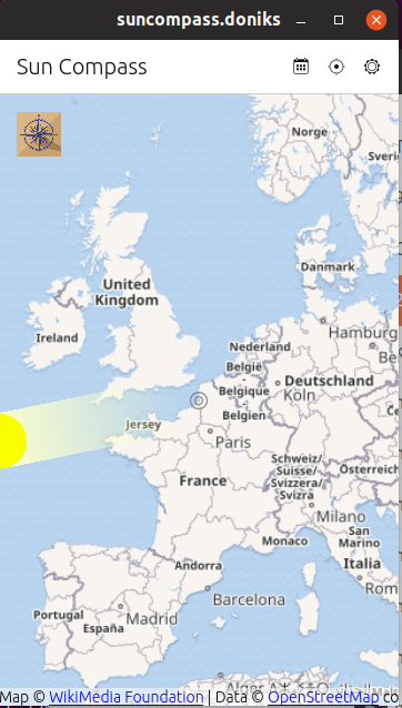
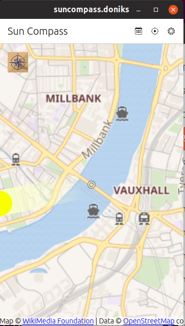
I filled the hands from the rose with light gray to make it more visible, creating contrast from the map.I think the blue is fine, and yes the filled hands on the map come out nicely. The thin line on of the arms I think is too thin though, look at this screenshot. I only had a quick look just now, maybe I need to play more with the size, but even if I make 50% larger as I want to, it still looks pixelated. maybe a solid fill would look better, but then maybe some other color would be better since it is too close to the colors on the map.
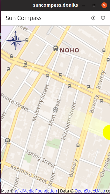
right now the North indication doesn't stand out too much, it is very subtle. But that might be just fine. I intend the map the always point north anyway (at least for the start). So, it's not like the users constantly need to check "where is north right now?" They just need to get it once, then they'll remember it anyway. -
Here you can find the SVG version of the "indicator".
So you can judge if the thin border of the hand are OK or if you prefer wider ones...Usage of SVG will probably fix the "pixelated" effect you have with PNG.
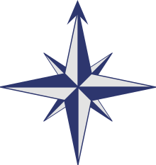
I have a proposal to add the sun symbol to the rose.
First I added the sun symbol at the center.
And my second idea was to add a sun gravitating around the rose.I'm not convince by the result (lack of contrast) but to show the idea it was better to be obvious.
Another idea is to only symbolize the sun with a blue disc, and a thinner circle around the rose but I was afraid it might be too subtle...What do you think?
A bigger sun and smaller rose is not my favorite option right now.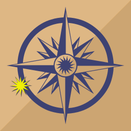
-
@AppLee ohhh, I like it
I need to try it on the app scope, to see how small the sun becomes, but I'm swamped right now with work and next week probably travel. And at some point I should also finish the logic for the app such that it actually makes sense to have an icon for it  So, apologies if I can't keep up with you next days.
I really like the flame-like sun rays of the center sun. (I think it shows that my manufacturing date is before icons and buttons turned flat
) Maybe the actual circling sun could be in that style and if it has some halo or something that just blends out the circle behind it then it would contrast nicely against the background even if it is in the regular blue.I think the flame like sun would also be nice to replace the dumb 'ol yellow circle that I have right now in the app.
-
@doniks No worry, I will wait for you to be available.
The "flaming sun" has some weird proportion when circling around.But I will make an example.
I also tried a solid border for the circling sun and it's not so bad.As you're busy, I will take more time and try few things.
There are options but I needed your feedback on some to have a better idea of what works for you. -
@doniks said in Looking for a volunteer to make app icons:
Actually, while thinking about it, also the libertine icon itself as used in the system settings looks out of place compared to the other system settings icons. It's a big black (or white) blob. So, I guess if someone would design something lighter it could be proposed to core team to give the system settings a nicer look.
there has been a discussion about it in the telegram UI/UX group and @CiberSheep had proposed some interesting icons for libertine but idk why we fell back to the original hat...
-
@mymike
the hat might be the original logo?
Was so long ago I can't remember
-
@AppLee said in Looking for a volunteer to make app icons:
Usage of SVG will probably fix the "pixelated" effect you have with PNG.
indicator.svgseems I was too slow. file has been deleted
-
@doniks Here you go : https://we.tl/t-6xBBiRPMyu
-
Here you go
thanks. I got it now.
I have a proposal to add the sun symbol to the rose.
Thanks! I think the app icon is almost perfect like this.
Maybe the color contrast of the yellow against the blue/brown is a bit harsh, but then we want the sun to stand out and be bright, so I guess it's fine. The sun could even be a little bit bigger to stand out more.
-
@doniks said in Looking for a volunteer to make app icons:
Maybe the color contrast of the yellow against the blue/brown is a bit harsh
I had the same feeling, so I changed the color a bit.
And I just layered the sun with the regular blue instead of the shadow to create contrast with the background.As you suggested I also enlarge the sun.
So now you have an idea of the different solutions.
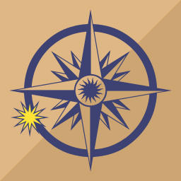
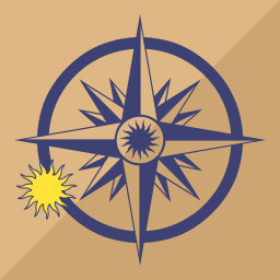
[Edit] Or you might prefer with the flaming sun...
-
@AppLee Nice. I have to admit that I can't actually see the flames on the device, but I'm just a sucker for them
And the flame version also happens to have more yellow surface pixels, so I'd go with that.I also tried the svg rose on the map now. Even the svg comes out pixelated though.
-
@AppLee I want to commit the the icon. Do you want to make a merge request yourself to make sure, your copyright is captured properly? Or shall I just add it on your behalf? If you want to MR it, just stick it into the assets folder. I can do the rest.
Hello! It looks like you're interested in this conversation, but you don't have an account yet.
Getting fed up of having to scroll through the same posts each visit? When you register for an account, you'll always come back to exactly where you were before, and choose to be notified of new replies (either via email, or push notification). You'll also be able to save bookmarks and upvote posts to show your appreciation to other community members.
With your input, this post could be even better 💗
Register Login