Clock App Survey Results
-
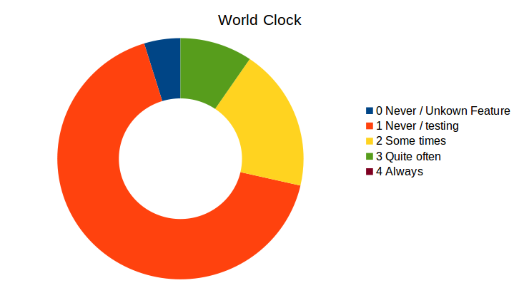
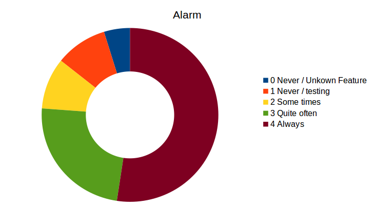
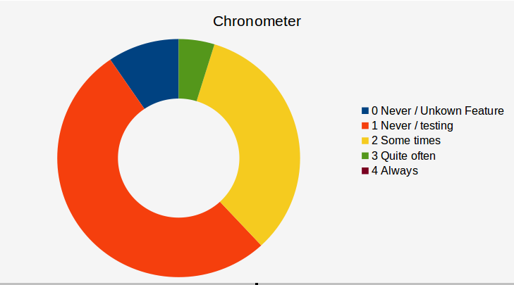
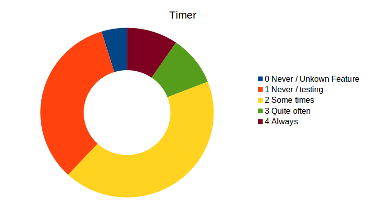
Here are some charts of the results of the survey. Think that is from a very small sample (21 users) open for about 1 week.
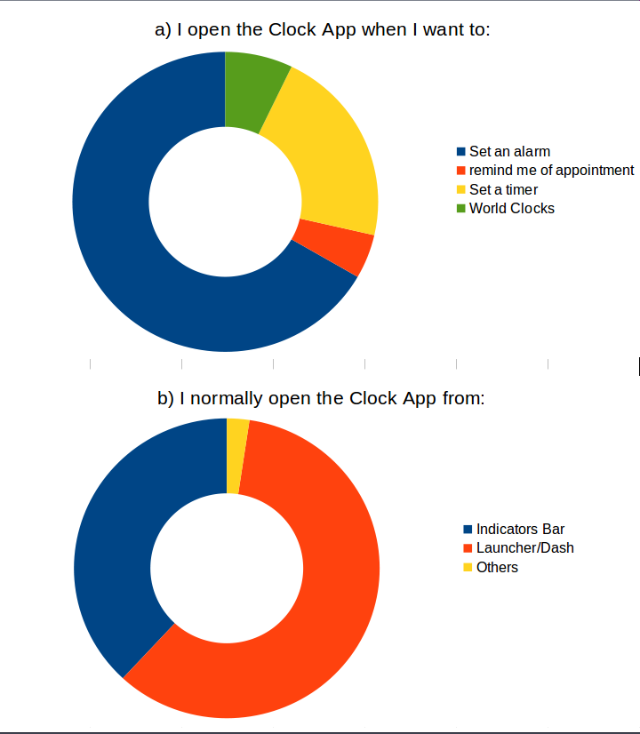
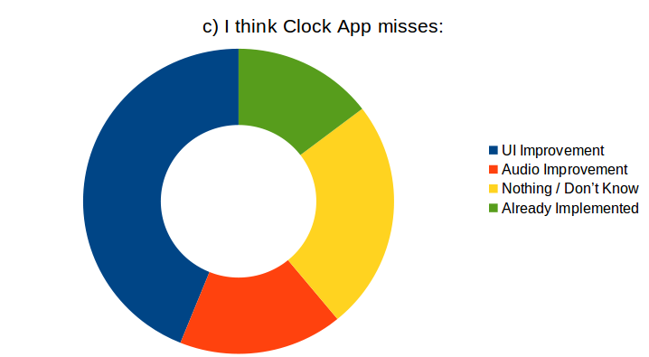
This is quite difficult to synthesize:
-
UI Improvements
- Adaptive Layout (2): Being able to rotate, Convergance
- Confusion with alarms (3)
- Problems with Picker (2)
- Multiple timers (2)
- Time zones (indicator)
-
Audio Improvements
- radio sound
- fade in (3)
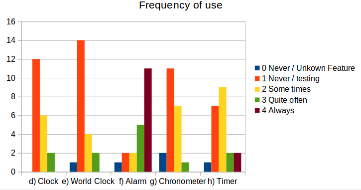
- Average of device as main drive: 28 months
-
-
If you want to check the spread sheet: https://ethercalc.org/35yelrmdeyjk
-
Isn't there a mistake in "b)" graphic?
- indicator bar
- clock app
- others
Shouldn't "clock app" be app launcher/drawer?
-
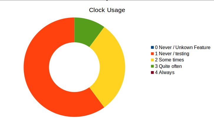
Usage per aspects:
-
Hello! It looks like you're interested in this conversation, but you don't have an account yet.
Getting fed up of having to scroll through the same posts each visit? When you register for an account, you'll always come back to exactly where you were before, and choose to be notified of new replies (either via email, or push notification). You'll also be able to save bookmarks and upvote posts to show your appreciation to other community members.
With your input, this post could be even better 💗
Register Login