dialer-app: "speed-dial" feature
-
Hi,
As you can see here , i've managed to give a try with the speed dial feature.
Now the UI is like this, do you see any improvements to be done ?:
I've tried with "large" fontSize but too large, here i use the "medium".
The list is a scrollable list from right to left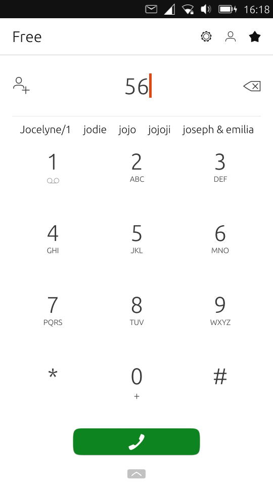
landscape may cause issue, but i'm waiting for @CiberSheep to finish its work
-
@lduboeuf said in dialer-app: "speed-dial" feature:
landscape may cause issue, but i'm waiting for @CiberSheep to finish its work
We are used to them
 I'll do the tweaks I want to do this week for the landscape.
Are you adding the space for the names or are you using the previous one (when you dial a number and suggests the user)? -
i haven't changed the height of the ContactWatcher, just anchored at the bottom of the divider
-
Ok. I have done the tweaks I wanted.
I'm waiting for the CI to finish and test it on my phone: https://github.com/ubports/dialer-app/pull/140If all goes ok, I'll take it out of draft and we should test on E4.5 and with your modification. Is that ok?
-
@CiberSheep nice, i will give a try
-
It look nice
 (i've done a little tweak to get the list space "clickable")
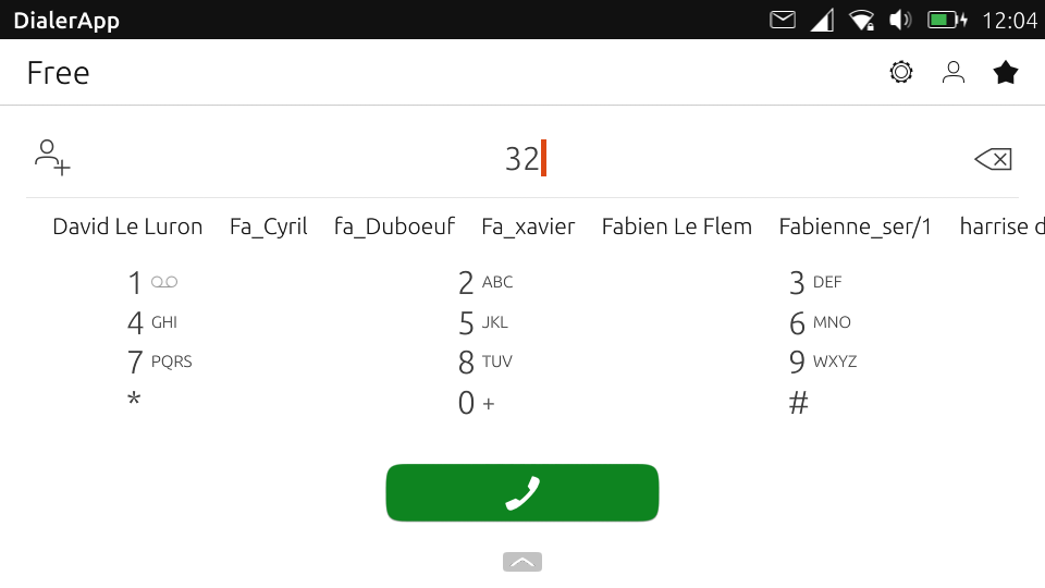
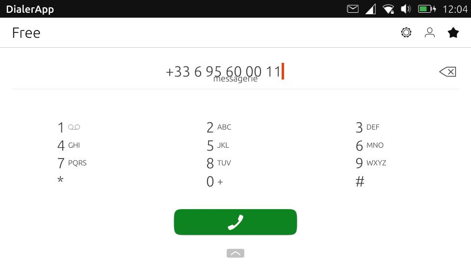
For contact guessing,It overlaps a bit, but it is due to my tweak i think:
-
@lduboeuf said in dialer-app: "speed-dial" feature:
It look nice
 (i've done a little tweak to get the list space "clickable")
Nice. I think the worst case scenario is E4.5 landscape with 2 SIMs (as it shows a Section) but the KeypabButton text should go even a bit smaller if that happens
For contact guessing,It overlaps a bit, but it is due to my tweak i think:
We could put the contact on the same space you show the ListView of contacts
-
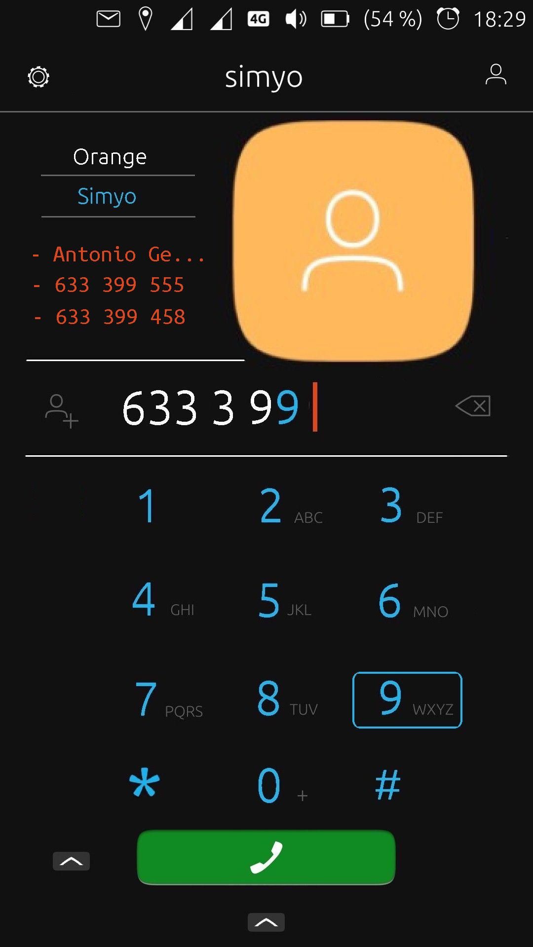
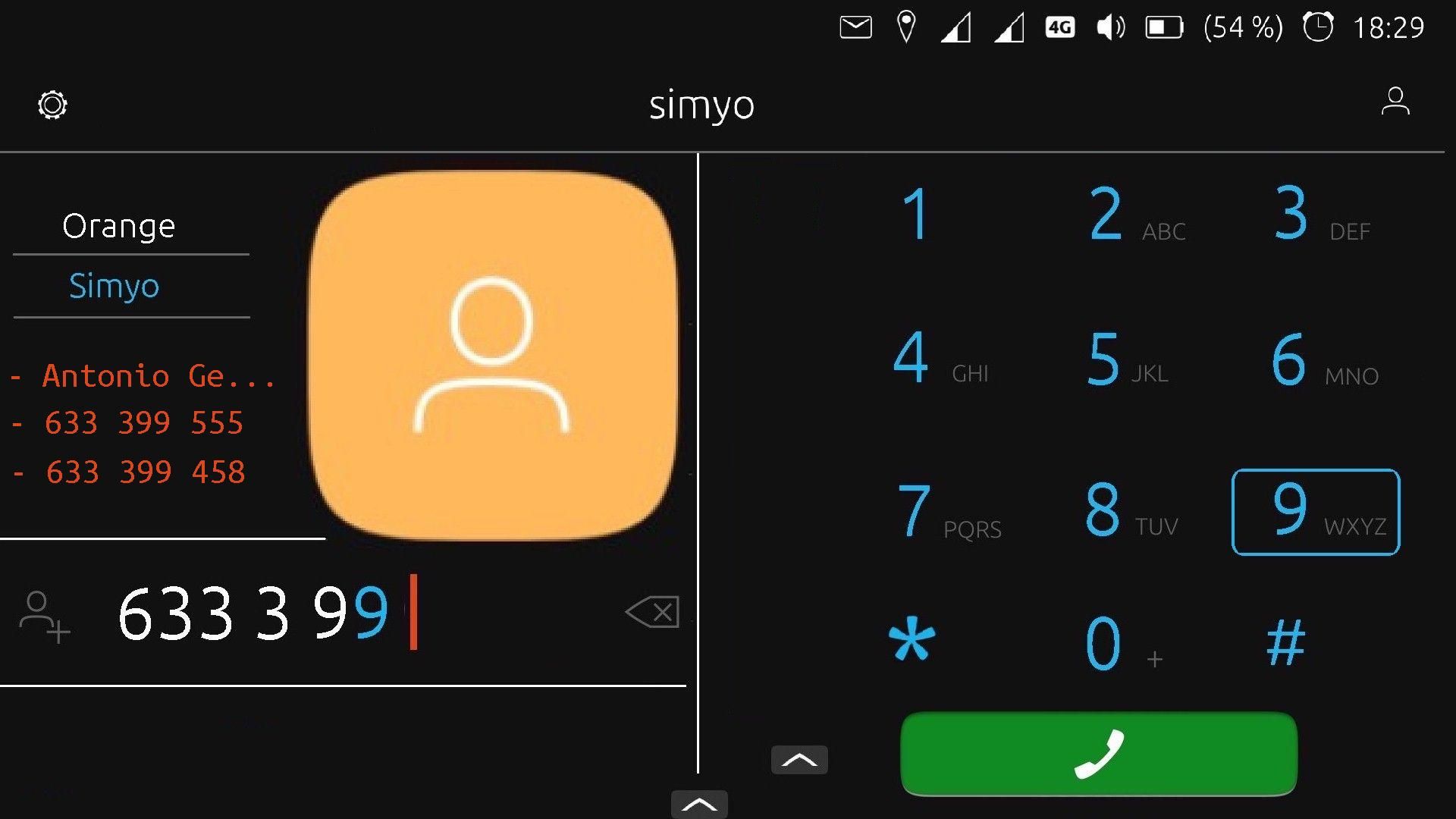
@lduboeuf I think it is not right in that position, the numbers are too close together, I think that to add the possible contacts it is better that only one or two possible numbers (contacts) appear to be added to the dialing,
Anyway, you can take a look at my idea
https://forums.ubports.com/topic/3726/phone-app-design
Regards...
-
This is my opinion, the numbers to dial are too separated, you go with your finger all over the screen to make a call, in a mobile like the Pinephone it is more difficult, if we use the keyboard they are very close together, two very different aspects
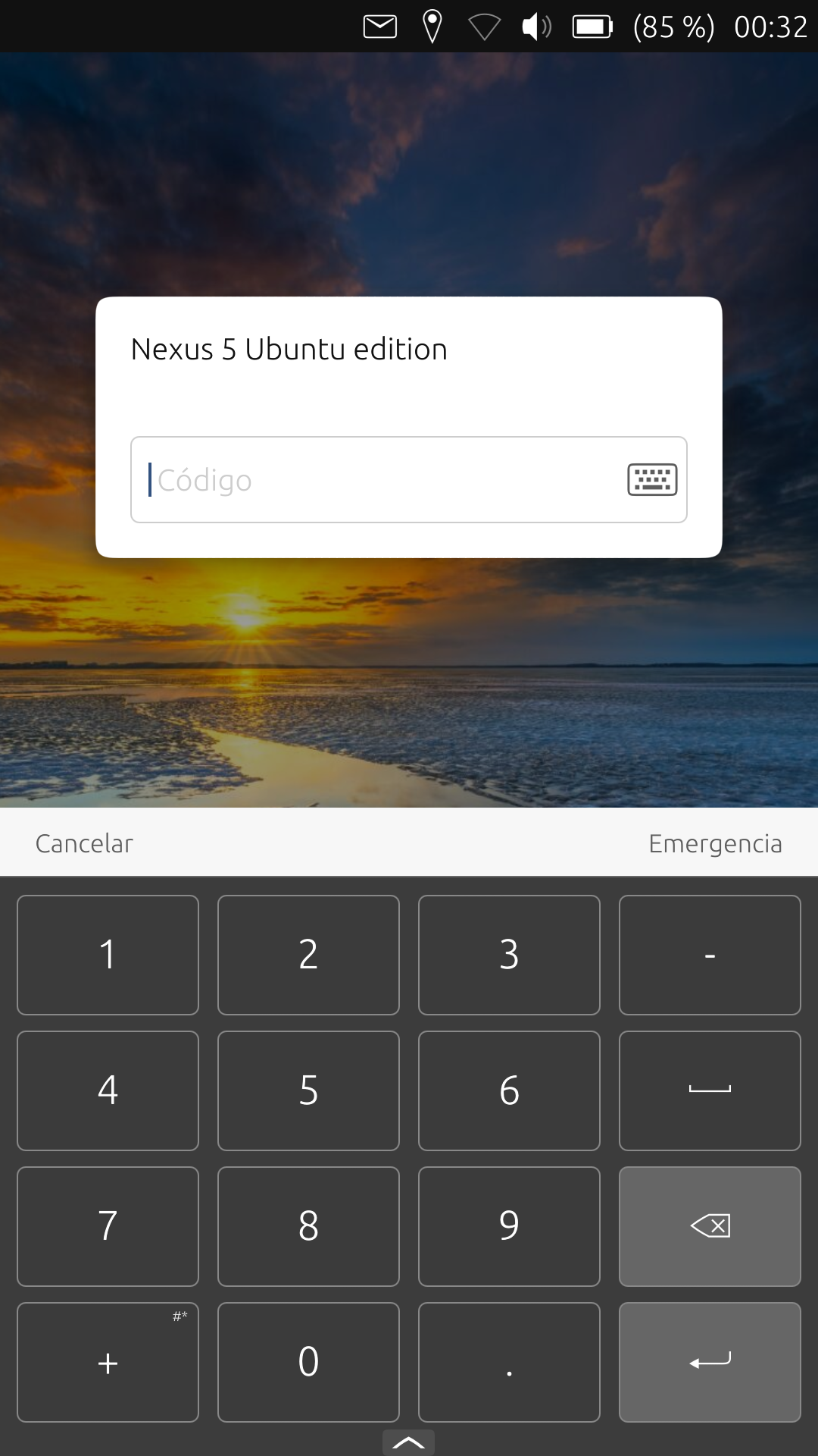
Why can't the dialer be the same size as the screen release numbers?Try this test, you will see that you can unlock your mobile phone with one hand
Regards...
-
yes this could be something to consider, for now i'm just focusing on this feature

[edit]: i mean not your new design proposal, just the contact search by dialpad feature with current design
Hello! It looks like you're interested in this conversation, but you don't have an account yet.
Getting fed up of having to scroll through the same posts each visit? When you register for an account, you'll always come back to exactly where you were before, and choose to be notified of new replies (either via email, or push notification). You'll also be able to save bookmarks and upvote posts to show your appreciation to other community members.
With your input, this post could be even better 💗
Register Login