-
Hi,
while there is no proper design subforum yet, I'd like to leave my idea for OpenStore desgin adjustments.
@sverzegnassi, this is what I thought of when I read your posts in the ticket on the clock app's github. However, in order not to talk about OpenStore in clock app's github, I'll write it here.
Idea
- Restore the header and add the "OpenStore" title to it on the home page. Collapse the search text field to the search button as it is everywhere.
- Remove search tab from the tab bar, as it is redundant - you can access searching from header.
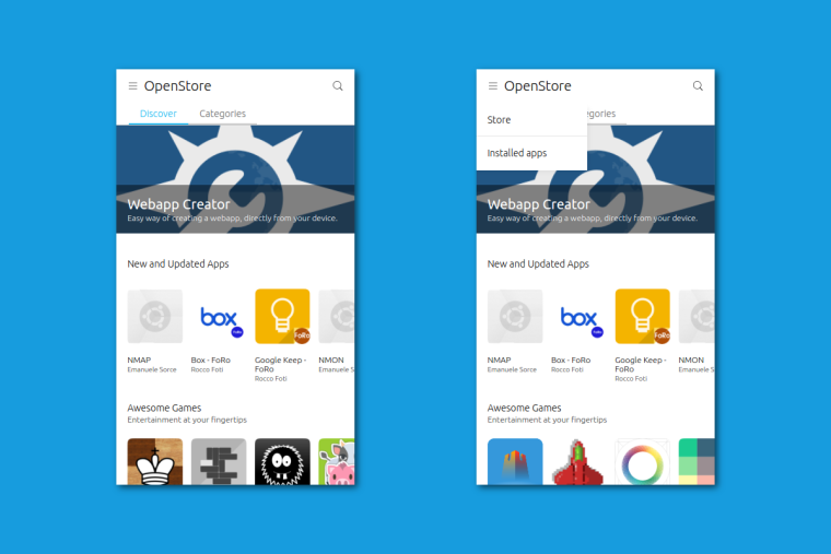
- I've looked throught the core apps to find out which use hamburger menu and discovered that only two of them use it: Music and Calendar. Both of them use them choose the way you view the content (Music - artists/albums/etc., Calendar - day/week/month views). For the store, I'd see the two options in hamburger: Store and Installed apps. If you really hate hamburgers, installed apps could be a tab as well.
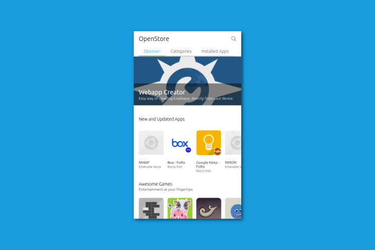
- Having two tabs (or 3) - Discover and Categories - they should be moved in my opinion to the top - and become the plain tabs looking the same as in the call history in Phone app.
I think that this solves the problem of categories' discoverability, and organizes the content logically and coherently with what Canonical defined with the rest of the core apps. What do you think about it?
-
Hey, sure! We might decide to use a "[Design]" prefix for the topic title, in the meantime.
I took some time to explore the different proposal. I have built up some screenshot, we might have interesting alternatives to the current design indeed.
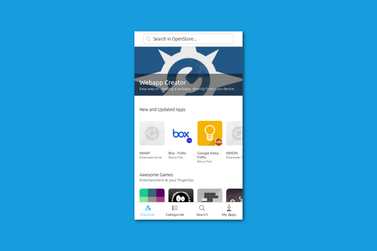
Here's the current OpenStore, as it appears on our phones.
This is your first proposal with hamburger menu. To be fair, it looks a bit strange to me to split the navigation and the installed apps in that way. But I guess you already knew that

Here's your second proposal with header sections only, as I understand it. (asking confirmation)
I wanted to push the limit a bit more further, and try some alternative solution. I came with three different proposals, but there is still some room for other permutations.
The first one is just the store as-is now, with a smaller bottom navigation, and a different style for header and highlighted app.
In the second one, I removed those carousels, and I collapsed them into ListItems. The result seems interesting (at least for me)
In the third one, I removed the bottom navigation. Search is now into the header, and the other destinations (categories and installed apps) are ListItems now.
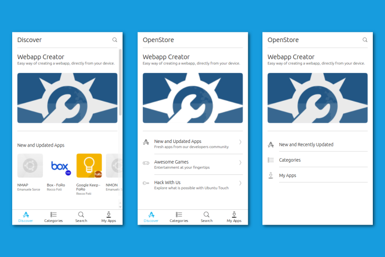
They look a bit iOS-ish, it's true. But the second one looks a bit interesting and promising. We could try to add further highlighted apps, and see if mixing my second and third proposal might eventually work
-
I think that carousels are good, as they are presenting the content right away on the homepage. It is much more attractive for users and the apps mentioned in them will be definitely more often viewed by the users. The two other versions are kinda closed and not welcoming.
It's nice that you went a bit further and suggested different concepts
 Thanks also for visualizing them!
Looking at them I still like the version with hamburger menu the most. I think that installed apps is a different context, so it is OK to put it in the different place. Two things:
- The settings icon of course remains on the header as it is currently for my proposals.
- I forgot about notifying user about updates, so here it is: updates waiting should display an additional icon in the header, so that it is accessible from both tabs on main page AND a bar above the "New and updated apps" label saying "You have X updates" and an "install" button.
Another things I've also noticed:
- I don't like the green "Run app" button on the header. It's so much out of match for me. I suggest either replacing it with plain icon header action or (better IMO) moving it beside "Uninstall" button. I think that the latter option is similar to what Google Play has (or at least had).
- The app details screen really should not slide from bottom in my opinion. This effect should only be reserved for the bottom edge panel.
And the last idea: what if we moved installed apps list to the bottom edge?
-
Hopefully You don't mind if I also add my opinions on the matter.
I like the second proposal most, the one just with the header sections.
Moving just the installed apps button on the bottom doesn't make sense, controlls for the app will be all over l, they should stay close to eachother.
Badge on installed app to show how many applications need to update.
I agree that the Uninstall / Open buttons should be next to eachother and also they should have a fixed size, leaving them long would look a bit unprofessional for my taste.
Aswell I agree that the application detail Page should not slide up from bottom edge. -
Congratulations! You get to have the first topic in our new Design category!
-
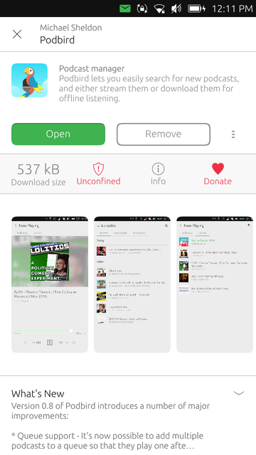
@Mitu - Yes, we're about to move the 'Open' button alongside "Remove" or "Update". I posted a screenshot a few weeks ago about a proposal for redesigning the "App Details" page (don't mind the slightly darker bg on that row, it wasn't meant to be there)
About the page scrolling from bottom, again yes. I'm going to get rid of that component, as we'll probably move the page into the regular PageStack,
-
I forgot you also posted that in my post.....https://forums.ubports.com/topic/733/some-opinions-related-to-the-latest-community-update/21
-
@sverzegnassi do you have any ETA or that design won't be released any more to the OpenStore app?
Hello! It looks like you're interested in this conversation, but you don't have an account yet.
Getting fed up of having to scroll through the same posts each visit? When you register for an account, you'll always come back to exactly where you were before, and choose to be notified of new replies (either via email, or push notification). You'll also be able to save bookmarks and upvote posts to show your appreciation to other community members.
With your input, this post could be even better 💗
Register Login