Wallet/Passes app for UT
-
@aarontheissueguy said in Wallet/Passes app for UT:
It would be great to allow importing QR and Barcodes (maby via tagger) and make it possible to create custom passes.
Oh yes, that would be very useful!
-
Thanks for your feedback!
@josele13 said in Wallet/Passes app for UT:
3 questions,
I have used an old pass and I have seen the barcode a little bit lower, is that its situation?Can you give an example? What do you mean with "seen the barcode a little bit lower"?
I have the dark theme and in settings I can't see the letters, they are black, maybe changing the colour would help?
How did you change the theme? I don't use UT regularly, so I am not so familiar with themes. So I did not take care for that in the app.
But it makes sense to support themes. I just gotta know how. Weird thing, on top, is that the line with "Updates" show the text in correct color, while the others are black. Seems likeListItemLayoutautomatically honors theming, whileTextitself does not.Gonna look into this issue and provide a fix for it.
I click on the information icon at the bottom right, to go the back of the pass, I see the information showing where I need to go.
you could place the icon in a more visible place? I think the icon would be better outside the pass area, that icon would only appear when you are inside 1 pass, I show you an example...Well, this button only makes sense for a given card, in the first place, since it will open the details of this very card. It would not make sense outside of a card, since you would have to pick the desired card anyway.
In your case, having only 1 card, I admit that selecting the card first before the
iis visible appears cumbersome. But once there is more than one card, you would not see theiof covered cards anyway.Its pretty much the behaviour of iOS wallet (some versions ago, before they changed the layout). So my desired usage pattern here is that you have to pick a card first, then you get all the options for that card (
i, delete, export, ...). -
@aarontheissueguy said in Wallet/Passes app for UT:
@s710 Great work! We really needed something like this. It would be great to allow importing QR and Barcodes (maby via tagger) and make it possible to create custom passes.
A corresponding issue was opened on github:
https://github.com/patrickjane/ut-passes/issues/5I'm going to check this and maybe put it into the app in case there was a feasible solution. Have not yet heard of this, so I need to check this out first.
-
@s710 The dark theme is changed from Ut tweak tools,
there are two usable, light theme.....Ambiance and dark theme...Suru dark
it's weird to see that the top has changed the letters and the others are black,
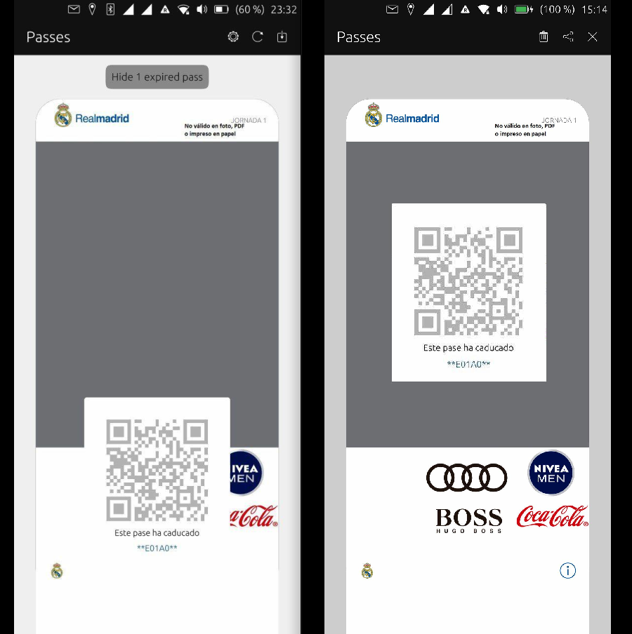
at least if you don't change the icon place, make it more visible, enlarging it or change its colour with respect to the card.The image on the left is how the barcode is placed, on the right you can see it inside the grey area.
Regards...
-
@josele13 said in Wallet/Passes app for UT:
@s710 The dark theme is changed from Ut tweak tools,
there are two usable, light theme.....Ambiance and dark theme...Suru darkOkay thanks, I will investigate it.
The image on the left is how the barcode is placed, on the right you can see it inside the grey area.
So you mean that when opening the app, the barcode is placed like on the first picture, and when you tap the card, it is displayed like on the right picture?
That should indeed not be the case. I think it might have something to do with the missing text content. In my test passes, I did not have any pass without text, so I didn't test it. Gonna try it out and make a fix for it. -
@s710 I see that the barcode should go up a bit, on your passes I see space at the top of the barcode, but it shouldn't cover any advertising or messages on the pass.
Regards...

-
@s710 said in Wallet/Passes app for UT:
@josele13 said in Wallet/Passes app for UT:
@s710 The dark theme is changed from Ut tweak tools,
there are two usable, light theme.....Ambiance and dark theme...Suru darkOkay thanks, I will investigate it.
The image on the left is how the barcode is placed, on the right you can see it inside the grey area.
So you mean that when opening the app, the barcode is placed like on the first picture, and when you tap the card, it is displayed like on the right picture?
That should indeed not be the case. I think it might have something to do with the missing text content. In my test passes, I did not have any pass without text, so I didn't test it. Gonna try it out and make a fix for it.Hey, I don't want to sound offending, but it is really confusing to find errors when you post screenshots which you have edited
 I can't get an idea what actually is, and what it should be like
Currently, the barcode is always attached to the bottom of the card. The reason for this is simple: I can't attach it to the end of the text in the upper area, since the text above is contained in an area which is of different dimensions, depending on device dimensions and pass text contents.
So, with all the different combinations of device dimensions, possible pass contents (with text, no text, a lot of text, few text, ...), it will be hard to find a generic, self-positioning layout which works for all passes.Could you maybe send me the .pkpass file (to mg.m@gmx.net), so I can take a look at it on my side? It seems like this very pass (and its background image) was designed in a way which expects a certain way of barcode positioning, which was maybe not the best idea, or, in other words, does not exactly help in designing a flexible/generic app for display.
Meanwhile I have solved the color issues with dark themes. I will provide an update soon.
-
@s710 Sorry if I have not explained well, if you are making a generic template is important not to cover the information, I thought that the same pkpass file told you the location to put the barcode, not being so forces you to adjust it manually, now I send you the pkpass file, and a link in github if you can take advantage of something.
-
@josele13 said in Wallet/Passes app for UT:
@s710 Sorry if I have not explained well, if you are making a generic template is important not to cover the information, I thought that the same pkpass file told you the location to put the barcode, not being so forces you to adjust it manually, now I send you the pkpass file, and a link in github if you can take advantage of something.
No, there is no information about the barcode position inside the pkpass file. And for your case, also I think that no "important information" is covered, since it's really just a background image.
Your pass looks pretty different within iOS wallet, so I need to check whats missing here. I will provide a fix with the next update, which also includes the theme support.
-
@josele13 said in Wallet/Passes app for UT:
@s710 Sorry if I have not explained well, if you are making a generic template is important not to cover the information, I thought that the same pkpass file told you the location to put the barcode, not being so forces you to adjust it manually, now I send you the pkpass file, and a link in github if you can take advantage of something.
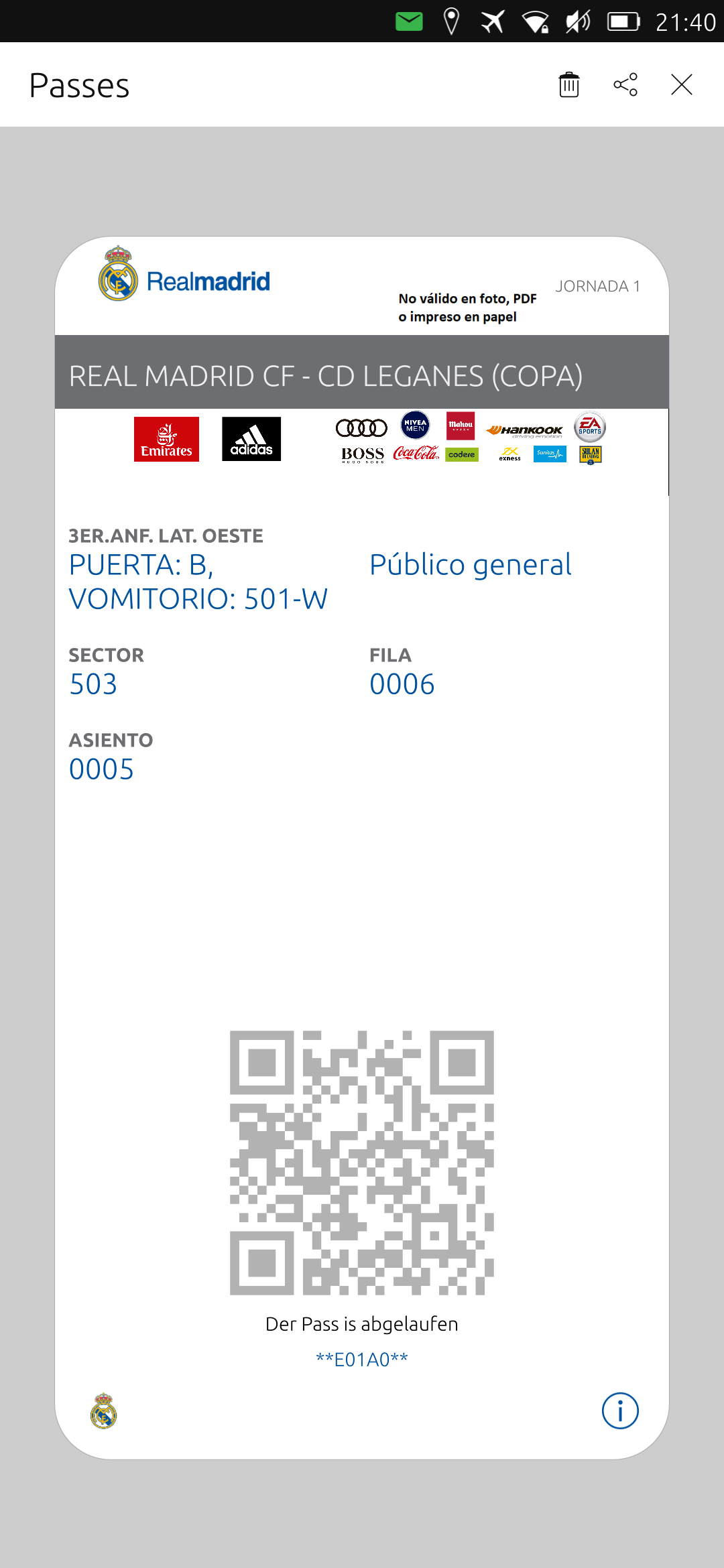
I have just published an update which should solve the displaying issues. The root cause was that your pass contained a strip image with a height of 334px, while, according to the layout guidelines, it should be only 98px in height.
I have added calculations to correctly crop and center the image on the top, so now it looks like in the iOS wallet.In addition, I have added code to guess font colors in case the strip image is dark & the passes text color is also dark (which was the case for your pass). In this case, a brighter font color is used.
As far I can see it didn't break any of my test passes, so I think its fine. I have also resolved the dark theme color issues in the settings page, along with a logo placement issues on the settings page.
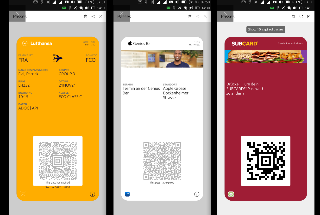
It should now look somewhat like this:

-
@s710 Lol, it looks very good the pass, you have solved it with good ideas, you have done a great job, thank you very much
Hello! It looks like you're interested in this conversation, but you don't have an account yet.
Getting fed up of having to scroll through the same posts each visit? When you register for an account, you'll always come back to exactly where you were before, and choose to be notified of new replies (either via email, or push notification). You'll also be able to save bookmarks and upvote posts to show your appreciation to other community members.
With your input, this post could be even better 💗
Register Login