tedit development and design discussion
-
@danfro Tested last built. That's great for me.
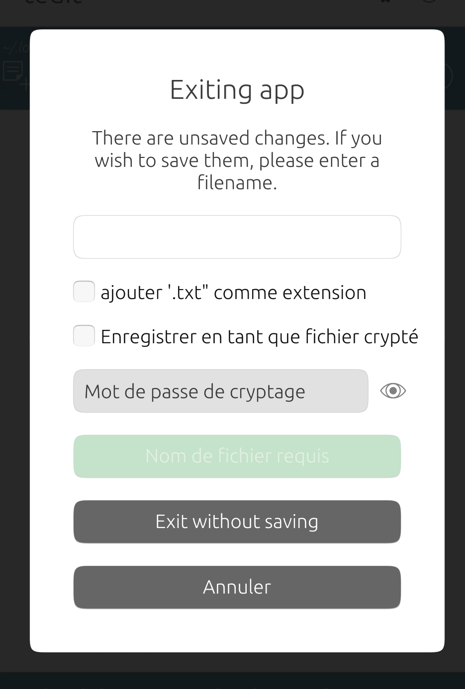
But, since 'save as' output is still active, perhaps a more appropriate title would be 'exit choice'? -
@danfro said in tedit development and design discussion:
My only idea would be to constantly keep reading a copy and comparing that. But I don't think that would be good for performance and very reliable. So I am afraid there is not much I can do about it.
Pardon my intrusion.
Just a suggestion. You don't need to keep the whole text. You can make and store just a hash of the original text (before edited) and compare to a hash of current text (edited) at exit (to see if save is needed).
jEzEk
-
@danfro The copy all function seems to work from the horizontal options line, but not the paste function: I get a white screen after paste.
-
@domubpkm Fixed now. Forgot to delete one line. Thanks.
-
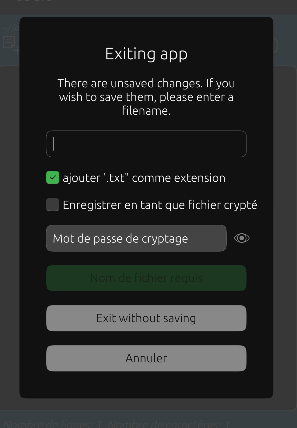
@domubpkm I rephrased the dialog a bit. Should be better now.
-
@jezek I never used hashes to compare anything, but sounds like a good idea. Thanks for the suggestion. Although this may need to wait for a future version too.
-
@danfro Another suggestion (personal opinion) for a future update: the order of the options icons, whether in the vertical main menu or the horizontal menu, could be revised. I read from left to right and top to bottom.
On this principle: I will put this order: for the icons mentioned: select all, copy, paste, empty the area, empty the clipboard.. -
@domubpkm So far I kept the exiting order from the menu to the toolbar.
The order in the menu seems to make sense to me. First file actions (new, open, save, save as), then text area actions (undo, redo, select all, clear all), followed by clipboard actions (paste, copy, clear) and at the end special actions. But of course that is grouped by kind of internal functionality. This may not be obvious to the user.Your suggested order would mix clipboard and text area options, but I can see some pattern from a users point of view. Maybe we can get some more opinions here from other users. The change is easily done...
-
@domubpkm I decided to do the button reordering. I also moved the exit button to the right top corner. That is where most other (desktop) apps have the close X button. And I fixed the colors of the icons on bad contrast as reported above. It would be great if you could please give the last build another test. If things work fine, I would consider this ready to be released.
-
@danfro Great work. Reordering the icons makes sense from the user's point of view. The contrast is perfect. Overall, a great update. THANK YOU !

-
@domubpkm Thank you for all testing and suggestions.
I am not going to work on file filtering or such for this release. But this is on my todo list near the top. I hope it proofs not to be too difficult.
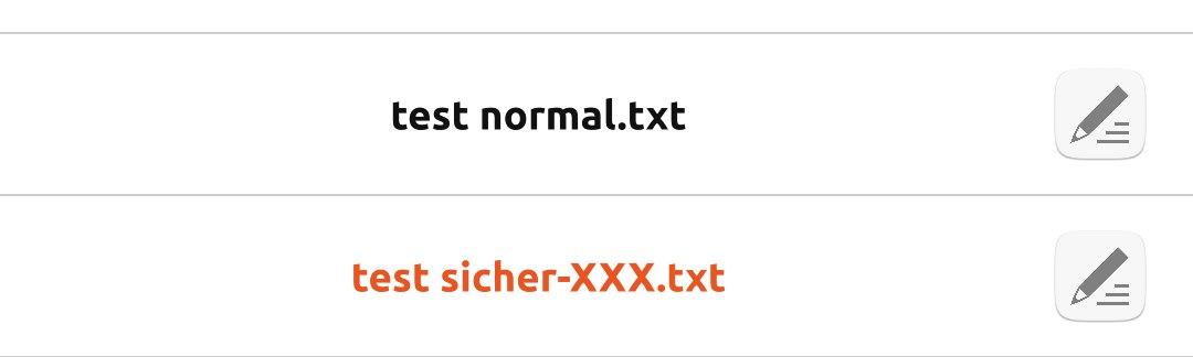
But I think about sneaking one small change into this release to hopefully make finding a file a bit easier. What do you think about having encrypted file names being colored different? I can imagine, this helps to visually filter files when you are looking for an encrypted file only.
I can make them colored orange for instance. I would not use blue, red or green. The mean "activity", "positive" or "negative" in our UI guidelines.
EDIT: There would be a switch in settings to turn the highlight off/on (default is on).
-
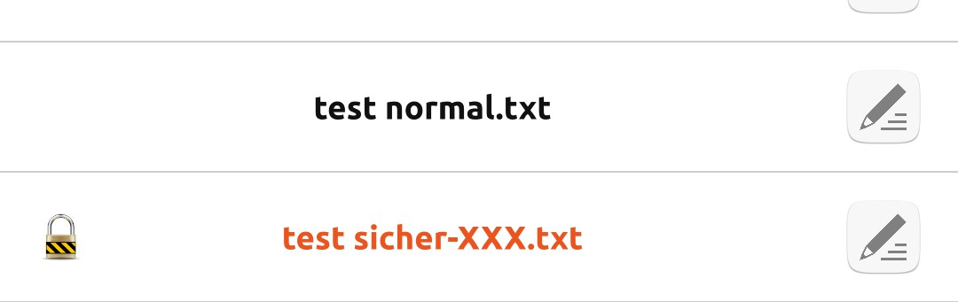
@danfro Or another idea (yeah, it never stops
") ), it might be more consistent to show the padlock icon for encrypted files. This can be of course combined with the (optional, setting) file name color.
), it might be more consistent to show the padlock icon for encrypted files. This can be of course combined with the (optional, setting) file name color.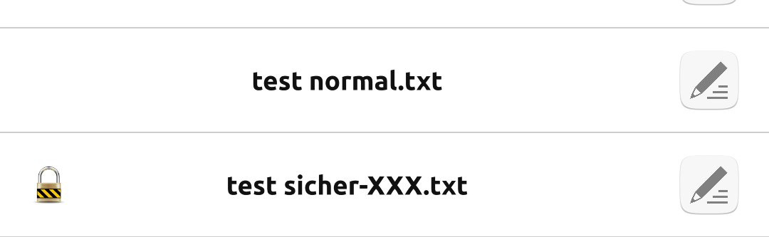
-
@danfro Good idea to put the encrypted notes in another color. this will help a little. For the color to respect, why not orange in fact, or a purple which makes a slightly less significant contrast. Your idea of giving encrypted files a different color makes me think that in the future, encrypted and unencrypted files could, if desired, be grouped into two groups.
-
@domubpkm I actually had the idea of providing filters for encrypted/not encrypted. But not sure if that will work with searching. Yes, maybe grouping is another options that I can consider.
-
@domubpkm said in tedit development and design discussion:
or a purple
I thought about purple too. But there we would need two purples to provide good contrast in dark and bright theme. Orange works for both.
From first tests, purple looks actually better than orange in dark theme, but not good in bright theme.
 I could provide a setting with no color/orange/purple of course. But not sure if I get that ready for this release.
 -
@danfro Actually purple does look better than orange. I just need to find the right purple or purples. No orange I think...
-
@danfro Another idea that could help in the search: the possibility of favorite files.
-
@domubpkm Yes, true. Not sure how easy that can be done. But I add it to my ideas list. Once I start working on that, its good to have several options to test.
-
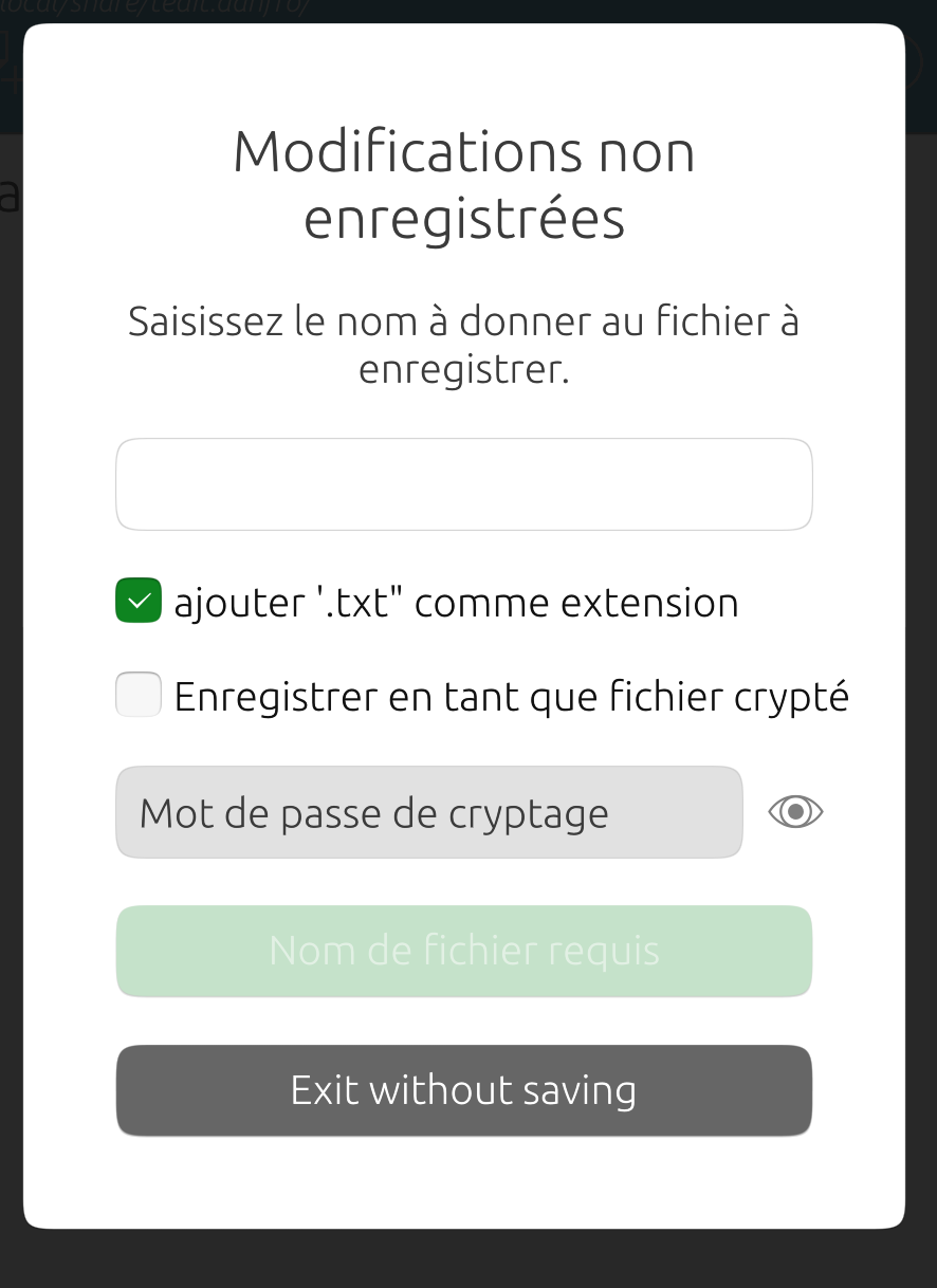
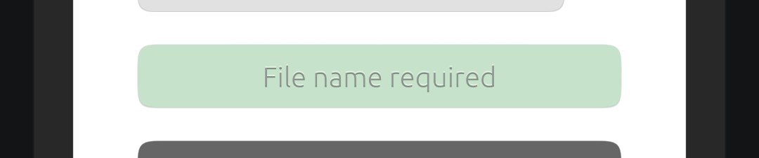
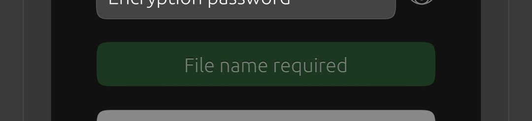
@danfro artifact #1261354733 . low readability for 'required file name'. Otherwise everything seems ok to me.
-
@domubpkm Thanks for mentioning this. Although I saw it myself, I didn't look into it yet.
Although this really needs to be fixed in the toolkit itself since it should affect all buttons system wide, I tested an workaround which I think brings some improvement here. Not perfect, but not too much hacking involved.
Hello! It looks like you're interested in this conversation, but you don't have an account yet.
Getting fed up of having to scroll through the same posts each visit? When you register for an account, you'll always come back to exactly where you were before, and choose to be notified of new replies (either via email, or push notification). You'll also be able to save bookmarks and upvote posts to show your appreciation to other community members.
With your input, this post could be even better 💗
Register Login