UI / UX discussion
-
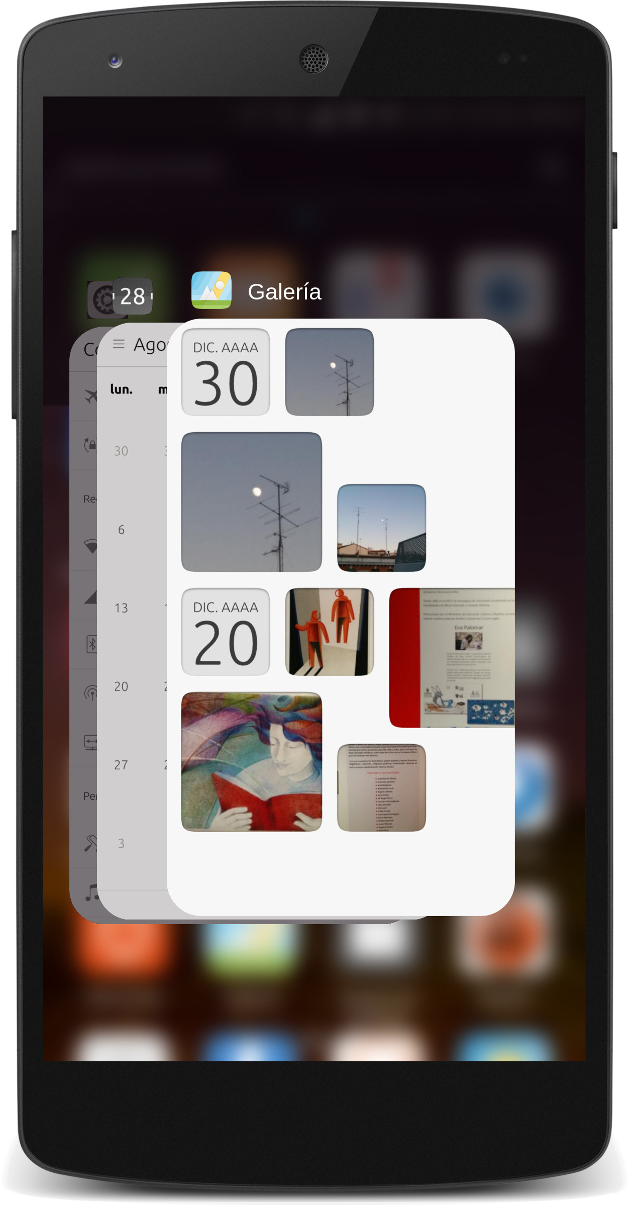
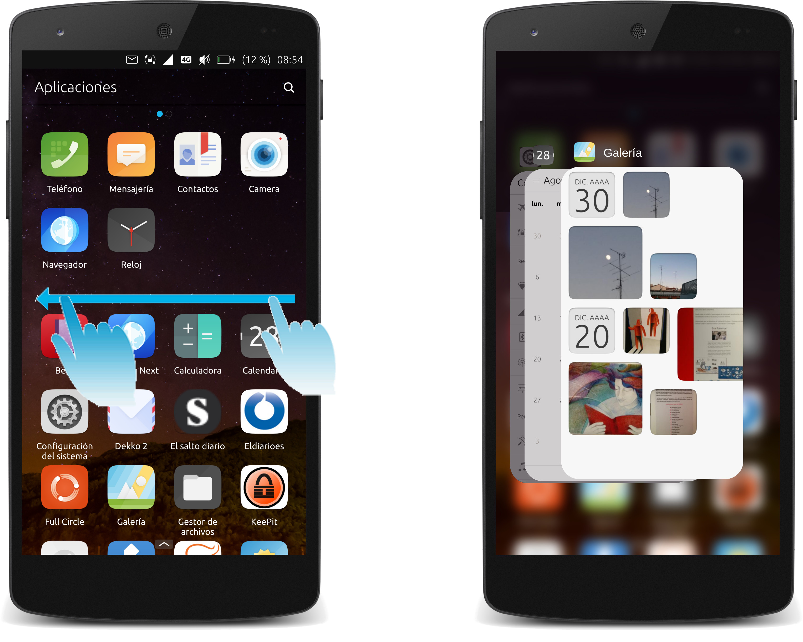
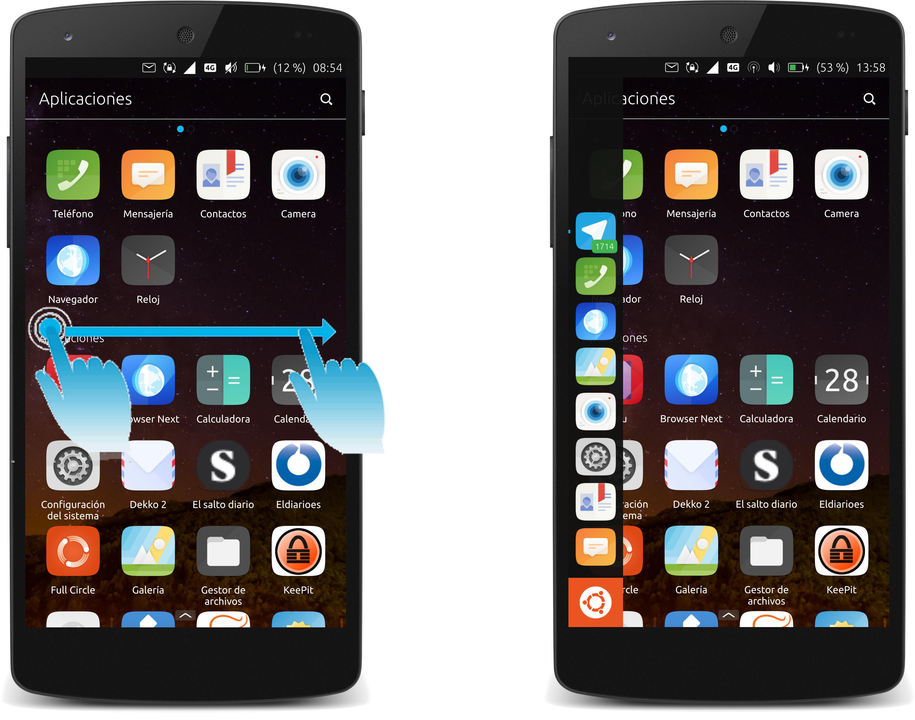
@gb c) Home scope can also be reached with a "long-drag" from left to right. (The "short-drag" from left to right opens app launcher only)
-
@gb
I was thinking about my m10 fhd for landscape.
and actually looking at your post on a pro5.
It looks great.
Nice to have ideas like this coming in. -
@gb the app launcher is not easy to reach for right handed users. So I most use the apps overview und search the scopes app.
For left handed users its the opposite I think. For them its hard to reach the apps overview. So I would say its important that Ubuntu Touch gets a left-handed-mode which switches the actions on the edges. -
This could work nicely and symetrically:
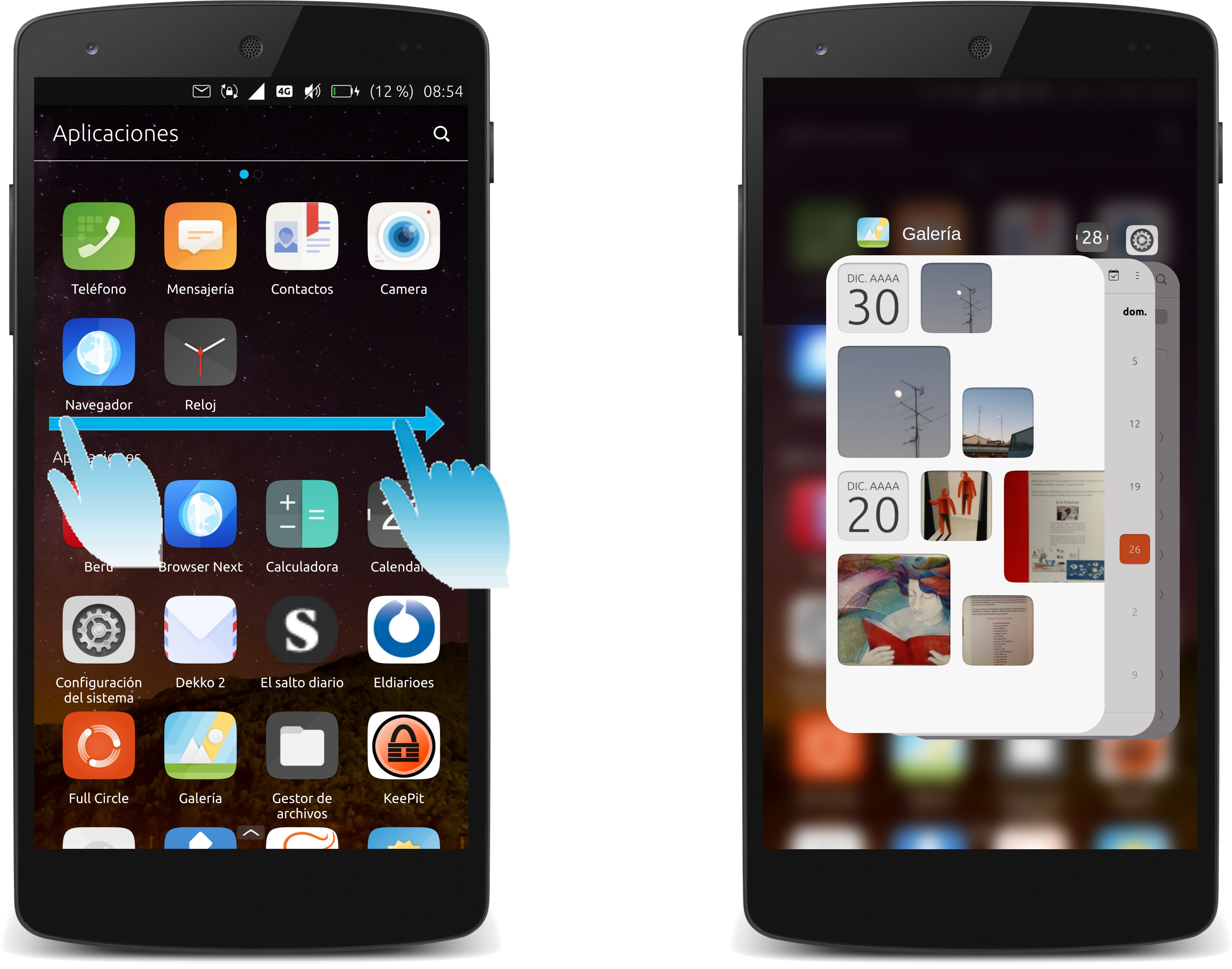
- Let the short-swipes (left and right) flip between apps AND open the app launcher (on left or right side), IF the short-swipe was made say in the upper or lower part of the display (near the corners).
This would provide the app launcher for both hands.
-
Long-drag from left could also open the app-switcher, like on the right for symmetry (as in the original proposal), and...
the short-drag from the top could open the home scope (or home menu / drawer) instead, while long-drag opens the tray menu. (The bottom edge remains app-specific.)
-
Some issues here:
-
The dash (scopes) is an app, but is special cased and should always appear at the bottom of the stack.
-
The dash is not like traditional home screens on phones. It is not a part of the background, but as noted above, is an app.
-
Scopes are going away in the future, and apps scope is replaced by app drawer.
-
Short swipe from left edge opens the launcher, while long swipe returns to the dash (or will open app drawer when dash is replaced).
-
Long press and then drag is not suitable for the design of UT, and would require breaking apps to be able to do this while an app is focused. I don't think we can do this (and it doesn't make sense, when short swipe from edge already opens the launcher panel).
-
As above, short swipe from left edge opens launcher panel. I don't think we should replace that with quick app switching in reverse. I don't have any special qualms about cycling through apps with short swipe from right, rather than just switching between last 2 apps, but the right edge swipes are designed to work more like the "apps" button on Android phones, where double tap switches between last two apps, and one tap opens the app switcher; here having short swipe mimic double tap, and long swipe for single tap.
-
-
@krille I think this is more an issue with phone sizes having gotten a bit out of hand (good pun that). This is not an issue on reasonably sized phones, that are 4.5-5.0" screens, but on 5.5-6.2" screens any interface becomes difficult to use with one hand.
Remember the Ubuntu Edge design was I think a 4.6" screen.
-
@dobey is right on the money here, introducing changing apps from the left to right, will make the ui more difficult to navigate, and make it VERY difficult, to open apps.
You can't tap the background to get to apps, you have to swipe from the left.
We aren't keeping scopes, what will replace them is uncertain, but launching apps is done by the app draw not the app scope in the near future.
-
@phoenixlandpirat said in UI / UX discussion:
We aren't keeping scopes, what will replace them is uncertain, but launching apps is done by the app draw not the app scope in the near future.
Even as a stopgap solution I think it will be insufficient to only have the drawer. It doesnt scale beyond a handful of icons
-
@gb What would be your take the ideas to make the user interface even more symetric?
- opening the app launcher when flipping left/right, if flipping near the upper and lower corners.)
I second, I have not thought about it before seeing your improvement draft above, but now I notice that what I do not like so much with the current ubuntu touch is that getting to the home screen (scope, drawer, whatever) is not a fast gesture. The quickest is currently the long-drag from the left. The long-press as you suggested would not be fast either, and does not seem to be technically possible.
Therefore, I think it might be a cool, fast way to
- quick-swipe from the top to open the "home menu".
And thus allow to make the interface completly symetric, no matter if holding the device in the left or right hand.
-
@doniks said in UI / UX discussion:
Even as a stopgap solution I think it will be insufficient to only have the drawer. It doesnt scale beyond a handful of icons
It should be fine. The app drawer has search, scrolling, etc… and can be extended to have other views if necessary.
-
@phoenixlandpirat I realize that they are somewhat out of fashion and rather neglected, but I still think scopes have the potential to offer more than an app. They could be a real differentiator for UT.
-
@3arn0wl said in UI / UX discussion:
@phoenixlandpirat I realize that they are somewhat out of fashion and rather neglected, but I still think scopes have the potential to offer more than an app. They could be a real differentiator for UT.
The entire point of scopes was they offered less than apps, and were easier to develop. Continually adding features to make them more like apps was the result, and they were never enough of a difference to make UT unique through their existence.
The back-end and core ideal of what scopes are might be salvageable in the future, but as scopes exist today, they just need to go. They are not essential, overly complex, and increase the maintenance burden.
-
@dobey I thought the idea of scopes was to pool information from varying sources, thus saving the user the trouble of delving into multiple apps to get the stuff they need. I gather they weren't as easy to develop as was hoped, and perhaps that's what did for them. Maybe they'll enjoy a renaissance one day, if we decide what we want from them.
-
@3arn0wl The idea of scopes was having a quick way to "consume" data (but not having any interactive components). Aggregator scopes came later, and they are meant to aggregate similar types of data for consumption, like the Today or Nearby scopes.
But as soon as you wanted to do anything with the data, you had to go to an app. Scopes are basically search plug-ins, and the UI did not represent that aspect well enough. If we did the same thing as Apple does with Quicksilver (or whatever it's called now) on iOS, they'd be great.
-
@dobey If I recall correctly, this is one of those instances where Apple noticed a good idea from the Open Source world.
-
@dobey said in UI / UX discussion:
3)... and apps scope is replaced by app drawer.
Is this the official plan? Can I see that on the roadmap? I always felt the app launcher and the app scope to be a bit redundant, but I'm tending to use the app scope instead of the launcher...
@dobey said in UI / UX discussion:
It should be fine. The app drawer has search, scrolling, etc… and can be extended to have other views if necessary.
I've seen the app drawer on the desktop but I didn't notice the view I think, perhaps that would be an option... But I really cannot imagine launching/searching apps by typing their names to be a nice and comfortable ux on touch devices. If we really remove the app scope, then lets make the app launcher multicolumn and extend it over the whole screen...
-
@hummlbach said in UI / UX discussion:
Is this the official plan? Can I see that on the roadmap? I always felt the app launcher and the app scope to be a bit redundant, but I'm tending to use the app scope instead of the launcher...
It was the plan before Canonical dropped development of Unity8 and the phone. All of the code to get the app drawer feature complete was not finished before that point though, so there is still some work to do. And yes, it is still the plan as I understand, given the plan is to get rid of the dash and scopes when the app drawer get shipped.
@hummlbach said in UI / UX discussion:
I've seen the app drawer on the desktop but I didn't notice the view I think, perhaps that would be an option... But I really cannot imagine launching/searching apps by typing their names to be a nice and comfortable ux on touch devices. If we really remove the app scope, then lets make the app launcher multicolumn and extend it over the whole screen...
Nobody says you must type to find apps. Just like I don't have to type to find apps on my Android phone when I open the whole apps listing. There are sorting options (only alphabetical at the moment though I think, in the app drawer, as the necessary APIs for most frequent/recent/etc… were never finished), you can simply scroll the view up and down the same as you can now in apps scope, or you can enter a search in the text field.
Yes there are still some bugs and features which need worked out, but overall it is a far better experience than the scopes method.
-
What concerns me is that you have one row per letter in the app drawer (right?), which will make the screen filled sparse with app icons, so that you'll have to scroll much more than now!?!
-
@hummlbach said in UI / UX discussion:
What concerns me is that you have one row per letter in the app drawer (right?), which will make the screen filled sparse with app icons, so that you'll have to scroll much more than now!?!
Empty letters get collapsed, so not necessarily.
But also, there's nothing that says we can't change it to not have the grouping by first letter. The code is out there.
Hello! It looks like you're interested in this conversation, but you don't have an account yet.
Getting fed up of having to scroll through the same posts each visit? When you register for an account, you'll always come back to exactly where you were before, and choose to be notified of new replies (either via email, or push notification). You'll also be able to save bookmarks and upvote posts to show your appreciation to other community members.
With your input, this post could be even better 💗
Register Login


