UBports Robot Logo UBports Forum
    • Categories
    • Recent
    • Tags
    • Popular
    • Users
    • Groups
    • Search
    • Register
    • Login

    Send Some: File Manager Icon Set Love

    Scheduled Pinned Locked Moved Design
    mockupsfilemanagerdesign
    34 Posts 7 Posters 7.9k Views 1 Watching
    Loading More Posts
    • Oldest to Newest
    • Newest to Oldest
    • Most Votes
      Reply
      • Reply as topic
      Log in to reply
      This topic has been deleted. Only users with topic management privileges can see it.
      • ? Offline
        A Former User @CiberSheep
        last edited by

        @elastic - so far as I know, this is just an exercise in lateral thinking... so I'm just offering an alternative solution. I hadn't particularly considered its merits...

        @cibersheep -
        0) I guess there would need to be a search box at the top...

        1. Holding down a blob (file) would offer the options to move/copy/delete etc (as with the right-click options of Ubuntu desktop)
        1 Reply Last reply Reply Quote 0
        • mateo_saltaM Offline
          mateo_salta
          last edited by

          I rather like the filemanager, but would like to see it move away from the old humanity icon set, and even the orange folder theme. I like the more modern style that sam hewitt https://snwh.org/suru has made, although for the purposes of ubuntu touch we could modify the color away from orange. 0_1541369845862_Screenshot_2018-11-04_16-13-51.png

          0_1541370202996_Screenshot_2018-11-04_16-23-03.png

          ? C 2 Replies Last reply Reply Quote 3
          • ? Offline
            A Former User @mateo_salta
            last edited by

            @mateo_salta the photo file & app file icon Because the color is too light or too bright, will not see the folder icon

            1 Reply Last reply Reply Quote 0
            • mateo_saltaM Offline
              mateo_salta
              last edited by

              0_1541385467506_Screenshot_2018-11-04_20-37-09.png Cool, I played with the intensity so it didn't wash out the icon

              ? CiberSheepC 2 Replies Last reply Reply Quote 3
              • ? Offline
                A Former User @mateo_salta
                last edited by

                @mateo_salta Yes like this( '今'd

                1 Reply Last reply Reply Quote 0
                • C Offline
                  chdslv @mateo_salta
                  last edited by

                  @mateo_salta Lovely!!!

                  1 Reply Last reply Reply Quote 0
                  • CiberSheepC Offline
                    CiberSheep @mateo_salta
                    last edited by

                    @mateo_salta The new light colours are better πŸ™‚

                    Another planet, another time, another universe!

                    1 Reply Last reply Reply Quote 0
                    • CiberSheepC Offline
                      CiberSheep
                      last edited by

                      Aaaand the time is up.
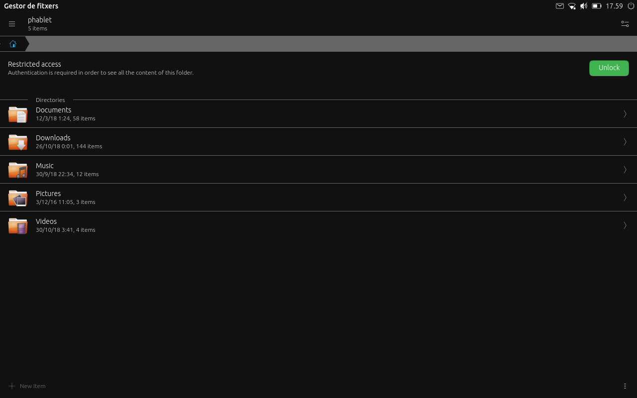
                      Thank you all indeed for joining this first experiment.

                      @3arn0wl I see your proposal as interesting but maybe in the information side. Maybe System-Settings > About > Storage
                      i could work there.

                      @mateo_salta I think the way to go with the icon set is feeding from upstream Suru project. You gave here a little twist with the colors. Conservative but effective πŸ™‚

                      Follow up next: The Content Hub

                      Another planet, another time, another universe!

                      mymikeM 1 Reply Last reply Reply Quote 0
                      • mymikeM Offline
                        mymike @CiberSheep
                        last edited by

                        @cibersheep sorry I'm late :*(, I'll upload my work this afternoon but it's quite similar to @mateo_salta 's one

                        1 Reply Last reply Reply Quote 1
                        • mymikeM Offline
                          mymike
                          last edited by

                          0_1541631451060_33e8b9bf-9509-4d17-a2e7-04607f26194f-immagine.png
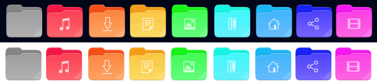
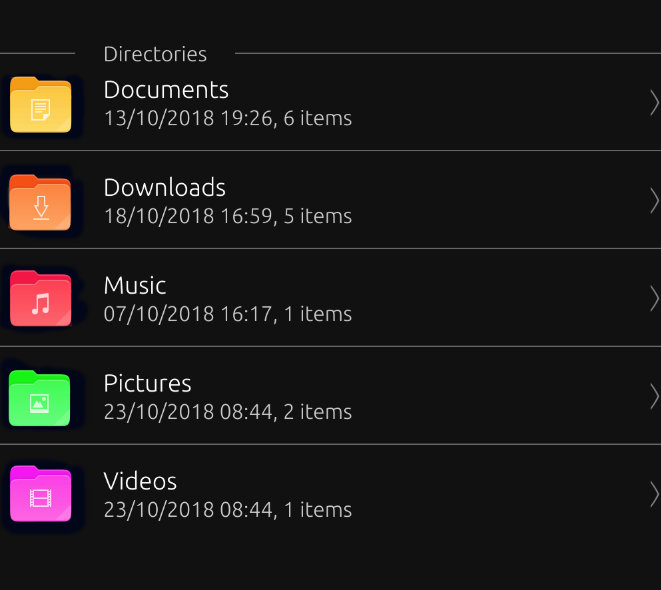
                          here is it! I took quite everything from suru-icon-theme. the video image could be not visible with SuruDark, but this was the color from video mimetype. in the music and models/templates I experimented a bit more with gradients making the back part of the folder more different from the near front part, a bit of contrast in addition...

                          mymikeM CiberSheepC 2 Replies Last reply Reply Quote 4
                          • mymikeM Offline
                            mymike @mymike
                            last edited by

                            @mymike also I'm not very sure about the right and bottom folds, not originally present in the folder icon, but took from mimrtypes

                            1 Reply Last reply Reply Quote 0
                            • CiberSheepC Offline
                              CiberSheep @mymike
                              last edited by

                              @mymike Very nice (you're late) I like the colors but not the folds. Good job (even you're late πŸ˜„ πŸ˜„ :D)

                              Another planet, another time, another universe!

                              ? 1 Reply Last reply Reply Quote 1
                              • ? Offline
                                A Former User @CiberSheep
                                last edited by A Former User

                                @cibersheep
                                This is even later - well! you can't expect creatives to keep to deadlines! πŸ˜›

                                A couple of ideas for a new desktop icon based on Suru:

                                0_1544090029800_files.png

                                0_1544090043300_files 2.png

                                And the suggestion that the app just be called "Files", rather than the more cumbersome "File Manager".

                                Also, I was wondering where the images came from on the documents themselves? And whether there were alternatives? The videos one is very orange...

                                CiberSheepC 1 Reply Last reply Reply Quote 1
                                • CiberSheepC Offline
                                  CiberSheep @Guest
                                  last edited by

                                  @3arn0wl Ha ha ha... nicely played with deadelines πŸ™‚
                                  I like that icon.
                                  About the name, actually in the desktop is called Files.

                                  Another planet, another time, another universe!

                                  ? 1 Reply Last reply Reply Quote 0
                                  • ? Offline
                                    A Former User @CiberSheep
                                    last edited by A Former User

                                    @cibersheep
                                    Hmmm - I took the File shape from the Suru link that @mateo_salta gave, but I've noticed subsequently that it's different to the one in his images. πŸ˜• I wonder where he got them from?

                                    0_1544129365300_Files x1.png

                                    Also, I quite like the idea that Files itself is "coloured" white - white being the combination of the whole spectrum - but it's a difficult hue to work with! Maybe it could have a folded background with a spectrum of colours? But then again, that might be too much... A monochrome Icon seems the other extreme though - just dull. πŸ˜•

                                    0_1544134420100_Files x2b.png

                                    (Apologies for my artwork not being up to snuff - I'm just trying to give an idea)

                                    CiberSheepC 1 Reply Last reply Reply Quote 0
                                    • CiberSheepC Offline
                                      CiberSheep @Guest
                                      last edited by

                                      @3arn0wl There's a pattern and it's to use whitish icon on greyish background for core system app:

                                      • System Settings (nearly)
                                      • File Manager
                                      • Ciborium
                                      • Terminal
                                      • Clock
                                      • Calendar
                                      • OpenStore

                                      and I kinda like it

                                      Another planet, another time, another universe!

                                      ? 1 Reply Last reply Reply Quote 0
                                      • ? Offline
                                        A Former User @CiberSheep
                                        last edited by A Former User

                                        Something like this:

                                        0_1545331588400_folder 2.png

                                        Or perhaps this:

                                        0_1545304635700_Files 2b.png

                                        1 Reply Last reply Reply Quote 1
                                        • First post
                                          Last post