Send Some: File Manager Icon Set Love
-
Let's try something:
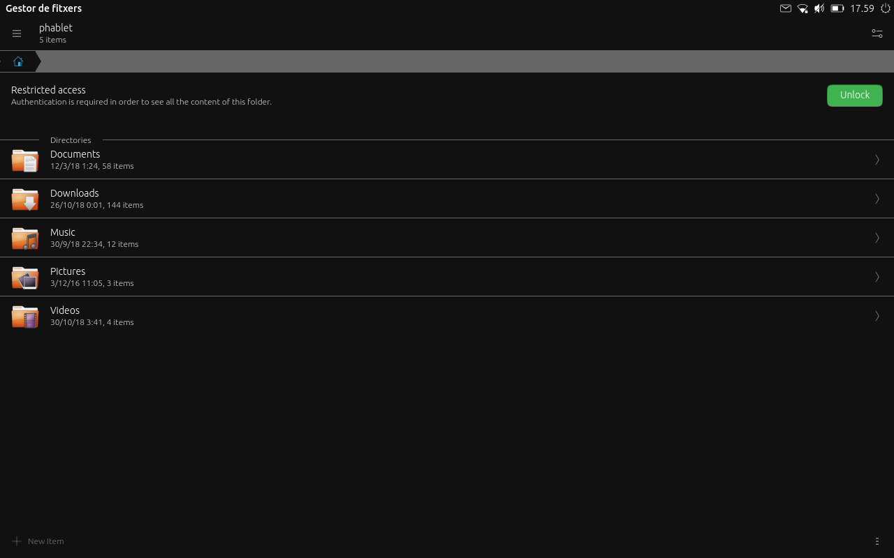
The File Manager icon set needs some love (basically, make an icon set).
Let's make a mockup for the home directory icons
Rules:
- Final date to send mockups: 6th at 20:00 UTC
- Sign the mockup with the username you derivate your work (if applyable) and yours
- No comments on other designs (we will do that later)
- Mockups can be on any format (even hand drawn)
To keep in mind:
- be nice to each other
- be open minded
- go bananas (no limits, let's do speculative design) but
- don't be upset if your design is not used
-
Interesting idea, @cibersheep, but there's already a number of icon sets readily available that could be used... On my laptop I use Papyrus (via Unity Tweak tool). I'm not suggesting that the creative and resourceful folks here aren't capable of developing an icon set, but I do wonder if we need to reinvent the wheel on this one?
-
@3arn0wl said in Send Some: File Manager Icon Set Love:
Interesting idea, @cibersheep, but [...]I do wonder if we need to reinvent the wheel on this one?
Thank you for the reply. The idea is not so much reinvent the Suru Icon set that we already have at access, but start a mind set and a weekly mockup routine. I'm interested in seeing what we are capable of doing, the philosophical aspects of it and how many people are interested in participating and what their vision is.
My first idea was to mockup a vital part of the system which is more difficult to do, but I thought we need a bit of fun before going into dark places

I hope you can play with us if you like

-
@cibersheep
 I'm certainly interested in the idea!
 -
@3arn0wl Weeeeeeeeeeeeeeeeeeee

-
How creative should we get, @cibersheep? Do we go beyond the dialogue of "Files & Folders" to consider some other hierarchical synonym, such as a tree? Might we have a broader colour palette than just Orange? e.g. Purple for Music areas, Yellow for photos, Green for Docs, etc.
-
@3arn0wl Ouh... I already love it. Go crazy!
-
You could use the "Welcome Circle" idea... Tap on it to shift though Documents, photos, videos, and the files show up in the circle shapes.
Or you could have a circle histogram in spectrum colours...
-
@3arn0wl Ouh! I'm waiting for your sketch
-
So, in the words of Doc. Brown: "Please excuse the crudity of the model" - I'm no artiste, dahling!
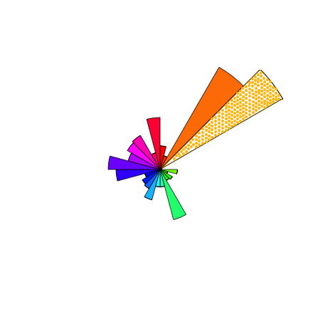
The idea is that there is no hierarchy. That each colour represents a file type. That each dot - sorry I only did it for the yellowy area - represents a file, and that zooming out would present the file name, and clicking on it would open the file.
-
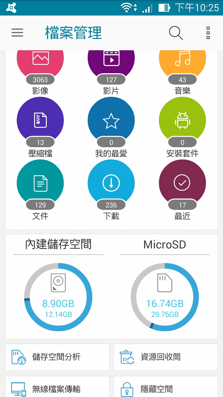
Like this ? (Thts is screen photo) -
@3arn0wl said in Send Some: File Manager Icon Set Love:
So, in the words of Doc. Brown: "Please excuse the crudity of the model" - I'm no artiste, dahling!

The idea is that there is no hierarchy. That each colour represents a file type. That each dot - sorry I only did it for the yellowy area - represents a file, and that zooming out would present the file name, and clicking on it would open the file.
-
@3arn0wl Interesting.
How finding a file would work? -
@louies Thanks.
-
@cibersheep Just zoom in!
-
@3arn0wl for me sunburst diagrams are nice to look at for the first days ... after that the become somehow annoying as it always takes to much time to get where you want. DaisyDisk for mac works in this way and by being a brilliant app from the esthetic graphical side its definitely not the fastest way of getting things done in a file manager
 - but still nice looking though ...
 -
@3arn0wl I have more «problems» for you to solve

- If you need to search for file «build . sh» how do you propose it would be done?
- Saving (exporting) a file from an app to the file manager, how it would be handled?
@Louies for you too

- That icon set which license is published under?
- How colors and shape would fit in Suru style?
Thank you both
-
@elastic - so far as I know, this is just an exercise in lateral thinking... so I'm just offering an alternative solution. I hadn't particularly considered its merits...
@cibersheep -
0) I guess there would need to be a search box at the top...- Holding down a blob (file) would offer the options to move/copy/delete etc (as with the right-click options of Ubuntu desktop)
-
I rather like the filemanager, but would like to see it move away from the old humanity icon set, and even the orange folder theme. I like the more modern style that sam hewitt https://snwh.org/suru has made, although for the purposes of ubuntu touch we could modify the color away from orange.

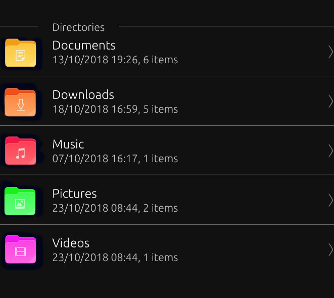
-
@mateo_salta the photo file & app file icon Because the color is too light or too bright, will not see the folder icon
