Ubuntu Touch For Phone Lock Greeter Design
-

Hello Guys
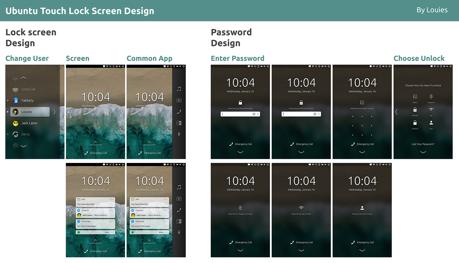
This my Phone Lock Greeter Design
But how it all seem off-topic

https://www.behance.net/gallery/74949937/Ubuntu-Touch-Lock-Design
-
That looks awesome
 maybe we should think abojt implementing more blur to the design at all
 -
Actually I am very pleased with the current uncluttered and distinguished look of the lock-screen.
-
@krille @marlboro50 Thanks
-
I know that we generally like to keep the dreams flowing in design threads, but I see multiple problems with this design:
- It appears both the left and right swipe areas are used for events which are not unlocking the device. This is a huge change from the current design to start with, but it is also much different from the rest of the OS.
- The dock comes from the right rather than the left, and it appears to not match the current dock
- The design as a whole doesn't really match the rest of UT. I think "Sailfish" right away, actually... convoluted gestures included
Also, I know it's probably not a very popular opinion, but I really prefer the Ubuntu Touch lock screen without notification access. Checking my notifications is an active action that I must choose to perform now. On other platforms it's a passive distraction for me. I've found myself unbound from my Ubuntu Touch phone, unlike my Android phone.
-
@unisuperbox ok ...


-
@unisuperbox I agree
Hello! It looks like you're interested in this conversation, but you don't have an account yet.
Getting fed up of having to scroll through the same posts each visit? When you register for an account, you'll always come back to exactly where you were before, and choose to be notified of new replies (either via email, or push notification). You'll also be able to save bookmarks and upvote posts to show your appreciation to other community members.
With your input, this post could be even better 💗
Register Login