New UI/UX Idea for the Morph Browser

-
Hi,
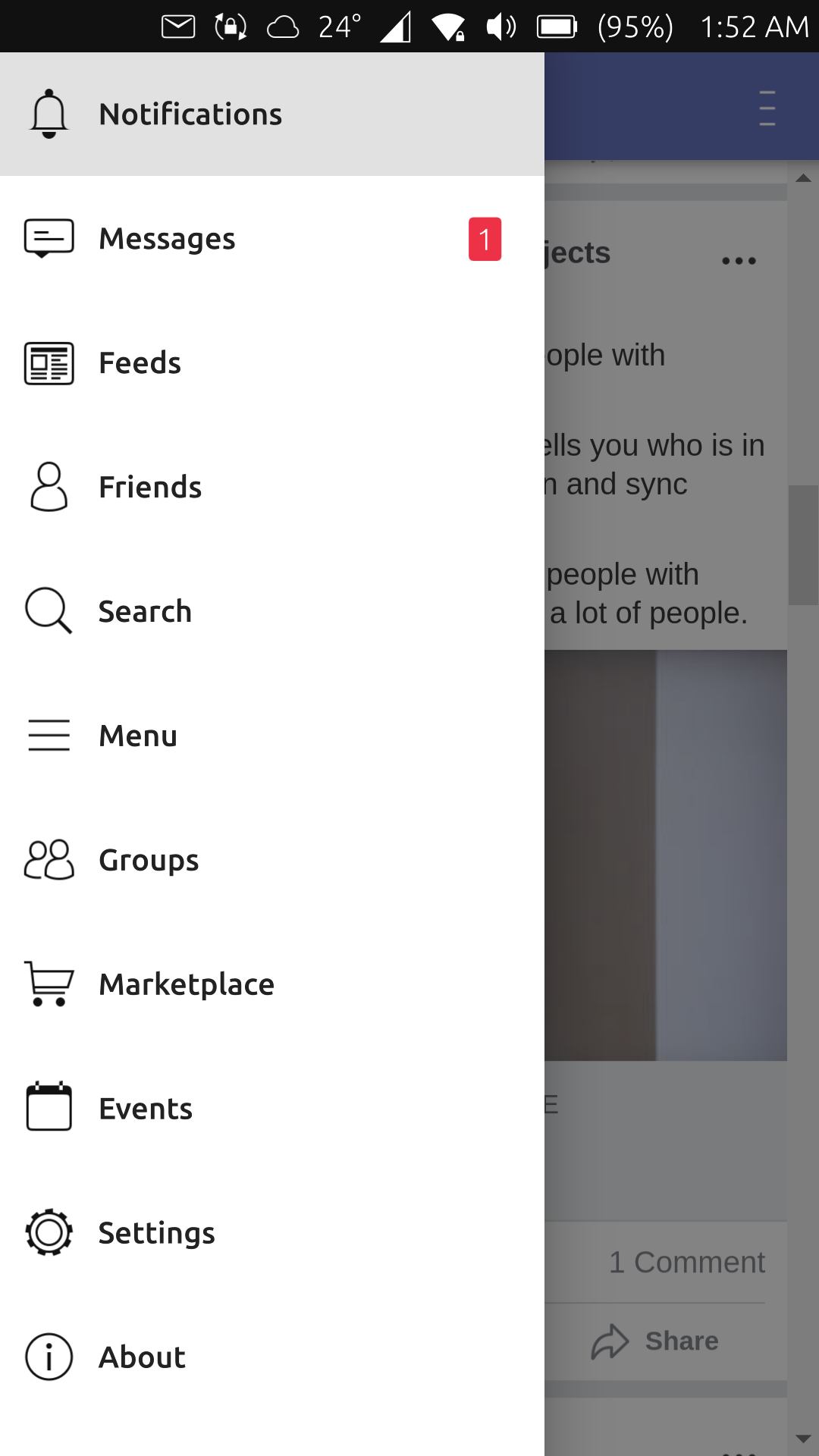
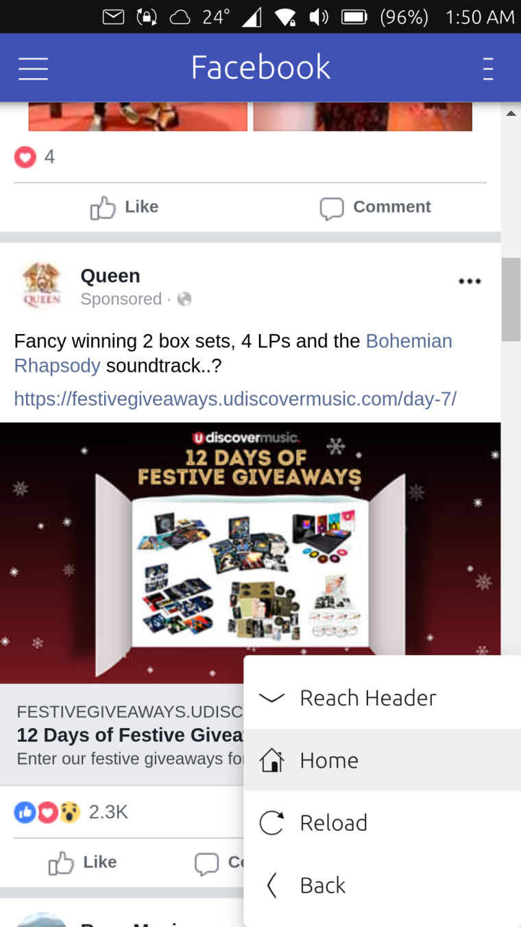
I recently released my very first webapp in the OpenStore using my own kind of a web container.
Basically, there's a drawer similar to how it is in Android on the left side and a menu on the right side.
Both can be opened via the bottom edge or the application header.
For me it's really useful and makes it easy to navigate.
And now whenever I use the browser, I feel like I'm looking for the same experience.So I just thought that maybe we can have the same UI/UX in the browser?
The drawer will contain all the open tabs and the right menu will have the navigation actions such as back, forward, and refresh.What do you think? Would it make sense and will it be good?
You can try it out yourself to get the feel of it. (Sorry for the shameless promotion LOL)
https://open-store.io/app/pesbuk.kugiigiI'm not capable of creating mockups so here are the screenshots from my webapp.
Just imagine it yourself

-
Swipe from the bottom edge to navigate is very handy yes
") And the left-side menu doesnt waste space thats also very good. What can be confusing is the menu button on the top left and this one on the top right. They are looking very similiar und so the user might not know where the difference is
And the left-side menu doesnt waste space thats also very good. What can be confusing is the menu button on the top left and this one on the top right. They are looking very similiar und so the user might not know where the difference is -
@krille Well if we will push with this idea, we can change the icon for the tabs. Maybe something similar to Chrome android where it indicates the number of open tabs.
Not sure if the browser suspends tabs that are not in focus but if not, this button can also have an indicator when a tab needs attention similar to the desktop browsers when the tab is blinking.
Hello! It looks like you're interested in this conversation, but you don't have an account yet.
Getting fed up of having to scroll through the same posts each visit? When you register for an account, you'll always come back to exactly where you were before, and choose to be notified of new replies (either via email, or push notification). You'll also be able to save bookmarks and upvote posts to show your appreciation to other community members.
With your input, this post could be even better 💗
Register Login