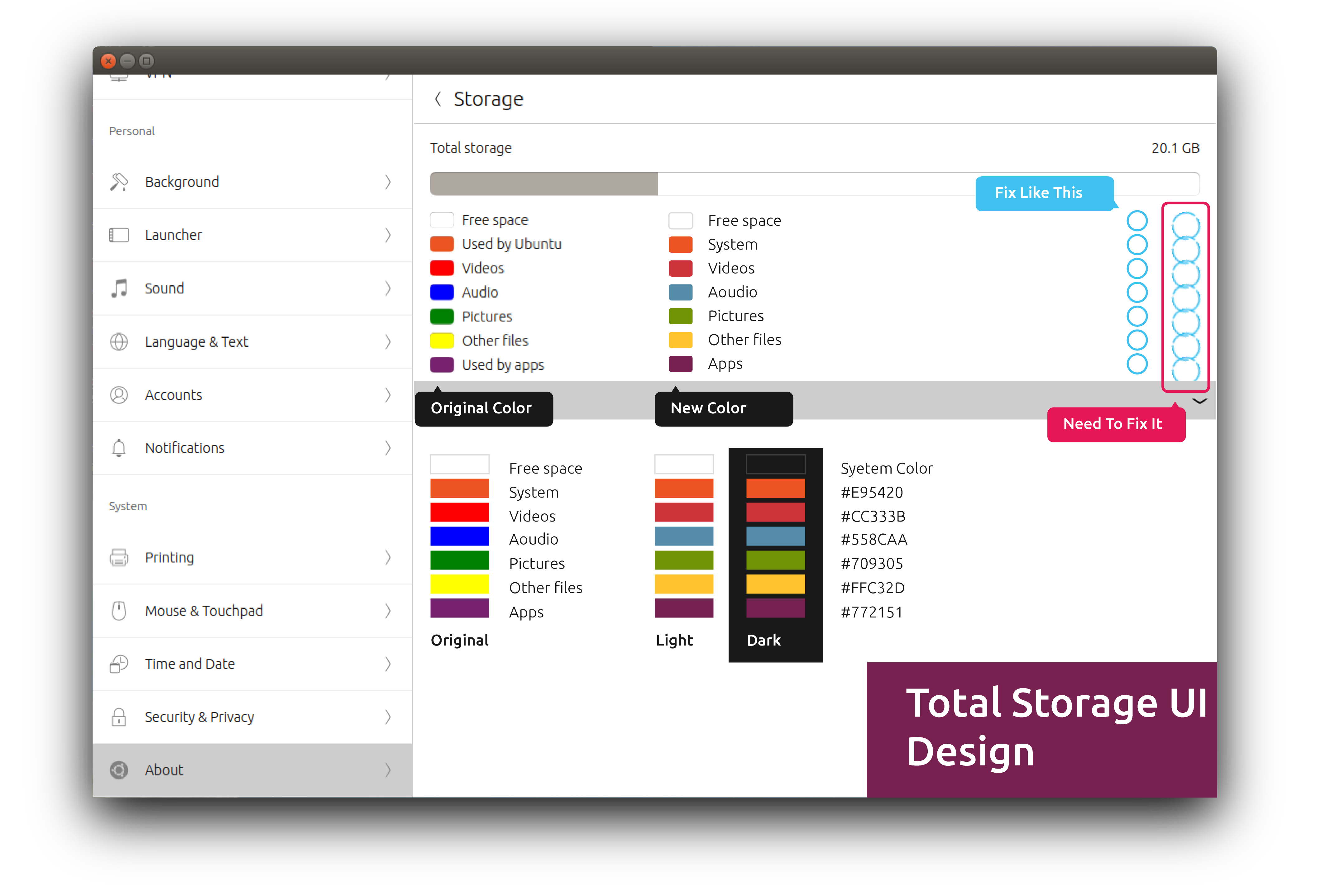
System Settings Total Storage UI Design
-

Hi Guys
The total storage UI need to fix. And new colors to Storage
I have put things on it. You can go and have a look. -
@Louies I like that change, you've got the same color in both themes, you've chosen well,
the very intense colors are really annoying,greetings...
-
@Josele13 yeaap
-
I don't understand the bit about the blue circles though. What's with that? There are no such circles when I open the storage page.
-
@dobey The circles wizz round as it's calculating. They seem to overlap as shown.
Hello! It looks like you're interested in this conversation, but you don't have an account yet.
Getting fed up of having to scroll through the same posts each visit? When you register for an account, you'll always come back to exactly where you were before, and choose to be notified of new replies (either via email, or push notification). You'll also be able to save bookmarks and upvote posts to show your appreciation to other community members.
With your input, this post could be even better 💗
Register Login