Privileged ICE contacts and medical information available on lockscreen [WORK IN PROGRESS]
-
@Moem said in Privileged ICE contacts and medical information available on lockscreen [WORK IN PROGRESS]:
@Rondarius said in Privileged ICE contacts and medical information available on lockscreen [WORK IN PROGRESS]:
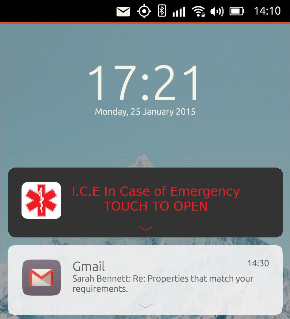
I make mockups and hopefully someone with the required talent could do something with it.
....... I believe we're on the right track, and someone with design skills could build on what has been done so far. It's a group project after all!
That's why I asked @C0n57an71n to join this project. And perhaps @CiberSheep likes to think along too?
-
Here is another mockup, I used the colour palette of UBports to choose the background colour:

-
Hi,
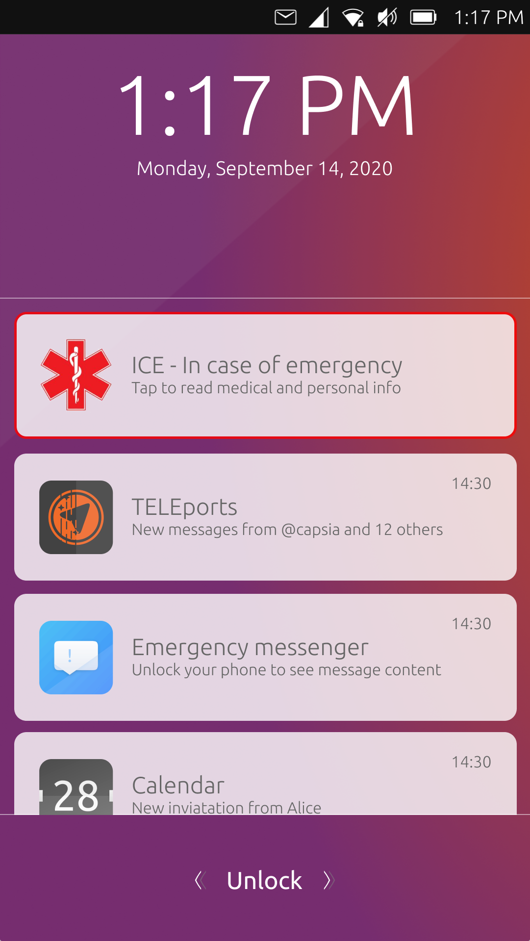
maybe just a red border to mark the notification as important and persistent could work and at the same time would be more consistent in the UT style.

-
@Capsia
Your proposed design is really good. Do you think that by changing the header into the official blue color of the Star of Life would an option while having the notification stand out at first glance when needed (emergency) and not (too) intrusive?@BigB
Just wondering if you being the OP are still with us. Judging by the many people who have joined this thread and have made a really great effort into bringing this project further this gradually looks to become a community effort. More than I expected it to be when you started this thread. I'm curious to reading your thoughts as to where you would like this to go. -
Thank You! I'm still here
 I just have less time than during holiday, but I try to follow thread.
 -
@BigB
Great! Good to know you're still around
-
I was thinking of one thing here, if there is no other feeds should this be visible all the time or should it be possible to have the regular lockscreen shown instead? I like the circle of history

-
@Rondarius said in Privileged ICE contacts and medical information available on lockscreen [WORK IN PROGRESS]:
should this be visible all the time
I believe so. If a notification pops up it will be in line with the design directly, otherwise you'd have homescreen switching to 'notificationscreen' again making it more distracting.
-
@3T_Ed I guess you can't make everyone happy

-
@Rondarius
Well you did put a question mark at the end of that sentence In the end I would be happy with either, it would be great if the ICE feature can make it to the Lockscreen (Circle or notificationscreen).
 -
@3T_Ed Sure, it can be blue, maybe also with the background as the other ones
@Rondarius I have also a few more lockscreen designs:
https://www.figma.com/file/qmsxA1Ep7YPxAXHX9ELkcc/ICE---LockScreen-DesignI like to have the background and the stats too

-
I was wondering if maybe we could just have the emergency symbol (the plus or the shield with a serpent) in like the lower left or lower right of the screen, that would allow us to keep the current lock screen, and have the ICE info easy to obtain if someone needed to access that, its just a thought.
-
There maybe an opportunity to create a widget for this https://open-store.io/app/uhome.pavelprosto but this may have already been mentioned by @Keneda somewhere.
-
@lakotaubp
Actually it was mentioned by @Capsia in the Lockscreen thread, not the uHome thread -
@3t_ed I stand corrected, knew I'd seen it somewhere though.
-
-
This post is deleted!
