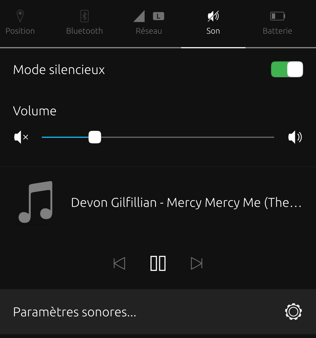
Scrolling of the title : where to open the issue ?
-

It isn't possible to see the whole title for a long music title in portrait mode by the sound drop down menu of the indicator bar when we use Radio app of Patrick Jane.
I would like to have the scrolling of the title, if it is possible, as there is no scrolling currently.
What is the good repo to open a feature request ? -
@domubpkm
Not exactly an answer to your question, but I notice that on your example both the artist and track data are on the same line, whereas when I look on my device I see the artist, track name and album name on different lines. This is on both 'Media Player' and 'Music' apps.
Maybe have a look at the tag data on your music files to see how this info is arranged on your files. I've used 'EasyTag' for this in the past.
This isn't the scrolling functionality you want, but it may make the info more legible. -
@moncon I clarified my post and you will have the same problem as me for this usage
 but thanks anyway.
 -
@domubpkm
Aah, I didn't realise we were talking about the radio app, I presumed wrongly we were talking about local media players. I was trying to fix (or workaround) a similar symptom to a different problem.
I've just loaded up the radio app and can confirm the same behaviour on my Cosmo. That must be frustrating if you hear something you like and can't identify it. Short of only listening to stations that only play artists with short names and short song titles I haven't got a workaround for this. :confused_face:
I wouldn't know where to open that feature request, but I guess that's your way forward, let us know how you get on. -
-
D domubpkm has marked this topic as solved on
Hello! It looks like you're interested in this conversation, but you don't have an account yet.
Getting fed up of having to scroll through the same posts each visit? When you register for an account, you'll always come back to exactly where you were before, and choose to be notified of new replies (either via email, or push notification). You'll also be able to save bookmarks and upvote posts to show your appreciation to other community members.
With your input, this post could be even better 💗
Register Login