Every icon with many elements is bad, it's too hard to recognize in the case where it small. The icon must be simple and recognizable. And if app name is far from original, then icon must point user what about this app
G
Offline
Posts
-
RE: TELEports. New Telegram app icon design
-
RE: UI design concepts and proposals
Some Behance posts I found by simple search:
Ubuntu Touch GUI elements by Taras Savytskyi
https://www.behance.net/gallery/27591427/Ubuntu-Touch-GUI-Free
Roman Nguyen concept on Behance
https://www.behance.net/gallery/28804097/Ubuntu-1604-Stupendously-Hot-Charmander-concept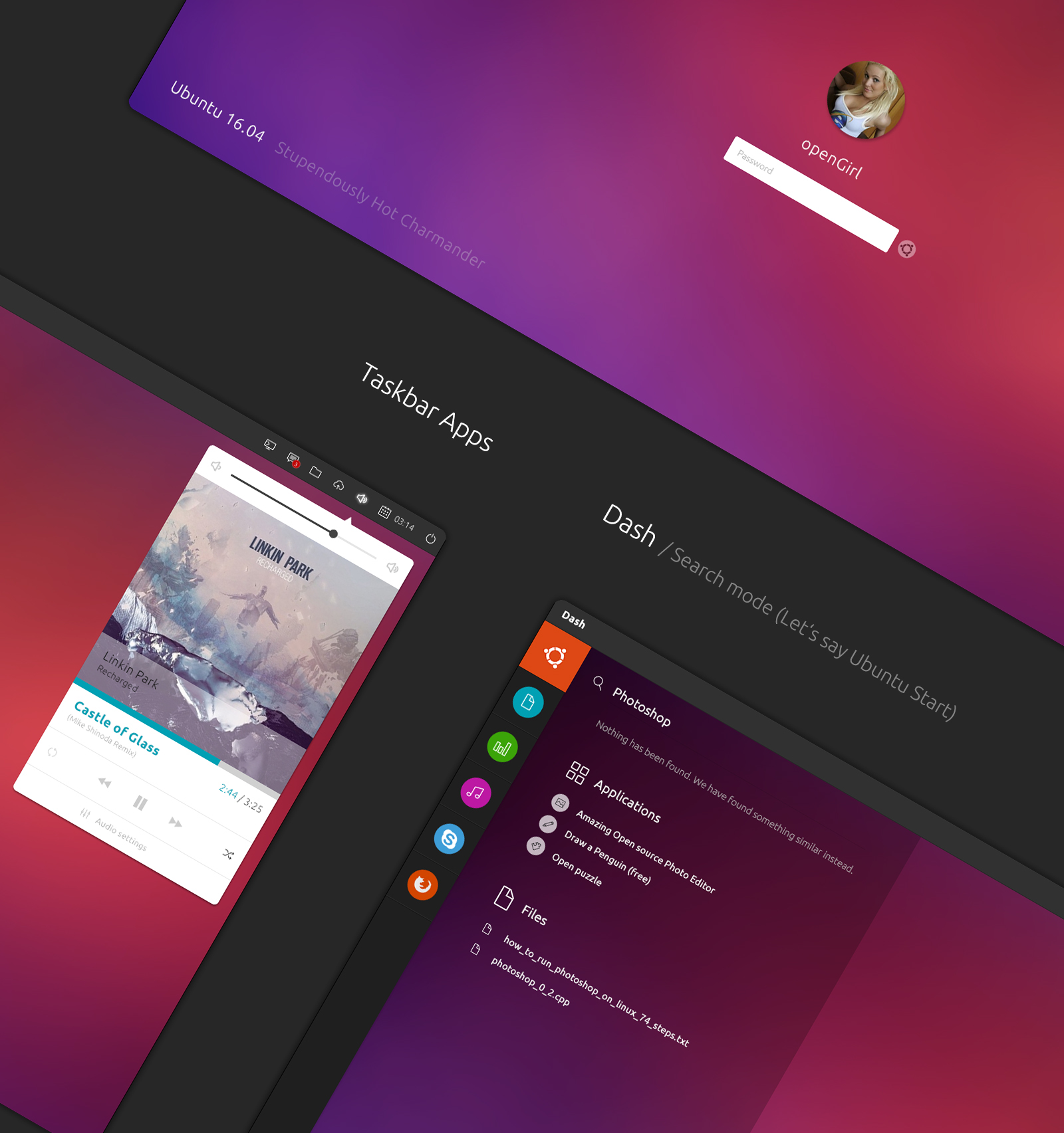
Pablo Marlasca concept on Behance
https://www.behance.net/gallery/29848255/Ubuntu-Touch-Vibrant-Venice
Alex Milazzo on Ubuntu System and Contextual Menus
https://www.behance.net/gallery/9167887/Ubuntu-System-and-Contextual-Menus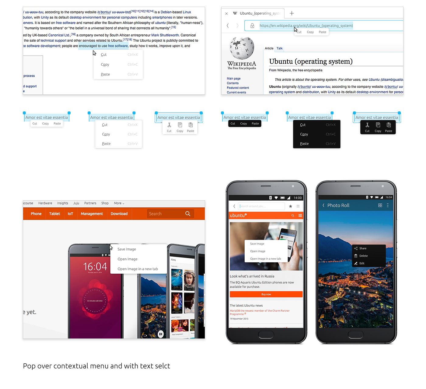
Convergence mockups by Alex Milazzo
https://www.behance.net/gallery/51028087/Ubuntu-Mobile-Tablet-and-desktop-convergenceApp concept by Jacek Kruk
https://www.behance.net/gallery/18228723/Skydiv-skydiving-logbookClock App for Ubuntu Touch by Lucas Romero
https://www.behance.net/gallery/14468723/Clock-App-for-Ubuntu-Touch