I have been lurking here for a while now and I will try to sum up what I think are some of the best suggestions. None of the following is intended to be a criticism of any other ideas, just my random thoughts about what I would like to see. The basic idea of Sprint is excellent but it needs the ability to move icons once they have been placed, and a means to categorise apps. The obvious mechanism for this already exists in the '.desktop' files.
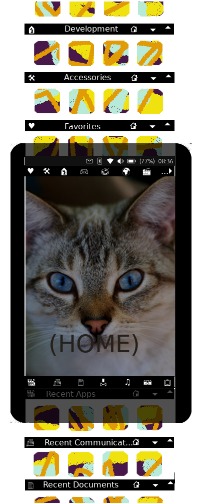
The HOME screen should be as clean as possible but fully customisable, and show any widgets placed there. By way of explanation of a possible mechanism, imagine a long vertical ribbon with collapsible sections, and the HOME screen at the middle. Below the HOME is everything RECENT and above is FAVORITES & CATEGORIES. HOME should effectively be DESKTOP and if larger than the current device screen could just scroll up and down as appropriate.
Widgets on the HOME would be active and automatically show latest information. Eg. Time, Weather, News headlines, etc. It could be argued that HOME screen could also control Login. For privacy, the HOME screen should not show anything other than generic info from the widgets. Attempts to slide the ribbon in any direction would prompt for password. The existing circle lock screen (without the lock) could be reduced to a widget within the HOME.
Once logged in HOME would display 2 icon bars, one above and one below HOME. See https://mir-s3-cdn-cf.behance.net/project_modules/max_3840/8d38e429848255.560b1cb20aad9.jpg for the lower bar representing each category of RECENT, eg, music, pics, documents, files, apps, etc. A similar icon bar at the top indicating categories of apps extracted from the .desktop files. These 2 bars should not scroll (ie would remain visible) until the HOME has left the viewed section of ribbon.
Clicking an icon on the 'recent' bar would display relevant files from that section of the ribbon. HOME could also be slid upwards to show sections of the ribbon corresponding to the icons; each section having a separator bar with the Icon, Section title (which scrolls horizontally if insufficient space), Expand and Contract buttons (^,v) and a home button. Initially only 1 row of most recent files would be displayed. This would allow quick up/down scrolling. Clicking Expand would show more files. A second Expand would launch a helper to extract info from files in that section, eg Artist, Album name, etc for music tracks; EXIF info for photos; Openstore description for Apps; etc.
Clicking an Icon on the top bar would show the appropriate category of apps, again with a separator bar. In a similar manner to recent items, clicking Expand once would show the most recently used within the category, and a second Expand would show description info from the .desktop file. Continuing to scroll up would show Favorite Apps, Categories (as declared in .desktop) and ALL.
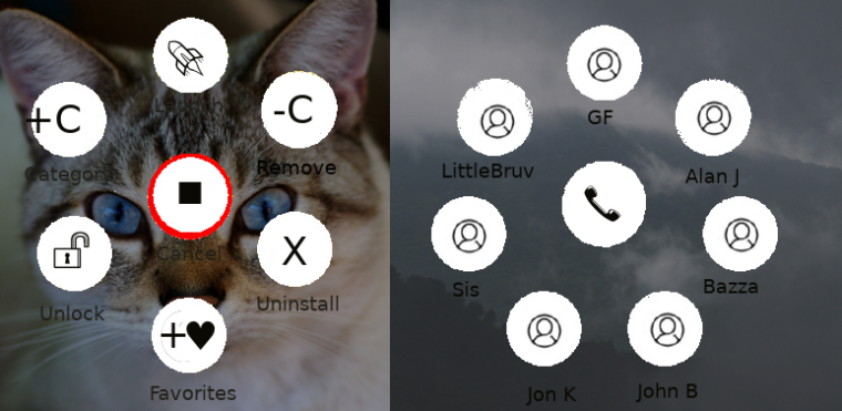
I would propose also to introduce another meta-file (say .app_space) to perform GIEMM's 'universe' idea. This file could be stored in the same location as .desktop files (~/.local/share/applications) and a short_tap/leftclick could open a helper which displays a 'flower' similar to the navigation buttons which you can currently drag up from the bottom of some apps, each petal performing a different action. The .app_space file would have a similar structure to .desktop and declare a Description, Categories and an action & icon for each 'petal'. Actions would be URLs where appropriate, or executable with startup parameters to invoke different behaviours for an app.
Rather than needing to have a separate area for selecting apps to add to the favorite screen, I would propose that a longpress on ANY icon should allow you to 'Launch, 'Unlock' to move within a Category display, 'Add to Favorites', 'Add to another Category', 'Remove' from Category, 'Uninstall'. Any changes to info held in a .desktop (or .app_space) would automatically save/update a local copy ( in ~/.local/share/applications). This action would be performed by a special xxx.app_space which responds to any to a longpress on any .desktop/.app_space file in order to implement the above add/remove/uninstall actions.
By allowing .app_space files to also have Categories, they can effectively be pinned to say Recent Comms. Also you could pin a games.app_space into Recent Apps to keep your 4-8 most favorite games on a single 'flower'
A question one should ask is: why do OSes need a taskbar? If you have a folder/ribbon section for RECENT apps, by definition anything running IS recent.
Proposed ribbon:
ALL
System
Settings
Office
Multimedia
Internet
Graphics
Games
Education
Development
Acessories
Favorites
HOME <-- ribbon always opens here and scrolls down and up to view other sections
Recent Apps <-- includes runnig apps (no need for separate taskbar)
Recent Communications
Recent Documents
Recent Downloads
Recent Music
Recent Pictures
Recent Video


