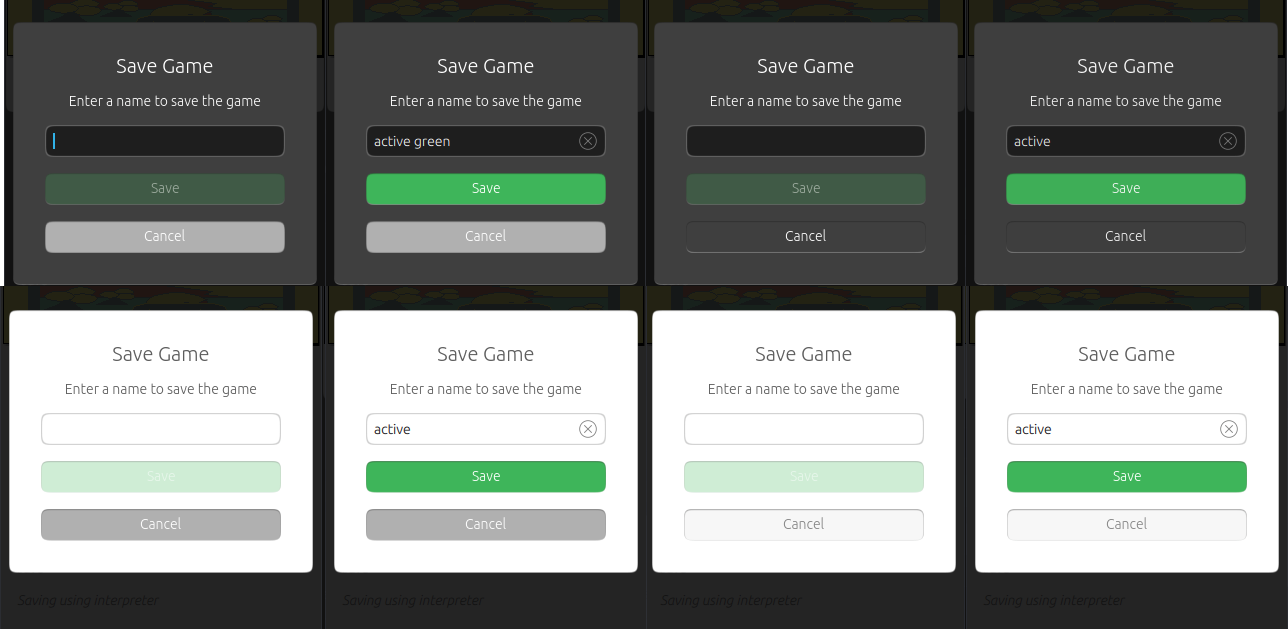
Happy Default Grey Year
-
I have realized that:
- Button element, if no color is asigned, looks grey #b2b2b2 (which is not in our palette) and
- Neutral button actions (in our theme palette) looks a bit special
What we do? Change the theme to match the default grey? Add an exception? Change the default button color to match the palette?
Left: default grey
Right: default neutral button palette specification
-
Happy New Year, @cibersheep. Well, if at all possible / easy, we need the no color assigned grey to be 'our' grey! (I don't like all of our colors, but our grey is better than the default one.)
-
To me, the ones on the right do not look correct. Definitely the same color as the background should not be used there. The "button" now looks like it's already pressed, and also disabled, regardless of the enabled state of the widget.
-
Excuse me for probably saying something contentious, but shouldn't cancel be red-based given that the opposite is already green-based?
-
@umagellan I don't think so. It should be neutral as the action is not destructive, but neutral.
-
@dobey Ah, I see, that follows.
-
Yes, IMO
Icons andButtons needs by default color set toTheme.palette.normal.backgroundSecondaryText, that's the color I use for them in my apps... -
It would be great if we can promote the color palette as @mymike suggests, so that it's easily adopted by app builders. That would give our apps increased cohesion.
-
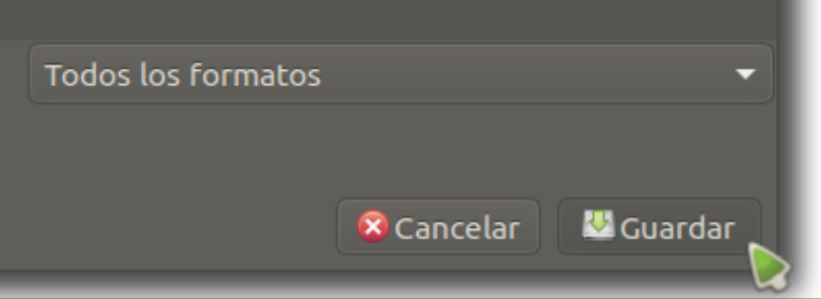
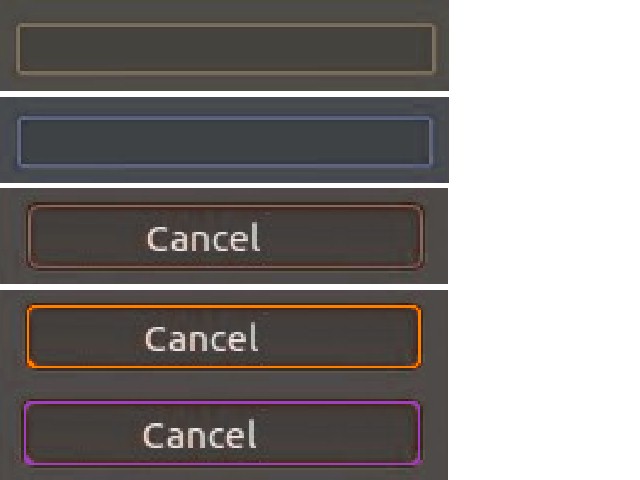
Good night, I like the dark windows, I show you some details of how Ubuntu MATE has those buttons, I think they are nice ,
it's possible you'll see another point of seeing it.If you try to change the color #b2b2b2b2 to another gray #8a8885, it looks better having the letters in white,
greetings...



Also by topic of the phone
-
Looks like we kind of agree that the default palette for neutral buttons is not right therefore next step should be changing the palette.
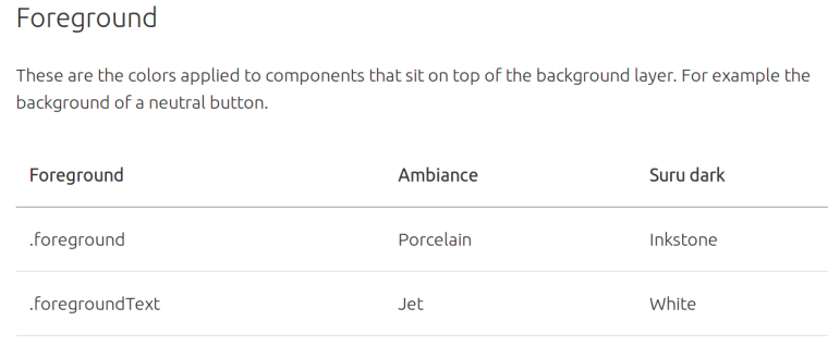
@mymike I think we should use the foreground color for the background button color and redefine the colors. I think using other palette terms (as backgrounSecondaaryText) will be more confusing than it is today

@3arn0wl there's only the information on the old Ubuntu... I try to come to UBports little by little
 but you can read about it for now here
Thanks @Josele13

-
mhmm is the background of a button background or foreground, since the text on it is also foreground...?
 Thats an interesting question...
 -
@hummlbach
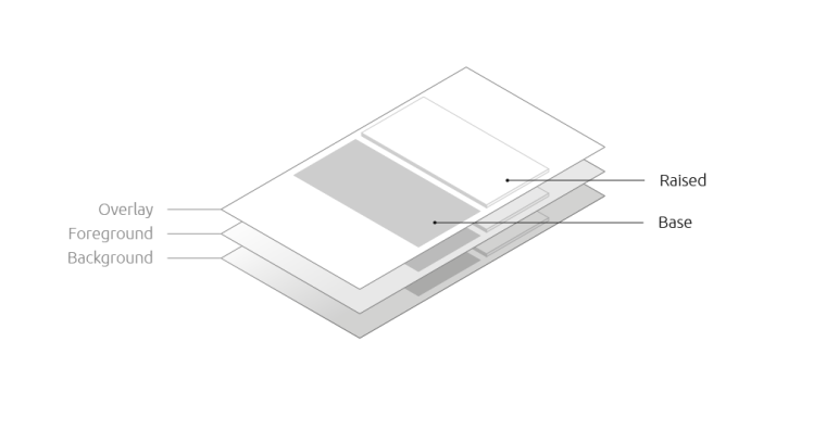
 it' confusing until you read the whole description (follow the link)
-
@cibersheep ha, cool! but somehow that doesn't make me happy completely... I I would have expected buttons to "be raised"... Why should the thumb toggles of switches be raised but buttons not?
-
 Thanks for the link @cibersheep.
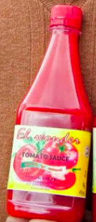
(I'm going to say it: I've never liked that red!! For me, it has associations with the fake tomato ketchup we used to have in East Africa. Ugh!)
-
@hummlbach

@3arn0wl Fake tomato ketchup? What are you talking about? Only real tomato here, maybe real tomato sauce with onion... but fake tomato? Where's the banning button in the forum?


-
And this, community, is why the forum moderator permission will not be granted to @CiberSheep

Hello! It looks like you're interested in this conversation, but you don't have an account yet.
Getting fed up of having to scroll through the same posts each visit? When you register for an account, you'll always come back to exactly where you were before, and choose to be notified of new replies (either via email, or push notification). You'll also be able to save bookmarks and upvote posts to show your appreciation to other community members.
With your input, this post could be even better 💗
Register Login