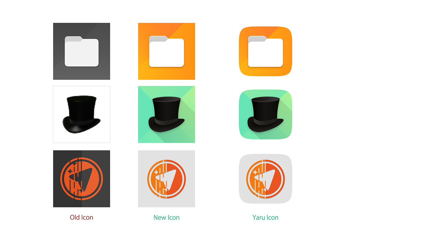
APP New Icon Design
-

Hey Guys !
Seeing the modern libertine icon,I am going to faint, so I try to make a new Icon to it. -
@Louies i like the new icon set
-
@stefwe thanks
-
nice! I like brighter colours in app design typically.
Intrigued to hear what the Teleports team says about your version of the icon

-
Mhmm I'm afraid you're a bit late to the party regarding the teleports icon... Its bin one month exactly since the teleports team voted for the 'old icon' (among 3 other colourings of the same icon). So the icon is not that old
 and it was the result of a longer process of suggestions and contributions made by different (at least 3) people of the community here: https://forums.ubports.com/topic/2234/teleports-new-telegram-app-icon-design/72 (Cool!)
All in all unlikely to be changed any soon... -
@Louies Nice work. I kind of like the colors you chose.
Have in mind that we have a non-writen rule that is: We tend to color System app icons whitish and greyish (check System Settings, Terminal, File Manager, OpenStore and External Drives).
About TELEports, the icon is quite new

-
Wow, I really like those icons,
could you try the external drives icon too ?
greetings...
-
The external drives icon has also been redesigned quite recently and follows the grey color for system icons.
-
@UniSuperBox said in APP New Icon Design:
The external drives icon has also been redesigned quite recently and follows the grey color for system icons.
This is also why the file manager icon is grey.
Hello! It looks like you're interested in this conversation, but you don't have an account yet.
Getting fed up of having to scroll through the same posts each visit? When you register for an account, you'll always come back to exactly where you were before, and choose to be notified of new replies (either via email, or push notification). You'll also be able to save bookmarks and upvote posts to show your appreciation to other community members.
With your input, this post could be even better 💗
Register Login