Icon Library
-
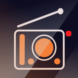
For a future FM Radio app.... -
Not sure if design rules allow this, why not use the red part as integrated part of the top section (upper right)? That would make the icon more stylish, attractive and in line with other icons that are worked on, thinking CiberSheep 's redesign of the Morph icon.
On a sidenote, wouldn't be great if the icon designs - besides the general UT design ruled so not just this one, as same goes for existing and upcoming ones - could just have some overlapping elements that can underline a somewhat more uniform design trend when opening the Open Store and stretching the cooperative vision of the platform, devs and community as a whole.
One of the pros of UT is that devs and designers are interacting with the community before launch. Love it, thank you for sharing your designs and thoughts. Good luck!
-
@3T_Ed Thanks for thoughts. Will consider what you said.
-
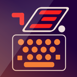
@3T_Ed The red thing gives icon energy and helps visualed impared to distinguish between them. Each of the icon from this style should have the red object always in another place in the plane.
-
@Lakotaubp I've said a little bit underneath that the red thing will be an element to accentuate and serves for visual impaired as to distinguish between icons as the red thing will be always in another place in the icon plane. It's a strong color and I cannot abuse of it.
-
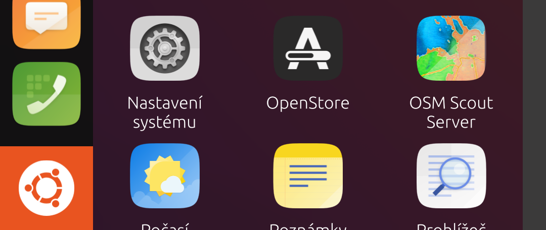
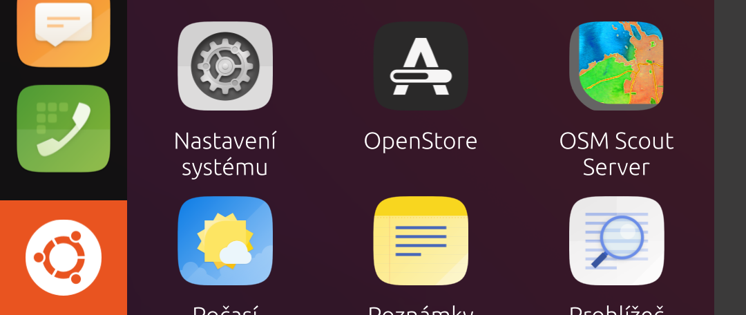
Not sure if it's the right place to ask but can someone please rework OSM Scout Server icon to be a regular square? I think it's pretty ugly now.
https://github.com/rinigus/osmscout-server/blob/master/icons/osmscout-server.svg
-
@C0n57an71n said in Icon Library:
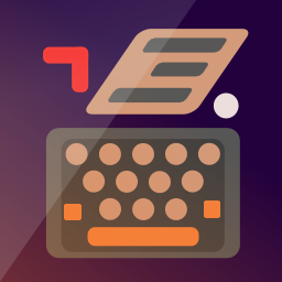
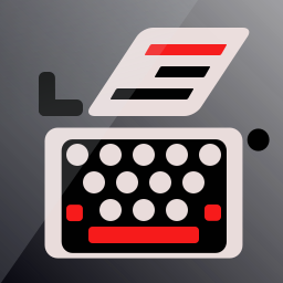
Opinions about this one?
Much better IMHO.
And the radio one is nice too.Now the main thing for me is the background. You used a gradient and a darker stripe.
I thing a solid color with a single fold would be better.And if I may, maybe try smaller lines for the type writer (but not sure it would be better... just something worth trying
 )
) -
-
@AppLee I've tested the lines thickness by zooming out. I would have loved them slicker, but when zoomed out to an icon size,,, I haven't test them on my N5, only in PNG format,,,
-
-
@C0n57an71n I like that one. lets hope I'm not the only one

-
@Lakotaubp The thing is I don't know how visible is the typewriter body on phone resolution. Right now is at 3px.
-
@C0n57an71n
Basically on the phone, there are two sizes.
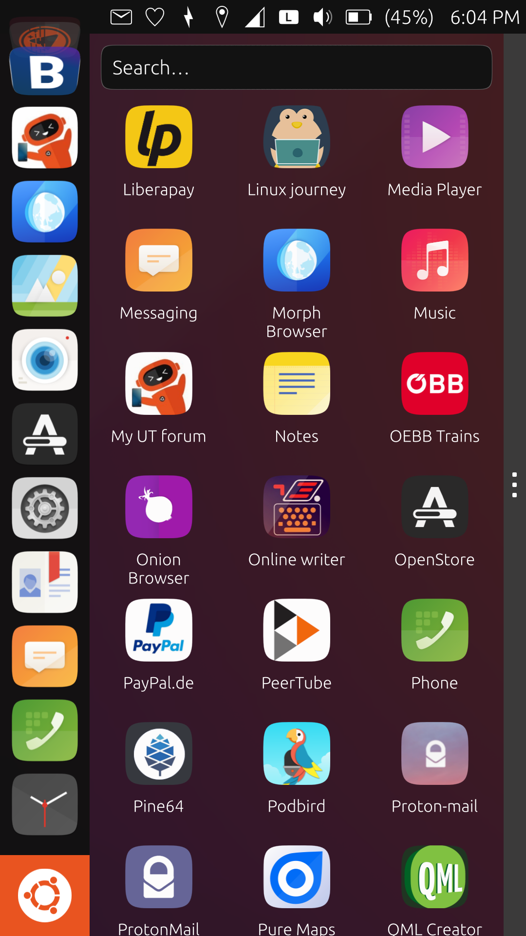
The one from the launcher and the one from the app drawer.
What I do is change the icon of an existing app in order to check it out.Just replace the file in the app directory.
-
@AppLee Super tipp! Thanks!

-
Sorry for the big size, but is just to have a sense how much 3px are.
-
-
-
-
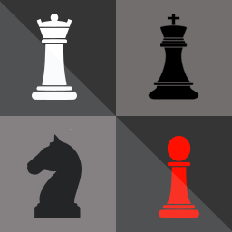
Does anybody has a contact from the Chess (Simple AI) app publisher? His name is Gregor Santner, but I couldn't find his email address. I would like to work with him to change the app icon, in case he wants that
-
@C0n57an71n
Really like your creative thinking within the set parameters.If all designers would stick to this lay out, which is more in line with the UT design than many others, would make the apps have a better overall uniformity, it'd make the Open Store a much more 'calmer' and 'easier' place to search the app you need at first glance.
Keep up the good work!
Hello! It looks like you're interested in this conversation, but you don't have an account yet.
Getting fed up of having to scroll through the same posts each visit? When you register for an account, you'll always come back to exactly where you were before, and choose to be notified of new replies (either via email, or push notification). You'll also be able to save bookmarks and upvote posts to show your appreciation to other community members.
With your input, this post could be even better 💗
Register Login