Icon Library
-
-
@C0n57an71n said in Icon Library:
@3T_Ed I like the idea with the arrow! The dots are to represent the week days. The grid is more of @matteo thing, I would avoid putting it since will make the icon too stuffed, I tend to be really minimalist at this moment.
Agreeing with you regarding the grid. Actually the shading does too however that feature does add value (expected output <-> actual output). Your style is minimalistic and I like that very much. @matteo seems to like that also because he asked you to design an icon for his app based on your initial icons. I'd say, stay true to your own style.
-
-
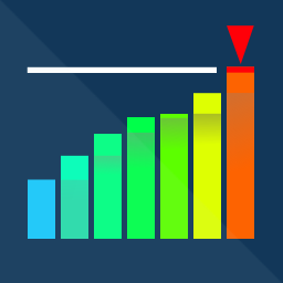
I prefer the previous design. May I suggest you take that one and then for the last bar:
- filling up to the limit in green
- doubling the existing bar above the limit and fill it red
- in the top of the red part have the arrow as you used in your typewriter concept (July 26th) and have that minimalistic arrow point to right-bottom (that would be a 90 degr. turn compared to the typewriter one)
The above would be indicating green to be good, red to be not in expectancy (drastically passing set limit), orange arrow to reconsider (either adjusting the limit or altering behavior to keep within the set limit). Thinking traffic light here

-
@3T_Ed Nah..., making the last bar in green will fuck up the spectrum's Feng-Shui... I'll come up with something...
-
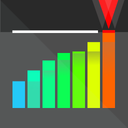
This is what I would use! From my point of view it has all it needs: it suggest what it does, it's well balanced, stands out but not disturbing, lower grey area is more softy, the upper black-red area is more aggressive to show warning,
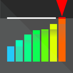
Softened variant.
-
This post is deleted! -
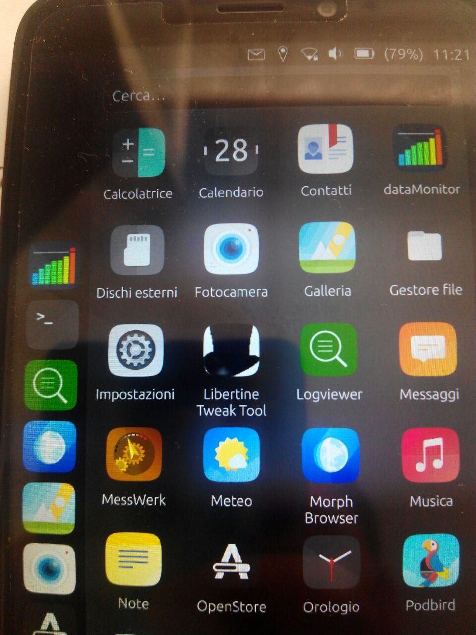
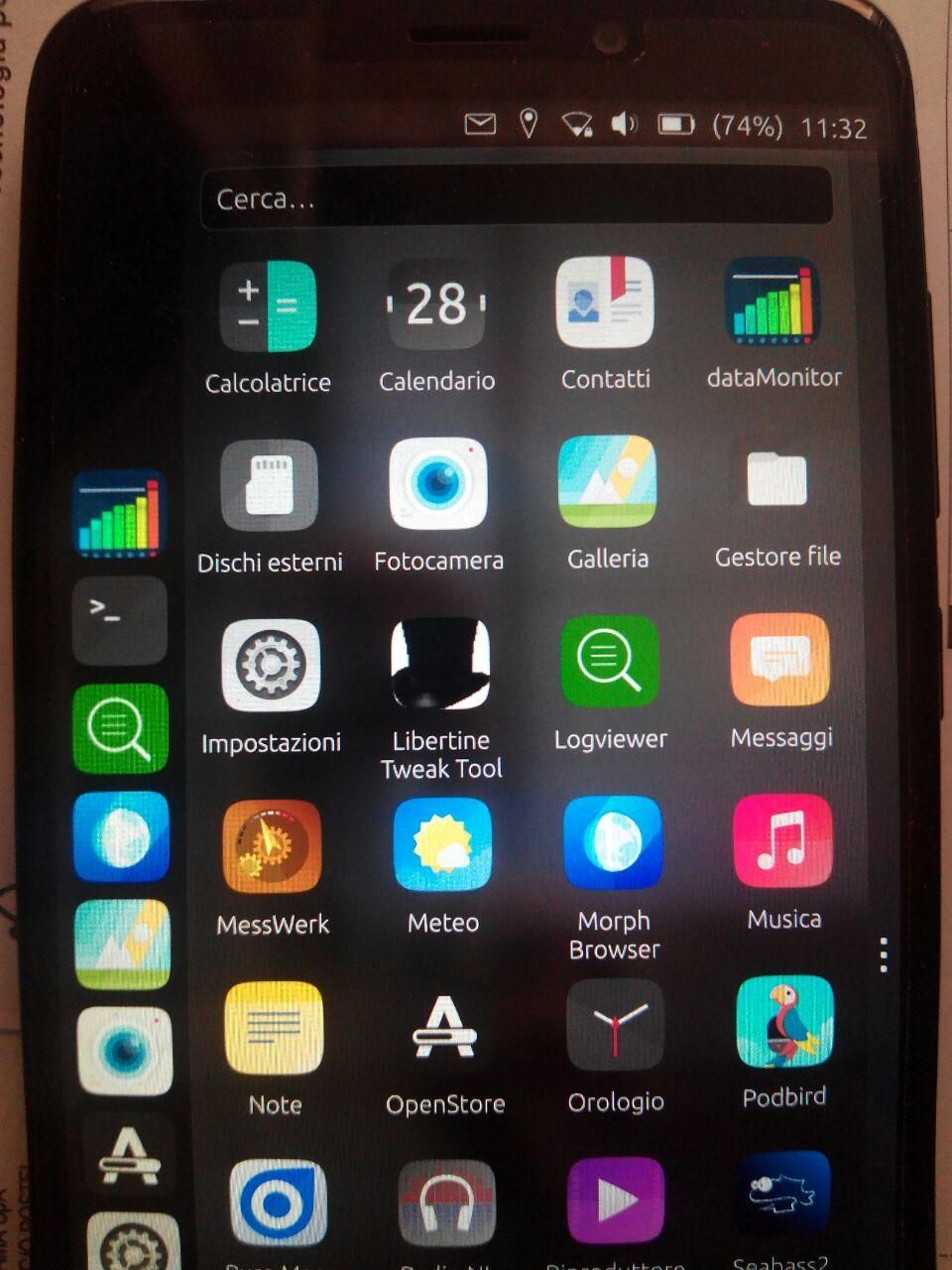
@C0n57an71n personally I like the one with the background transparent grid the most, I think it gives a professionality touch to the app but I see some of you disliked this concept. However, since I designed this app to learn coding for UT and not secondarily to fill a gap I felt our beloved OS got, i.e. the lack of feature for metering the data usage, all for the UBports Community, I'd like to adopt the icon which will result the most popular one, or at least to identify the most promising one to be considered as basis for last tinkering by @C0n57an71n, if needed.
-
ICON N.3rendering:
-
ICON N.4rendering (the one with background grid):
-
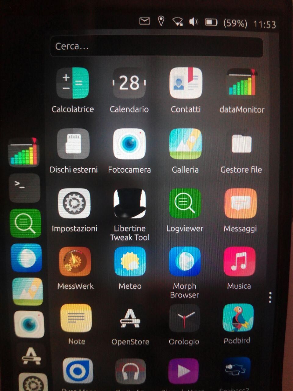
ICON N.5 rendering (last version by @C0n57an71n:
-
@matteo Where do you change the app logo (I mean the path.) I would like test them myself before posting them, just to make sure they are in proportion.
-
@C0n57an71n I use
clickableto change the icon compiling the app straight on the device. The icon is stored as a .png file in theAssetsfolder. Perhaps you could just create a new dummy project with the standard app template creator provided by clickable and replace there the icon, only to see its rendering... -
@matteo said in Icon Library:
The icon is stored as a .png file in the Assets folder.
You can use SVG directly, you'll have better result scaling it...
On the device (without compiling it yourself) it should be in something like:
/opt/click.ubuntu.com/XXX.YYY/current/with XXX.YYY being the app identifier. -
@AppLee thank you for the pointer. I'm not familiar with SVG format at all but I'm looking forward to employing it, foremost if it is convenient and it brings advantages as you said over the PNG format, but I don't know a thing about implications for a graphical artist in terms of time consuming to preparing that or the software to be used, so I leave to @C0n57an71n the evaluation whether to adopt this format or not.
-
@matteo
Sure, I bet @C0n57an71n is already working with SVG.
This is a vector image format which means it uses mathematical formulas to describe visual features (circles, triangles, rectangles, bezier curves, etc.)
In the open world, one of the best tool is inkscape if you're interested and it's not that hard to learn and use it...Long time user of the Gimp, I'm slowly learning how to master basic features of Inkscape.
PNG works fine, SVG is more versatile even if it has limitations...

-
@matteo The easy way to distinguish is when you zoom in: a graphical/vector like SVG/Inkscape will keep it's details because you are changing some proportions and the display will adapt and cover those changes and thus: no loss in details. On the other hand, a 256x256 pixels PNG, when zoom in... So... yeah SVG is better. But if you want to be artistic and use brushes etc, than Gimp, Krita are some good choices. For 3D is Blender.
-
@C0n57an71n deal then
 let's do it with SVG.
 -
@matteo I was thinking, since so many people have different opinions and like different icons, why not give the user the option to choose it. Have your app in OpenStore with the icon that you like, but when the user had installed your app, has the option to change the icon.
-
@C0n57an71n not sure if this is even possible to get since as far as I understand the app icon is hard-coded once the app is compiled. But I'm not the best to tell you about the insight behind that.
Instead, I think that since it seems the discussion is too quite and nobody voted so far on the different rendering of icons, I wish to give you my preferred guide lines to be followed to draw the best icon, in my humble opinion:- I''m still preferring the look of the rendered ICON N.4, with the grid shown in transparency; maybe I'd provide the deep green color to the grid and more evidence to it (therefore less transparency), in order to look more "Matrix"ish;
- I like the dots at the bottom row, to ideally recall the days numbers;
- I don't really mind colors gradient for the columns, but they look like randomly set for each column (extent of the gradient): perhaps we could adjust that in order to have a consistent approach?
- On top of the last column, I still prefer having the rectangle more than the triangle shape, for it seems to me more discreet;
- Sure style with a fold-able side is perfect.
Thank you.
Matteo
Hello! It looks like you're interested in this conversation, but you don't have an account yet.
Getting fed up of having to scroll through the same posts each visit? When you register for an account, you'll always come back to exactly where you were before, and choose to be notified of new replies (either via email, or push notification). You'll also be able to save bookmarks and upvote posts to show your appreciation to other community members.
With your input, this post could be even better 💗
Register Login