USB parameters on headband ?
-
Can i suggest to add the usb parmeters (choice between file tranfert, charging or data sharing) on the principal headband : it will be easyer to use when connecting to computer.
It is probably complicate to do, but it will be a good feature in my opinion. -
@DJac What's a headband?
-
sorry, not the good word.
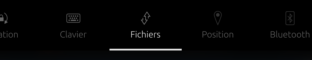
the supperior part of the sceen, with hour, batterie, network....

-
I think that it's could be called the indicator area - I have not found an 'official' name.
So in a word, you would like an USB icon at this place ? Maybe it's a good idea, however I'd guess that system developers could be not so keen in overloading this area. There is a Bluetooth icon, yet this connectivity is immediately available while using USB requires connecting a cable.
If there was an icon that I'd remove in favour of Usb, it would be 'Files'. First I don't know what it's for since it is empty on my phone, then phone are not very files-centric, maybe it was a classic Linux bias ('in Unix everything is a file', yet this should not necessarily imply that there should be an icon in priviledged position for this).
If someone can explain why 'Files' should be here rather than 'Usb' - you have given an explanation for the rationale in favour of Usb,- let's them do speaking.
If no one yells for Files, I'd say that you could raise the issue in a Q/A. As I said, your proposition could make more sense if you could advocate for leaving the indicator area not more crowded that it is already. In my opinion, all the remaining icons but Files seems at least as justified as Usb (or even more) for a rapid access.
-
@gpatel-fr I don't have 'Files' there...
-
Thanks for reading my ramblings and taking the time to post a pertinent remark !
that must be this feature
Wonder why I have it and not everyone. Maybe that's because I installed this app that aims at replacing ubtd, the Bluetooth file transfer app. Let's uninstall it, restart the phone, Still here. I don't know if there are other apps using transfer or if it's an UT problem. -
@gpatel-fr Do you have an SD card in your phone?
-
No SD card.
I tested a download with Morph, and it's not showing anything under 'Files', it is displaying an app specific transient window to control the download, like, well, all the browsers I have seen.
If the flagship UT app don't use this feature, it may be not worthy of keeping it on by default. -
@gpatel-fr For all we know so far, you may be the only one who has it...

-
If there was an icon that I'd remove in favour of Usb, it would be 'Files'.
Yes, I agree. I don't understand too.
(I have SD card and nothing in this part)you're wright, Pearaps it could be possible to 'group' some actual indicators. If file is usefull (?) it could be group with an usb and blutooth in a connection&exchange icon.
I think that less icons will be better actualy.
in the same direction, the rotation is on his own... It will be certainly less usfull, but it could be group with keyboard in a interface icon. (with - why not in the futur - 'external display' ?) -
I'm a happy user of the files indicator! PodCat and PodPhoenix uses them to track ongoing and finished downloads, and it is very useful to see that the downloads are finished before I leave wifi in the morning. So to me this is a very useful feature, and definately not a bug.
That being said, I would also love some kind of icon/easier way for managing the function of a connected USB.
-
@gpatel-fr yes. It is called the Indicators Bar.
I see a need to refresh the UI names because new comers have lost the knowledge@DJac the Downloads indicator, will show the files you download (it should show the ones from Morph but it's broken since some time). You could tap on a file and it would open the app that downloaded it
If you download a podcast with PodCat you'll see what I mean. -
Pearaps it could be possible to 'group' some actual indicators.
I had some ideas. When I was younger

https://forums.ubports.com/topic/1983/send-some-indicators-love-week-3/58?_=1772814659569 -
Indicator bar : okay for this name
")
I don't know this usage pour the file indicator. It make sens. But, not all the app use it ?
If we merge some indicator, it is important that the logic is obvious : for exemple, blutooth + keyboard will be not correct in my mind...
-
Sorry I may have turned this discussion a bit off-topic with my idea of not overloading the top area. If it's about indicators, I'd say that it's not justified to show an USB icon in the indicator bar. Turning off USB does not make much sense as it's actually easer to not connect a cable in fhe first place, and having a three state icon Charge/File/connection sharing would not be not so obvious.
However, when actually selecting the indicator bar, there are more options that are not graced with an icon - like 'Files' for example. That's because at this point, the user has turned attention to this rapid access area and can scroll it: so adding an USB section in the same way that there are Files or Keyboard sections could be justified and not overload the system too much.
If one wants absolutely to not have one more section, I'd say that the section that could be dropped would be 'Keyboard'. I am pretty sure that more users would want a rapid access to USB than users wanting to switch keyboard language very often (changing keyboard language force you to restart the phone...)
-
@gpatel-fr no,no, totaly in the topic. It could be a place to exchange aboute ideas to increase the comfort of the indicator area.
in my mind, the displayed icons (without drop-down) are clear and usefull.
my idea was to acces easily to the options (with a drop-down menu for exemple). without launching the parameters app. -
my idea was to acces easily to the options (with a drop-down menu for exemple)
now that you have done the hard part (to persuade a French that beyond difficulties in the meaning of words he agrees to what you say - what will happens next, concur on the best cheese, camembert or roquefort ?
") ) , remains only the easy part, persuade the UT project leaders to dedicate some part of their huge workforce (cough) to your idea
) , remains only the easy part, persuade the UT project leaders to dedicate some part of their huge workforce (cough) to your idea -
XD
I know. It was juste au suggesion topic...
I have no any competences in the UT coding. 'talk it easy'.
But, it is to propose a direction when UT project leaders will thinking about this part. -
there is still no question for the Q&A of today so this is your chance for the limelight
-
 D DJac referenced this topic on
Hello! It looks like you're interested in this conversation, but you don't have an account yet.
Getting fed up of having to scroll through the same posts each visit? When you register for an account, you'll always come back to exactly where you were before, and choose to be notified of new replies (either via email, or push notification). You'll also be able to save bookmarks and upvote posts to show your appreciation to other community members.
With your input, this post could be even better 💗
Register Login