Make the top menu transparent
-

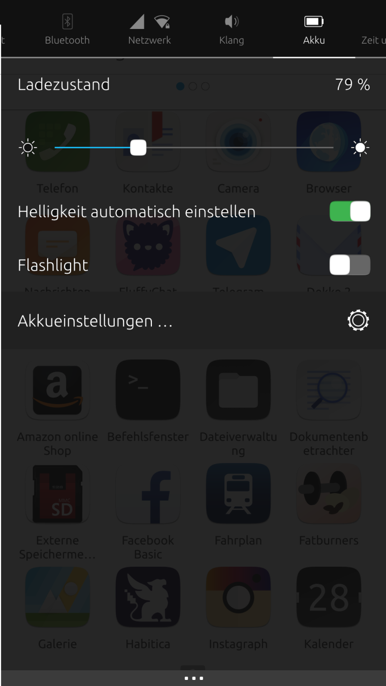
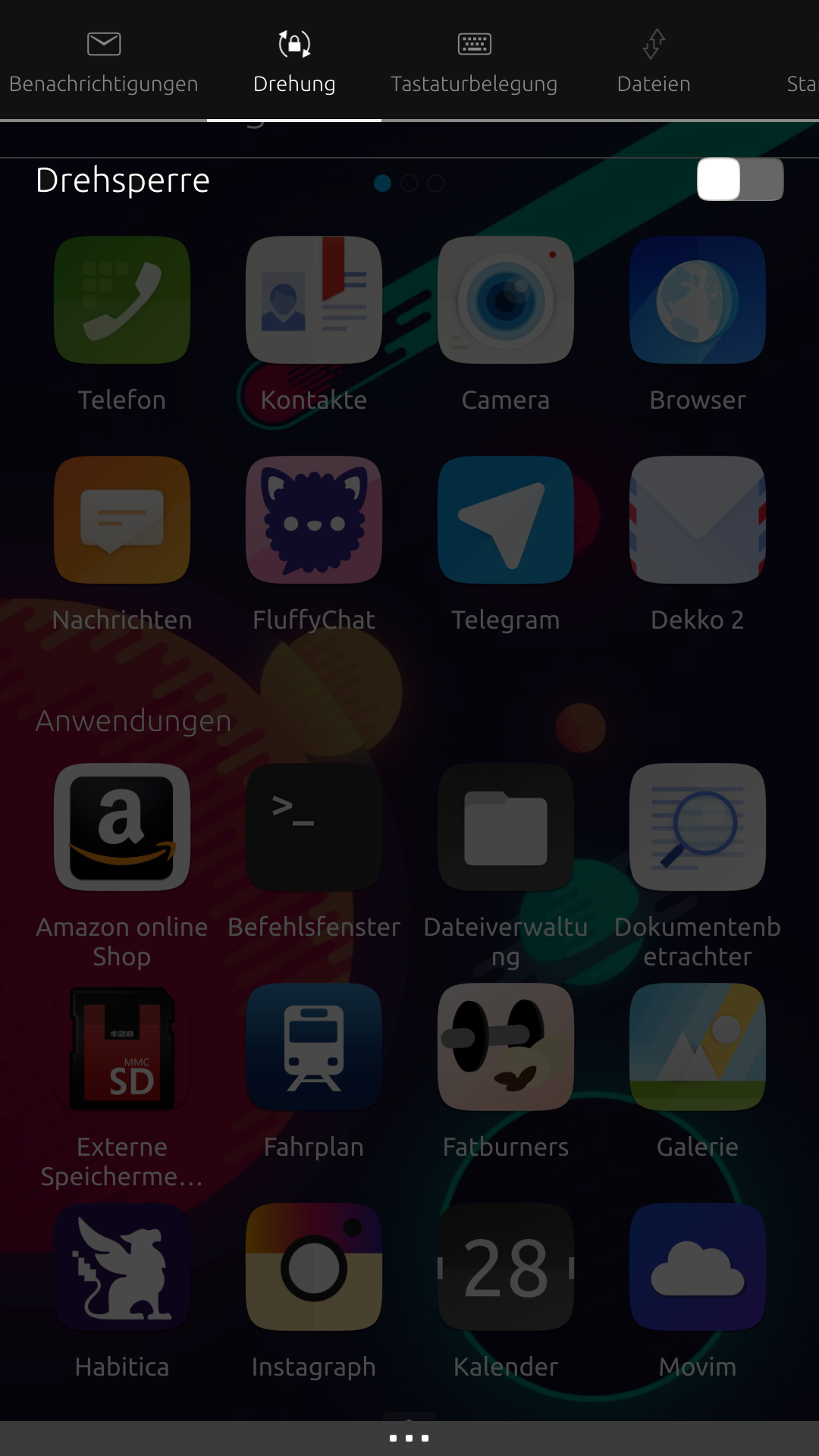
Hey, another simple design proposal: Make the indicators menu a little bit transparen.
The menu is "over" the current app. The user can use this menu without leaving his app. With a transparent effect, it feels more like that he is still in his app and just makes a quick action at the top menu. Also he could still get some information about a change in the current app, for example: I want to look at the calender but in my messenger is a new message. Maybe it is to dark to read the message, but I can see that:
-There has something changed
-The message is very long or very shortFor more asthetic: A light blur effect could be a nice eye candy.

-
nice idea
-
I think that can easily done in the code.
But it would also need an additional item in the settings and might clutter the settings too much because of too many configurations available. -
@krille second this proposal
-
It kind of works in your example with a dark background. But I still have the default white-ish background and think the text in the dropdown will become hard to read. Maybe post a screenshot of that too?
-

Just need to find the perfect transparency value and it seems to work fine.

-
@krille this is OT but I find really interesting that the word in German for "sound" is "klang".
-
@advocatux Does "klang" has another meaning in english/spanish?

@all so I would open an issue now at github to implement this, if no one has more ideas about this.

-
Does "klang" has another meaning in english/spanish?

@krille no, "klang" is just an onomatopoeia in Spanish, a loud metallic sound. And in English, "clang" literally means "metallic sound"

@all so I would open an issue now at github
Sounds good to me
Hello! It looks like you're interested in this conversation, but you don't have an account yet.
Getting fed up of having to scroll through the same posts each visit? When you register for an account, you'll always come back to exactly where you were before, and choose to be notified of new replies (either via email, or push notification). You'll also be able to save bookmarks and upvote posts to show your appreciation to other community members.
With your input, this post could be even better 💗
Register Login