Send Some: Indicators Love (week 3)
-
This week I was hesitant between two subjects, one ore accessible and one more difficult. As it looks like you people like the hard stuff and it also popped in the Telegram channel: let's «design speculate» on the indicators.

Rules:
- Final date to send mockups: Tuesdat 20th at 20:00 UTC
- Sign the mockup with the username you derivate your work (if applyable) and yours
- Mockups can be on any format (even hand drawn)
To keep in mind:
- be nice to each other
- be open minded
- go bananas (no limits, let's do speculative design if you want) but
- don't be upset if your design is not used
-
Are we still talking about design, as opposed to feature enhancement, @cibersheep?
You won't be surprised by my initial reaction of "What's wrong with notifications?" Seriously, I ask in the kindest way - what do you think is wrong with it?
- I like the icon set.
- I like its functionality.
- I like the way it enables one to move around different setting so smoothly.
In fact, I think it's one of the best features of UT.

If we were talking about enhancements; then I would like to see the ability to customize the welcome circle to our own choices. I'd like to expand ringtones for individual contacts, and be able to have different notification alerts. I'd also like to be able to respond to Matrix messages (or Telegram or Signal) in the same smart way that we can with SMS. But my guess is that this is not the place for that conversation.
-
@3arn0wl This isn't about notifications, but about the general indicators interface. Not other general design changes you'd like to see around the system. Only indicators.

-
So, just to be absolutely clear, @dobey, @CiberSheep - this is about how we're notified of an SMS, telegram/matrix/signal message, or phone call?
-
@3arn0wl No, it is not. It is about the indicators in the top panel when you swipe down from top edge (or click on the network/clock/system/etc… icons with mouse). Notice there are no notifications shown in the screenshots which @CiberSheep posted.

That is, the messages indicator (where notifications may show up after receiving them), is part of it, but the general concept of notifications is not what this is about.
-
Hmm, I don't really understand, @dobey. As I said, I like notifications as it is, so I guess I'll leave it to the others.

-
@3arn0wl I might be wrong but I think its about designing/altering the little white indicators at the top of the screen the envelope,location,phone signal indicator, wifi,sound, battery etc. and their associated pull down drawers.
-
@3arn0wl Hmm, it sounds like you are perhaps conflating notifications and indicators to be the same thing. Notifications are the white shaped rectangle pop-up, like when you get a call, connect to wifi, or get a message. That initial item is the notification. In some cases, such as when you've missed a call or message notification, the notification will go away, and it will be added to the messaging menu (the indicator with the envelope icon), which you can view by opening the indicators menu and switching to the messages/notifications indicator.
Being able to respond directly is I think something that needs to be handled from the app side, so that is theoretically something we could enable for matrix/tg/signal/etc… (I don't recall the specifics of how that works at the moment, though.)
So, this thread is not about the messaging menu or notifications specifically, but about the general interaction with all of the indicators from the top panel menu, I think. However, if you only want to concentrate on some changes to the messages/notifications menu portion, that would perhaps be fine as well. Ideas you might have there, could possibly transfer over to others. But I think any suggestions here should be restricted to only the indicators, and not general notifications, or app-specific integration to messaging menu, or such things. Think more broadly.

-
Ouh, sounds like we need to have a conversation also on notifications
 but not in this thread.
So, @3arn0wl I agree, I love how the indicators work. They're easy accessible, swiping between one and another is cool but I'm sure there's room for improvement.
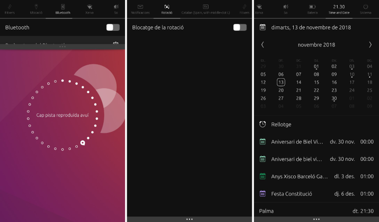
Just to be clear, as Rodney said, @Lakotaubp the indicators are the «panels» that you pull down to see the calendar, the bluetooth, wi-fi, etc.They are not consistent:
- Nearly all of them have a settings section at the bottom except for Notifications, Rotation and Downloads (some because it's not applicable)
- Some are busy as Calendar or Network and others are empty as Rotation or GPS
- What happens if we need or want to add more areas?
-
As is so often the case you are right @dobey, but the Top Edge is a beautiful mash up of more than one thing, and actually holds a ton of promise. And I'm sorry that this is another post about function rather than form, but it seems somehow necessary.
As you suggest @cibersheep, the dropdown menus are varied. The time and date one almost has the functionality of the calendar app. The Sound one has music player controls built in. And the notifications one lets us send SMS. All absolutely brilliant. And one asks therefore if we actually need said apps at all? Same with the Settings icon in the app scope - it's right there at the top.
If you compare what's in Settings, against what is accessible from the top edge, there are gaps. I guess at some point a decision was made about what things ought to be readily available. BUT do we need to be able to access everything? Is it the purview here to review that functionality?
-
This for example were some in-progress docs from canonical: https://docs.google.com/presentation/d/1tpH-vtedGBcvxq-cEgJfAY4XsuHluYdH32yZjYqnU48/edit#slide=id.g18edbbffea_1_4 do we progress in this direction, cleanup, reorginize, possibally new concepts. What criteria do we use to add extra things to indicator menus?
Color, transparency? Maybe we can layout two columns and have it pull halfwaydown, maybe pulling halfwayish gives simple toggel buttons for yhe simple actions, further for more?
-
Well, my suggestion is that we should move in a whole new direction, replacing individual indicator drop-downs, with a single slide-in area, which combines some core features from each, and directs one to appropriate place in settings or other apps, for further settings or information.
Something somewhere in the middle of what we have now, and what Android/iOS/Win10 have, for action area/notifications.
-
@cibersheep
 I do
I do  the indicators.
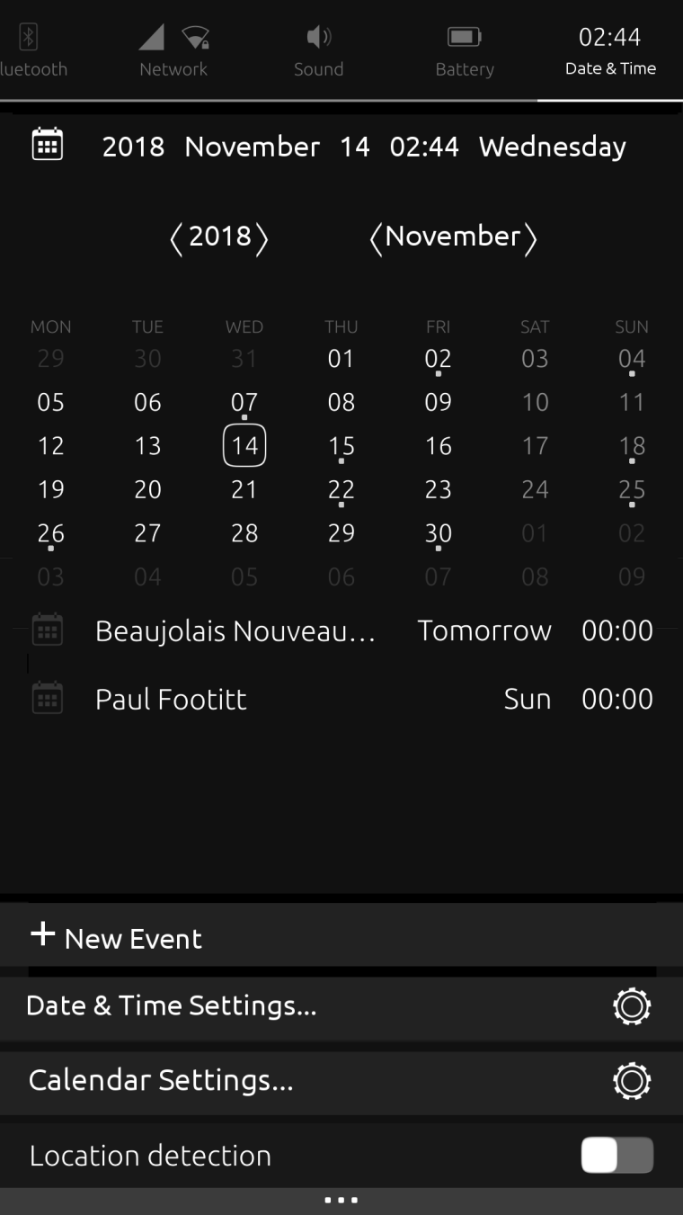
Here's an edited Date & Time indicator... It adds Calendar functions, making the calendar app front somewhat redundant. Nevertheless, the + New Event button, and the Calendar Settings would still use the Calendar app, if that makes any sense at all.

The Location dialogue is part of Time Settings, so the Location detector function could go here too.
I've taken away the link to the Clock - as time is an element of date - so in this scenario, the Calendar app would need the Alarm Notifications function added.
-
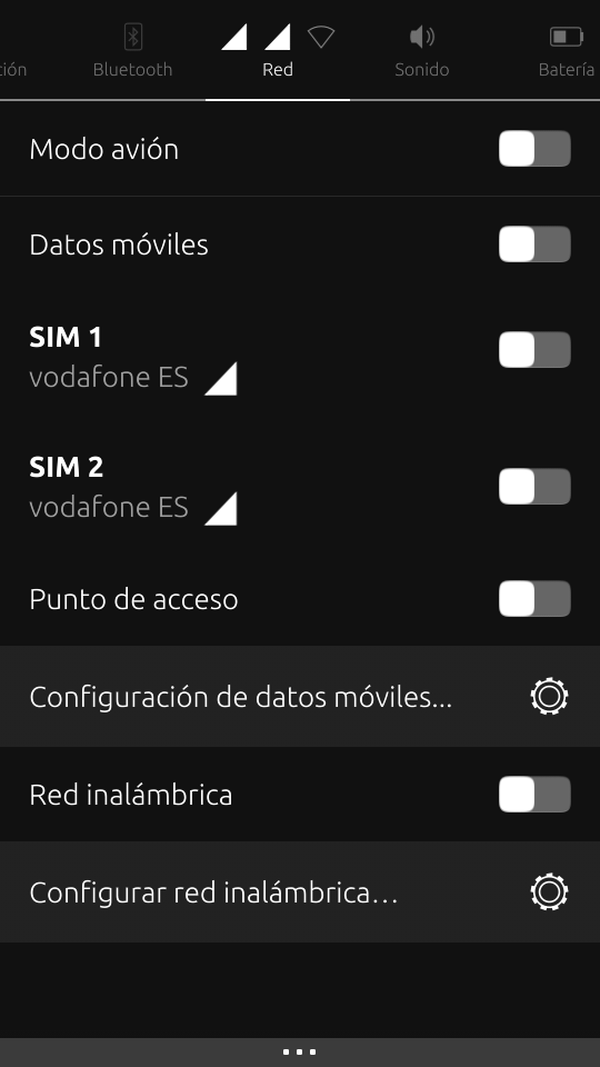
Perhaps could be interesting put an ON/OFF switch button for each SIM card. I think that people with Dual SIM phone (like BQ E4.5) will love this feature (like me xDDD).
I propose something like this:

-
And what do you think about putting another slide button for enable/disable device visibility in the Bluetooth section when the Bluetooth is enabled?
-
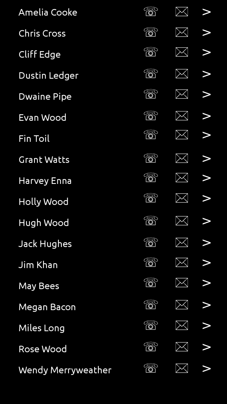
Some people have seen this idea before: a Comms Indicator.

Pull down gives you your contacts, and you can choose to call them, text them or go to their entry in the contacts app. There would need to be an intermediary dialogue to enquire about the app to be used: SMS / Telegram / Matrix / Signal, for example.
-
@dobey I actually love how the indicators works now. It's very easy to find things. For example: changing the brightness of the screen is very quick to access. And that is something I do not want to lose.
I don't see how that would work with one panel.
-
@3arn0wl Mmmmm...
-
@dr0w I don't know if disabling the SIM is possible... or do you mean the data connection per SIM?
-
@3arn0wl I don't think this is a good idea. Think of having 300 contacts, listed in the indicator... and you have the Contacts app

Hello! It looks like you're interested in this conversation, but you don't have an account yet.
Getting fed up of having to scroll through the same posts each visit? When you register for an account, you'll always come back to exactly where you were before, and choose to be notified of new replies (either via email, or push notification). You'll also be able to save bookmarks and upvote posts to show your appreciation to other community members.
With your input, this post could be even better 💗
Register Login