Send Some: Indicators Love (week 3)
-
As is so often the case you are right @dobey, but the Top Edge is a beautiful mash up of more than one thing, and actually holds a ton of promise. And I'm sorry that this is another post about function rather than form, but it seems somehow necessary.
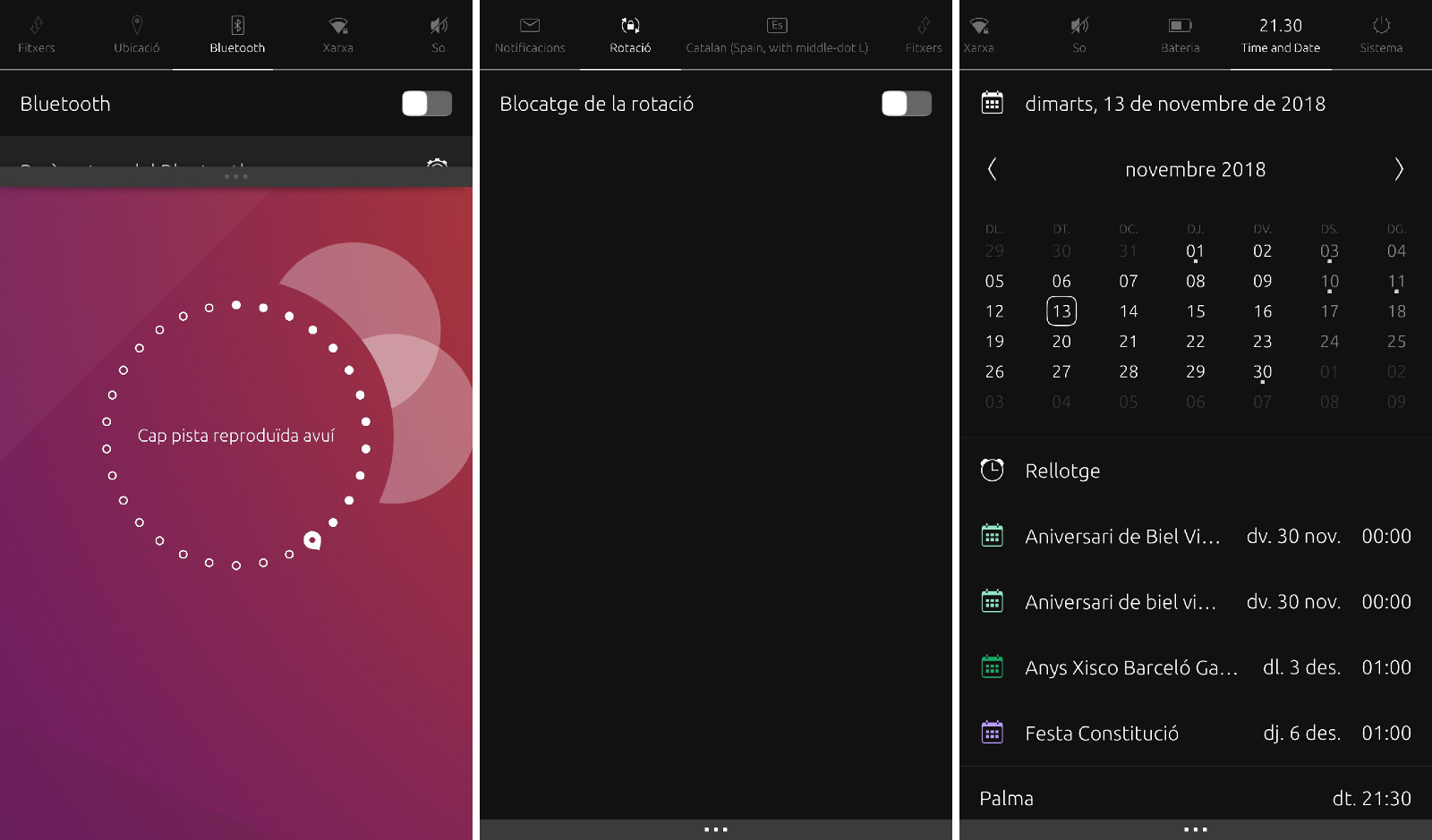
As you suggest @cibersheep, the dropdown menus are varied. The time and date one almost has the functionality of the calendar app. The Sound one has music player controls built in. And the notifications one lets us send SMS. All absolutely brilliant. And one asks therefore if we actually need said apps at all? Same with the Settings icon in the app scope - it's right there at the top.
If you compare what's in Settings, against what is accessible from the top edge, there are gaps. I guess at some point a decision was made about what things ought to be readily available. BUT do we need to be able to access everything? Is it the purview here to review that functionality?
-
This for example were some in-progress docs from canonical: https://docs.google.com/presentation/d/1tpH-vtedGBcvxq-cEgJfAY4XsuHluYdH32yZjYqnU48/edit#slide=id.g18edbbffea_1_4 do we progress in this direction, cleanup, reorginize, possibally new concepts. What criteria do we use to add extra things to indicator menus?
Color, transparency? Maybe we can layout two columns and have it pull halfwaydown, maybe pulling halfwayish gives simple toggel buttons for yhe simple actions, further for more?
-
Well, my suggestion is that we should move in a whole new direction, replacing individual indicator drop-downs, with a single slide-in area, which combines some core features from each, and directs one to appropriate place in settings or other apps, for further settings or information.
Something somewhere in the middle of what we have now, and what Android/iOS/Win10 have, for action area/notifications.
-
@cibersheep
") I do
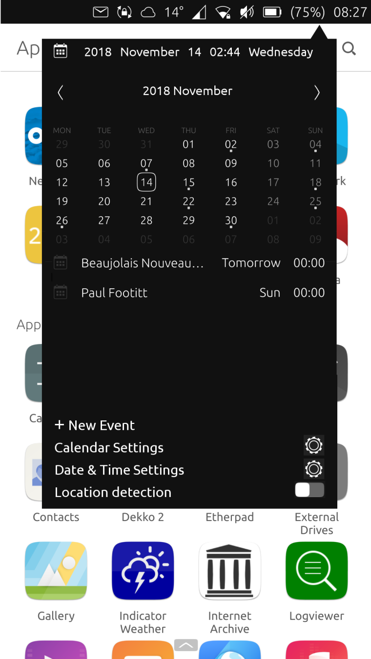
I do  the indicators.
Here's an edited Date & Time indicator... It adds Calendar functions, making the calendar app front somewhat redundant. Nevertheless, the + New Event button, and the Calendar Settings would still use the Calendar app, if that makes any sense at all.
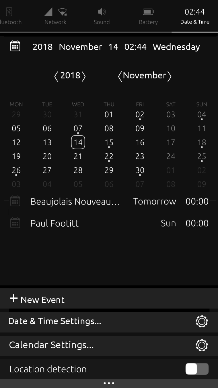
The Location dialogue is part of Time Settings, so the Location detector function could go here too.
I've taken away the link to the Clock - as time is an element of date - so in this scenario, the Calendar app would need the Alarm Notifications function added.
-
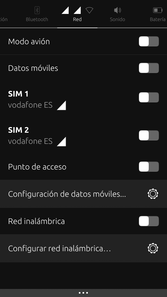
Perhaps could be interesting put an ON/OFF switch button for each SIM card. I think that people with Dual SIM phone (like BQ E4.5) will love this feature (like me xDDD).
I propose something like this:
-
And what do you think about putting another slide button for enable/disable device visibility in the Bluetooth section when the Bluetooth is enabled?
-
Some people have seen this idea before: a Comms Indicator.
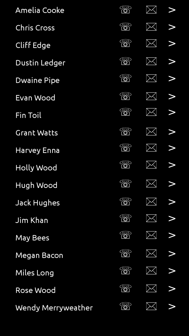
Pull down gives you your contacts, and you can choose to call them, text them or go to their entry in the contacts app. There would need to be an intermediary dialogue to enquire about the app to be used: SMS / Telegram / Matrix / Signal, for example.
-
@dobey I actually love how the indicators works now. It's very easy to find things. For example: changing the brightness of the screen is very quick to access. And that is something I do not want to lose.
I don't see how that would work with one panel.
Another planet, another time, another universe!
-
@3arn0wl Mmmmm...
-
@dr0w I don't know if disabling the SIM is possible... or do you mean the data connection per SIM?
-
@3arn0wl I don't think this is a good idea. Think of having 300 contacts, listed in the indicator... and you have the Contacts app
-
@cibersheep
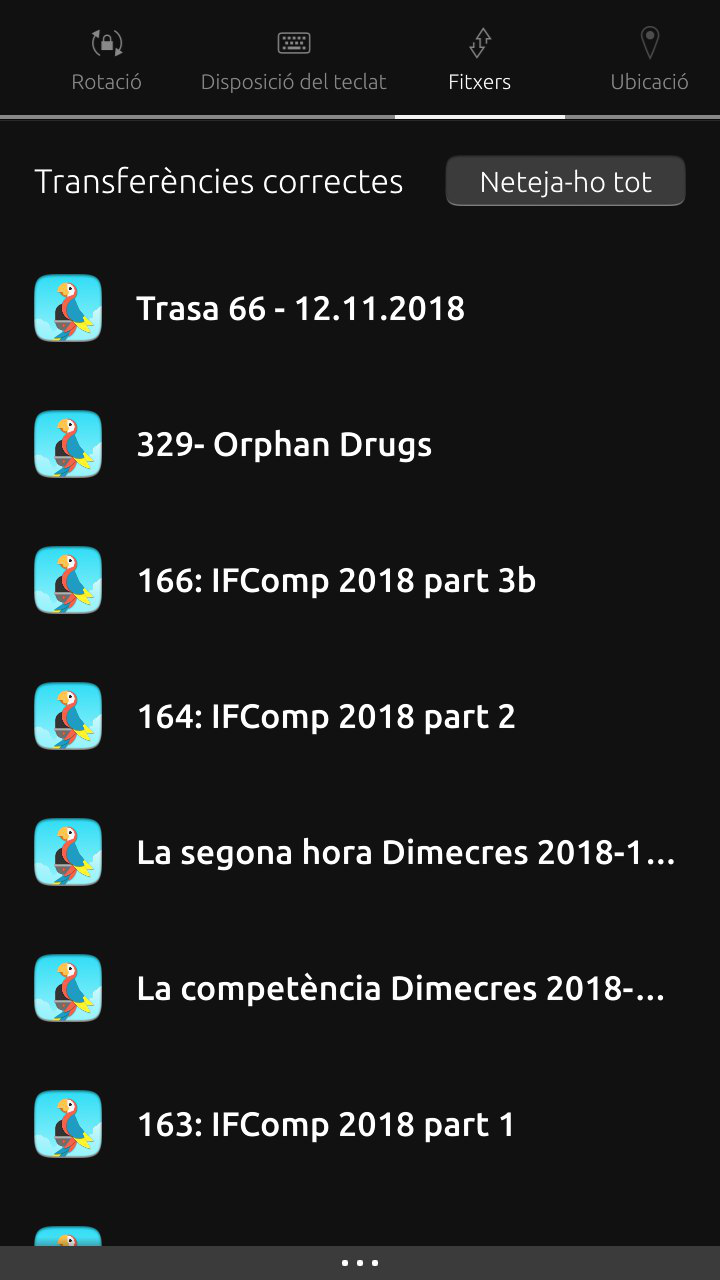
I've come to the conclusion that Indicators ought to be a way of getting to do the common, important things, like calling/texting, listening to music and scheduling quickly and easily. And I think a comms indicator would do just that.The Files Indicator by contrast doesn't seem to have any functionality to it at all... I think in that case, going through the app icon process is better. So perhaps the Files Indicator could be removed...
-
@3arn0wl Files, lists the download files (as podcasts from Podbird, or pdf from the browser
-
Fair enough, @cibersheep - mine's completely empty.

-
@cibersheep Try GNOME. It's something like this:

-
@cibersheep SIM disabling is possible with this script command that another user said me (in other thread):
/usr/share/ofono/scripts/offline-modem/ril_0 for SIM1 or using ril_1 for SIM2
and using online-modem command you can enable it again -
Is the pop-up design language of GNOME, with a flattened palette, preferable to a pull down screen?
-
@dobey I'll do that when staying at my mum's (she has 18.04 with GNOME)
-
@dr0w I didn't know that. Thanks
-
@3arn0wl nope, it's how thing are put inside it. different things (connectivity, bluetooth, position, battery, volume ecc...) inside one single panel...