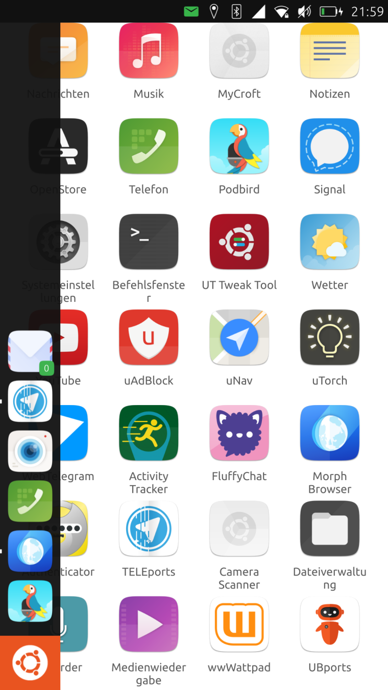
TELEports. New Telegram app icon design
-
@cibersheep Looks great! No, I dont need rounded corners if they are made automatically. Just wanted tomention the design considerations, so that people wont expect to have a circle as an icon xD
-
To complete the ideas from the Telegram-thread a few days ago I add my draft as well. Although I was already reminded that there used to be a browser "in the old times" using a similar logo.
")
Teleports - port - steering wheel was the idea behind it...Edit 1:
In Germany there is a phrase "ein sicherer Hafen" (a safe port). A port suggests safety (for ships).
If that makes sense in other languages a marketing phrase for TELEports (independent of the icon) could be:
<marketing> "TELEports - a safe port for your chats" </marketing>Edit 2: For legal purposes, the plane is taken from https://commons.wikimedia.org/wiki/Category:Telegram_Messenger#/media/File:Telegram_logo.svg and comes as public domain. No copyright fraud intended.

-
@flohack @cibersheep so the background of the icon will be white right?
If it will be transparent you wont see any rounded corners anyway no matter if they are made automatically or not?
If the background will be white: could we see how it looks on a non white background? At best... just did it:
-
@hummlbach Yes that looks awesome!
-
@hummlbach I agree, looks awesome ... Sam Hewitt's work was excellent ... and this is just the old icon inside a circle...
-
That looks eerily similar to the uNav icon though. They are both a stylized arrow pointing to the upper right corner, and inside a circle.
-
The mysteries of design synchronicity : )
-
@dobey yes that bugs me too...

-
Maybe with any other colour...the design it's cool.
-
@hummlbach why not let it point left or right then...
-
@flohack no, keep it to top right like the original icon...
-
@Flohack Yes I'm also in favor to keep it as it is now... At least I tend to... As @elastic I like that it resembles the original but having the white circle in the blue disc you imagine it standing on a teleporter plattform
and additionally there are the teleporter beams on it. The similarity to uNavs icon is unfortunate... Lets try to force @costales to change uNavs icon 
-
IMHO it's fundamental that the icon resemble the original one obviously avoiding any trademark infringing. I think we can use the original "3D-ish" icon as a base and colors (so to keeping similarity with the official one and make it discernable from the Unav one) and apply on it some of the UT official graphic guideline/style so to avoid trademark infringing.
for example something like:

and

they both are in origami style. in the first the geometry and the style of the paper airplane is different from the original/official logo (it'is another paper airplane ;)). the second is more similar in terms of geometry but the teleport effect make it whole new icon.
-
@aury88 I really like the second one
-
@Aury88 Prdon me for intrusion. I like the second one. Just one suggestion. How about get rid of one of the top-right folds. Like this:

There were too much folds in your original for me.I also took the liberty to invert background coloring (dark <-> light), but dunno why. Just a feeling.
Anyway kudos o your contribution.
Edit: I also like the fist one. Simplicity in it's finest form.
jEzEk
-
-
@hummlbach said in TELEports. New Telegram app icon design:
its so asymetric now.
Sometimes asymmetric is more beautiful
")
@hummlbach said in TELEports. New Telegram app icon design:
or lets remove all folds in the upper right edge...(?)
This is a trick question, right? You can not remove both of the upper-right folds. You always need at least one to maintain light-dark background (without using gradients).
-
@jezek If we need a single fold probably is better to maintain only the upper one because it is based on one of the main folds/lines in the airplane (as the icon guideline says). about the dark-color it is used also to make the farther wing more dark so to give a 3d effect. tomorrow i will post some iterations of the design with the light color fold applied on the top side (or dark in the lower) so we can see what is better for the 3d effect and for the icon.
about the single or the double fold honestly I didn't saw that the single fold style was the mainly used. My error.
@hummlbach I don't think a little less sharp edge would be so visible with the icon sizes. vice versa if we make them more rounded (greater radius) we risk making it difficult to understand that the element is an airplane with missing pieces. we can try to reduce the number of the missing strips so to lower the number of the sharp edges
-
ok, I made some design iteration based on your suggestions.

(2.2)Applying a light fold on the airplane doesn't make it more white (obviously) and we lost part of the 3D effect.
So a better way is to apply a dark fold in the lower (nearest) wing.
first iteraction:
(2.3) but here the shadow on the inner part of the airplane is wrong (shadow cast in the wrong direction)
So imho is better to apply the fold aligned on another edge of the airplane :

(2.4) here the shadow is correctly applied.the last one is the case with two folds (I still like them):

(2.5) -
@aury88 2.5 for me
Hello! It looks like you're interested in this conversation, but you don't have an account yet.
Getting fed up of having to scroll through the same posts each visit? When you register for an account, you'll always come back to exactly where you were before, and choose to be notified of new replies (either via email, or push notification). You'll also be able to save bookmarks and upvote posts to show your appreciation to other community members.
With your input, this post could be even better 💗
Register Login