Revised System User Experience
-
@marc_aurel said in Revised System User Experience:
it needn't be necessarily an app. see the concepts of Spotlight or Notification center for example
I don't see your point here. Both of these are simply alternate ways to access applications, via system integrations.
@marc_aurel said in Revised System User Experience:
but what alternatives are available for UBports
UBports is simply a foundation which develops Ubuntu Touch (which I presume is what you're referring to), which uses the Unity 8 interface. There are no "alternatives" to that within Ubuntu Touch. It is a core part of the system, and not going to change.
@marc_aurel said in Revised System User Experience:
Are these initiatrives still active? Is someone working on this? Or is someone interested to work together with me and my team?
None of those things were ever implemented at any level, nor are they likely to be, as they do not fit within the core design goals of Unity 8.
-
@dobey My examples are unserintefaces, which hides the apps underneath. In companies it is now a matter of course that data, business logic and user interfaces are separated. I also think this approach makes sense for end users. See also the vision of tim Berners Lee to create a standard for data that can be used by different services and apps.
Too bad that there are no other initiatives to improve or change the UI of UBports. In the medium term, I think this makes sense if other device classes are to use UBports, for example Smart Watches or Smart Glasses. Developers or companies of the community who are interested can write to me. I am a big friend of cooperations.
-
@marc_aurel said in Revised System User Experience:
Too bad that there are no other initiatives to improve or change the UI of UBports
Simply because you do not like the designs or improvements, does not mean they aren't happening. We are definitely working on improving the system. However, making everything be a generic plug-in that you can replace for every piece of the UI, as you seem to want, is not happening, and doesn't make sense.
To really do what you want, and build a solid product with it, you're basically going to have to hire a couple hundred people to work on things full time.
@marc_aurel said in Revised System User Experience:
if other device classes are to use UBports, for example Smart Watches or Smart Glasses
Neither of those are in the target segment. Both require substantially different methods of interaction.
-
@dobey I appreciate the improvements of the UI like the support of the Suru Dark theme. Pushing themes is a good example for flexibilisation.
Improvements don't necessarily need a completely new UI. Some alternative concepts might be easy to implement lika a tile instead of fan arrangement of open apps by reusing the UI element of scopes in the fan.
However, I respect the fact that you are not open to UI changes. The current concept is not bad. It highlights the concepts of Ubuntu that many users appreciate.
My question is directed at all forum participants who enjoy discussing improvements to the user experience and maybe want to be practical about it.
It is very gratifying that the people behind the UBports Foundation are very open-minded about the topic.
I like by the way the concept of Android to develop and exchange a launcher like an app. It makes the implementation of ideas and innovations very easy.
-
In this photo i'm in Desktop Mode + UTTT Scaling value: 16, + Usage Mode: Windowed, + Launcher: Disabled, Theme: SuruDark.
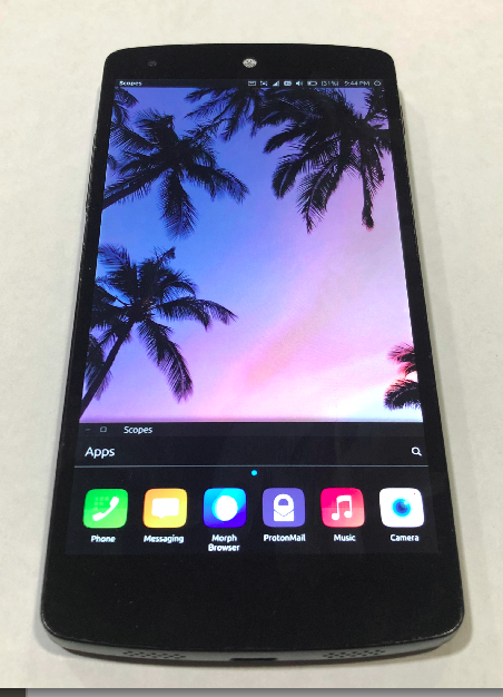
I customized mine with UT Tweak Tool because I didn't like the look of stock OTA 8 and edge was giving me problems if I didn't lock the rotation settings. Here's my mock-up
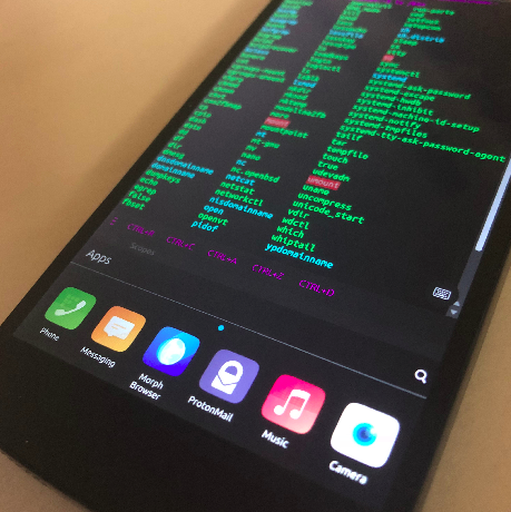
I hid the Unity Bar and put all my favorite apps at the bottom. If you scroll up from the bottom, all of the apps are visible, but the app drawer doesn't get in the way of the main display.
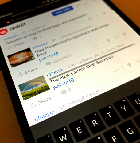
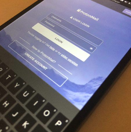
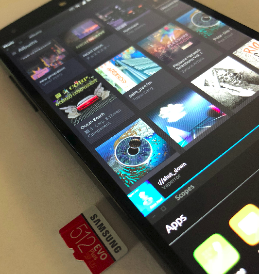
overall I like this user experience over the current stock Ubuntu Touch user interface, but the only limitation right now is that I don't know how to keep all the windows locked so I don't accidentally move them out of place. Grid locking for when using windowed mode would make this easier.
-
@divideandsponsor Great work. Thanks. So, you realized the modification with the Tweak Tool? Amazing. I will have a look at it.
If I understand you correctly, you hide the Ubuntu inspured app side bar and introduced an app dock at the bottom of the screen, that is alway wisible?
You can slide the app dock in like in Plasma Mobile and Sailfish OS to show all apps, that are avalable in a separate scope by default. Correct?
I think, the window mode has no fan arrangement of the open apps. So you have to tap on an icon at the bottom to get an opened app to the front, right?
Your suggest, that app tiles should be possible to implement more easy with a window mode, doesn't you?
What do you mean with this sentence?
The only limitation right now is that I don't know how to keep all the windows locked so I don't accidentally move them out of place
-
@marc_aurel said in Revised System User Experience:
If I understand you correctly, you hide the Ubuntu inspured app side bar and introduced an app dock at the bottom of the screen, that is alway wisible?
No. The launcher is still there if one does short swipe from left. The thing at the bottom is just the
unity8-dash(scopes) app carefully positioned and mostly off screen. It is not always on top, and can be minimized, but not closed.You can slide the app dock in like in Plasma Mobile and Sailfish OS to show all apps, that are avalable in a separate scope by default. Correct?
No. It's just a normal window, and the area inside it is scrollable. The window can be dragged around and resized like any other app window.
I think, the window mode has no fan arrangement of the open apps. So you have to tap on an icon at the bottom to get an opened app to the front, right?
Again, no. Swiping from the right edge will still open the app spread. Or one can tap the icon on the launcher from the left edge swipe to switch. Attempting to launch again by tapping on the icon in the scope will possibly also raise an app if it's already running.
Your suggest, that app tiles should be possible to implement more easy with a window mode, doesn't you?
No, and it's not clear what you mean by "app tiles" in this sense. Whatever it is though, the difficulty is unchanged.
What do you mean with this sentence?
That unity8 does not have iOS/Android style multitasking.
-
@divideandsponsor what do you think about sprint? It's similar
-
@malditobastardo Do you have a link? I found a special user interface for Sprint phones, but I think you have something different in mind. If I search for sprint and user interface I get many scrum related hits

-
@marc_aurel he's talking about https://open-store.io/app/com.ubuntu.sprint (a little UI experiment)
-
@advocatux Thanks. I'm afraid I don't quite understand the idea behind the app. I suspect the intention is to freely select preferred apps and place them on a grid on the so-called desktop.
Interestingly, an alternative selection of apps was simply implemented as an app itself. It would be nice if the default view was adapted to SuruDark.
With the Tweak Tool many interesting variants are already possible. I would still like to be able to hide the permanent display of the device status.
A refined UI could start with the following actions:
- Adding another mode to the fan and window mode, that uses tiles.
- Hiding respectively replacing the starter bar with a different one.
- Adding another launcher as one or more apps.
Hello! It looks like you're interested in this conversation, but you don't have an account yet.
Getting fed up of having to scroll through the same posts each visit? When you register for an account, you'll always come back to exactly where you were before, and choose to be notified of new replies (either via email, or push notification). You'll also be able to save bookmarks and upvote posts to show your appreciation to other community members.
With your input, this post could be even better 💗
Register Login