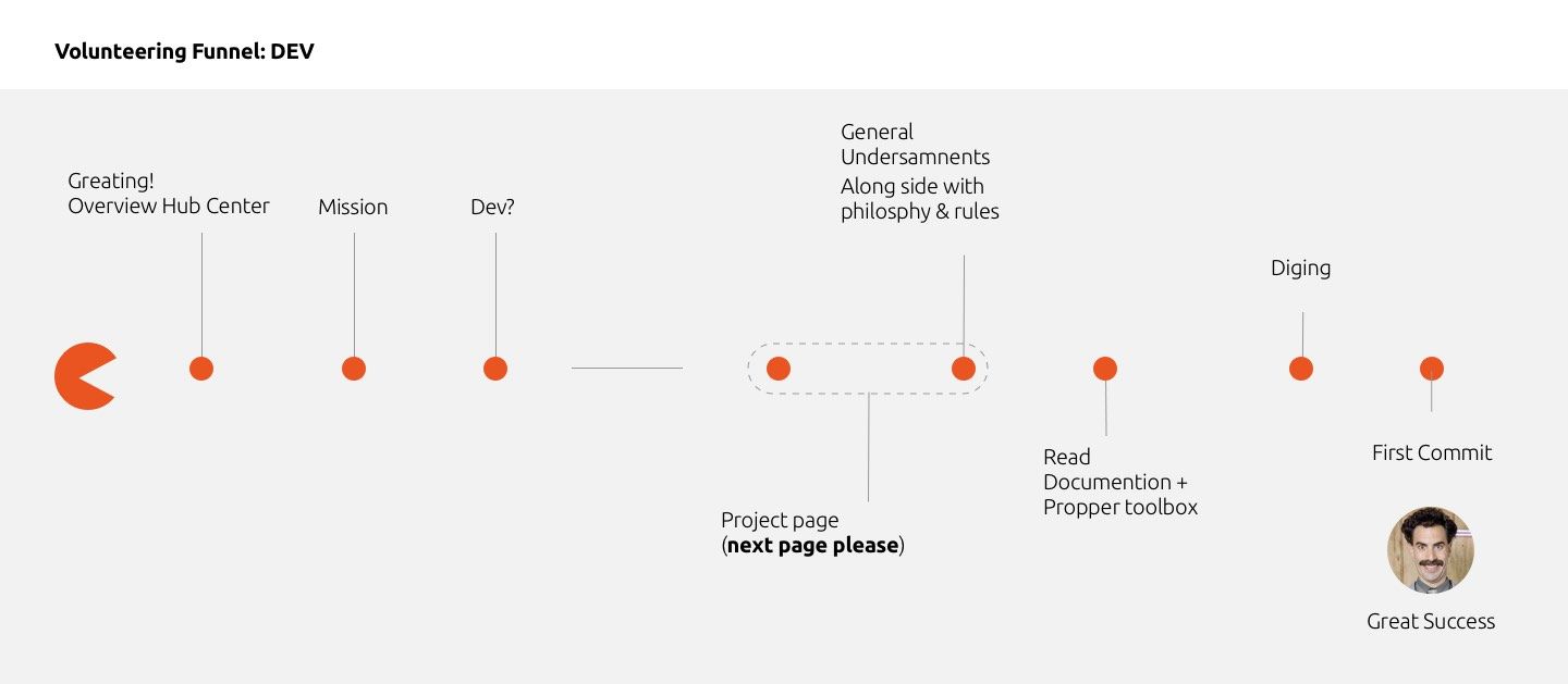
Calling all developers to break down the new onboarding web page
-
@Kaizen i would suggest the same order of reading for the OS schemas ( the one with Android based and the Pinephone ), low level at the bottom.
-
@Kaizen the schema at the bottom seems still accurate for most of things, but need confirmation
-
Is anyone working on making these changes?these mockup are fantastic.I would love to contribute in developing the website as per the mockups.Is anyone working on it already?
-
@kaizen Amazig work! goood job! I really like it

Can I suggest something from a non-technical POV?
At the top of the sketch you have inserted a truly explanatory schematization (we need to add the app layer). I suggest to keep the same order for the component listed in the first "about the project" section.
Also in the second "about the project" you have used new therms and this could be confusing for someone like me:- where is the lomiri layer?
- what is this new midleware? is it the halium + core layer?
A better way to keep all more intuitive as possible (but i don't know if it is possible) is to make all the information hidden unless we touch on the desired section: if you touch the "lomiri" layer on the top scheme it opens in the bottom the "Lomiri project" of the first "about the project"
If you touch the "halium" layer on the top scheme it opens in the bottom the "halium project" of the first "about the project" with also the explanation you putted in the second "about the project" section
and so on...
also all element in the second "about the project" should be clickable (not the software ) with direct link to the doc or their github/lab page.
my2cents.
Aury
Hello! It looks like you're interested in this conversation, but you don't have an account yet.
Getting fed up of having to scroll through the same posts each visit? When you register for an account, you'll always come back to exactly where you were before, and choose to be notified of new replies (either via email, or push notification). You'll also be able to save bookmarks and upvote posts to show your appreciation to other community members.
With your input, this post could be even better 💗
Register Login