Navigation

    UBports Robot Logo

    UBports Forum

    • Register
    • Login
    • Search
    • Categories
    • Recent
    • Tags
    • Popular
    • Users
    • Groups
    • Search
    1. Home
    2. Kaizen
    • Profile
    • Following 0
    • Followers 2
    • Topics 5
    • Posts 50
    • Best 22
    • Groups 0

    Kaizen

    @Kaizen

    57
    Reputation
    50
    Profile views
    50
    Posts
    2
    Followers
    0
    Following
    Joined Last Online

    Kaizen Follow

    Best posts made by Kaizen

    • RE: UBports Website rebuilding

      Thank you, @loops! And thank you @CiberSheep for sharing your design/process with me! it seems that I've just arrived at the right timing! - First, let me introduce myself, I'm Kaizen 35y/o, designer from Tel Aviv/California.

      To be honest - my goal is to create/design a kick-ass, super modern, and shiny website like any mobile OS entitle to have.

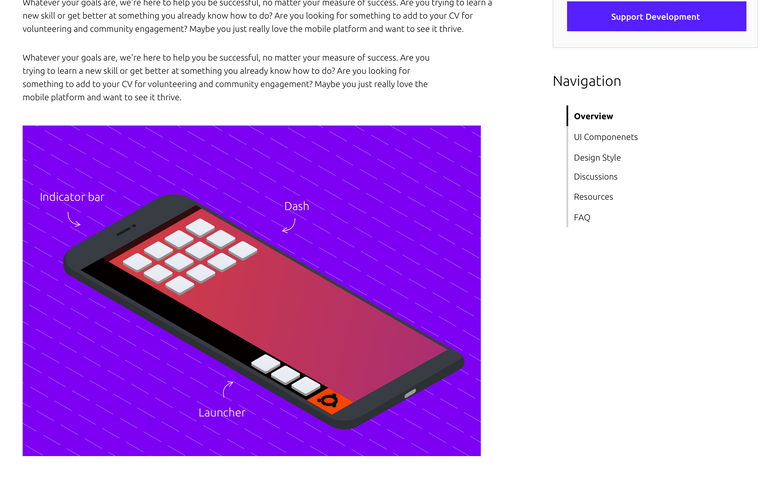
      Let me share some of my thoughts and my point of view - The home page has to be stunning and be a pixel perfect design (like the OS)
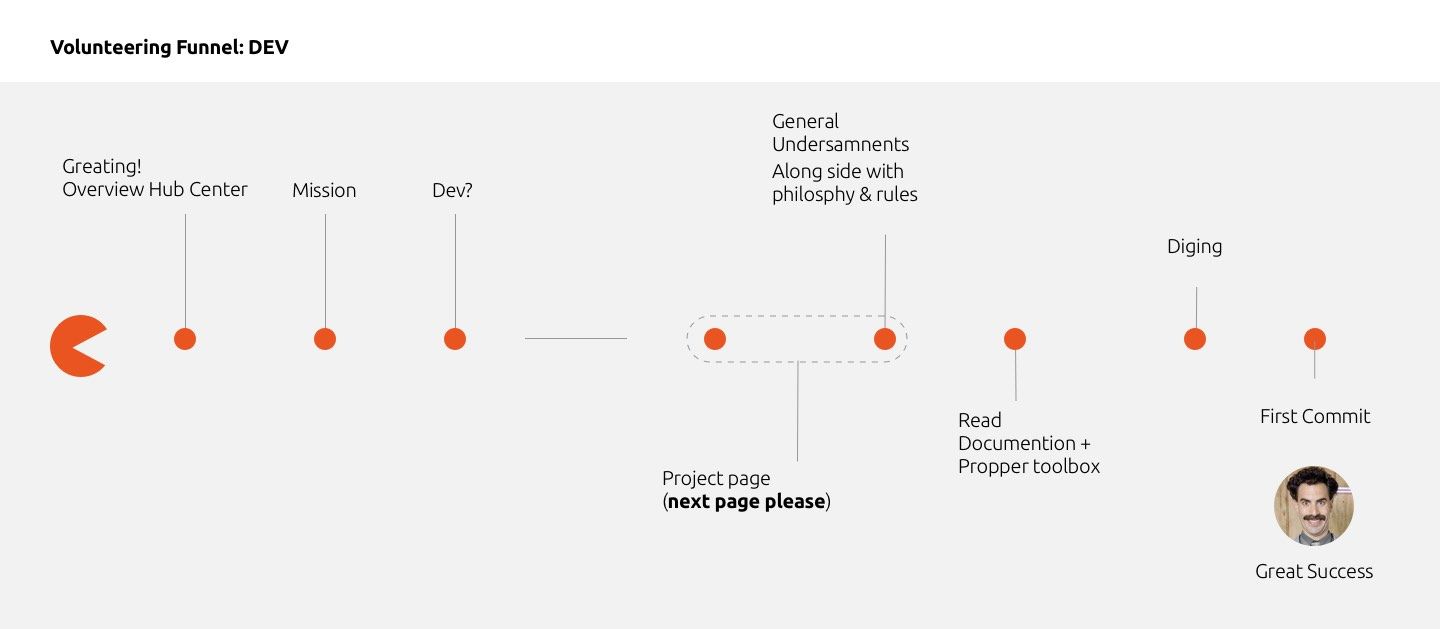
      Home page goals

      • Attract developers/testers to join and contribute
      • Be simple to Install for the general public
      • Attract donors and supporters (hall of fame?)

      General

      • I would like to prioritize context and explore a different value proposition.
      • Keep the navigation bar clean and straightforward.
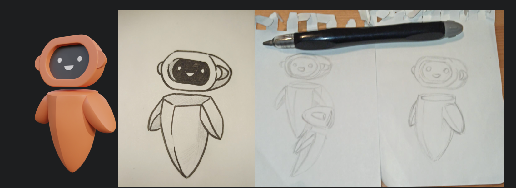
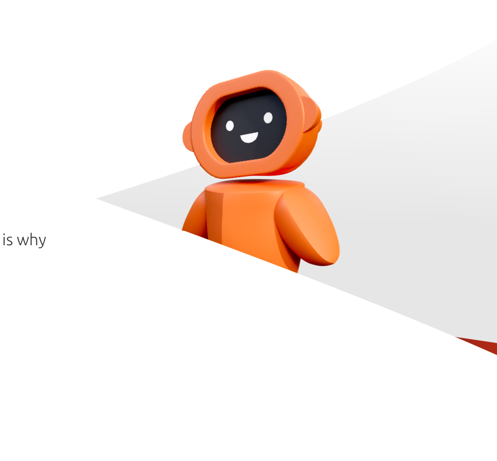
      • Create new high-resolution imagery - I was thinking of creating a Yumi 3D version in a low poly environment (doing stuff: building an engine, creating, developing)
      • Simplify the download section into a nice flow.
      • Add social and media proof.
      • Keep the right balance between UBport and Ubuntu colors.
      • Keep the texts easy to read.

      I was thinking of a black background website, dark style with the right balance of colors (Orange/Purple), 3D Icons.

      I have already created many 3D assets and still looking forward to creating the perfect figure and environment.

      I have a lot of positive attributes, but if you have any genuine suggestions, I would be glad to hear them.

      Please see the attached a rough drafts for concept only and share your thoughts.
      WIP > Home page suggestion - https://ibb.co/bdS0CJv
      Device List - a popup with device list! - https://ibb.co/DVcnZPw
      Installer > Download Section - https://ibb.co/hyR69mr

      posted in Design
      Kaizen
      Kaizen
    • RE: UBports Website rebuilding

      The wife took the kids for ice cream, and I couldn't wait. Here is my half-mile away design, without the demonstration part, and Yumi's icons/imagery.

      Please shoot on anything (aim to kill 😉 )

      posted in Design
      Kaizen
      Kaizen
    • RE: UBports Website rebuilding

      Thank you all for your great comments! I liked the black version, but you right doesn't go along with the brand. Also, it was too "Gaming" and a bit childish.

      @CiberSheep - I'm trying something new, white, cleaner, pure—worth waiting, not necessary without "extra elements that add nothing to the design."

      Few words about these elements:

      These elements are for an extra layer of communication like words (I don't believe in design BS, but it's true). As the same value, Ubuntu touch gives the market we need to provide the website visitors.

      Ubuntu touch is not just a community-foundation with cool people creating geeky open-source OS. UBUNTU TOUCH IS A BRAND. If we want to attract donors and talented people, we need to choose the right communication tools.

      @Loops - Exactly, something refreshing, attractive as you said. Dark/Light toggle button is something that I thought about, but I'm not sure that fits into the current website.

      I'm here to deliver one page. As I see it, I need to design a new 'Header' and 'Footer' to be fit with the rest of the site. (If my design ever be used :))

      @CiberSheep I've no attention to ruin Yumi, just lift his spirit. I plan to create beautiful scrolling animation, which tells a story of Ubuntu touch trough privacy, freedom, features, community, app store, etc.

      @standwood - I see the urgent of multi-language website, I'm not sure I'm there. First I would like to the deliver perfect pixel design and see what the rest think of it, hope I earn my credit to design rest of the pages 🙂

      It will be appropriate if anyone can tell me where I can find open store icons, screenshots, phone mockups, OS demo, and any materials which can help me.

      I encourage everyone who is interested in taking part in the design process. Please leave comments!! positive or negative, I have thick skin (and much self-criticism)

      In the end, I will deliver one page ready to use. (with animation and all the magic going on) Some parts of the design will be unusual elements, which may be hard to digest, but I promise It looks excellent.

      In meanwhile, see some of the 3D work in progress.

      Screen Shot 2020-05-26 at 10.32.48 AM.png

      Screen Shot 2020-05-26 at 10.32.28 AM.png

      posted in Design
      Kaizen
      Kaizen
    • RE: UBports Website rebuilding

      Great things going on, major update soon.

      posted in Design
      Kaizen
      Kaizen
    • RE: Calling all developers to break down the new onboarding web page

      New update released. Please follow the progress
      https://www.sketch.com/s/78141e91-1a75-401d-b7a2-1c1a1797b561/a/yR1zza

      posted in Design
      Kaizen
      Kaizen
    • Marketers/PR/Media people wake up! This is your time to shine!

      I'm looking to fill a new page on the new website which is going address mostly PR Stuff, tools, logos, voice and ton of marketing style. Also a place which you can invite people from the community to talk in your show or podcast.

      What else would like to see there? comments are welcome!

      https://www.sketch.com/s/78141e91-1a75-401d-b7a2-1c1a1797b561/a/gjRGGj

      posted in Marketing Incubator
      Kaizen
      Kaizen
    • RE: Clock Redesign Ideas

      @AppLee Thanks.

      World Clock:
      My friends and family located in many cities around the globe. Sometimes, when I'm not sure who is awake for small talk (East or West), I need to double-check myself on the search engine.

      My need is to understand "Where am I" comparing to other folks -> quickly! (It may be aligned with "Ubuntu philosophy" Think about it 😉 ) I will call this feature "maphakathi" (Middle in Zulu).

      Typography:
      I'm avoiding use Ubuntu Medium Weight. it's in the middle of light and bold, and it's hard to define, which is a title and which not, and very confusing.

      Spacing:
      Spacing is different than Ubuntu Touch, I'm afraid spacing is necessary to read this kind of information.

      Figma Link for everyone to clone and take if from here

      I tried to adopt the look-screen style. In addition you'll find other alternative screens for Timer and Alarm. (WIP)
      Screen Shot 2020-08-17 at 7.07.47 PM.png

      posted in Design
      Kaizen
      Kaizen
    • RE: Calling all developers to break down the new onboarding web page

      @CiberSheep That's great idea! for the UI part in the hub center.
      Do you mind share some words on that please? I will add it to the raw content drafts!

      Mean time, you're idea turned to nice page already 😉

      Screen Shot 2020-07-23 at 12.46.48 PM.png

      posted in Design
      Kaizen
      Kaizen
    • Calling all developers to break down the new onboarding web page

      As part of a new approach to crack new boarding page. I need your help to figure out what developers need before getting into documentation and visitors to take action.

      For developers, I set a helpful guideline for contributing. I'm not a developer myself, so please comment as you answer your mom, I'm still trying to puzzle the devs to get a proper overview.

      New ideas and comments are welcome!

      Please review this file - Development Funnel

      1 copy.jpg

      posted in Design
      Kaizen
      Kaizen
    • RE: UBports Website rebuilding

      @CiberSheep Thank you.

      @henri2h I will check that, Thank you!

      @Josele13 Well, I think you look at the first initial draft I wouldn't call it design. Yeah I can try to to make a 3D model

      @potet Thank you.

      Well, I have decided that I need to break things out into two pages. I want the whole demo section (it mostly value proposition) into the new page.

      1. Home - Frontpage mainly presents the 'Why' of using the ubuntu touch - Open source, freedom, etc.

      2. OS - The OS page is mostly about the 'How.' So this page will primarily include OS Visuals and tons of animation (Which I almost figured out) - Tricks, look, terminal, player, App store, messaging.

      I might need help to record the screen for the second page. I don't have a compatible UT device, and my Linux is out of reach right now - Who will ever volunteers gets a storyboard of what he or she needs to do.

      @potet You've done great on the first page. Maybe you can write a value proposition based on the given?

      Guys, I need you to write comments on the design, check grammar, and have a pixel-perfect eye, feel free to comment on anything (wrong or right)! - Just not the footer because I haven't been figure it out yet.

      Version 2 is now air!

      UB Web.jpg

      posted in Design
      Kaizen
      Kaizen

    Latest posts made by Kaizen

    • RE: UBports Website rebuilding

      It's about having common and easy ways to get access from the forum to the website vice versa.

      @3T_Ed Not sure I follow you... Figma link is now working, see if it answers your request.

      I'm just curious as to what progress ...

      Mostly interviewing, designing, programming, and debating.

      ... and your thoughts in sketches as a continuous work in progress (creative, design, usability, content/catchphrases, etc.)

      Funny, I find it as an interview question 😃 . (The sketch process was done a few weeks ago, and removed it due to advantage reason)

      I answered that question, but I found it too vulnerable to expose my process, so I erased it. But you won't go empty-handed. >>> The general plan was to bundle all current resources and community needs to newcomers, with a vibrant attitude and, a clean/clear social purpose. I see the process as pure sale (as we discus before)

      Website traffic is X. Every month, a small portion of the visitors' sticks. We have meaningful idea to convey others to join something big. As more we turn visitors to contributors, the more community is becoming productive and more teams are formed organically.

      Soon, with the brand book release, I will elaborate more details ...

      posted in Design
      Kaizen
      Kaizen
    • RE: UBports Website rebuilding

      @3T_Ed Oh, I see, for discussion purposes. Btw, that is already been done live and working.

      But I think what he tried to say that the subdomains need to have go back button (?)

      posted in Design
      Kaizen
      Kaizen
    • RE: UBports Website rebuilding

      First, thank you for suggesting ideas, I'm more then open to apply new changes.

      where is easy to enter but difficult to exit

      @Aury88 Are you sure you talking about the forum?

      should let the user easily navigate in any "direction" inside the project

      Beside SDK, Documents and Forum, what other subdomains/pages do you find important to navigate to insistently? (within the UBports domain ofc)

      the same should also apply to the documentation page, another dead end section

      Basically you suggest to have a full navigation menu on ubports sub domain? or just return to home (to website/forum) button?

      posted in Design
      Kaizen
      Kaizen
    • RE: UBports Website rebuilding

      sorry for re-opening this discussion

      The project isn't done yet, all is cool 😉

      it does seem almost a thing in itself while in reality the forum is an integral part of the community and the project.

      The site has MANY entrance points to the forum on many subjects and conversations.

      JAVA compatible?

      Thank you for paying attention

      posted in Design
      Kaizen
      Kaizen
    • RE: New badge for Yumi?

      @C0n57an71n I liked the feather!

      I see it as a mascot, not as an OS logo.

      Yumi has plenty to offer as a character. There are many ways to improve him to a really memorable logo, but he is already taken the mascot position. The bottom line it's all come down to the process.

      And the process is sometimes full of many stressful decisions. Since I do it for my living, I can say behind every pixel hiding many stakeholders' decisions, expectations, and argues.

      Nobody has copyright to nature.

      Some companies even claim colors.

      giving this, I just played around the word "Touch".

      Yes, and that is where process start from. I like your styles, you are definitely a thinker.

      posted in Design
      Kaizen
      Kaizen
    • RE: I made a new boot screen image. (for nexus 5)

      @hammerhead That was for the demo proposition. I have the entire logo list of all manufacture somewhere in SVG I was just lazy to use, but thank you for suggesting a better one!

      It's not up to me to decide. I'm just a fixer. When the foundation approves it, I will send the guidelines — I'm just trying to create a standard for all. What can I do? I know everyone has it's own preferences...

      BTW - The left one is the one we can legally use. Not sure about the circle of friends tho, I need to check it again.

      posted in Design
      Kaizen
      Kaizen
    • RE: I made a new boot screen image. (for nexus 5)

      Ok. Check this two
      Screen Shot 2020-08-24 at 5.39.33 PM.png image url)

      posted in Design
      Kaizen
      Kaizen
    • RE: I made a new boot screen image. (for nexus 5)

      respect the brand logo as much as possible

      Manufacturer or OS?

      elegant «powered by» and «supported by»

      That is bit tricky IMHO, Ubuntu getting their logo for recognition, nothing else if I understand right, so it's not true say support or powered by

      @CiberSheep So how you would recommend to address that in one single line? we can also, leave those icons with no line at all (better I think).

      posted in Design
      Kaizen
      Kaizen
    • RE: I made a new boot screen image. (for nexus 5)

      @hammerhead @geekvine @magdesign @Lakotaubp
      Hi Guys, I'm reviving this thread due to my work on standardizing logo applications.
      Please see my design propositions, feel free to give comments and express your thought.

      posted in Design
      Kaizen
      Kaizen
    • RE: Clock Redesign Ideas

      @AppLee Thanks.

      World Clock:
      My friends and family located in many cities around the globe. Sometimes, when I'm not sure who is awake for small talk (East or West), I need to double-check myself on the search engine.

      My need is to understand "Where am I" comparing to other folks -> quickly! (It may be aligned with "Ubuntu philosophy" Think about it 😉 ) I will call this feature "maphakathi" (Middle in Zulu).

      Typography:
      I'm avoiding use Ubuntu Medium Weight. it's in the middle of light and bold, and it's hard to define, which is a title and which not, and very confusing.

      Spacing:
      Spacing is different than Ubuntu Touch, I'm afraid spacing is necessary to read this kind of information.

      Figma Link for everyone to clone and take if from here

      I tried to adopt the look-screen style. In addition you'll find other alternative screens for Timer and Alarm. (WIP)
      Screen Shot 2020-08-17 at 7.07.47 PM.png

      posted in Design
      Kaizen
      Kaizen