Login screen/Code input Design
-
oh, that is looking nice
")
-
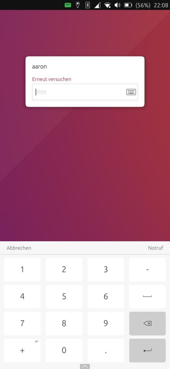
@aarontheissueguy here was the start - https://github.com/ubports/unity8/pull/314
just started with removing the background to let keyboard transparency work, and removing the hard-coded theme - unfortunately the theme is hard-coded to dark at a lower level for lomiri - then hard-coded back to light for notifications and lockscreen... so we would have to undo dark theme for the whole shell, and then retheme?
-
so we would have to undo dark theme for the whole shell, and then retheme?
@mateo_salta If I understood what you say correctly, that would require work in unity as a whole and not just the Greeter part, right? Id rather try to make the Login neutral to theming, I think the mockups @purplevvay made would work well in both scenarios.
Anything else would probably result in even more work which requires better understanding of the source code and a person who actually is able to do the described things. (pls correct me if I misunderstood something here)
here was the start - https://github.com/ubports/unity8/pull/314
Thanks I will take a look at what you did later. It seems similar to the things I tried in last days at a first glance.
-
@aarontheissueguy yeah, just means we leave it on the light theme for now
-
Glad to hear that my mockups are useful
So now we should write a qml version of the mockups and submit it, or open a new topic about feature requests, shouldn't we?
But later, I guess right now everyone is focused on preparing ut for focal.
-
So now we should write a qml version of the mockups and submit it
That would be optimal, but we will probably need some help to do this.
or open a new topic about feature requests, shouldn't we?
I would open an issue on github with a detailed request and mockups
I will continue to work on the QML side but that will take some time and much work for me. If someone with QML knowledge wants to help me that would be great.
-
I think it would be better to get the opinion of UBports people especially the design team before doing any serious effort on actually implementing these designs. I would be willing on helping on this
-
@kugiigi That makes sense. Do you know which is the best way to reach out to them?
-
I think we should contact these people:
https://ubports.com/members/contributors/ux-design-3@kugiigi said in Login screen/Code input Design:
If you're serious with this, I would suggest to make a proper design proposal and maybe submit them to @CiberSheep .
!!!
I guess we will also need to describe how did we create the mockups. I used there some transparent to black gradients: one 360 another from top to bottom. (in both versions)
-
@purplevvay said in Login screen/Code input Design:
I think we should contact these people:
https://ubports.com/members/contributors/ux-design-3That list is not updated

Feel free to ping me and I can pass to the rest of the team
-
@cibersheep said in Login screen/Code input Design:
That list is not updated
Talking about who's doing what, how many core devs ubports has?
On the forum there is even no "Dev" title like there are ones for "moderator" or "administrator".I don't know how he found this UX design list, however deprecated.
-
@cibersheep said in Login screen/Code input Design:
Feel free to ping me and I can pass to the rest of the team
Ok thanks.
@keneda said in Login screen/Code input Design:
I don't know how he found this UX design list
Just go to the join-us page, click the design icon, then find Leading members and click "Find out here". You can find some more info by editing the path.
-
@purplevvay I was quite motivated to continue tinkering with qml and made this work. Note that this is very much a hack rather than a real code intended for real use:
-
A summary of this thread:
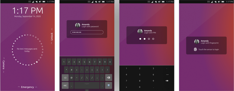
This thread discusses many different ways on how the design of the Login screen of UT screen could be improved. The whole conversation got pretty big thus, here is a small summary on Ideas, wishes and approaches.
What is to consider when redesigning the Login?
- The design needs to be convergent (usable in desktop and mobile mode)
- The design should look good in light and dark mode as there is no way to incorporate theming well.
- The design should not duplicate the look and feel of Android or iOS
- The design needs to be usable as good with a pin as with a passphrase
Which designs have been discussed so far?
@purplevvay made many mock-ups for different design Ideas, and we borrowed some from the ICE thread as well:
1.

- close to the current design
- original Keyboard is used
- slight transparency
- Input field based on login method
- Emergency is missing
2.
(my personal favorite)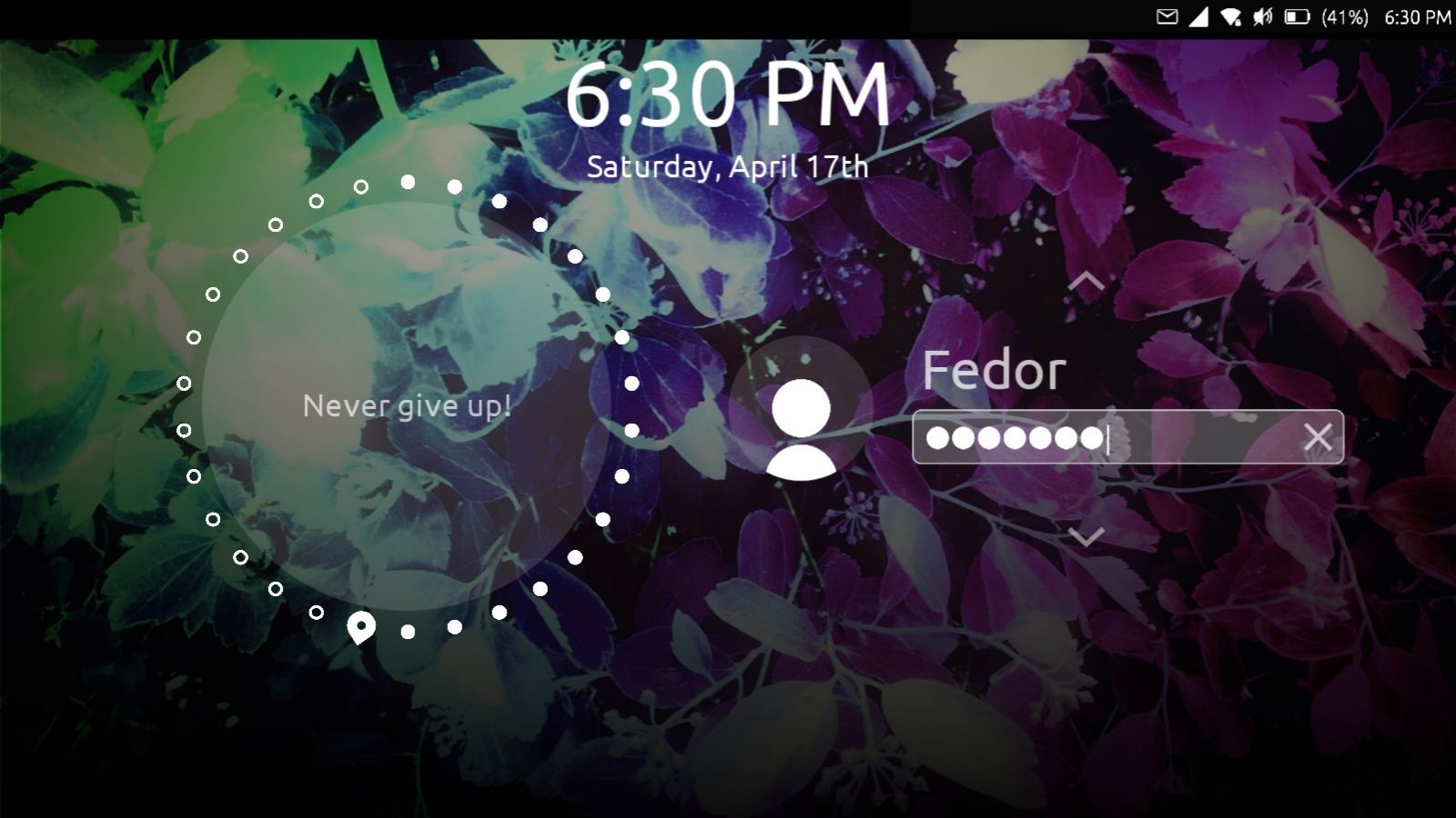
- repositioned input
- bigger user Icon above the text input
- Original keyboard is used
- No design changes based on Input method
- Very universal between light and dark mode
- transparency for default user and input
- blurred background
3.
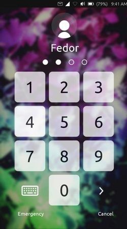
- full screen pin pad
- extra click required for keyboard
- not very convergent
- modern
- a mobile experience people are used to
I created a click dummy for this design:
https://aaron.place:8018/index.php/s/ot9SEG5FWfH2nJE4.
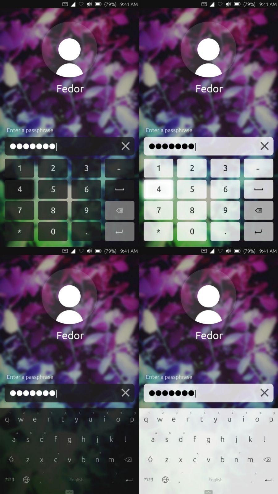
These designs are more or less a variation of the designs in 2. but uses a custom version of the keyboard.
How far have we come to implement this our selves?
I have been able to tweak unity/lomiri to my liking, but we are not really close to anything that could be proposed in a pull request.
To @CiberSheep and the rest of the design team:
What do you think of our Ideas and mock-ups? Do you think this is something that should be added to UT? How could we further help you to turn this into reality? Do you have other thoughts?
To anyone:
If you are interested in turning this into reality, I would be happy to give you a small gift card as a thank-you
-
@aarontheissueguy said in Login screen/Code input Design:
A summary of this thread:
To @CiberSheep and the rest of the design team:
What do you think of our Ideas and mock-ups? Do you think this is something that should be added to UT? How could we further help you to turn this into reality? Do you have other thoughts?
Thanks for putting them together
")
Personally I like 1 as keep the Ubuntu look and 2 (even I would suggest some tweaks) because is quite simple and yet with character.Some additional thoughts:
- Emergency is required and I think it should be visible
- I think we should use UT OSK as the keyboard (which is themable)
-
I'm with number 1 too. It has the least change from the current design but makes it look a lot better.
-
I think we could make #1 happen.
- add phone icon + 'emergency' translated above keyboard
- just keep user picked theme of keyboard
-
Hi! Great to see that you like my designs!
 You might not have noticed that in the design there is also a proposal to move the emergency button. I think the button fits better on the home screen, because it should be very fast to access. The user should just swipe up or tap on the label to open the emergency dialer and maybe also emergency information in the future as discussed in the ICE thread. Since UT is hugely based on gestures I've also placed a camera swipe to make pictures when the phone is locked which might be useful.
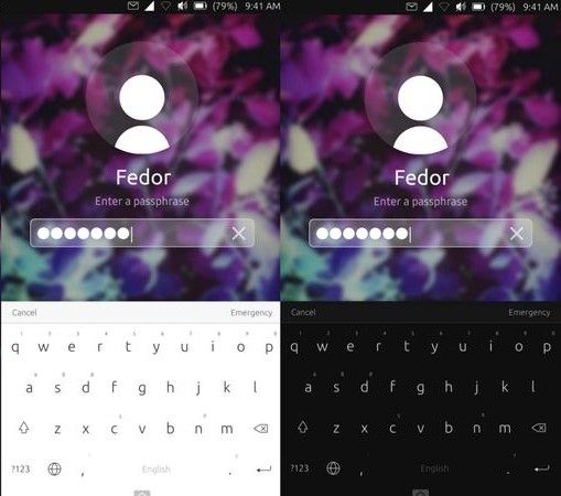
I've used two different styles for the keyboard to see if the login theme fits to different keyboard themes.
Let me know what do you think
-
The Emergency button, will it be a quick dial option for calling a preset (national/regional/personal) emergency number? Will it accomodate the (future) options as discussed in the ICE topic? Or both?
-
cibersheep said in Login screen/Code input Design:
(even I would suggest some tweaks) because is quite simple and yet with character
Glad to hear it! But which tweaks would you suggest? Ready to improve the mock-up asap!
capsia said in Login screen/Code input Design:
Let me know what do you think
It looks good! But I guess we should make the passcode/passphase bar transparent to let it be suitable for any theme.
using ut on xiaomi mi a2
Hello! It looks like you're interested in this conversation, but you don't have an account yet.
Getting fed up of having to scroll through the same posts each visit? When you register for an account, you'll always come back to exactly where you were before, and choose to be notified of new replies (either via email, or push notification). You'll also be able to save bookmarks and upvote posts to show your appreciation to other community members.
With your input, this post could be even better 💗
Register Login