Login screen/Code input Design
-
@mateo_salta said in Login screen/Code input Design:
yep, lets focus on what is there to theme first.
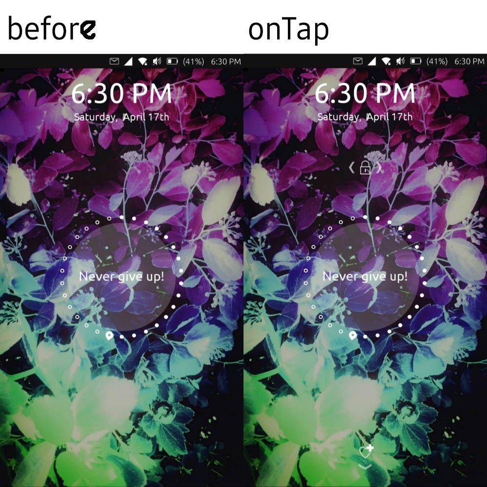
I do really like the idea of the emergancy on bottom edge, will have to see how we code thathere is a screen of progress in implementing some theme tweaks:
I think maybe it could go a bit lighter?
Great to see this implemented in system!

@capsia said in Login screen/Code input Design:
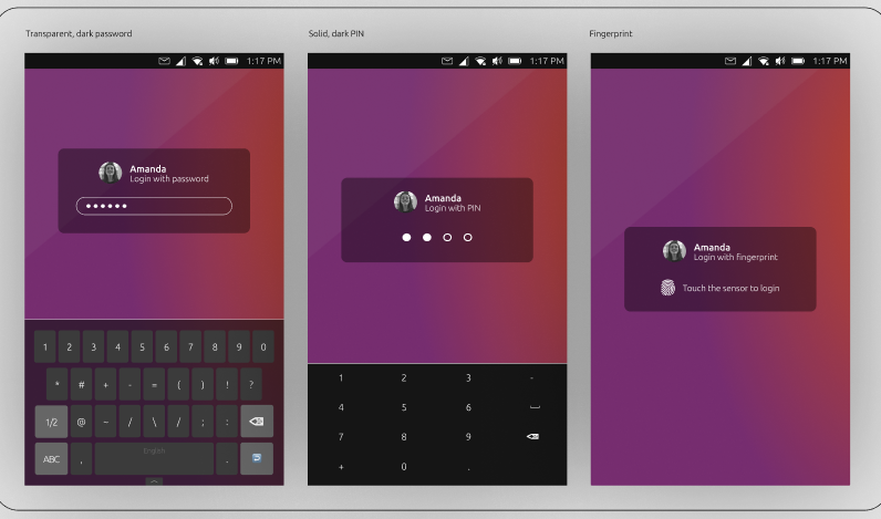
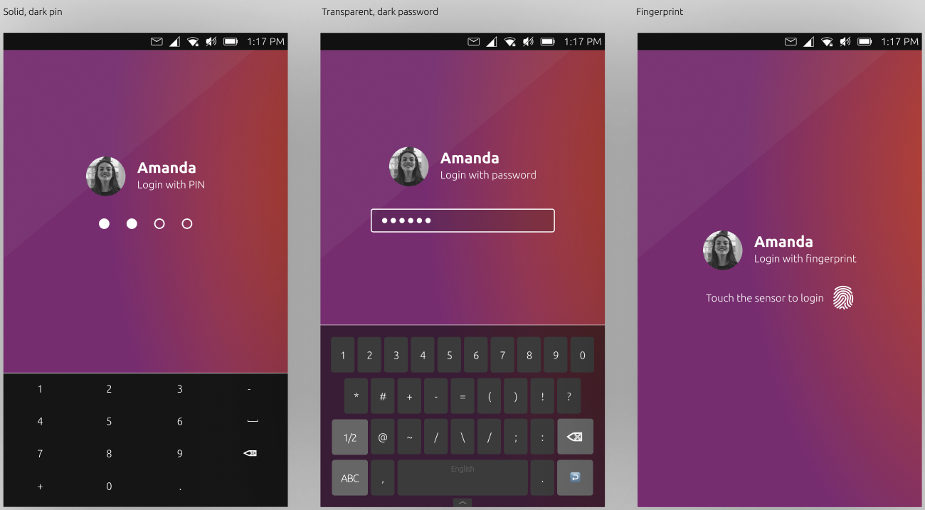
I've tried to use transparent background, but it doesn't look well when a user sets a light background:
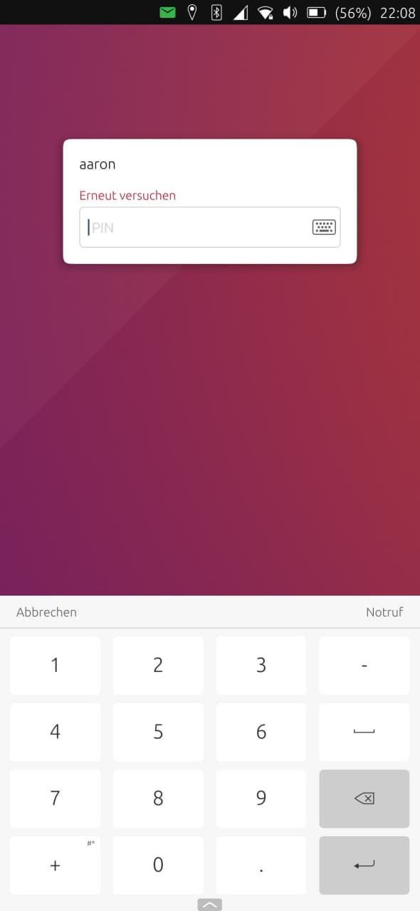
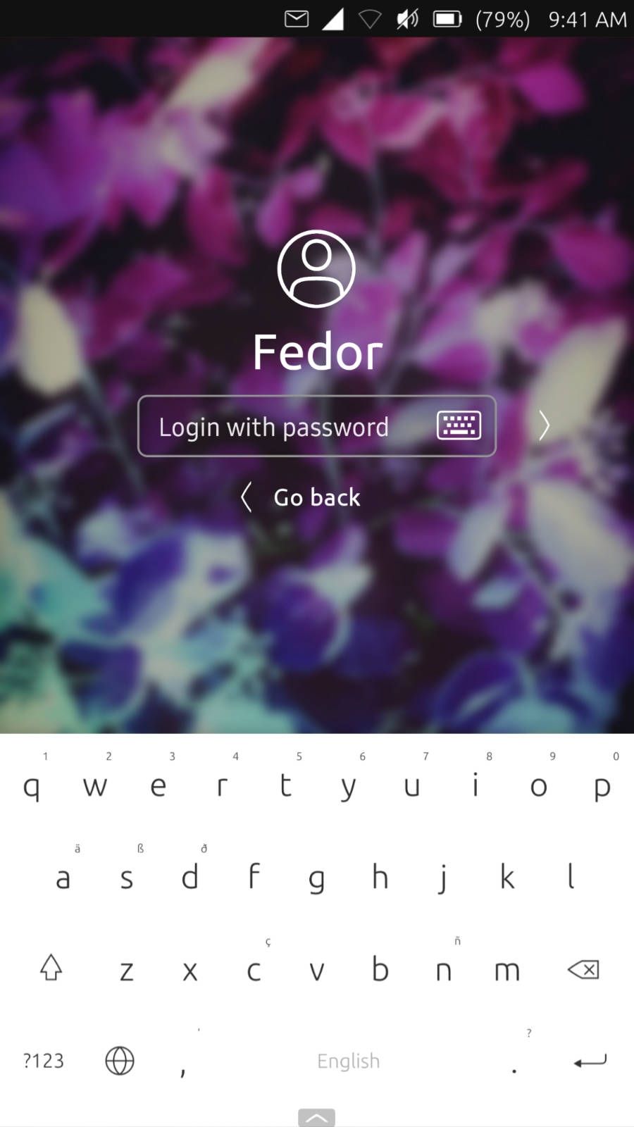
I think it looks very good! I guess the only one thing we need is to make the passphrase/passcode field less rounded to match the system look. (sorry for not saying that earlier)
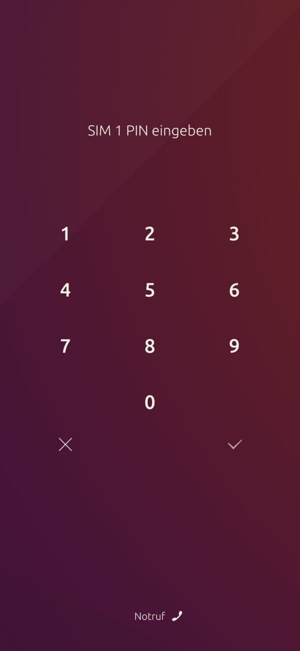
The background in lockscreen is darker then the actual one. I put the white color background to see if that's true.
using ut on xiaomi mi a2
-
also it would be great if we could have some predefined phone numbers to call when opening the page
Currently the option on Lomiri lockscreen just opens the dialer app, no predefined number.
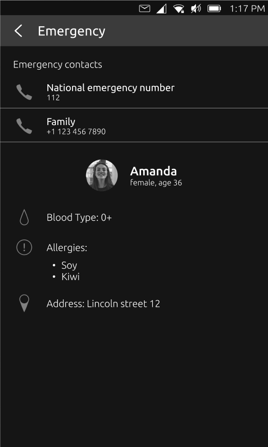
The Emergency option as proposed, opening the ICE information would open a tab neccessary for emergency services, not dialing the number of emergency services instantly when needed as user/owner -> one tap away from being connected to emergency services to call for help immediately.
Not looking to make this design more complicated but wouldn't it be more logical to have two buttons on lockscreen?
- Emergency call
- Emergency info (seperate ICE icon as discussed in the ICE thread)
Critics are the true Positives | OnePlus 3T, Lumia 950
-
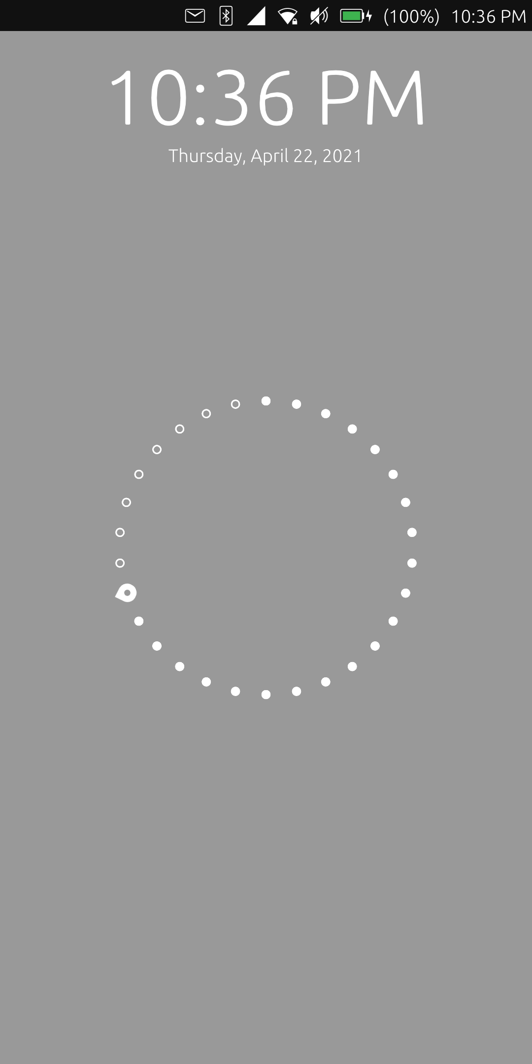
Hi, I have a few updates. I've managed to make the white text more visible on light backgrounds using a bit bigger text and I made a design for the emergency screen.
@purplevvay said in Login screen/Code input Design:
I guess the only one thing we need is to make the passphrase/passcode field less rounded to match the system look.
Thanks for the suggestion! Done
")
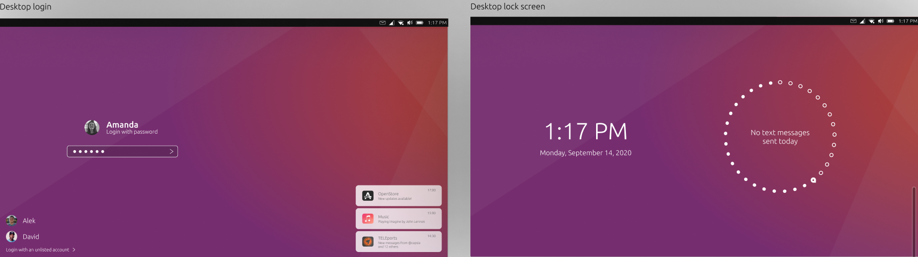
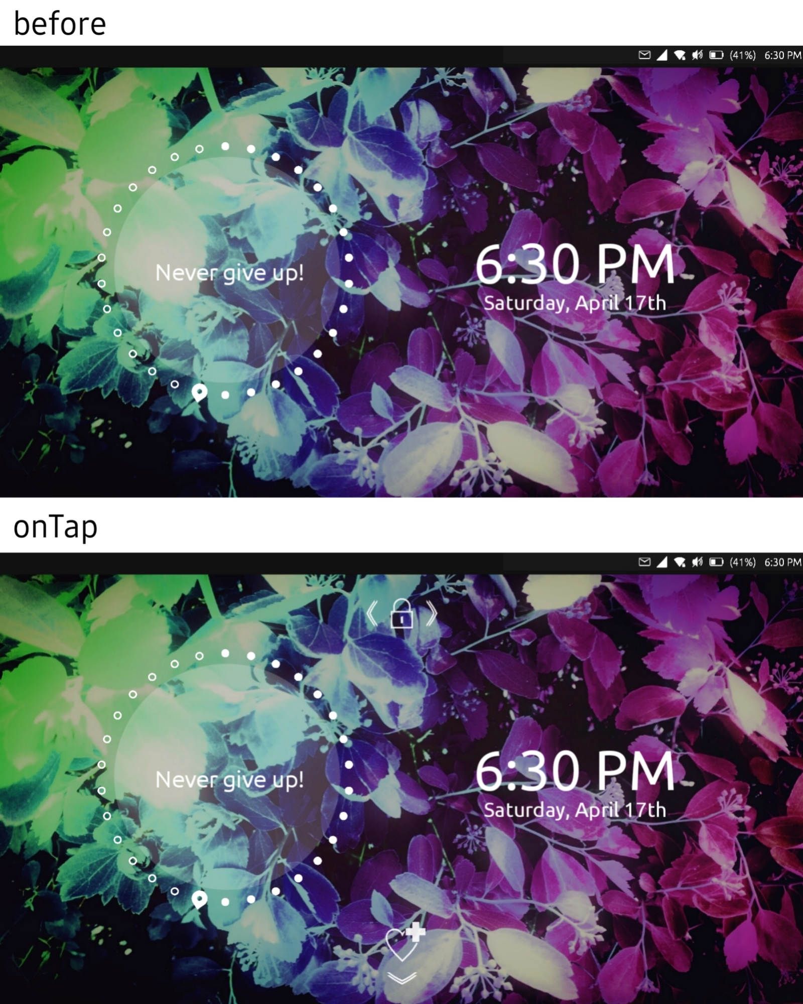
I've added also some more designs to show how it could look in desktop mode:
@3t_ed said in Login screen/Code input Design:
Not looking to make this design more complicated but wouldn't it be more logical to have two buttons on lockscreen?
This would probably be confusing when you are in an emergency situation and you don't know which button to press. Here is what I've thought will be displayed when the emergency button is pressed/swiped:
I've also found a few more discussions on the forum about lockscreen / login screen that might be useful when thinking about the design:
https://forums.ubports.com/topic/2278/ubuntu-touch-for-phone-lock-greeter-design
https://forums.ubports.com/topic/2240/home-screen-locked
https://forums.ubports.com/topic/2206/login-greeter-design-for-desktop -
@capsia said in Login screen/Code input Design:
This is very interesting. I don't know if the OSK can show up if the cursor is not in a TextField though
-
@cibersheep Couldnt we make the actual textfield invisible and create a replica to create that look?
-
@capsia oh, I like the emergency screen, this could easily be in the bottom edge. We would then need to make corresponding gsettings, and settings in the settings app.
-
@purplevvay yes, this is implemented as a background could be white in places making the text there in unreadable, if we come up with a better option, this could be removed
possibilities?- adapt color with calculating brightness(could lead to just grey text, or partially disappearing text)
- drop shadow(difficult to get right)
- more complicated text overlay blend mode( more difficult, resource intensive, might not exist in a simple command)
-
@3t_ed yes, if we were to add speed dial for emergency numbers it would send it through url dispatcher I believe and only pre fill in the number, I will double check how they launch the dialer app.
-
@capsia Im not sure we would want to change one swipe to something else, but camera or other shortcuts, could come as configurable buttons, but that is a lot of work. It would be great to see more ideas on how to go about 'no unlock' launching of apps. There are also things in the quick launch menus in the launcher that are conditionally hidden when designated private, this makes sure the open window names are not shown for morph browser when locked, something similar may be needed for apps to use this feature if we want to implement, ie take pictures but not allow deleting, or viewing the gallery portion of the app, or if you want quick clock app access, show time/stopwatch, but not edit zones or alarms, is a complicated feature, but one that could be really cool if made
-
@kugiigi perhaps, I will need to test to see if switching out apps in the file will work, it might be a easy hack
-
@capsia hm, I wonder if some kind of overlay blend mode is available, we might be able to make some kind of color changing glass look if that is possible, instead of a grey see through box
-
@aarontheissueguy said in Login screen/Code input Design:
@cibersheep Couldnt we make the actual textfield invisible and create a replica to create that look?
Making it
visible: falseI don't think it work, butopacity: 0might.You might want to check the terminal app code. I never found how it does it.
-
@cibersheep oh, intresting. i guess terminal isnt a traditional text box either - i once tried to port cool retro term, but couldnt get the keyboard to show
")
-
@cibersheep said in Login screen/Code input Design:
This is very interesting. I don't know if the OSK can show up if the cursor is not in a TextField though
I think it could be a text field with the appropriate letter spacing and a text label with the empty dots on the background. The text field would have a custom password char, no border and hidden cursor. Would it be simpler to implement like that?
@mateo_salta said in Login screen/Code input Design:
@capsia oh, I like the emergency screen, this could easily be in the bottom edge. We would then need to make corresponding gsettings, and settings in the settings app.
Great!
@mateo_salta said in Login screen/Code input Design:
@capsia Im not sure we would want to change one swipe to something else, but camera or other shortcuts, could come as configurable buttons, but that is a lot of work. It would be great to see more ideas on how to go about 'no unlock' launching of apps. There are also things in the quick launch menus in the launcher that are conditionally hidden when designated private, this makes sure the open window names are not shown for morph browser when locked, something similar may be needed for apps to use this feature if we want to implement, ie take pictures but not allow deleting, or viewing the gallery portion of the app, or if you want quick clock app access, show time/stopwatch, but not edit zones or alarms, is a complicated feature, but one that could be really cool if made
My idea to implement it, was to run the apps in something similar to the 'guest session' that unity7 used to have. This way the app won't have access to userdata. Then the app could say which data to save in the user session. When the user logins will be notified that new pictures ( timers.... or anything else) were taken in guest mode and ask him whether he wants to save them or not. Of course this would need a lot of work too, because we will need to provide multiuser capabilities.
@mateo_salta said in Login screen/Code input Design:
@capsia hm, I wonder if some kind of overlay blend mode is available, we might be able to make some kind of color changing glass look if that is possible, instead of a grey see through box
I think that the current background darkening looks good, however if you think it can be improve it, give it a try.
-
@mateo_salta said in Login screen/Code input Design:
@purplevvay yes, this is implemented as a background could be white in places making the text there in unreadable, if we come up with a better option, this could be removed
possibilities?- adapt color with calculating brightness(could lead to just grey text, or partially disappearing text)
- drop shadow(difficult to get right)
- more complicated text overlay blend mode( more difficult, resource intensive, might not exist in a simple command)
I don't think so. Also the time and the day showing widget are white. So we don't need to worry about that.
@capsia said in Login screen/Code input Design:
Hi, I have a few updates. I've managed to make the white text more visible on light backgrounds using a bit bigger text and I made a design for the emergency screen.
Looks so good! Also I really like the landscape mode. But I think we should scale the items differently. Ubuntu Touch supports convergence and gives us ability to use our smartphone like a computer. But this system is developed for mobile devices (smartphones, tablets) so it should be optimized primarily for them.
I mean we should make the items a little bit bigger.Hi, I apologize for not replying for long time.
I have tried to match all the needs in these mockups.
The problem is that emergency and unlock instructions make the screen look overdetailed. So I have tried to use Suru icons (system default icons). But some of them are made by me, so it would be cool if someone, who knows more in design, will make them.
So basically when you turn on the screen you just see clocks and day showing widget. But when you tap, the unlock and emergency swipes instructions appear.
I have also an idea about the passphrase/pin section (screen):
The size of text field should match the current one.
using ut on xiaomi mi a2
-
@purplevvay Interesting, very interesting
-
@capsia awesome, then we can leave the semi dark overlay, and use white text
-
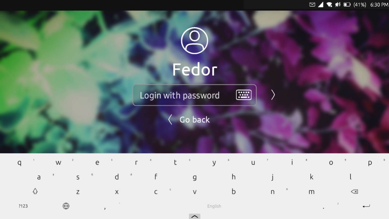
@purplevvay I like the icon only idea
looking niceI think we don't need a "go back", or if we want just the arrow to the left of the login?
-
At all involved, I'm thrilled to see this project grow. While it looked like the ICE initiative was dying it's great to see it being integrated in another great project we all would like to welcome.
Besides the benefit of a wonderful lockscreen and perhaps saving lives with an accessible ICE I hope the Lomiri Circle can make way for the @Capsia design for updates on homescreen.
Wish I could contribute at this stage however lacking programming and styling skills my added value will be that of positive critical feedback and earlier posts in the ICE topic
Thank you all for taking these steps to make this a reality!!
-
@mateo_salta said in Login screen/Code input Design:
@purplevvay I like the icon only idea
looking niceI think we don't need a "go back", or if we want just the arrow to the left of the login?
I have tried doing that, but if I just place the "Back" icon to the left (near the text field), some people may think that this button allows to change the user. If I place that below, it won't be that visible as the forward button is.
I haven't got any other ideas (maybe yet).
Hello! It looks like you're interested in this conversation, but you don't have an account yet.
Getting fed up of having to scroll through the same posts each visit? When you register for an account, you'll always come back to exactly where you were before, and choose to be notified of new replies (either via email, or push notification). You'll also be able to save bookmarks and upvote posts to show your appreciation to other community members.
With your input, this post could be even better 💗
Register Login