UI question - alternative pincode prompt system setting integration
-
@cibersheep elipse, does it exist on UT somewhere, can you give an example ?
-
Ellipsis, not elipse. Three dots. Like so ...
-
@moem oh i see, thx
-
I think you just manually put 3 dots? Ellipsis is usually only use when cutting off texts but in this case, it means there are more actions to be done after selection.
-
@kugiigi I've just added the 3 dots:
I still found weird that clicking on the selected item will open a new page.
But if its ok, then it is less work for me, otherwise i would need to change all the component")
I first thought about a ListItem with an "on/off" label and a progress slot.
e.g:
[EDIT]: Well the "On/Off" is maybe not appropriate...
-
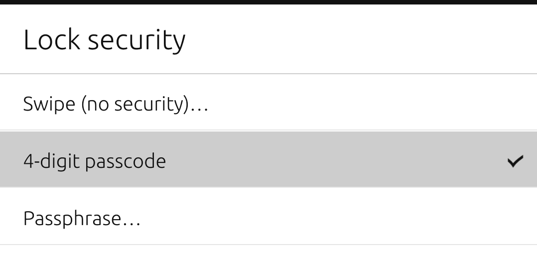
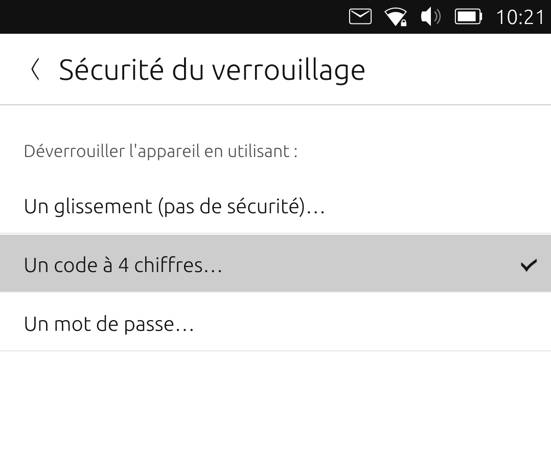
Personally, I would redesign them especially adding a separate way to change the passcode/passphrase

-
@kugiigi if you are talking about the "change passcode/passphrase", i've made a MR to make the button visible again ( was already there but the condition to make it visible was wrong) :
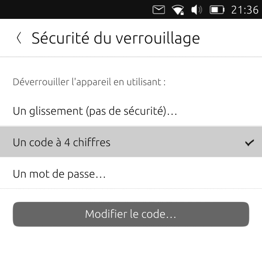
https://gitlab.com/ubports/core/lomiri-system-settings/-/merge_requests/330
-
@lduboeuf how about expanding/collapsing the main item when selected with the indented two additional sub items on the same page? Not to be collapsed, when a sub item is selected. I think this relates more to your original question or concern and would be more intuitive to me, but I am not sure, whether this is actually used in UT UI, nor how much work the implementation would be.
-
@mschmids said in UI question - alternative pincode prompt system setting integration:
e

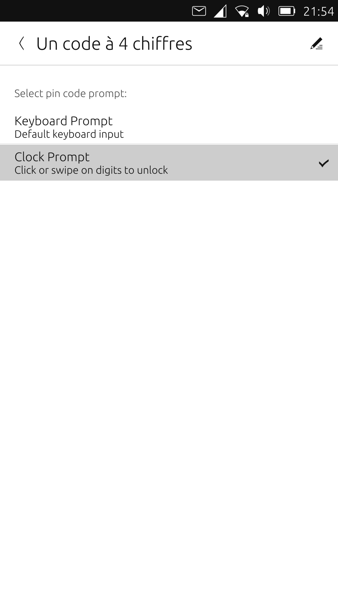
Swipe animation
00**
AbcAbc**And then images of a keyboard/clock etc.
This avoid mistakes like "pin" → "PIN", and the variation of
"passcode" "passphrase" "pin code" "4 digit code", and so on.
Basic users will also struggle with "prompt", and possibly "keyboard input".Ideally it would be a non-nested menu
with selectable entries where other possible options are grayed out and deleted when selecting something else.This removes the need for "On" and "Off", with the currently saved method showing up in a colour.
-
@kingu I'm sorry, but it is very difficult to understand what you are trying to explain here.
Can you try again with other words?
Hello! It looks like you're interested in this conversation, but you don't have an account yet.
Getting fed up of having to scroll through the same posts each visit? When you register for an account, you'll always come back to exactly where you were before, and choose to be notified of new replies (either via email, or push notification). You'll also be able to save bookmarks and upvote posts to show your appreciation to other community members.
With your input, this post could be even better 💗
Register Login