UI / UX discussion
-
@phoenixlandpirat I realize that they are somewhat out of fashion and rather neglected, but I still think scopes have the potential to offer more than an app. They could be a real differentiator for UT.
-
@3arn0wl said in UI / UX discussion:
@phoenixlandpirat I realize that they are somewhat out of fashion and rather neglected, but I still think scopes have the potential to offer more than an app. They could be a real differentiator for UT.
The entire point of scopes was they offered less than apps, and were easier to develop. Continually adding features to make them more like apps was the result, and they were never enough of a difference to make UT unique through their existence.
The back-end and core ideal of what scopes are might be salvageable in the future, but as scopes exist today, they just need to go. They are not essential, overly complex, and increase the maintenance burden.
-
@dobey I thought the idea of scopes was to pool information from varying sources, thus saving the user the trouble of delving into multiple apps to get the stuff they need. I gather they weren't as easy to develop as was hoped, and perhaps that's what did for them. Maybe they'll enjoy a renaissance one day, if we decide what we want from them.
-
@3arn0wl The idea of scopes was having a quick way to "consume" data (but not having any interactive components). Aggregator scopes came later, and they are meant to aggregate similar types of data for consumption, like the Today or Nearby scopes.
But as soon as you wanted to do anything with the data, you had to go to an app. Scopes are basically search plug-ins, and the UI did not represent that aspect well enough. If we did the same thing as Apple does with Quicksilver (or whatever it's called now) on iOS, they'd be great.
-
@dobey If I recall correctly, this is one of those instances where Apple noticed a good idea from the Open Source world.
-
@dobey said in UI / UX discussion:
3)... and apps scope is replaced by app drawer.
Is this the official plan? Can I see that on the roadmap? I always felt the app launcher and the app scope to be a bit redundant, but I'm tending to use the app scope instead of the launcher...
@dobey said in UI / UX discussion:
It should be fine. The app drawer has search, scrolling, etc… and can be extended to have other views if necessary.
I've seen the app drawer on the desktop but I didn't notice the view I think, perhaps that would be an option... But I really cannot imagine launching/searching apps by typing their names to be a nice and comfortable ux on touch devices. If we really remove the app scope, then lets make the app launcher multicolumn and extend it over the whole screen...
-
@hummlbach said in UI / UX discussion:
Is this the official plan? Can I see that on the roadmap? I always felt the app launcher and the app scope to be a bit redundant, but I'm tending to use the app scope instead of the launcher...
It was the plan before Canonical dropped development of Unity8 and the phone. All of the code to get the app drawer feature complete was not finished before that point though, so there is still some work to do. And yes, it is still the plan as I understand, given the plan is to get rid of the dash and scopes when the app drawer get shipped.
@hummlbach said in UI / UX discussion:
I've seen the app drawer on the desktop but I didn't notice the view I think, perhaps that would be an option... But I really cannot imagine launching/searching apps by typing their names to be a nice and comfortable ux on touch devices. If we really remove the app scope, then lets make the app launcher multicolumn and extend it over the whole screen...
Nobody says you must type to find apps. Just like I don't have to type to find apps on my Android phone when I open the whole apps listing. There are sorting options (only alphabetical at the moment though I think, in the app drawer, as the necessary APIs for most frequent/recent/etc… were never finished), you can simply scroll the view up and down the same as you can now in apps scope, or you can enter a search in the text field.
Yes there are still some bugs and features which need worked out, but overall it is a far better experience than the scopes method.
-
What concerns me is that you have one row per letter in the app drawer (right?), which will make the screen filled sparse with app icons, so that you'll have to scroll much more than now!?!
-
@hummlbach said in UI / UX discussion:
What concerns me is that you have one row per letter in the app drawer (right?), which will make the screen filled sparse with app icons, so that you'll have to scroll much more than now!?!
Empty letters get collapsed, so not necessarily.
But also, there's nothing that says we can't change it to not have the grouping by first letter. The code is out there.
-
@dobey yes removing the grouping by letter sounds good. Then it would be fine for me and also an improvement compared to the app scope now in my opinion. Here is an example for what I meant posted by @PhoenixLandPirat in https://github.com/ubports/ubuntu-touch/issues/838:

I think there should be at least an option to pack the icons more tightly and use the whole width of the screen for the drawer.
-
A full width appdrawer would look very nice and minimalistic. Also the launcher would be visible so it gets more focus from the user. I would really like that

Edit: But if you go to the task overview and kill all active apps, which app would be then visible? Only the background or launch the appdrawer automatically then?
-
@krille
 As I've said numerous times, I'd like to see the app scope tidied away behind the dash button.
 -
Hm, ok does the app drawer always belong to (extend) the app launcher?
It would then be interesting to know if it would be possible to open the app launcher from either sides (together with fast left/right app-flipping done near the upper and lower corners) with the app drawer always extended towards the center.
Or only open the (unextended) app launcher when app-flipping (left/right) near the corners, and only extended the app-drawer right away with a fast-flip from the top? (long-drag from top opens system tray menu)
-
@gnu-mobile The app drawer is part of the unity8 shell itself, and whenever it is open the launcher is visible (just like when you open the dash in unity 7 on PC today).
I must disagree with the idea of opening things from corner swipes and such, especially from both sides of the screen. I think this will cause problems for implementation of proper accessibility support, and it breaks Fitts's Law for the concept of edge swipes.
Instead of coming up with new interaction designs off the cuff, it would be much better if we could objectively define all the problems you wish to solve first, and then we can come up with properly designed solutions which take all the relevant concerns into consideration. It's also good to remember that phones are not the only device this needs to work on. Convergence means everything needs to be usable and accessible on a full range of devices, including phones and PCs.
-
Well, the app drawer is a poor substitute for the Dash, in my opinion. I'd hoped that it was a temporary measure in Unity8, and that they would implement the Dash in the fullness of time.
-
User @gb has devised and inspired very sound UI/UX improvements regarding accessibility, symmetry, difficulty, and performance.
(Fitt's index metrics can not be broken, they improve or degrade.) A proper alternative for the originally proposed long-tap has been shown, and an improved gesture to access the "home" action has also been identified.
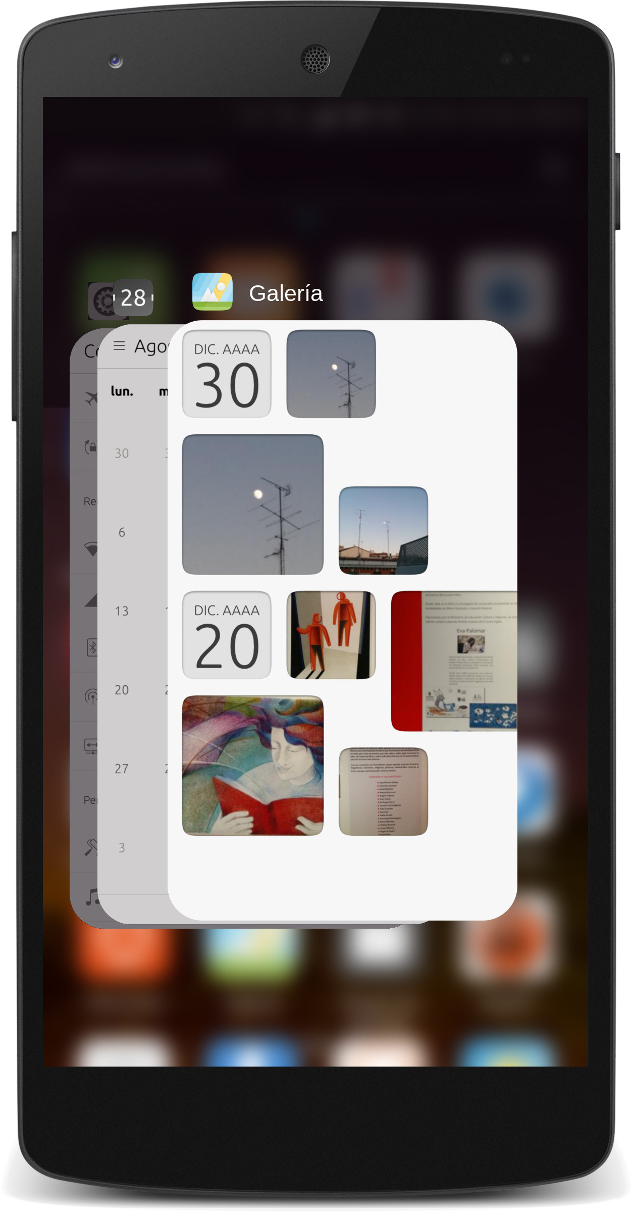
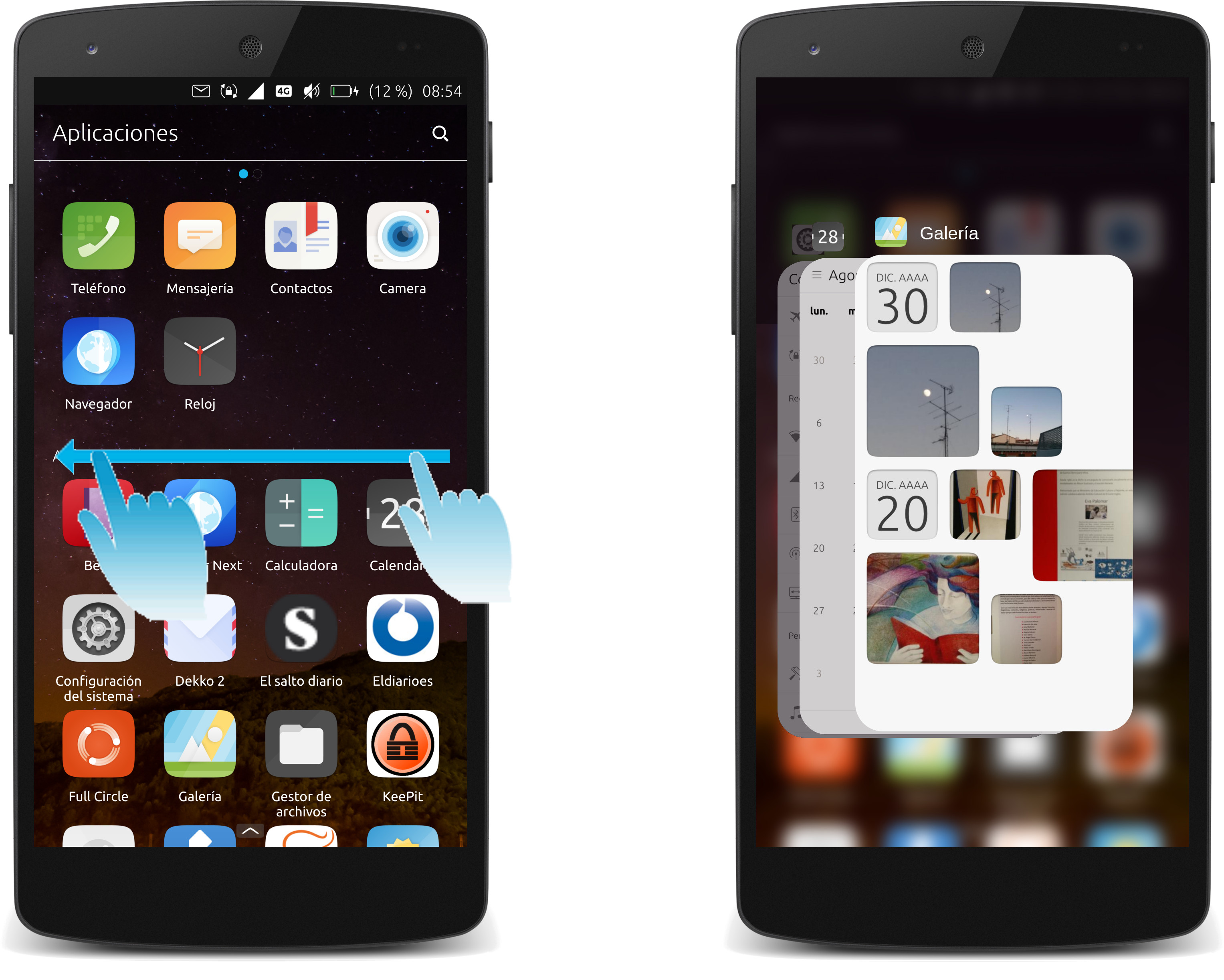
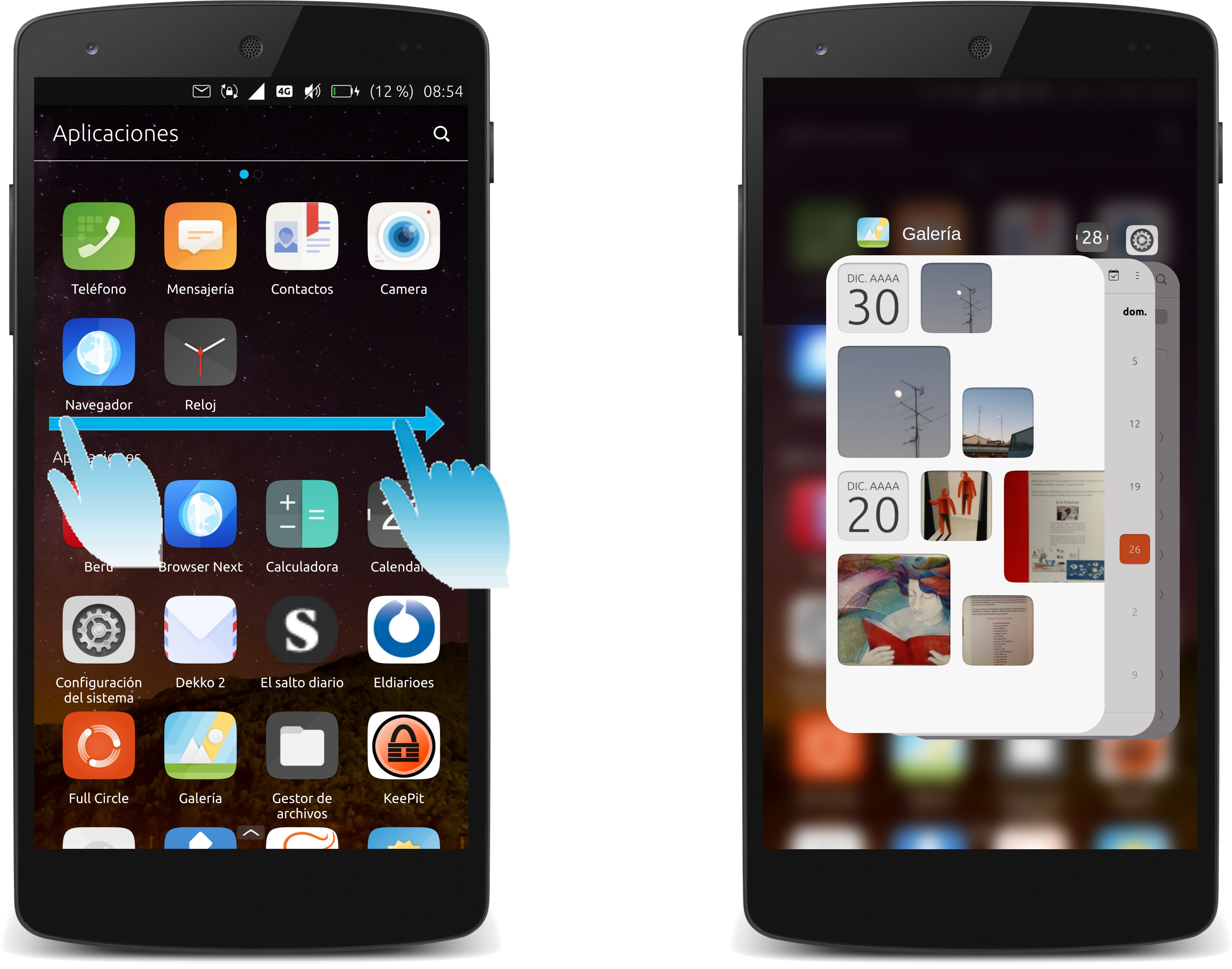
app flipping (from left and right) is fast, intuitive and improves access to running apps.
app switching (long-drag from left and right) provides an overview and allows larger, targeted jumps between a higher number of apps.- Allows fast flipping back and forth to more than just the last used app.
- Accessible for both hands, compared to old behavior (mean difficulty index improved, due to shorter average distance).
- Performance improves due to shorter distances and the faster direct flipping times.
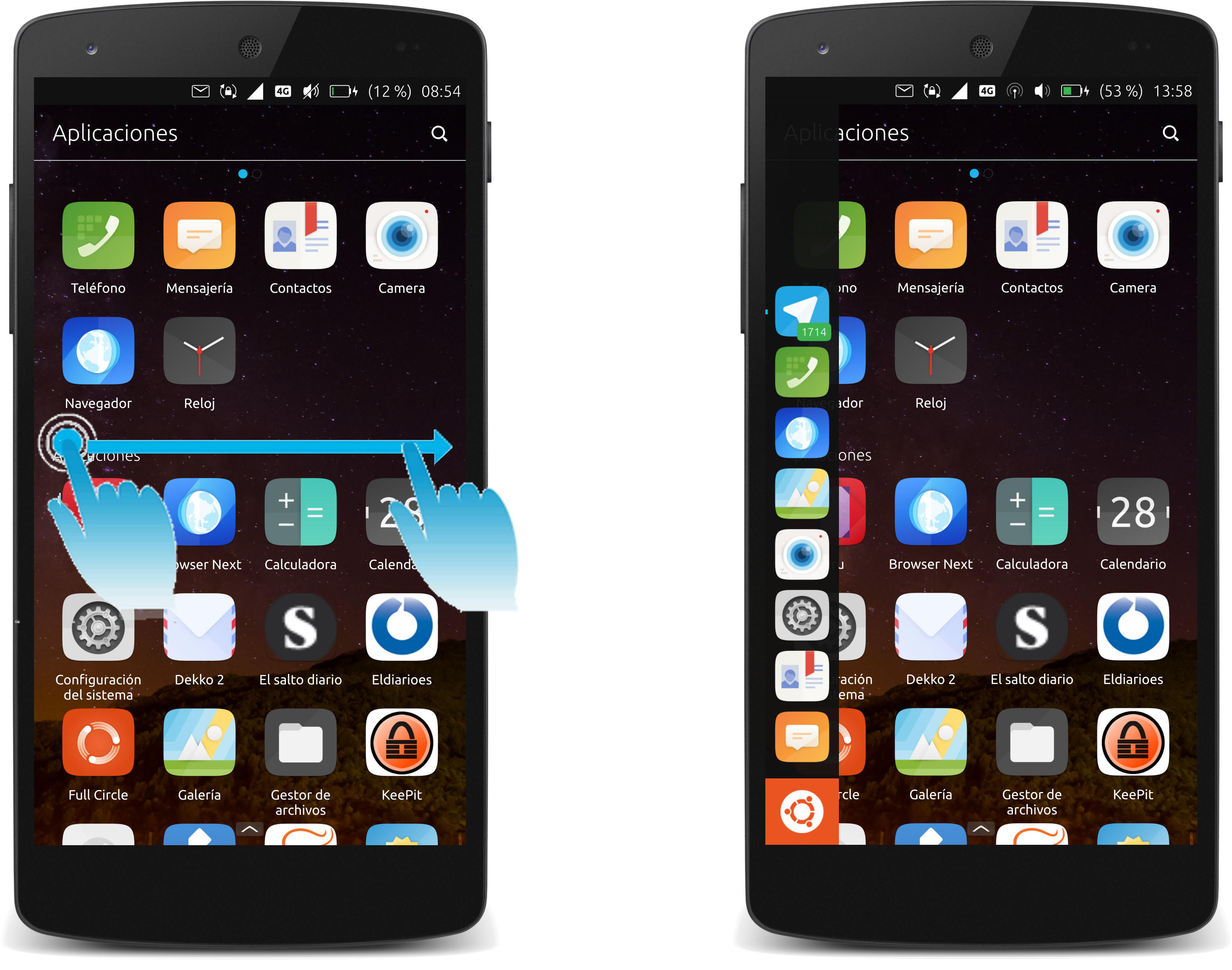
app launcher (old: short-drag left) can be integrated (opened together) with left and right app-flipping.
- Accessibility improves as it can be opened with both hands.
- Even if only opened if the flip is done in large enough sections near the corners (allowing to omit opening the app launcher when flipping in the middle), the target / distance ratio and difficulty index is improved due to the four locations instead of just one edge before.
home view (old: long-drag left) new: flip from top edge, which was not yet used before)
- Accessibility improves as it can be opened with both hands.
- Performance for the "home" action improves as the gesture changes from long-drag to short-drag (flip).
Other non-touch devices and platforms have additional means to open the UI elements, no drawbacks here.
-
@gnu-mobile You may agree with the designs, but that doesn't make them objectively good.
What are the problems being solved? How do these proposed changes improve things? Where is the rationale?
I'm all for appropriate and warranted design changes, but we need to be able to verify the improvements; not just make up excuses on the fly which support the new design. Even if all the things you stated are true about it, ther are still issues with it. We must list not only the things we think are good about a design, but we must also try to put ourselves in the shoes of others, and try to view problems from their side. For example, you mention accessing certain things easier from both hands. How does someone who does not have hands access those things? What about a blind user? We need to understand the situation from all these points of view, and make a compromise for the default behavior, as well as improve the accessibility features for those who may fall outside the default expectations.
-
If relevant, please post forward a use-case how any of the edge assignment optimizations would degrade any aspect in regards to your questions?
The improved and relevant aspects have been identified above. But, to express some points in negative terms: With the old edge assignment,
- the distances and times to conduct actions were longer, especially if not directly accessible with the used side of hands
- getting "home" was not a fast action
- back and forth flipping to last app on one side was against physical analogy
- there was no support for fast flipping back and forth through all apps
-
there was no support for fast flipping back and forth through all apps
Just a reminder that a long swipe from the Right hand side presents a beautiful folio of all the apps you have open. From there you can then select the app you wish to interact with. (HTH)
-
First: Me personally likes the idea of symmetry as well as 'flipping' through opened apps forth/right and back/left. But... I have the feeling that, the symmetrization plus new funtionality overloads gestures a bit... For me its already hard to differentiate long and short swipe from the right and it interferes sometimes with the apps functionality...
Secondly: I also want to add, that the app flipping as it is suggested here is intuitive in my opinion but breaks symmetry and being able to do all moves equally good with both hands... this is a bit of a contradiction here
Third: I dislike the mix of concerns of the app launcher (as it is now). On the one hand it provides short cuts for favorite apps and on the other side its displaying opened apps. Also it does not scale good enough for the latter and doesn't look and feel nice when the icons to be displayed exceeds the height of the launcher.At the end @gb: Thanks for the nice mockups, sharing your ideas and moreover for starting this discussion. (It seems to me its 'needed' and good to have it.)
Hello! It looks like you're interested in this conversation, but you don't have an account yet.
Getting fed up of having to scroll through the same posts each visit? When you register for an account, you'll always come back to exactly where you were before, and choose to be notified of new replies (either via email, or push notification). You'll also be able to save bookmarks and upvote posts to show your appreciation to other community members.
With your input, this post could be even better 💗
Register Login


