UI / UX discussion
-
What concerns me is that you have one row per letter in the app drawer (right?), which will make the screen filled sparse with app icons, so that you'll have to scroll much more than now!?!
-
@hummlbach said in UI / UX discussion:
What concerns me is that you have one row per letter in the app drawer (right?), which will make the screen filled sparse with app icons, so that you'll have to scroll much more than now!?!
Empty letters get collapsed, so not necessarily.
But also, there's nothing that says we can't change it to not have the grouping by first letter. The code is out there.
-
@dobey yes removing the grouping by letter sounds good. Then it would be fine for me and also an improvement compared to the app scope now in my opinion. Here is an example for what I meant posted by @PhoenixLandPirat in https://github.com/ubports/ubuntu-touch/issues/838:

I think there should be at least an option to pack the icons more tightly and use the whole width of the screen for the drawer.
-
A full width appdrawer would look very nice and minimalistic. Also the launcher would be visible so it gets more focus from the user. I would really like that

Edit: But if you go to the task overview and kill all active apps, which app would be then visible? Only the background or launch the appdrawer automatically then?
-
@krille
 As I've said numerous times, I'd like to see the app scope tidied away behind the dash button.
 -
Hm, ok does the app drawer always belong to (extend) the app launcher?
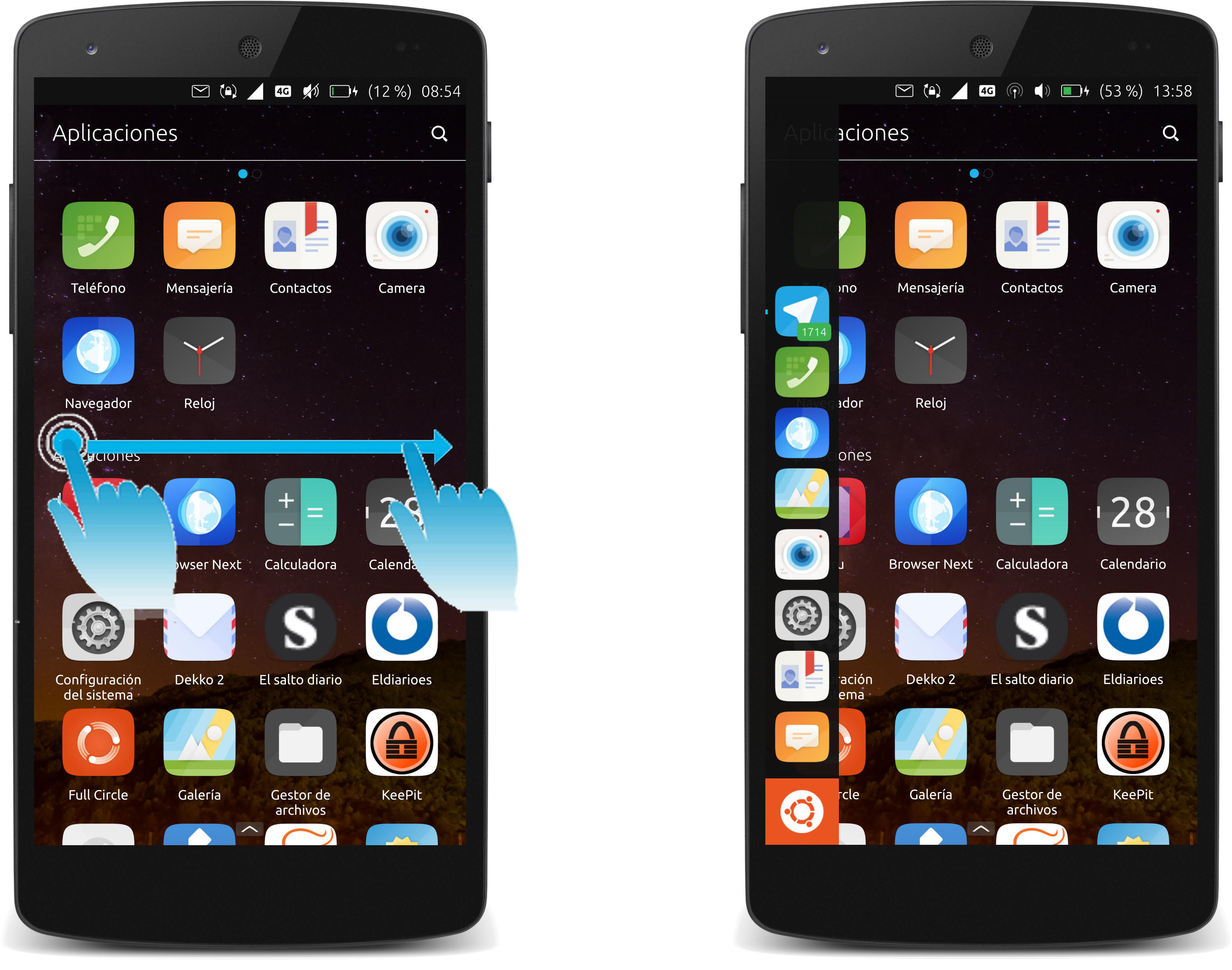
It would then be interesting to know if it would be possible to open the app launcher from either sides (together with fast left/right app-flipping done near the upper and lower corners) with the app drawer always extended towards the center.
Or only open the (unextended) app launcher when app-flipping (left/right) near the corners, and only extended the app-drawer right away with a fast-flip from the top? (long-drag from top opens system tray menu)
-
@gnu-mobile The app drawer is part of the unity8 shell itself, and whenever it is open the launcher is visible (just like when you open the dash in unity 7 on PC today).
I must disagree with the idea of opening things from corner swipes and such, especially from both sides of the screen. I think this will cause problems for implementation of proper accessibility support, and it breaks Fitts's Law for the concept of edge swipes.
Instead of coming up with new interaction designs off the cuff, it would be much better if we could objectively define all the problems you wish to solve first, and then we can come up with properly designed solutions which take all the relevant concerns into consideration. It's also good to remember that phones are not the only device this needs to work on. Convergence means everything needs to be usable and accessible on a full range of devices, including phones and PCs.
-
Well, the app drawer is a poor substitute for the Dash, in my opinion. I'd hoped that it was a temporary measure in Unity8, and that they would implement the Dash in the fullness of time.
-
User @gb has devised and inspired very sound UI/UX improvements regarding accessibility, symmetry, difficulty, and performance.
(Fitt's index metrics can not be broken, they improve or degrade.) A proper alternative for the originally proposed long-tap has been shown, and an improved gesture to access the "home" action has also been identified.
app flipping (from left and right) is fast, intuitive and improves access to running apps.
app switching (long-drag from left and right) provides an overview and allows larger, targeted jumps between a higher number of apps.- Allows fast flipping back and forth to more than just the last used app.
- Accessible for both hands, compared to old behavior (mean difficulty index improved, due to shorter average distance).
- Performance improves due to shorter distances and the faster direct flipping times.
app launcher (old: short-drag left) can be integrated (opened together) with left and right app-flipping.
- Accessibility improves as it can be opened with both hands.
- Even if only opened if the flip is done in large enough sections near the corners (allowing to omit opening the app launcher when flipping in the middle), the target / distance ratio and difficulty index is improved due to the four locations instead of just one edge before.
home view (old: long-drag left) new: flip from top edge, which was not yet used before)
- Accessibility improves as it can be opened with both hands.
- Performance for the "home" action improves as the gesture changes from long-drag to short-drag (flip).
Other non-touch devices and platforms have additional means to open the UI elements, no drawbacks here.
-
@gnu-mobile You may agree with the designs, but that doesn't make them objectively good.
What are the problems being solved? How do these proposed changes improve things? Where is the rationale?
I'm all for appropriate and warranted design changes, but we need to be able to verify the improvements; not just make up excuses on the fly which support the new design. Even if all the things you stated are true about it, ther are still issues with it. We must list not only the things we think are good about a design, but we must also try to put ourselves in the shoes of others, and try to view problems from their side. For example, you mention accessing certain things easier from both hands. How does someone who does not have hands access those things? What about a blind user? We need to understand the situation from all these points of view, and make a compromise for the default behavior, as well as improve the accessibility features for those who may fall outside the default expectations.
-
If relevant, please post forward a use-case how any of the edge assignment optimizations would degrade any aspect in regards to your questions?
The improved and relevant aspects have been identified above. But, to express some points in negative terms: With the old edge assignment,
- the distances and times to conduct actions were longer, especially if not directly accessible with the used side of hands
- getting "home" was not a fast action
- back and forth flipping to last app on one side was against physical analogy
- there was no support for fast flipping back and forth through all apps
-
there was no support for fast flipping back and forth through all apps
Just a reminder that a long swipe from the Right hand side presents a beautiful folio of all the apps you have open. From there you can then select the app you wish to interact with. (HTH)
-
First: Me personally likes the idea of symmetry as well as 'flipping' through opened apps forth/right and back/left. But... I have the feeling that, the symmetrization plus new funtionality overloads gestures a bit... For me its already hard to differentiate long and short swipe from the right and it interferes sometimes with the apps functionality...
Secondly: I also want to add, that the app flipping as it is suggested here is intuitive in my opinion but breaks symmetry and being able to do all moves equally good with both hands... this is a bit of a contradiction here
Third: I dislike the mix of concerns of the app launcher (as it is now). On the one hand it provides short cuts for favorite apps and on the other side its displaying opened apps. Also it does not scale good enough for the latter and doesn't look and feel nice when the icons to be displayed exceeds the height of the launcher.At the end @gb: Thanks for the nice mockups, sharing your ideas and moreover for starting this discussion. (It seems to me its 'needed' and good to have it.)
-
Yeah, I agree it's good to have the discussion how things can be improved. Thanks @gb
I too use the app overview and switching all the time. Not clearly noticed before, but switching apps really seems not as straight forward and quick as it could be. The long-swipe + overview selection operation is getting longish for quickly changing to another app, compared to the quick flip (currently available only to get to the last app).
Nevertheless, the app overview is important and could be a nice place to allow reordering apps by dragging, but thats not possible now. Instead I find it each time showing the apps in a different order (last used put to the back (left) and the home scope always insterted as second). It might be easier and quicker to navigate if the sorting order would be kept, if not rearranged by dragging in the app overview, or no other sorting order was selected.
If it is a problem when the direction of the proposed app flipping hard-depends on the side (left/right), it should be possible to find a solution. Maybe allow flipping in the other direction: If the short-drag towards the center is not simply released, but the finger is instead moved back out of the screen again. (Like first reaching in (not necessarily pressing a little more) and then accelerating back and dragging the app out to the side, instead of only bopping it in, towards the center.)
-
Thinking about the app launcher access overloading the interface and maybe it not fitting in too well with small form factors, maybe some way could be found to merge the useful parts of it into the "home" function on smaller devices.
Maybe part of this could be to make "home" only open as a menu-like, modal or overlay (not listed in the app overview) with
- a flip (short-drag) from the top at any time
- EDIT: another flip or back-flip at the top switches back to the last app again
- by touching the blurred "home" background when in the app switcher.
-
What some people seem to be missing here (and with any designs in general) is that we don't need to use gestures for everything, and we don't need to be fully bound by the limitations which were set by Canonical with the intent of shipping on retail devices.
For example, we could implement support for the hardware buttons on android devices, so people can tap the back/home/apps buttons there to go back, home, or get to the apps overview.
-
Maybe som type of configurable gestures is the answer. You know, make list of global gestures, we can use, list of global actions and some configurable file, that links gestures to action. So anyone could redesign gestures to personal use (left handed peple) or reset to default. Thus, just a idea for future.
-
There is an issue for hardware key support https://github.com/ubports/ubuntu-touch/issues/823 (improvable title), strictly speaking, this again seems hardly relevant for a discussion about possible improvements to the ubuntu touch gestures, but it's another possibility to improve, yes.
@advocatux The reporter there may miss a fast "home" gesture, like the short-drag (flip) on the upper edge, as discussed here.
-
By the way, wouldn't the new concept be really simple to explain to new users?
- The home screen can always be flipped in and out from above (even if there is no physical home button on the display).
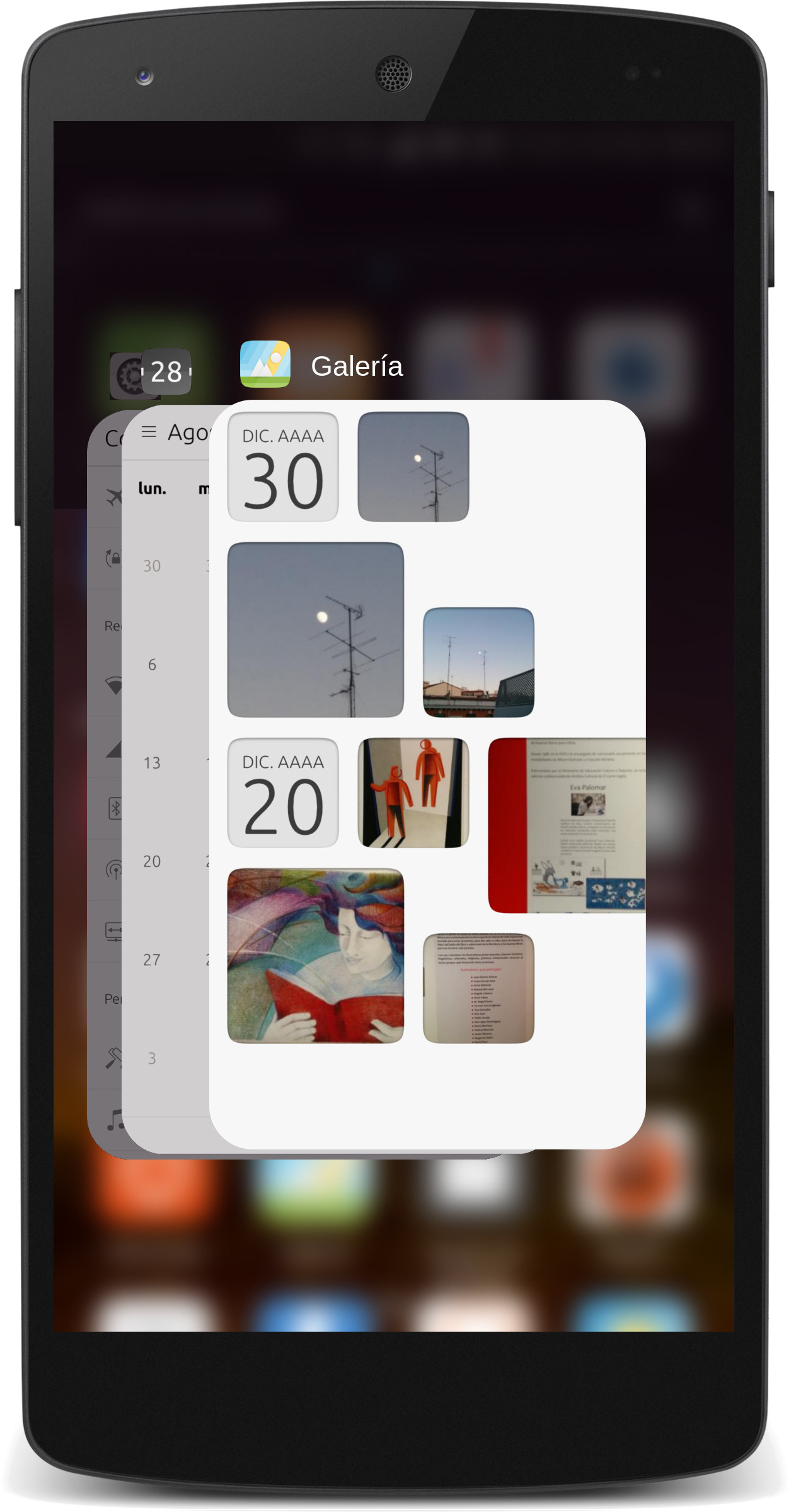
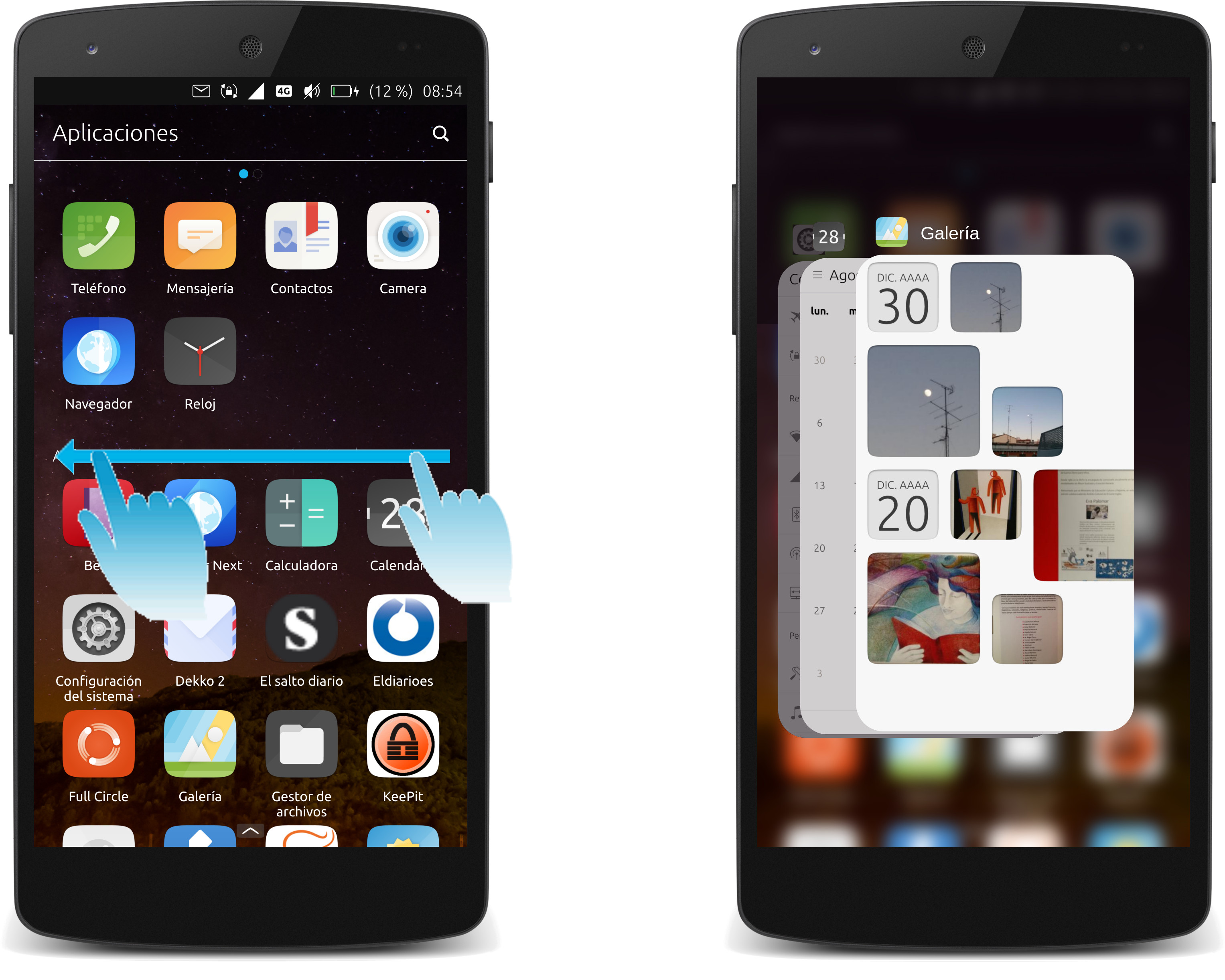
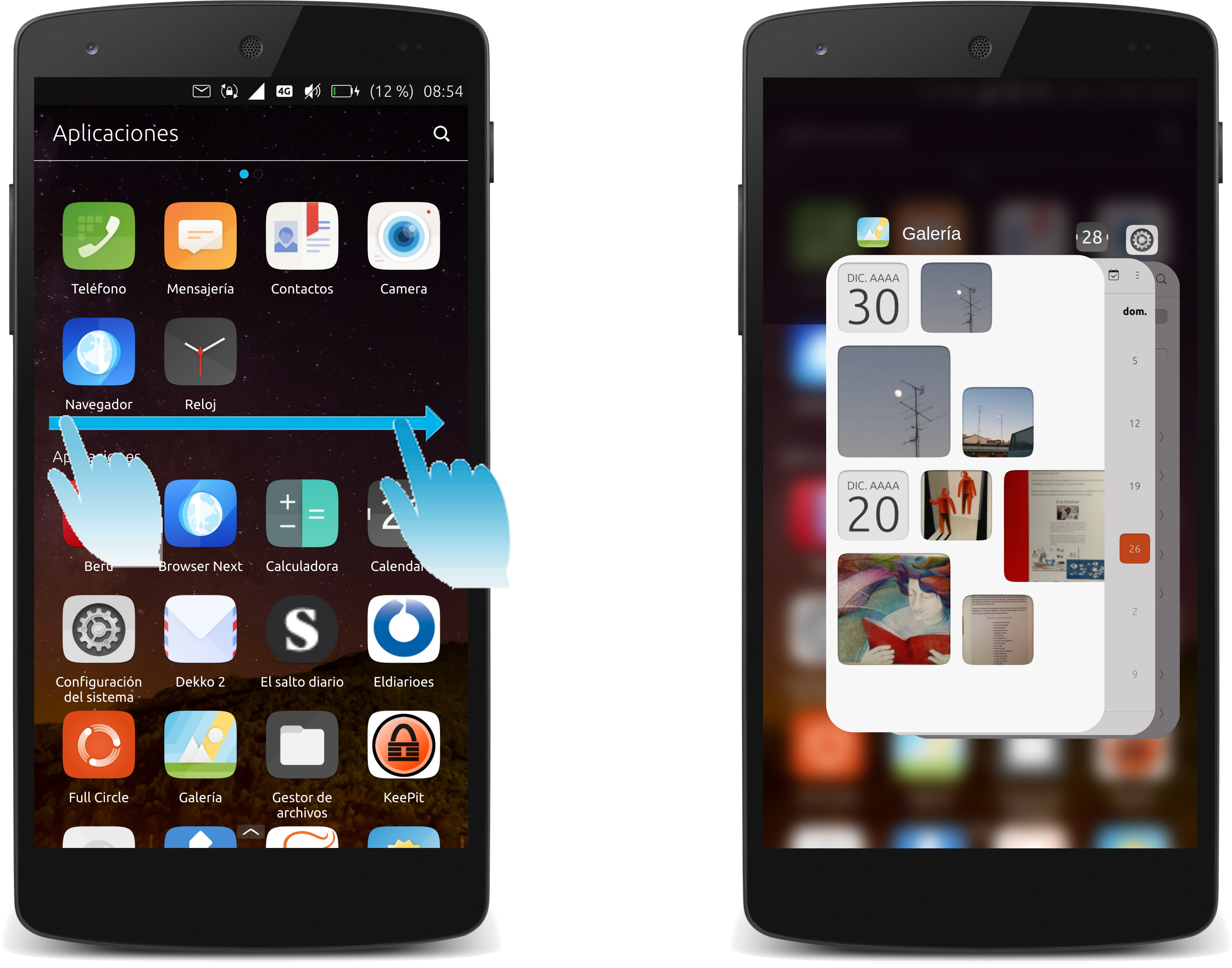
- When there are multiple apps open, one can flip through them from the edges on the right or left side (one-by-one), or long-drag out the app overview from either side to manage the running apps (throw out, switch, reorder).
Really? Can it be so nice and easy folks?

-
@gnu-mobile said in UI / UX discussion:
this again seems hardly relevant for a discussion about possible improvements to the ubuntu touch gestures, but it's another possibility to improve, yes.
How one performs actions is exactly relevant, especially when you are proposing changing designs specifically around performing those actions. First one must understand the actions, and who is using them, to be able to design an interface around those actions.
Hello! It looks like you're interested in this conversation, but you don't have an account yet.
Getting fed up of having to scroll through the same posts each visit? When you register for an account, you'll always come back to exactly where you were before, and choose to be notified of new replies (either via email, or push notification). You'll also be able to save bookmarks and upvote posts to show your appreciation to other community members.
With your input, this post could be even better 💗
Register Login


